AKÍBA branding and visual identity
AKÍBA, meaning thank you in Fang, an Equatorial Guinea language, is a massage and well-being space in Barcelona. I was commissioned to develop an identity that represents the connection between two important pillars of its owner: body health and Africa. The space is led by founder Tamara Ndong Bielo, an African woman from Malabo (Equatorial Guinea) based in Barcelona, who believes in the importance of thanking your body for sustaining you every day.
AKÍBA is built on sustainable values, respecting the environment, promoting fair trade and responsible consumption with all products that are used in the space.
Design concept
The biggest challenge about developing this identity was the representation of the connection between body health and the strong link with Africa that the brand has.
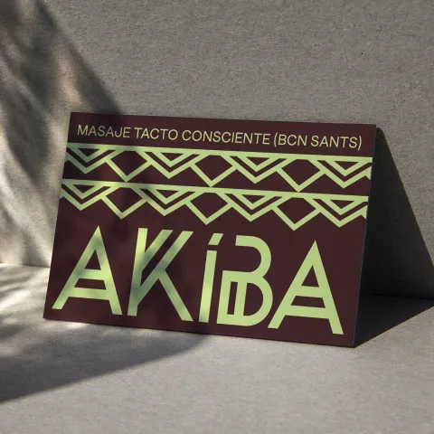
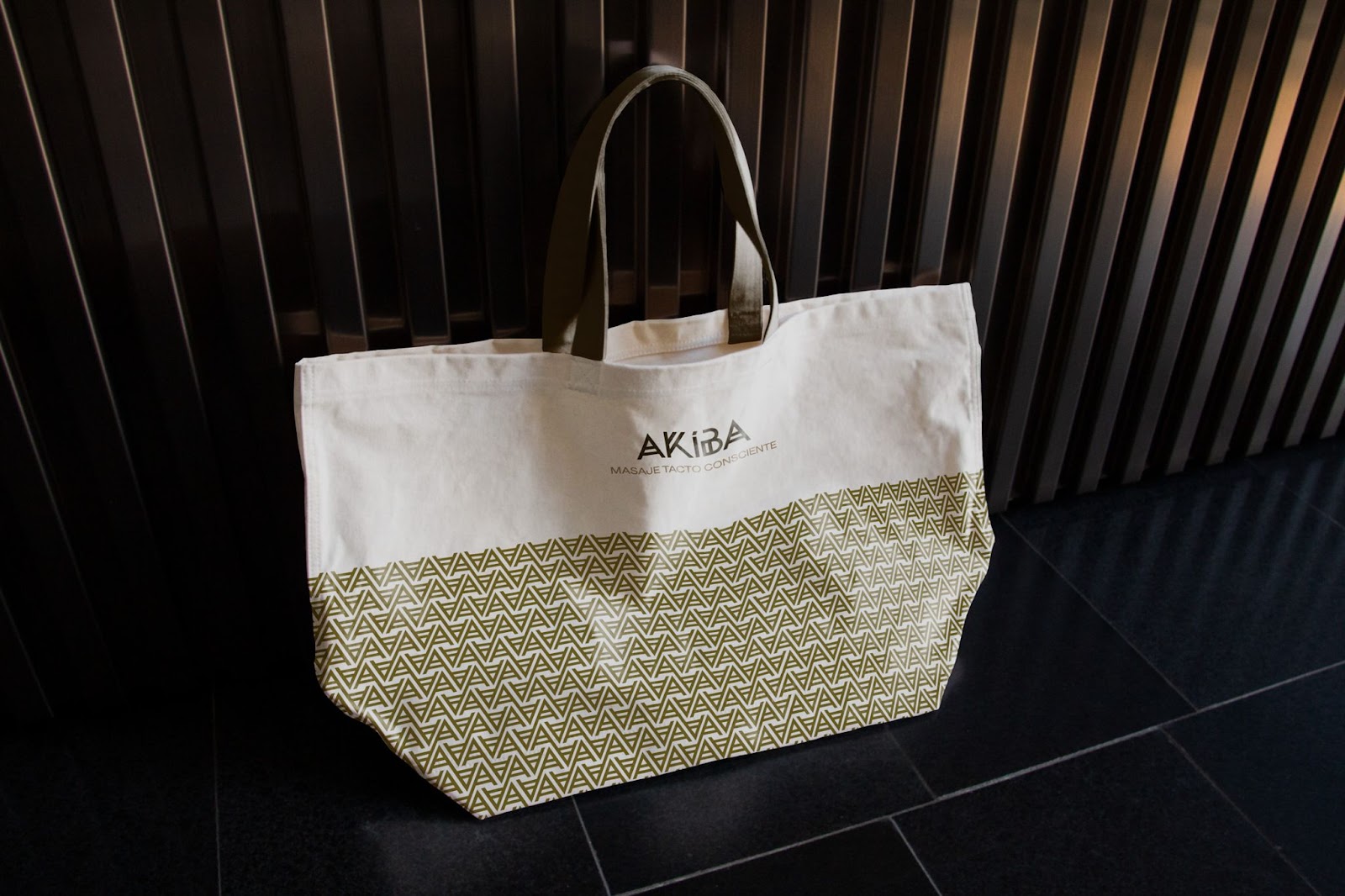
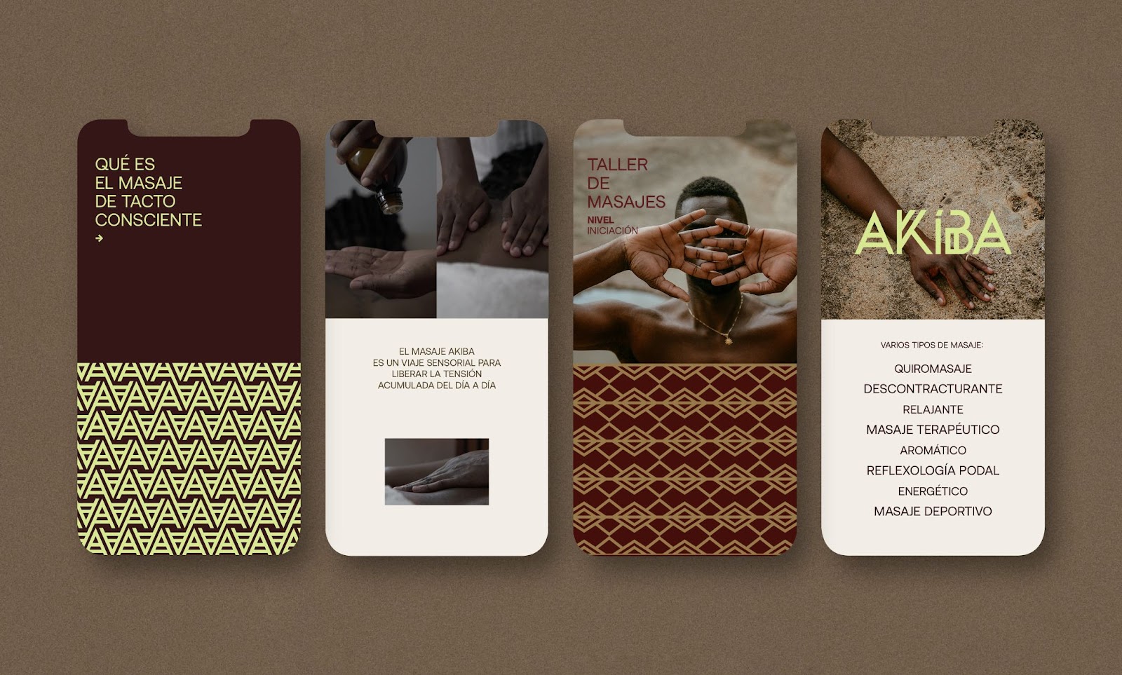
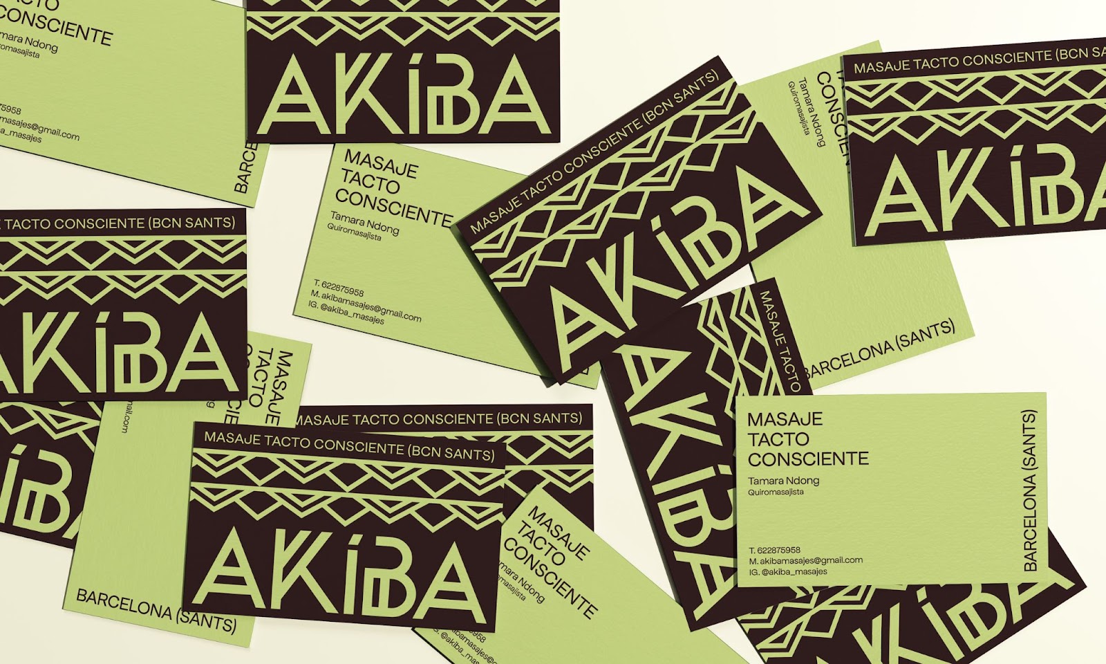
Three layers make up the AKIBA identity: the wordmark, as the core of the brand; the visual system, with unique patterns; and the colors, as a way to complement the brand in a natural and inclusive visual design but also with a strong personality.
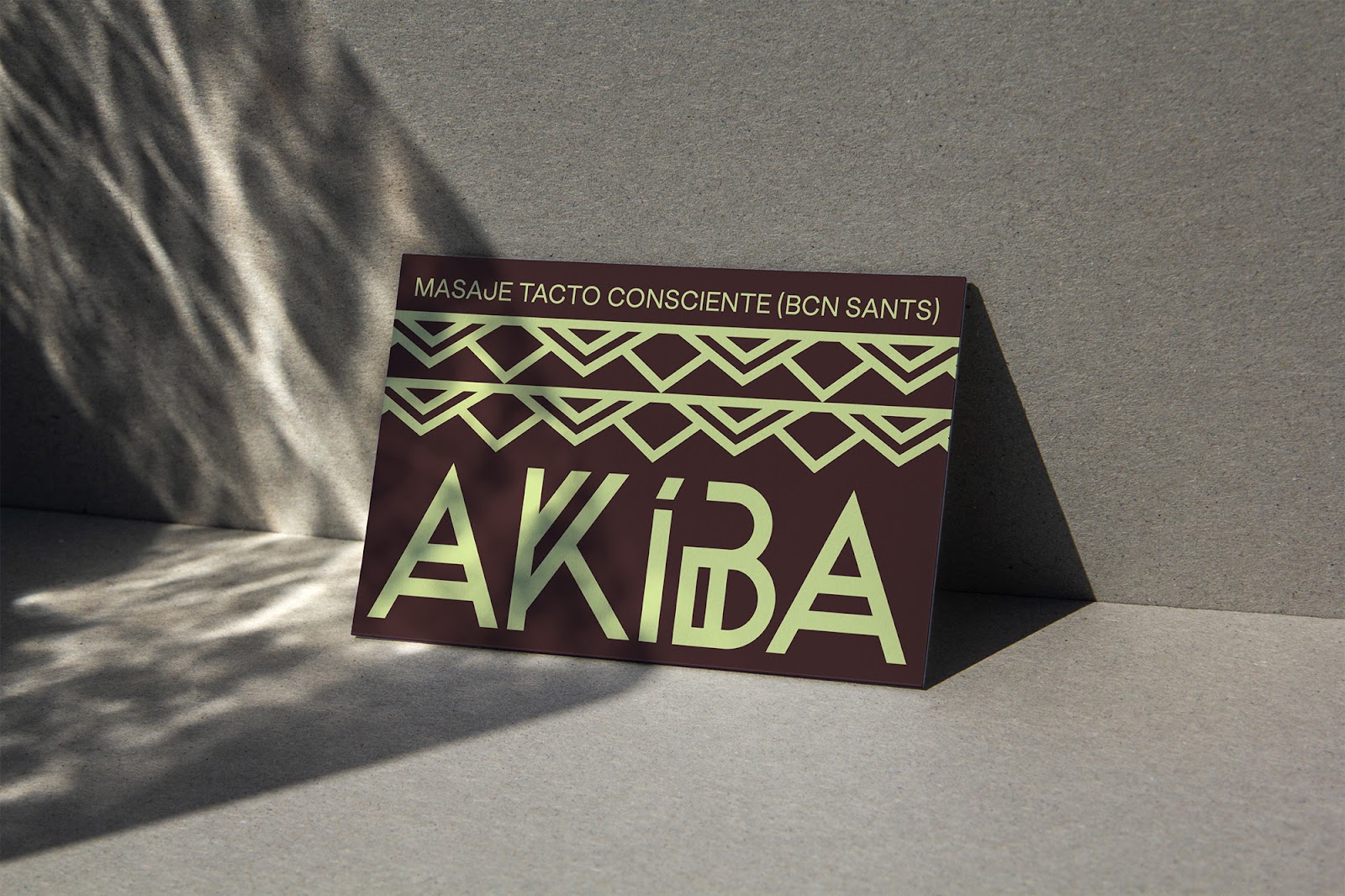
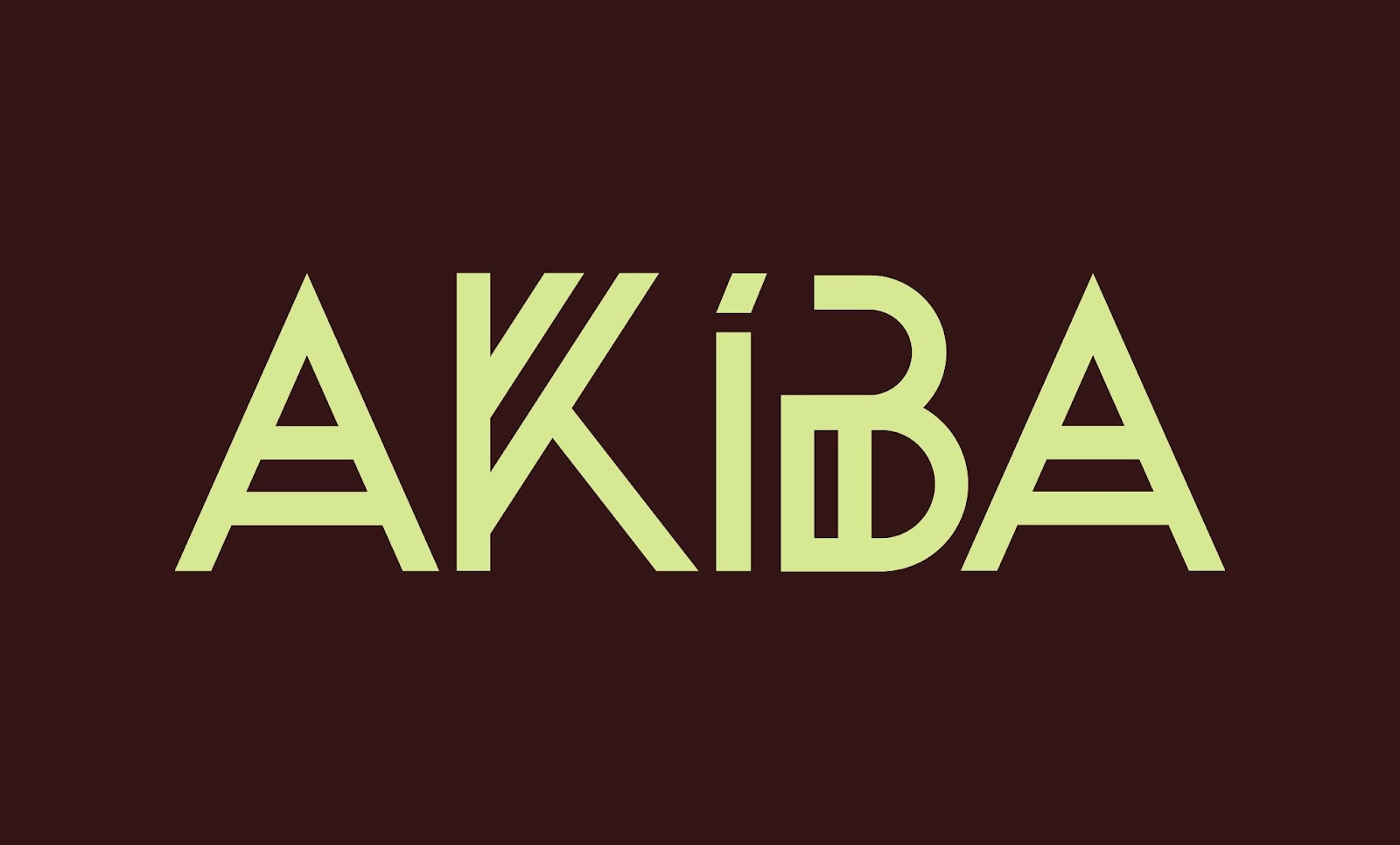
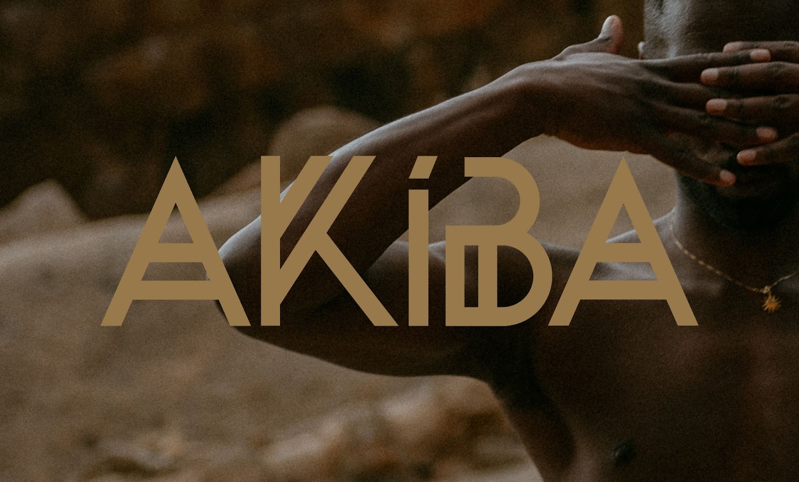
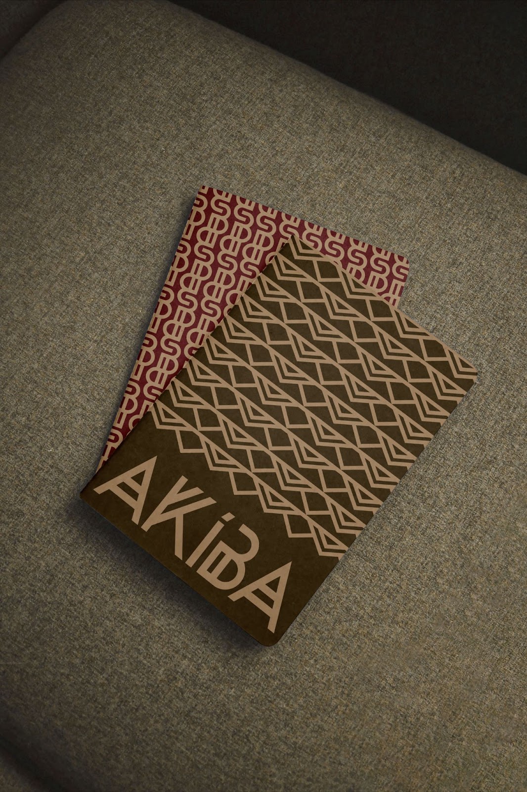
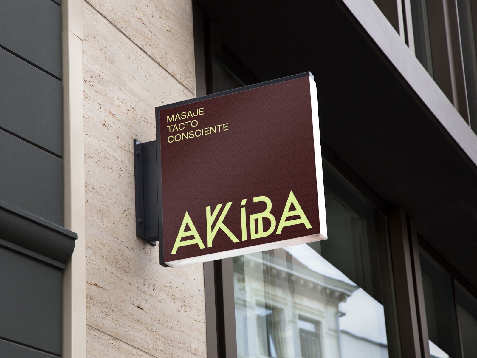
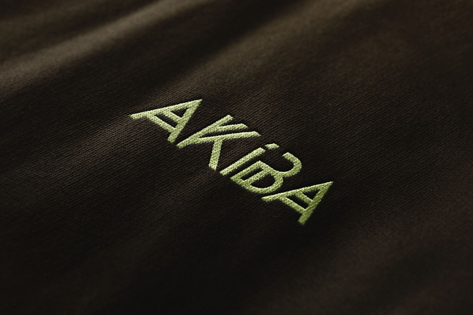
The creation of AKÍBA’s logo letterforms was inspired by historically-referential elements such as African pattern fabrics, where the geometric forms and the duplicated lines denote Africa. Taking this visual idea into a logo was the way that AKIBA’s logotype was created.
The logotype was also designed with the intention to break from the’ fine and delicate’ category norm found in traditional massage and relaxation brands. I harnessed Africa’s recognizable energy cues to explore and create a bold and strong letterform logo.
This logo also allowed us to develop our own visual system. Using each letter and playing with it through position and repetition to generate several unique reticles that only AKÍBA could have. Again the African fabric patterns are the inspiration in creating this design.
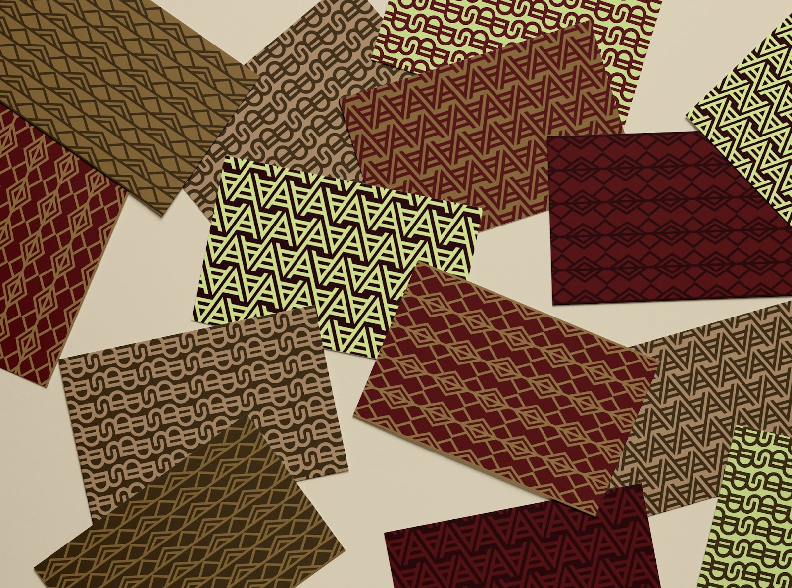
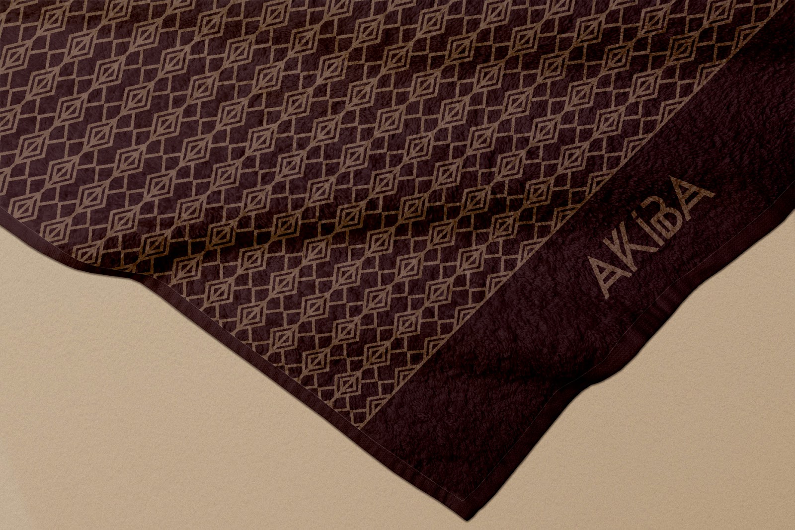
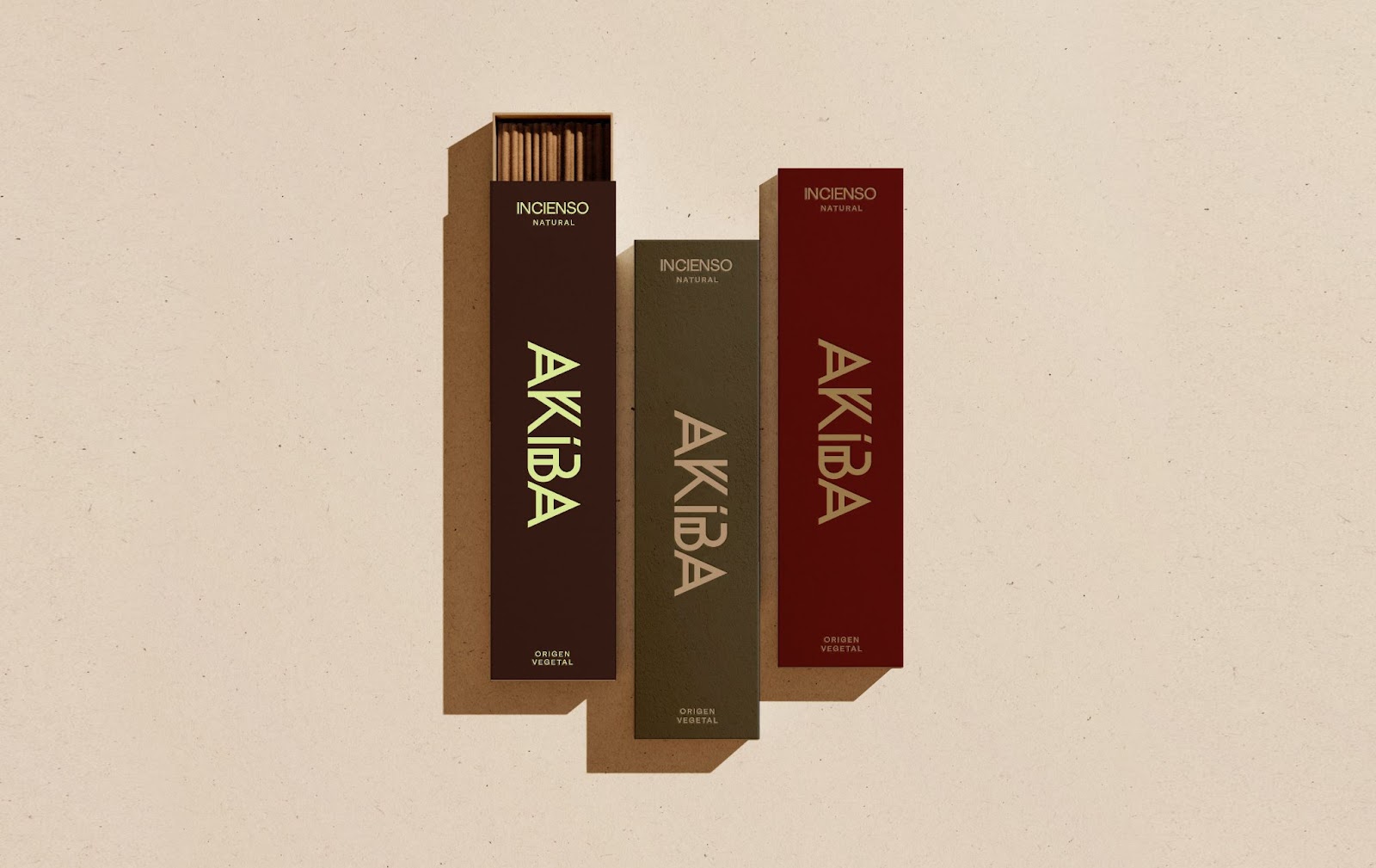
The color palette is inspired by nature and diverse skin tones. Exploratory mixing and matching of skin and nature tones birthed a color palette that looks natural and close.
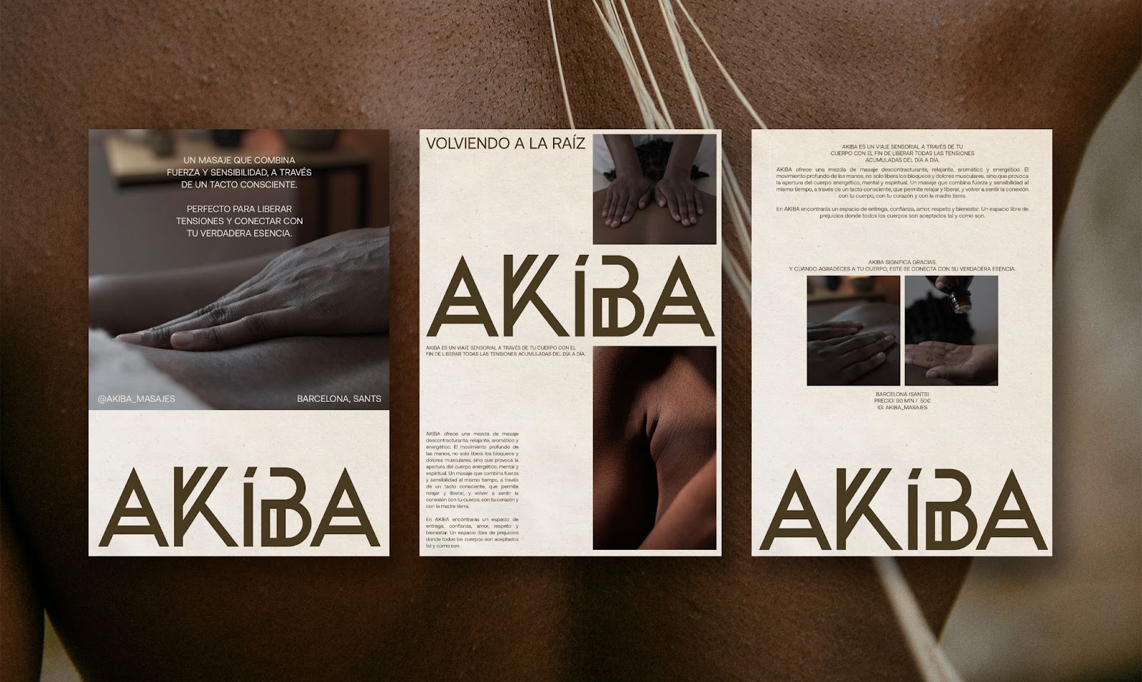
But, as we know already, AKÍBA is not only a space where you can heal your body, but a space of holistic healing with the promise of vitality. This was the rationale for a bright color within the brand lock-up to generate contrast with the warm part of the design identity.
It should be noted that the founder’s intent is to expand her vision to Malabo in the future, so the design identity needed to be adaptable. That is why we need a forward-thinking identity with the ability to work visually in two different cities and cultures, such as Barcelona (now) and Malabo (in the future).
The combination of all the design elements create an unconventional design for a massage brand. A brand that adapts to being bold and expressive when necessary, and tender when communicating relaxation and massage.
For more information make sure to check out Tamara González's website