Bold Typography Shines in HOMME's Branding & Visual Identity
Discover HOMME's new branding and visual identity, where organic typography and bold fonts merge to create a standout design. Explore this innovative project on abduzeedo.com
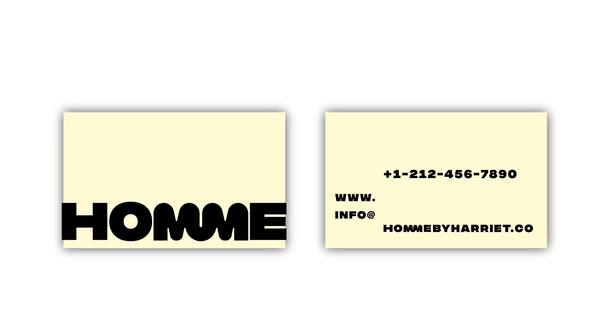
In the diverse and ever-evolving world of design, every project brings with it a unique set of challenges and opportunities. The recent branding and visual identity project for HOMME, created by Charlotte Slegers, stands out as a prime example of innovative design. This project, as seen on Behance, skillfully combines organic typography elements with a daringly bold font, creating a distinct visual language that speaks volumes about the brand's character.
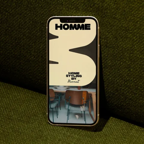
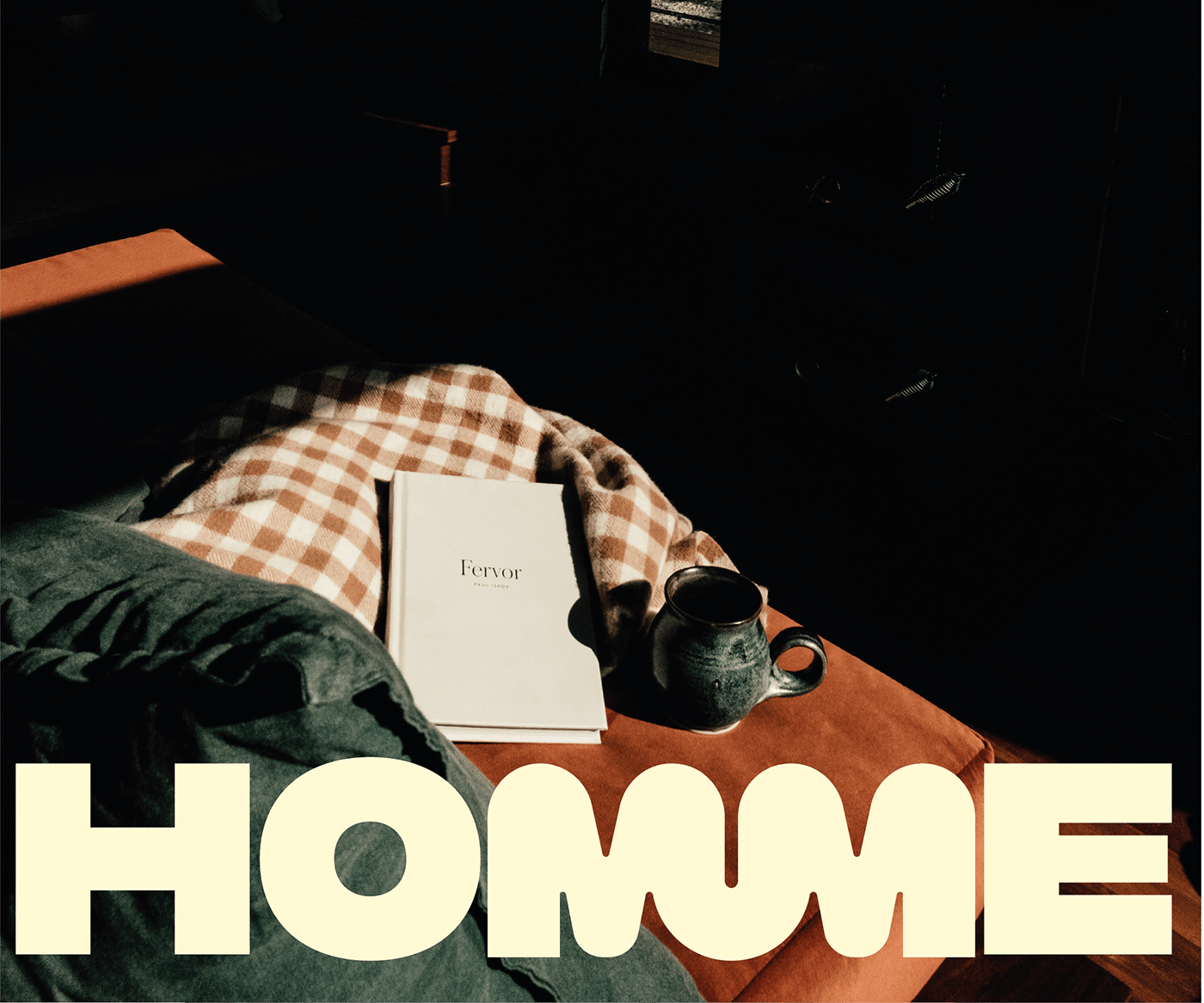
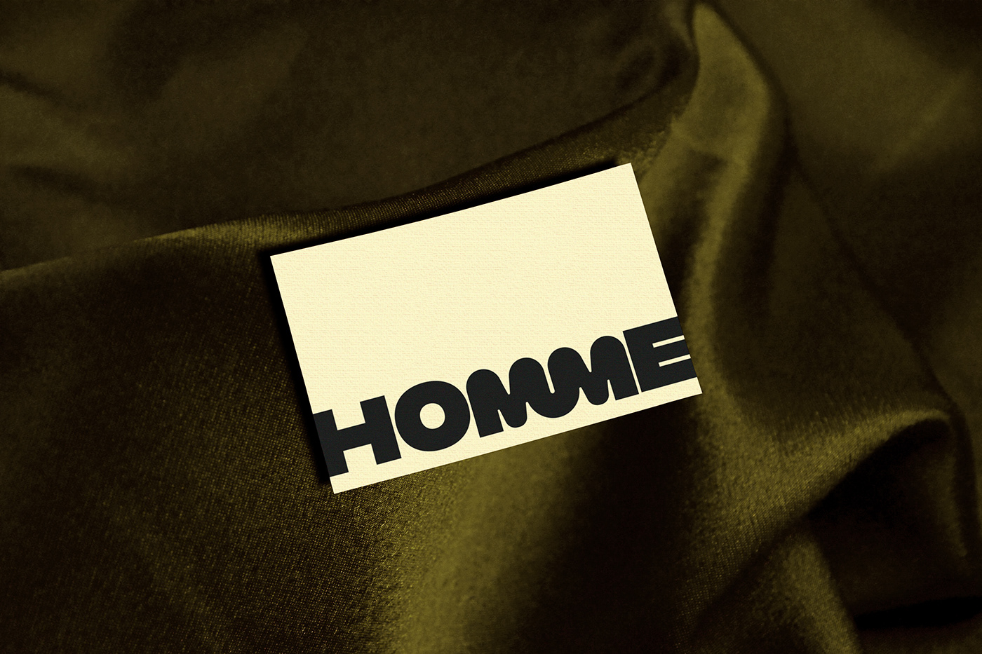
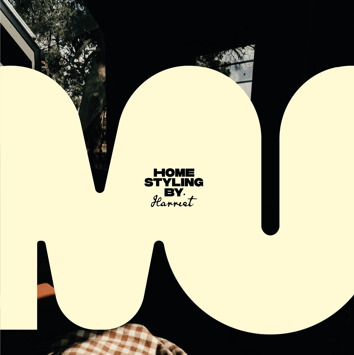
Charlotte Slegers, a notable figure in the design community, has applied her expertise to develop a visual identity that is both refreshing and impactful. The project hinges on a clever representation of the double "m" in HOMME, which adds a layer of personality and distinctiveness to the brand. This design choice is not just a visual gimmick; it's a strategic move that encapsulates the essence of the brand in a single, memorable feature.
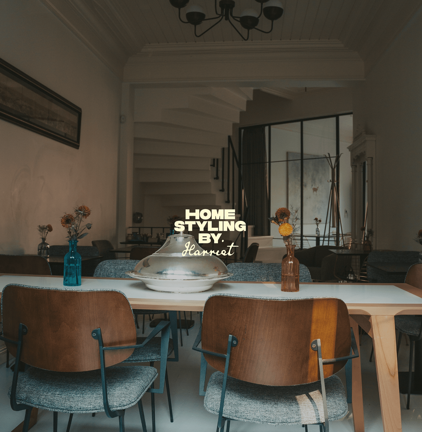
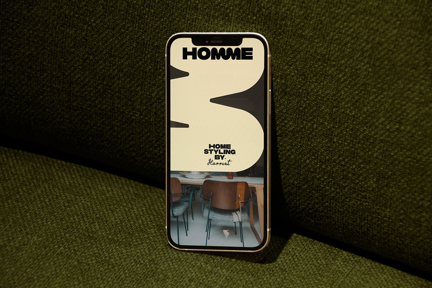
What sets this project apart is how the typography is seamlessly integrated across various mediums. From the website to print media, the consistency and fluidity of the design ensure a cohesive brand experience. This kind of integration is crucial in branding, as it reinforces brand recognition and builds a strong visual connection with the audience.
The choice of a super bold font aligns perfectly with the current trends in typography. Bold fonts are not just visually striking; they convey strength and confidence, qualities that are desirable in any brand. This approach also demonstrates a keen understanding of how typography can influence perception and evoke certain emotions in the viewer.
The visual identity of HOMME, as curated by Charlotte Slegers, is more than just a branding exercise. It's a testament to the power of typography in shaping a brand's image. The project showcases how a well-thought-out typographic strategy can elevate a brand's identity, making it stand out in a crowded marketplace.
This project is a must-see for anyone interested in the intersection of typography and branding. It serves as an inspiration and a benchmark for designers looking to create compelling and effective visual identities.
Branding and visual identity artifacts

For more information make sure to check out Charlotte Slegers website and Behance profile.