Branding and Visual Design: Studio Fabio Biesel Crafts Identity for Kriste Ceramics

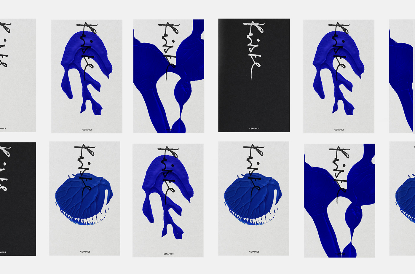
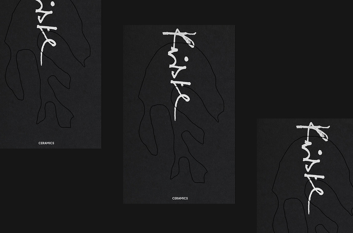
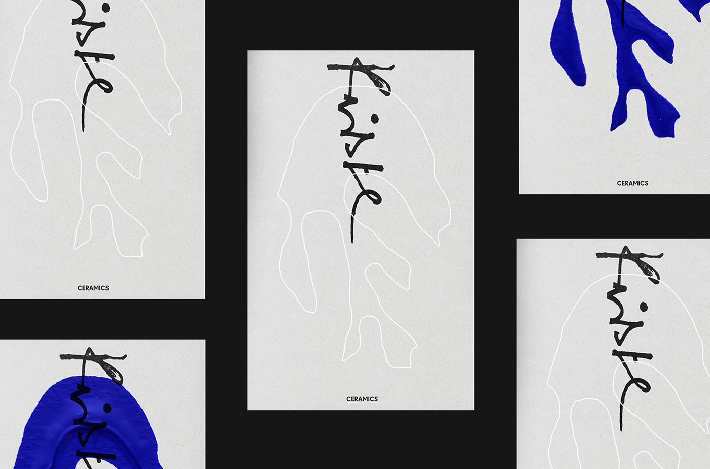
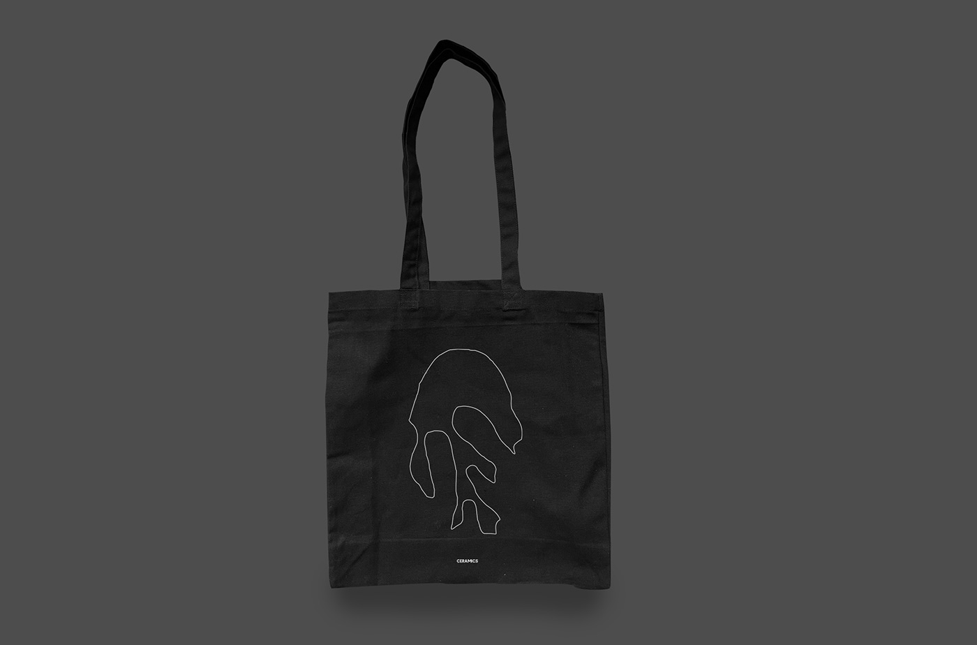
Design is a language, spoken in textures, colors, and forms. Crafting a brand identity requires the art of combining the essence of an artist's work with the visual language that speaks to its audience. Studio Fabio Biesel achieved this delicate balance in their creation for Kriste Ceramics.

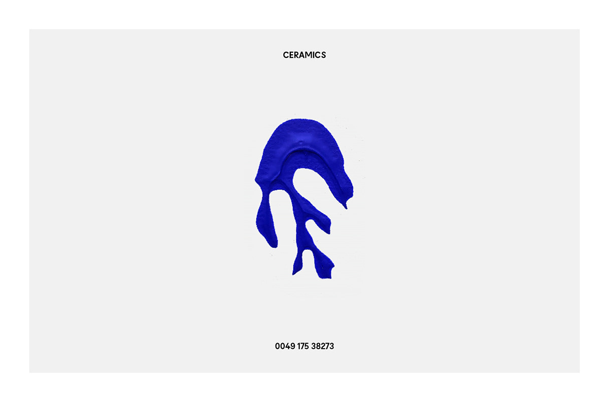
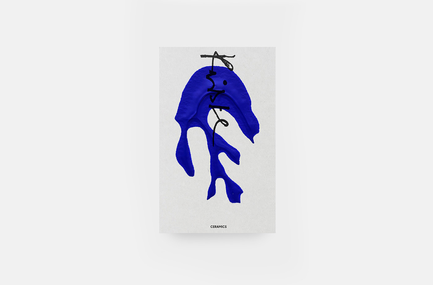
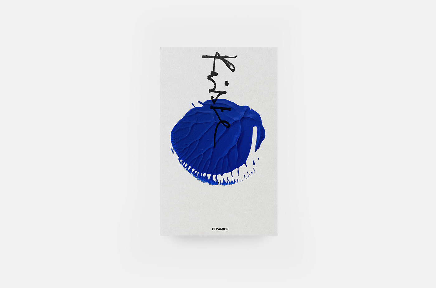
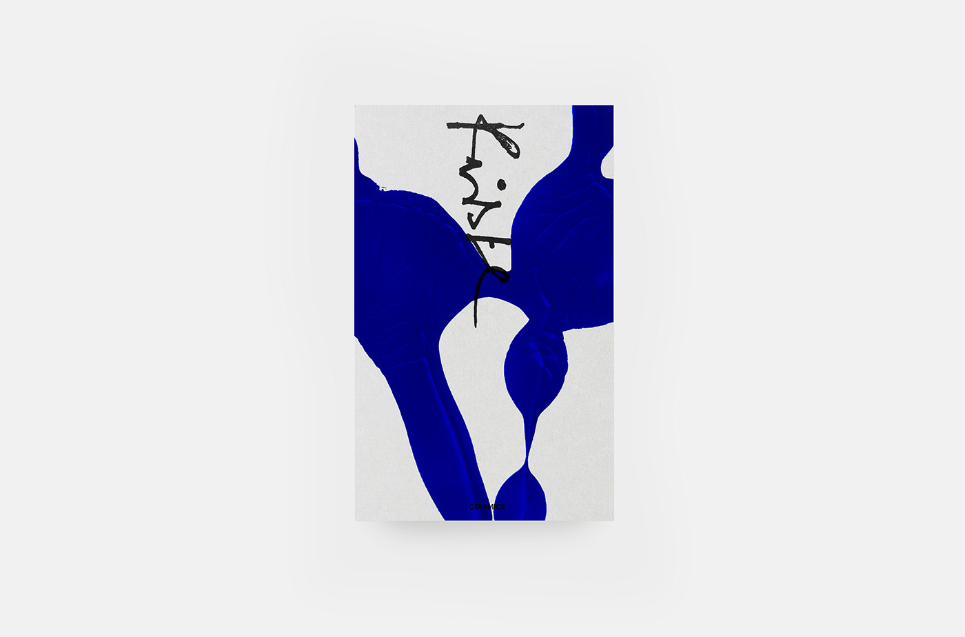
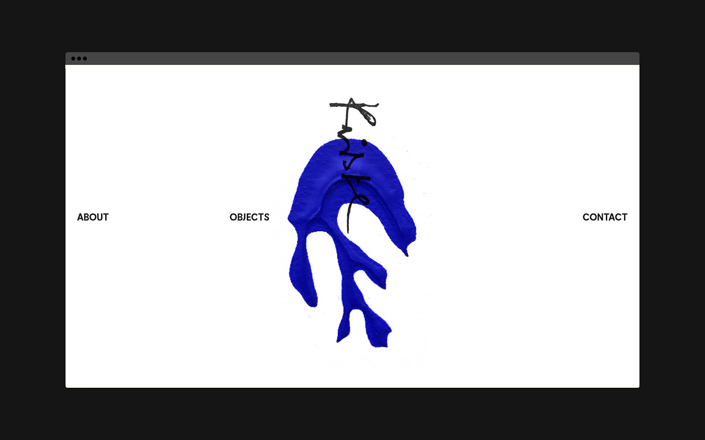
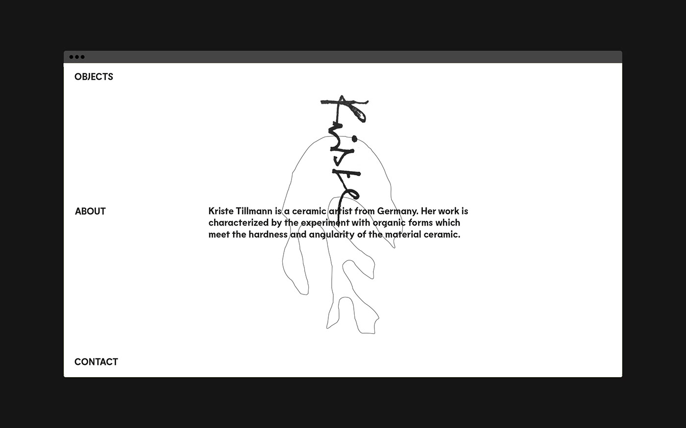
Kriste Tillmann, the person behind Kriste Ceramics, hails from Germany. She weaves the sea's tranquility into her work, merging the softness of organic forms with the ceramic material's stark angularity. This duality is the cornerstone of her creations, where nature's fluidity clashes and combines with the solidity of the craft.

Understanding this dynamic was vital for Studio Fabio Biesel. Their mission was not just to create a logo or a visual theme but to bring forth an identity that resonates with both Kriste's personal journey and the unique essence of her ceramic artistry. Their design philosophy for this project was centered around blending the elements Kriste cherishes: the memory of the sea and the unique characteristics of ceramic art.

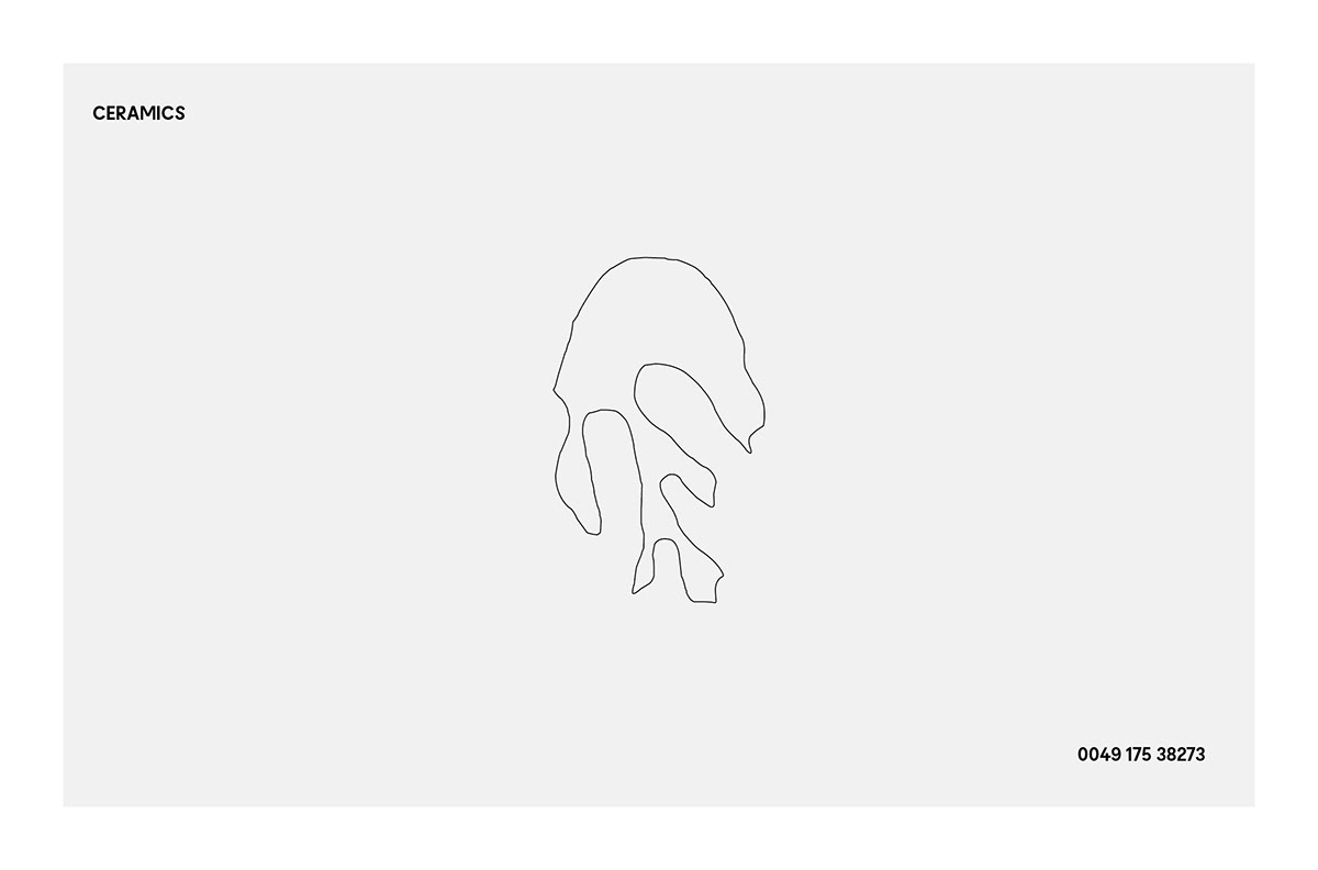
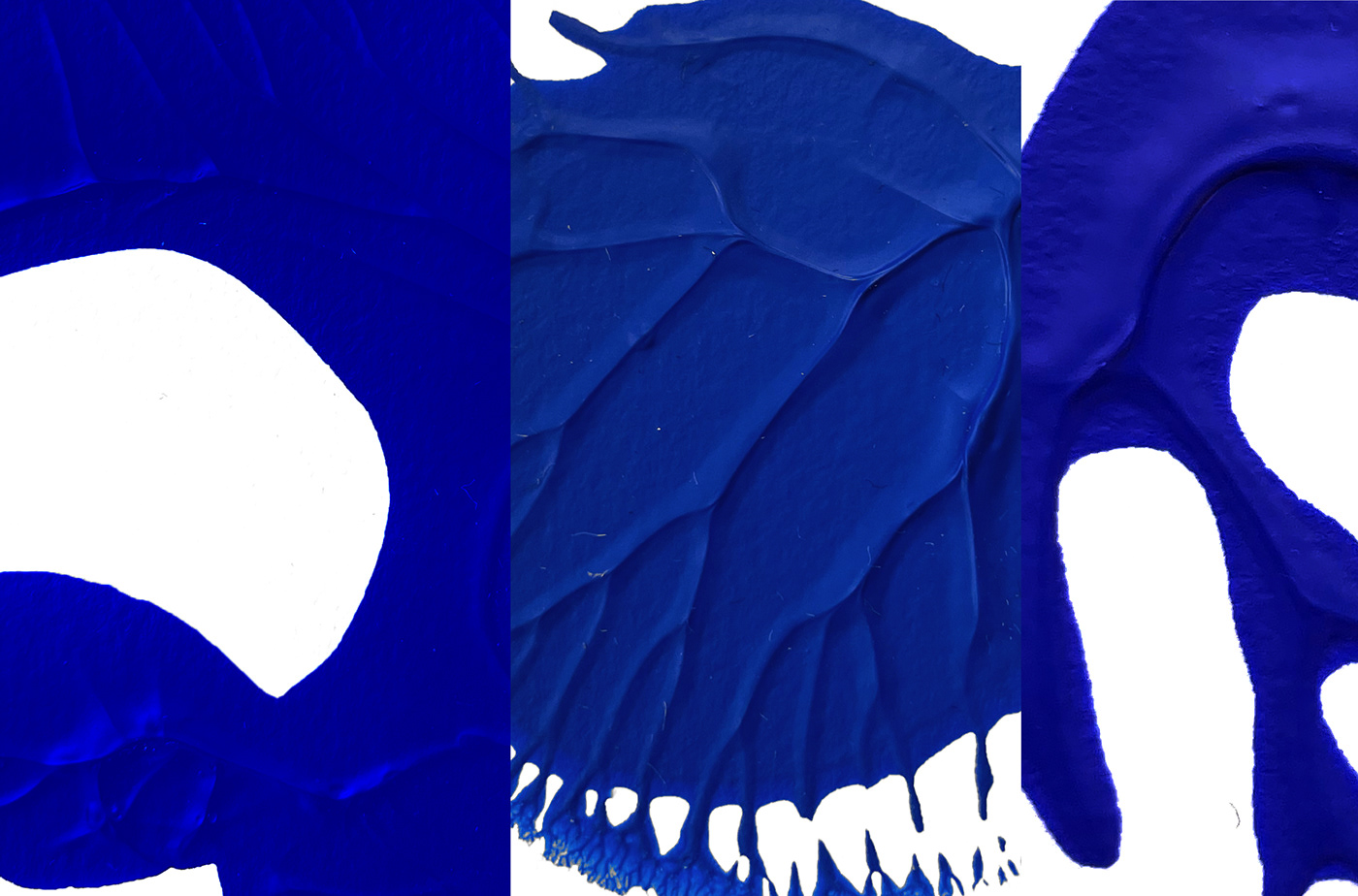
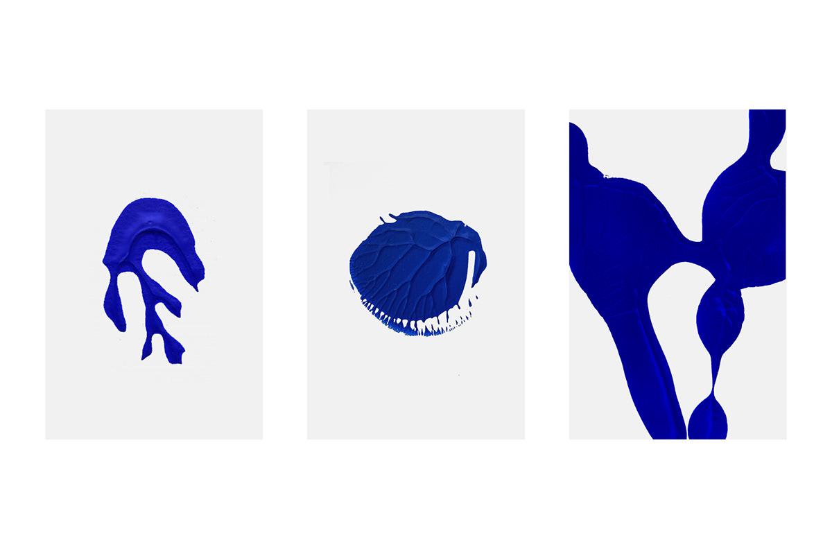
The outcome was a design echoing the sea's vastness and depth. Organic shapes and textures, reminiscent of the ocean's surface, became the primary visual elements. These textures, when looked at closely, tell tales of the waves, the ripples, and the serenity one finds by the shoreline. It's a reminder of Kriste's roots, of the seascape that

Branding and visual identity artifacts 

Corporate Identity branding  Brand Design ILLUSTRATION  organic typography   clean handmade lettering studiofabiobieselCorporate Identity branding  Brand Design ILLUSTRATION  organic typography   clean handmade lettering studiofabiobieselCorporate Identity branding  Brand Design ILLUSTRATION  organic typography   clean handmade lettering studiofabiobieselCorporate Identity branding  Brand Design ILLUSTRATION  organic typography   clean handmade lettering studiofabiobieselCorporate Identity branding  Brand Design ILLUSTRATION  organic typography   clean handmade lettering studiofabiobieselCorporate Identity branding  Brand Design ILLUSTRATION  organic typography   clean handmade lettering studiofabiobieselCorporate Identity branding  Brand Design ILLUSTRATION  organic typography   clean handmade lettering studiofabiobieselCorporate Identity branding  Brand Design ILLUSTRATION  organic typography   clean handmade lettering studiofabiobieselCorporate Identity branding  Brand Design ILLUSTRATION  organic typography   clean handmade lettering studiofabiobieselCorporate Identity branding  Brand Design ILLUSTRATION  organic typography   clean handmade lettering studiofabiobieselCorporate Identity branding  Brand Design ILLUSTRATION  organic typography   clean handmade lettering studiofabiobieselCorporate Identity branding  Brand Design ILLUSTRATION  organic typography   clean handmade lettering studiofabiobieselCorporate Identity branding  Brand Design ILLUSTRATION  organic typography   clean handmade lettering studiofabiobieselCorporate Identity branding  Brand Design ILLUSTRATION  organic typography   clean handmade lettering studiofabiobieselCorporate Identity branding  Brand Design ILLUSTRATION  organic typography   clean handmade lettering studiofabiobieselCorporate Identity branding  Brand Design ILLUSTRATION  organic typography   clean handmade lettering studiofabiobieselCorporate Identity branding  Brand Design ILLUSTRATION  organic typography   clean handmade lettering studiofabiobiesel

For more information make sure to check out STUDIOFABIOBIESEL.COM or follow them on Behance.  

Brought to you by