by abduzeedo
Explore Studio Messa's stunning website, a testament to the power of minimalist web design. Discover how they blend grid systems, balanced compositions, and captivating imagery to create a truly luxurious online experience.
In the realm of web design, where trends come and go, Studio Messa's online presence stands as a beacon of timeless elegance. Based in Sydney, Australia, this full-service creative production studio specializes in crafting digital experiences for the world's most prestigious luxury and lifestyle brands. Their own website, designed by Martin Briceno serves as a testament to their expertise, showcasing the beauty and effectiveness of minimalist web design.
Grid Systems and Balanced Compositions: The Backbone of Elegance
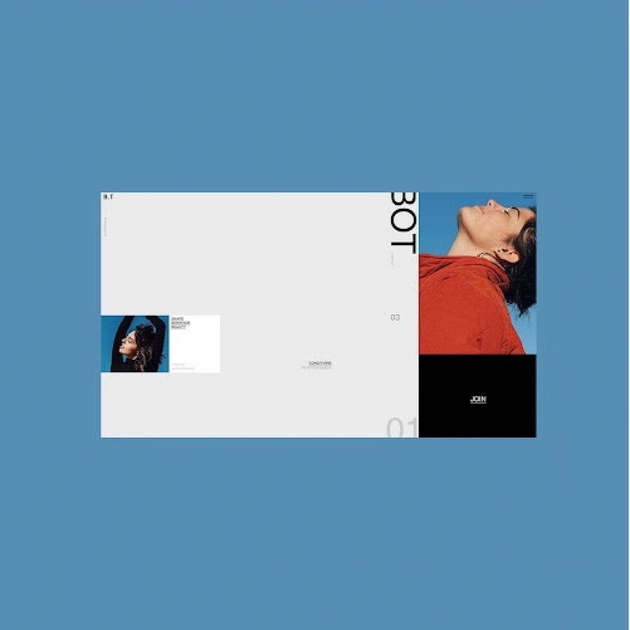
Upon landing on Studio Messa's website, one is immediately struck by its sense of order and clarity. This is achieved through a meticulous grid system that underpins the entire layout. Content is organized within clearly defined sections, creating a sense of visual hierarchy and guiding the user's eye across the page. Balanced compositions further enhance this sense of harmony, with each element thoughtfully placed to achieve a sense of equilibrium.
Studio Messa's website draws inspiration from the world of editorial design, where aesthetics and readability are paramount. Clean typography, generous white space, and subtle dividers create a sophisticated and uncluttered aesthetic. This approach ensures that the content takes center stage, allowing visitors to effortlessly engage with the studio's message.
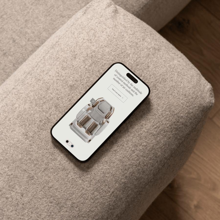
While minimalist in its approach, Studio Messa's website is far from austere. Carefully curated imagery plays a vital role in supporting the content and enriching the user experience. Each image is thoughtfully selected and artfully integrated into the design, serving both an aesthetic and informative purpose.
Dividers: Subtle Yet Impactful
One of the subtle yet effective design elements employed by Studio Messa is the use of dividers. These simple lines serve to delineate different sections of the website, creating visual breaks that enhance readability and guide the user's journey.
Studio Messa's website is a masterclass in minimalist web design. By combining a clean grid system, balanced compositions, and thoughtfully curated imagery, they have created a digital experience that is both beautiful and functional. This approach not only reflects their expertise but also serves as an inspiration for designers seeking to create elegant and impactful websites.
For more information check out Martin Briceno Behance profile and check out the website at studio-messa.com

