by abduzeedo
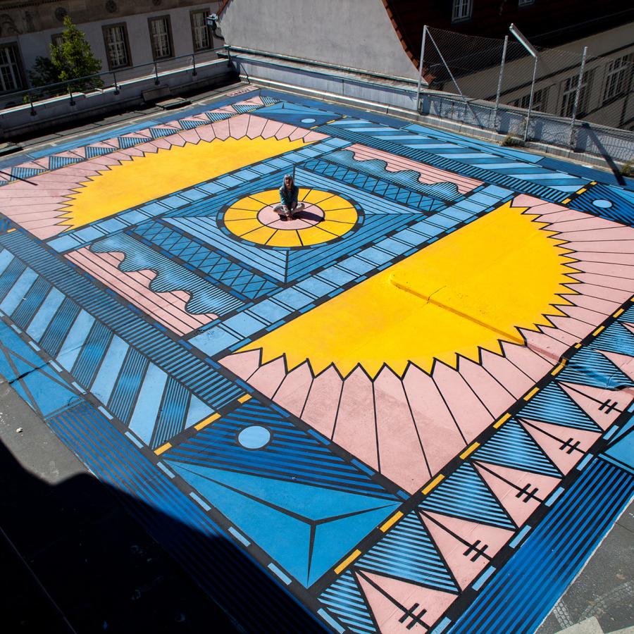
Anil Rinat shared an awesome illustration project for a newspaper cover. The work was commissioned for an exhibition curated by @zoharariso, Jerusalem design week. I personally love the geometric aspect of the illustration in a clean vector style. I always find it hard to nail this type of vector work because most of the time it looks not polished or professional. That’s totally the opposite of Anil accomplished, the outcome is stylish and full of personality.
For more information make sure to check out:


