by abduzeedo
Discover how minimalist web design concept enhances Fujifilm’s e-commerce, focusing on user convenience and brand individuality.
In the competitive realm of e-commerce, standing out is crucial. Nikita Minkin’s redesign concept for Fujifilm’s e-commerce platform offers a compelling case study in effective web design. Renowned for its innovative products, Fujifilm needed an online presence that matched its market reputation. The original site was cluttered, poorly structured, and indistinguishable from competitors. Minkin’s minimalist approach transforms the user experience by emphasizing convenience and brand uniqueness.
Addressing Key Issues
The original Fujifilm site struggled with excessive information and a lack of clear structure. These issues not only confused users but also diluted the brand’s strong positioning. Minkin’s redesign tackles these problems head-on. By stripping away unnecessary elements, the new design presents a clean, focused interface. This minimalist style isn’t just about aesthetics—it’s grounded in user psychology, ensuring that visitors can navigate effortlessly and find what they need without distraction.
Emphasizing Brand Identity
A significant aspect of the redesign is its focus on Fujifilm’s brand identity. The previous design failed to distinguish Fujifilm from its competitors. Minkin’s approach rectifies this by creating a visual language that reflects Fujifilm’s heritage and innovative spirit. The design elements evoke positive emotions, aligning with the brand’s strengths and encouraging users to engage and purchase.
User-Centric Design
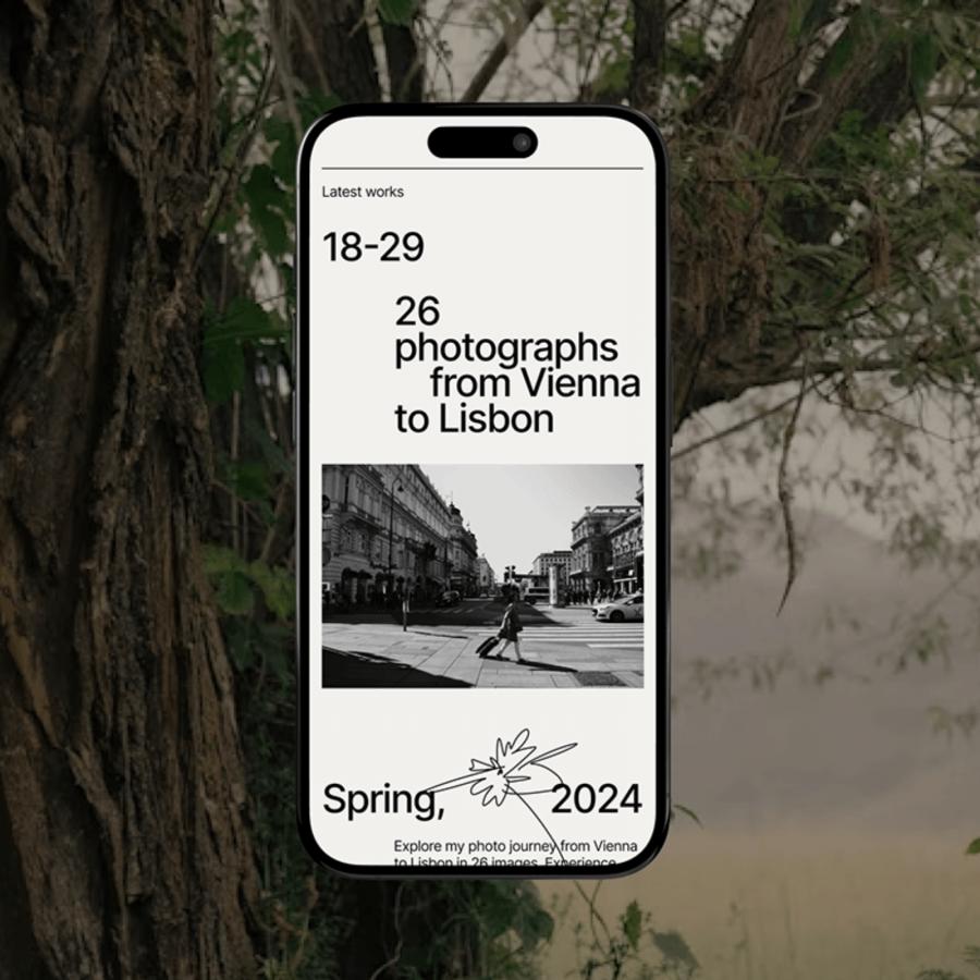
Minkin’s redesign features a streamlined navigation structure: Main, About, Photographers, Catalog, Cart, Checkout, and Contacts. Each section is crafted to provide a seamless user journey. For instance, the “Photographers” section highlights user-generated content, fostering a sense of community and trust. The “Catalog” and “Cart” sections are optimized for quick access to product information and smooth transactions, enhancing overall user satisfaction.
Visual and Functional Harmony
The minimalist and brutaist design not only looks appealing but also functions efficiently. White space, clear typography, and intuitive icons guide users naturally through the site. This approach reduces cognitive load, making the browsing experience more enjoyable and effective. The emphasis on simplicity aligns with current web design trends, ensuring that Fujifilm’s site remains modern and user-friendly.
Nikita Minkin’s redesign of Fujifilm’s e-commerce platform showcases the power of minimalist web design. By addressing structural issues and highlighting the brand’s uniqueness, the new design offers a superior user experience. This project underscores the importance of thoughtful design in enhancing brand identity and user engagement in the digital age.
Web design artifacts
For more information check out Nikita Minkin’ Behance profile.
