New Visual Identity for Brazilian Amazon Tourism
FutureBrand São Paulo designs a living brand for the Brazilian Amazon using river geography to boost sustainable tourism and local business development.
The Brazilian Amazon is a territory of immense scale. It covers 60% of Brazil and is home to 28 million people. Until now, its visual representation was fragmented. Different states used different styles. This lack of unity made it difficult to market the region as a single, powerful destination. FutureBrand São Paulo has solved this by creating a "living brand" that unifies nine states under one cohesive design system.
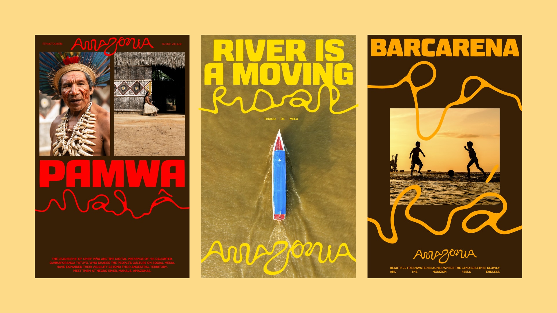
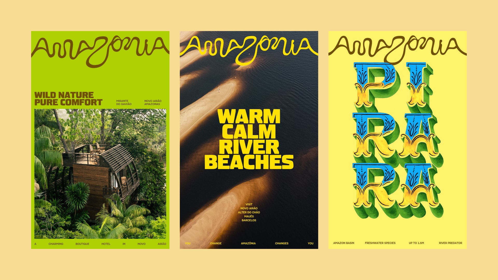
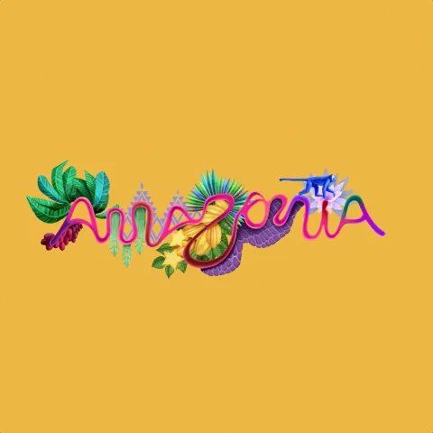
The core of the project is found in the geography itself. Designers used satellite imagery and real coordinates of the Amazon River. By tracing the curves of 25,000 kilometers of waterways, they discovered an entire alphabet hidden in the landscape. The logo is literally formed by the earth. This choice removes the ego of the designer. It allows the forest to speak for itself. It is a brilliant example of data-driven organic design.
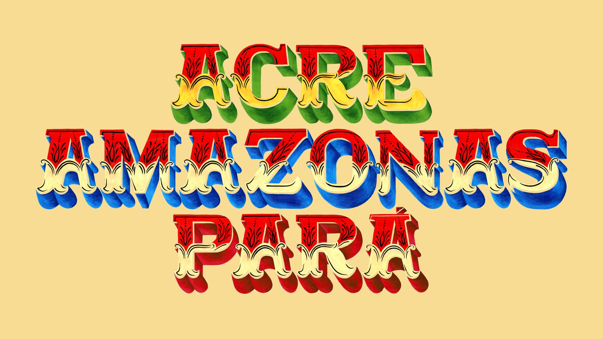
This is not a static logo. It is a flexible system. The project includes a wide range of colors and elements that reflect local fauna and flora. This allows the brand to change based on the specific state or occasion. Whether it is Acre or Pará, the identity remains recognizable but adapts to the local culture. This flexibility is essential for a region that is as diverse as the Amazon.
A key part of this launch is the "Made of Amazon" seal and visiteamazonia.com.br. This seal is for local producers and artisans. It helps small businesses certify the origin of their goods. By doing this, the design becomes a tool for economic growth. It moves beyond aesthetics and enters the world of social impact. It gives local people a sense of pride and a way to compete in global markets.
The project succeeded because it was a collaboration. FutureBrand worked with local illustrators like Winy Tapajós and Beatriz Belo. They also partnered with photographers and letterers from the region. This ensured the "soul" of the Amazon was present in every pixel. It is not an outside perspective forced upon the region. It is a reflection of the people who live there.
The result is a brand that feels ancient and modern at the same time. It captures the rhythm of the river and the pulse of the forest. It positions the Amazon not just as a place to visit, but as a transformative experience. For the design community, it serves as a reminder that the best solutions are often already written in the landscape. We just need to know how to read them.
Credits: FutureBrand São Paulo