by AoiroStudio
Benedikt Lehnert who work as 'Director of Product Design for Fluent, Mobile and Office Experiences' at Microsoft shared about their freshest update on Fluent UI. What's Fluent UI? It's a collection of UX frameworks that will be used and shared across platforms to help them produce the next generation of Microsoft 365 experiences. Personally, I am not a huge fan of Microsoft in terms of hardware but I do love their leadership to push through innovative solutions to help them design and build more collaboratively, and pushing an immersive experience across all products. Alike a few other companies who rather keep these things under a locked door. I took the opportunity to share a few key lines from Benedikt's article but I do suggest giving it a full read and make your own mindset. Check it out and props to everyone who worked effortlessly on this endeavor.
the beauty in our open-source approach is that the people who eat, live, and breathe our products contribute to and improve the Fluent Design System for everyone.
In his words
New cross-platform library
Fluent UI is more than a collection of UX frameworks for creating web and mobile apps that share code, design, and interaction behavior. It’s a new approach to how we work across disciplines and product teams to deliver more seamless experiences that feel natural on the devices our customers use throughout their day. We’re simplifying our developer ecosystem, so that all sorts of partners can leverage and contribute to these frameworks to build their own experiences.
Native to each device, still uniquely Fluent
Like in car design, we think it takes only a few signature design elements for each product to shape the impression of a branded experience in people’s minds. These “essential” elements create clarity and structure, so people understand how to use a product no matter which device they’re on. Our Microsoft logo, familiar app icons, recognizable app names, and distinctive app brand colors shape people’s impressions of our branded experiences. But there are also more specific UI components that make our apps feel uniquely Fluent. For example, our custom navigation bar gives our mobile apps a familiar, familial touch.
Delivering a more coherent, productive experience
It can be frustrating when things work differently for no (or some unexplained) reason. It frustrates our customers, frustrates us, and motivates us to make it better. Rallying around the Fluent Design System helps us simplify and become more efficient as a company, which is great. But it also allows us to deliver more coherent and connected experiences for our customers. Win, win. Simply put, Fluent is about designers and developers working better together to create best-in-class experiences that empower our customers.
Modernizing our theming architecture
We’re looking to modernize our theming architecture to create a scalable, future-proof design system. Future themes will make it easier and faster to update design values across all platforms using a common theming infrastructure, taxonomy, and centralized set of cross-platform style libraries across Microsoft frameworks.
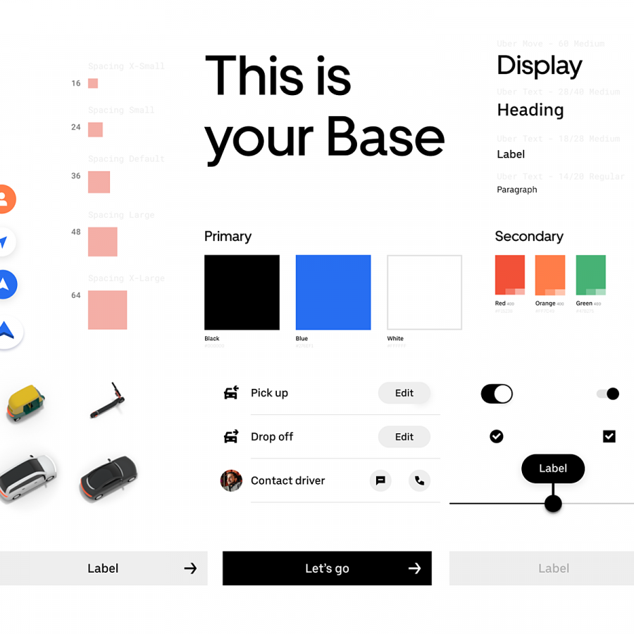
To do this, we’re moving away from fixed values and toward more agnostic variables, or design tokens. Design tokens define the visual attributes of a UI surface and link design to code using a common syntax. Centralized style libraries, accessible by both design and development tools, will serve as the place to make updates without having to revise coded components.
the beauty in our open-source approach is that the people who eat, live, and breathe our products contribute to and improve the Fluent Design System for everyone.
