by abduzeedo
Explore Jabuti’s simple and charismatic branding and visual identity in architecture, crafting cozy and inviting environments.
In the world of architecture and interior design, branding plays a pivotal role in conveying a firm’s ethos, values, and the unique experience they offer. Jabuti, a firm based in Natal, Rio Grande do Norte, exemplifies this with a carefully crafted visual identity that mirrors its dedication to creating welcoming and warm residential spaces.
Founded by Gaby and Vini, Jabuti specializes in transforming houses into homes, making their branding a crucial element of their identity. The firm’s visual identity is centered around the image of the jabuti, a tortoise that in Brazilian culture symbolizes resilience, wisdom, and longevity. This choice reflects the firm’s commitment to creating spaces that are not just aesthetically pleasing, but also enduring and full of character.
The jabuti, with its slow and deliberate movements, embodies the careful attention to detail that Jabuti Architecture & Design brings to each project. The upward gaze of the tortoise in the logo symbolizes curiosity and openness—qualities that are evident in the firm’s approach to design. Each project is seen as an opportunity to explore new ideas while staying grounded in the principles of comfort and warmth.
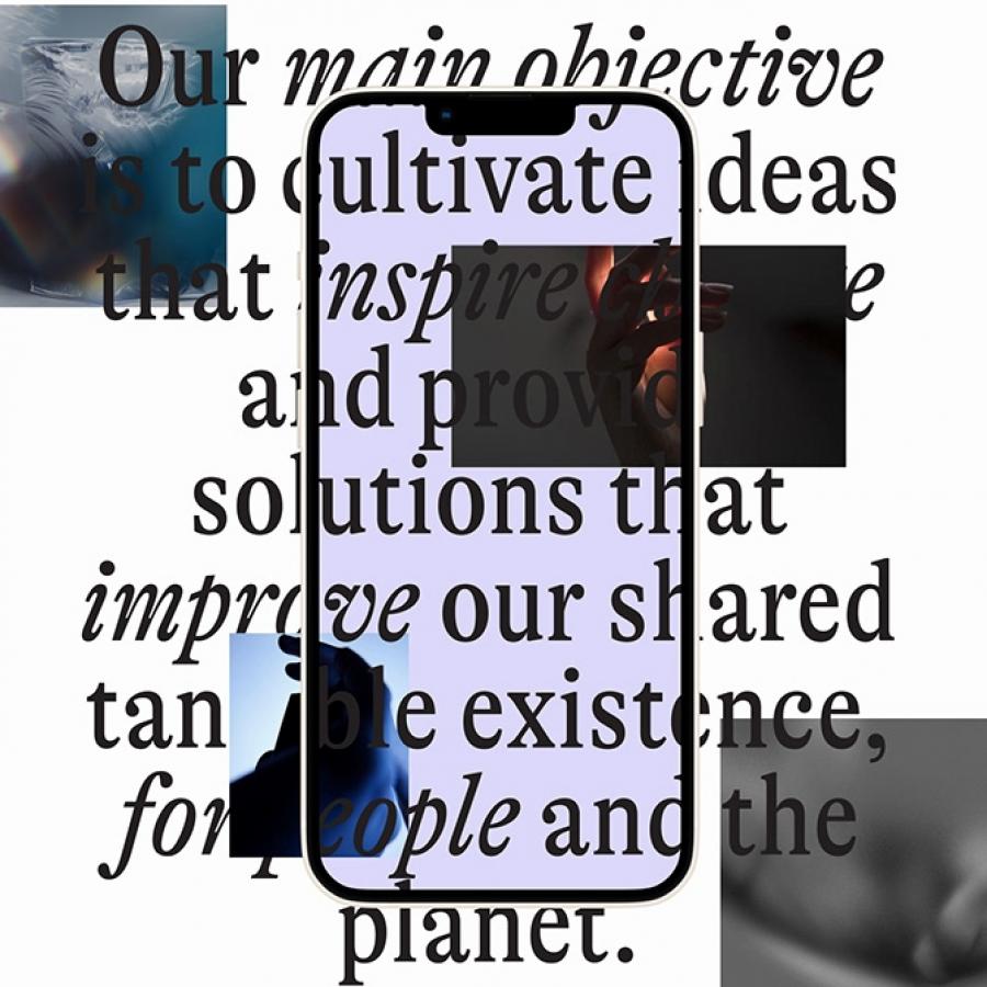
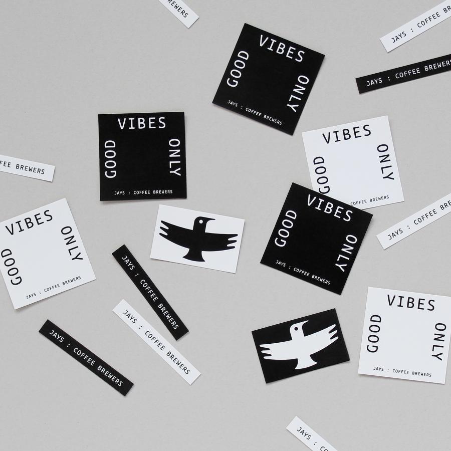
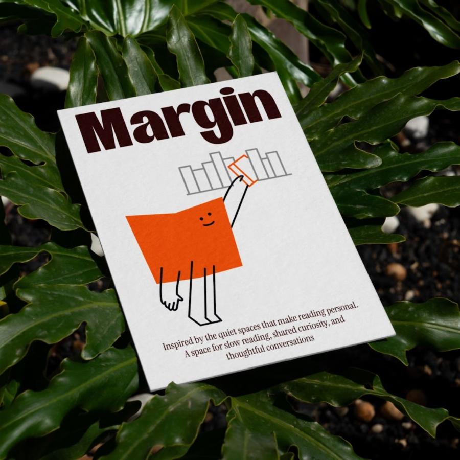
One of the most striking aspects of Jabuti’s branding is its ability to communicate professionalism alongside a sense of warmth. This balance is crucial in the residential market, where clients seek both trustworthiness and a personal connection with their designers. The firm’s branding successfully conveys this through its choice of colors, fonts, and imagery, all of which work together to create a cohesive and inviting visual identity.
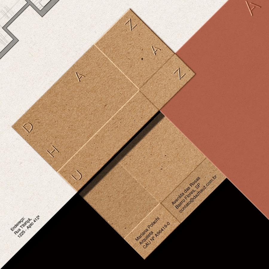
The color palette used by Jabuti is subdued and earthy, reflecting the natural materials and warm tones that are often found in their designs. This choice not only aligns with their architectural style but also reinforces the connection between their visual identity and the environments they create. The fonts are modern yet approachable, balancing formality with friendliness—another reflection of the firm’s dual focus on professionalism and warmth.
Jabuti’s branding extends beyond just visuals; it’s an integral part of their business strategy. By establishing a strong, recognizable brand, they build trust with clients even before a project begins. This branding approach ensures that every interaction, from the first consultation to the final reveal, reinforces the firm’s commitment to crafting spaces that feel like home.
In conclusion, Jabuti’s branding and visual identity serve as a masterclass in how architecture and design firms can effectively communicate their values and approach. By carefully crafting an identity that is both professional and welcoming, Jabuti not only stands out in the competitive residential market but also creates a lasting connection with their clients.
For more information make sure to check out Will Gomes on Behance.

