by abduzeedo
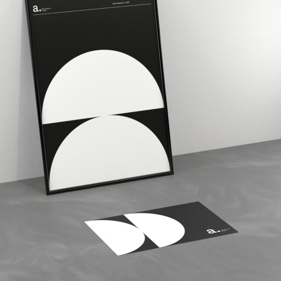
Since Tiago Souza Oliveira aka. Ted Oliver a was a child he has always been in constant contact with art, mainly due to the experience of nuclei, curves and forms of architecture/culture in Pirenópolis, the city where he was born and grew up. After positioning himself professionally as an art director, he had the need to create an identity for his personal brand and improve my online presence. A logo, brand guidelines, animated identity, business cards, institutional materials and a portfolio website were developed, thus becoming a complete visual identity with easy identification and memorization.
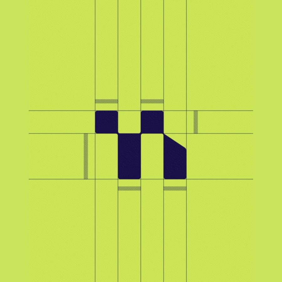
The initial letters of Ted Oliver, "T" and "O", were used in the logo monogram with disruptive geometric shapes, giving the slight sensation of dynamism and movement - with a strong influence on Hans Richter's aesthetics.
Branding and Visual Identity
Logo
The initial letters of Ted Oliver, "T" and "O", were used in the logo monogram with disruptive geometric shapes, giving the slight sensation of dynamism and movement - with a strong influence on Hans Richter's aesthetics.
Hierarchy
Considering the importance of brand consistency, the use of a disruptive hierarchy for main titles and texts was considered. - always keeping the title on the upper left side and the supporting text in the lower right corner, giving the idea of "zoom in" or modifying tool of the scale shape in manipulation / editing softwares.
Colors
The holographic Hot Stamping was chosen to convey the feeling of "movement" / infinite colors and possibilities that design can provide.
Credits
- Creation Director: Ted Oliver
- Photography: Pedro Morais
- Video/Motion: Ted Oliver
- Translation: Clarice Carvalho
- Original link: https://www.behance.net/gallery/79719917/Ted-Oliver-Personal-Brand-Identity
