by alex
Clay shaped Eden branding for an AI home design app — Martina Plantijn serif headlines, ABC Diatype body, terracotta palette, botanical photography.
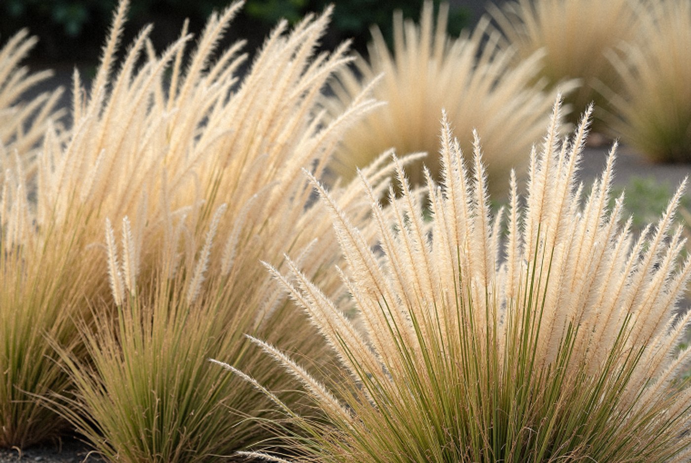
The challenge behind the Eden branding was simple: a real estate client needed a digital identity that felt as warm as the spaces it helped people find. Clay responded with a system built on type pairings rather than decoration. Headlines carried Martina Plantijn, a serif typeface in both regular and italic variants, while body text sat in ABC Diatype — a clean sans serif chosen specifically for screen readability at small sizes. The terracotta and cream color palette followed naturally from the Garden of Eden concept, with botanical photography anchoring the visual direction across every touchpoint.
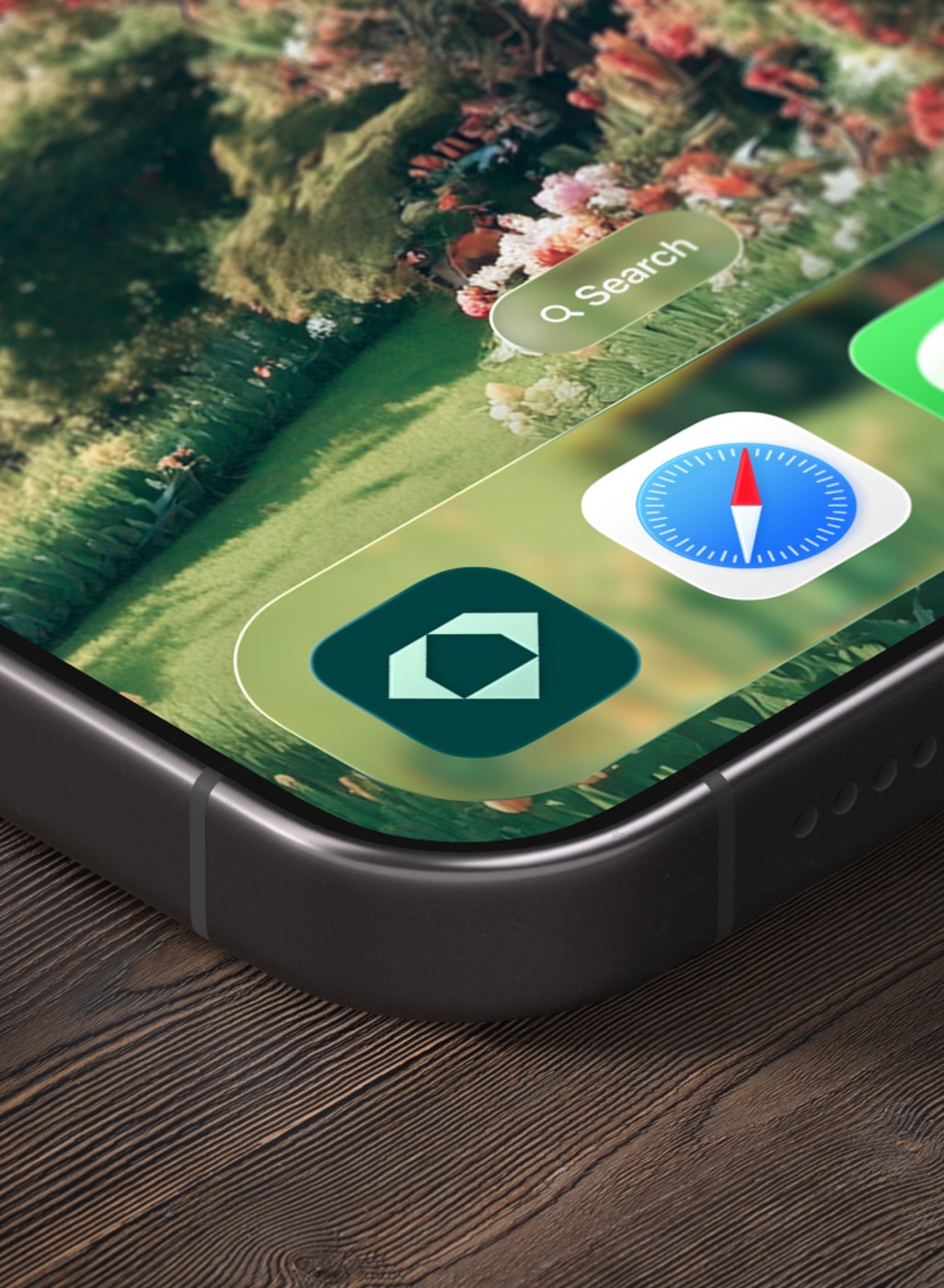
How the Eden branding holds together across screens
What keeps the system coherent is restraint. The serif carries weight and elegance through the app interface without competing with the home imagery users browse daily. Portrait photography of people and botanical shots provide the human and natural elements the brand needed. Clay extended the typography into the AI-powered home-finding tools, where the type pairings guide users through visual exploration without adding visual noise. The result is a design system where the work speaks through its own clarity rather than embellishment, and every screen respects the boundaries the system established. This discipline makes the Eden branding feel confident without demanding attention.
The branding extends from a food and beverage parent company into a distinctly digital space. That tension between heritage and innovation defines what the Eden branding achieves — a real estate identity that feels rooted while operating entirely through screens. Clay's approach shows that a limited palette and clear typographic hierarchy can carry a full product experience without requiring additional visual systems. The botanical photography choice proves that even in an AI-driven interface, organic subject matter anchors user trust.


Via: Clay