WB Sans: A typeface that tells the story of Warner Bros
In 2019, Pentagram, the world-renowned design firm, collaborated with MCKL, a typeface design studio, to create a new custom typeface for Warner Bros. as part of its brand identity redesign. The result of this collaboration is the WB Sans, a family of fonts that reflects the new brand positioning of the company, "We believe in the power of story."
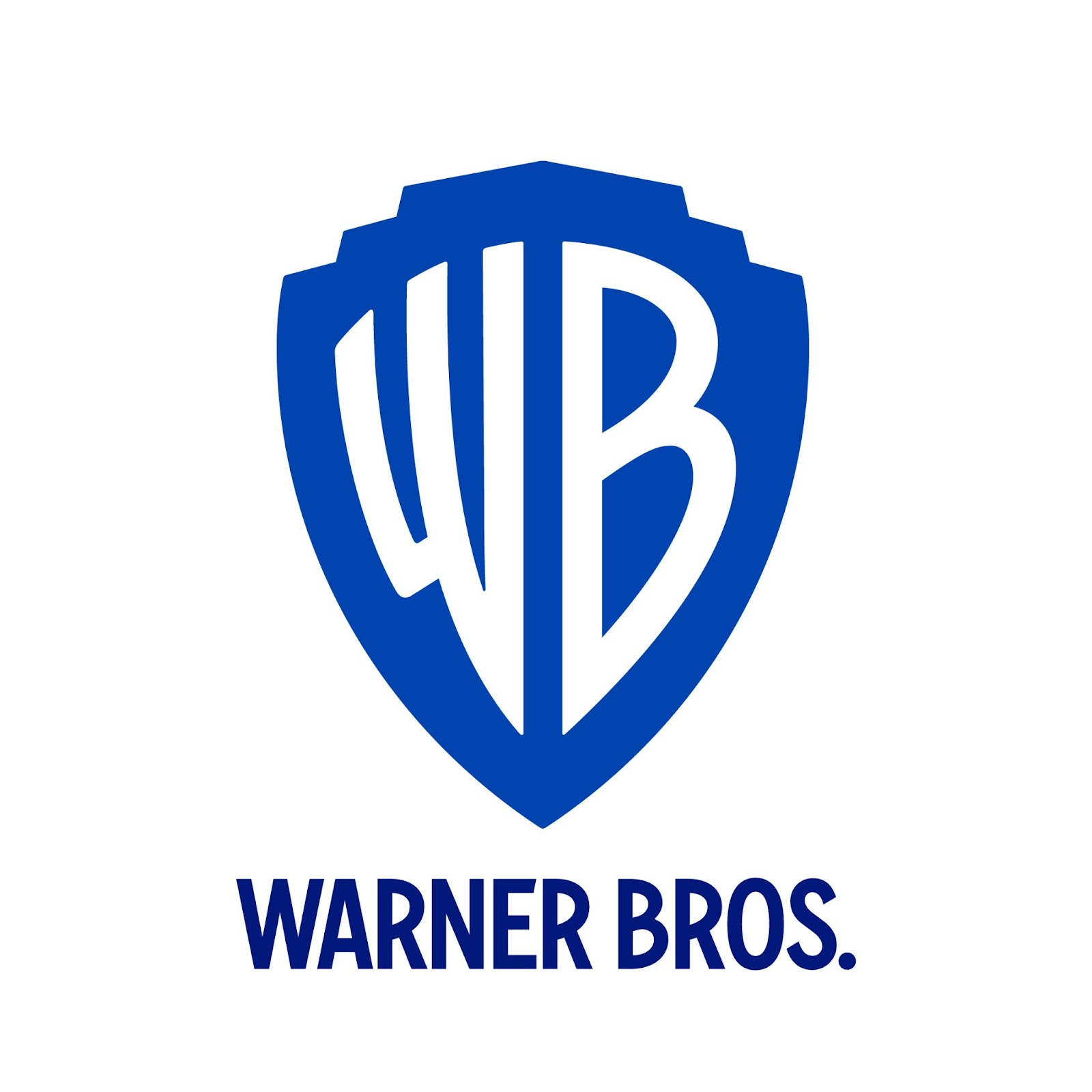
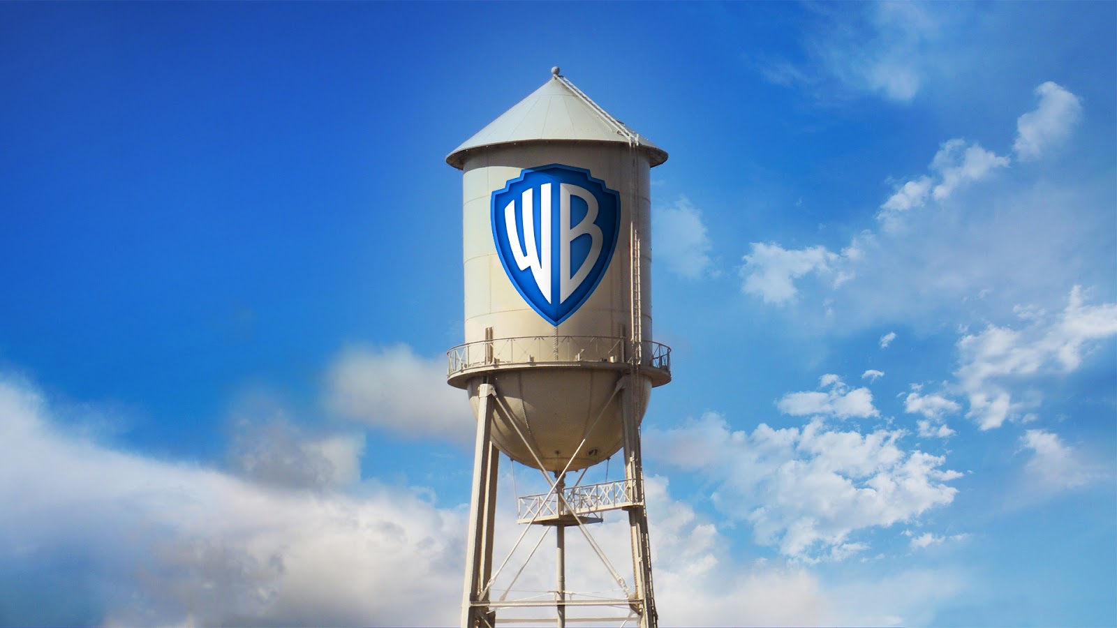
To create the WB Sans, the design team drew inspiration from the lettering in the WB shield and the animated quality of signmaking. The typeface features condensed letterforms that relate to the elongated "WB" in the shield, which has been an iconic symbol of Warner Bros. since its creation in 1970.
The typeface was designed to be clean, modern, and timeless, while still carrying a sense of the company's history. The curvature of the "R" in the WB Sans references the redrawn "B" in the logo, tying the typeface to the company's visual identity.
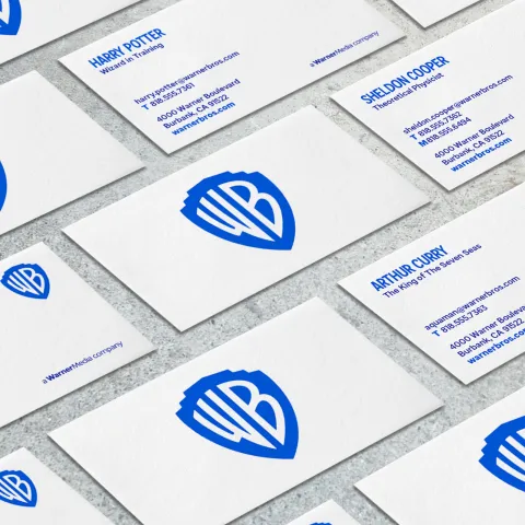
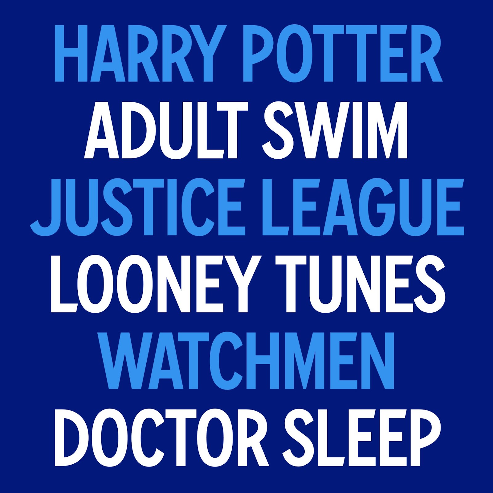
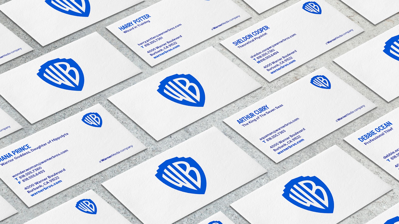
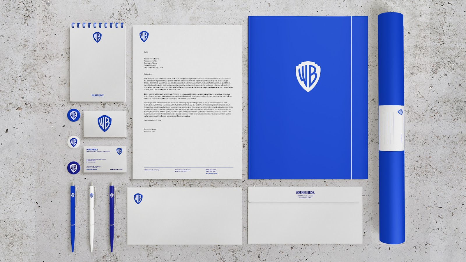
The WB Sans family of fonts includes Warner Bros. Condensed Bold, a custom typeface inspired by the WB monogram. This typeface is used for the wordmarks of the various divisions and other display typography. The typeface has a look and feel that is uniquely Warner Bros., making it an integral part of the company's visual identity.
The Pentagram and MCKL team visited the company's headquarters in Burbank to learn more about its heritage, including its famous studio lot and on-site restaurant Commissary. This helped the design team gain a deeper understanding of the company's values and history, which they incorporated into the WB Sans.
The new typography is highly versatile and works well across a range of mediums, including print, digital, and motion. The WB Sans reflects the company's commitment to storytelling and creativity, and is a testament to the power of effective design in communicating a brand's message.
In conclusion, the WB Sans is a custom font that tells the story of Warner Bros. and its commitment to storytelling. The work reflects the company's heritage and values, while still being modern and timeless. As part of the company's identity redesign, the WB Sans has become an integral part of the company's visual identity and is highly versatile across a range of mediums.
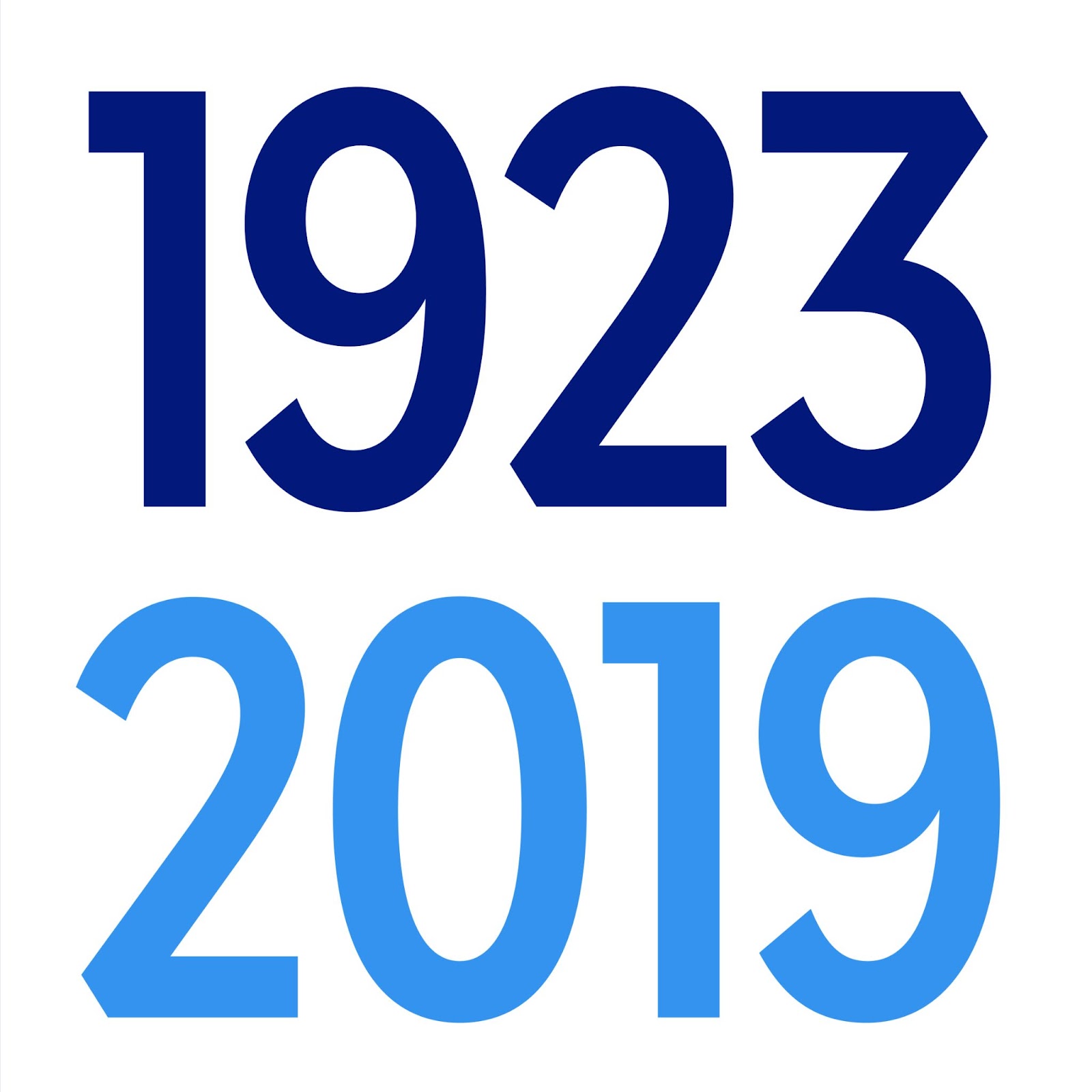
Typeface applications
Credits
- Design direction by Pentagram: Emily Oberman, Tim Cohan, and Tom Grunwald
- Typeface & logo: Jeremy Mickel at MCKL.
For more information make sure to check out MCKL website at mckltype.com