ANA Red Wine — Branding and Packaging Design

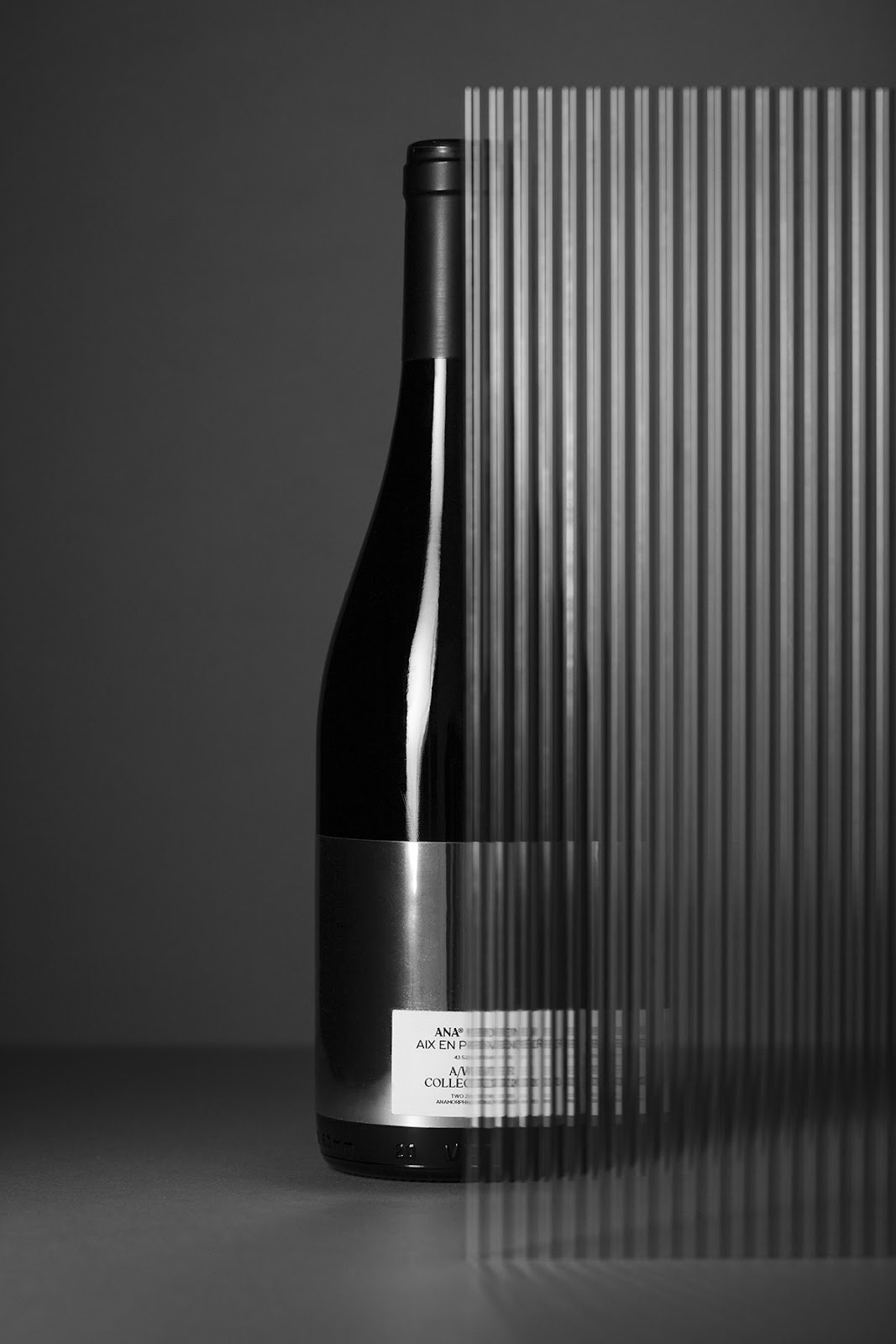
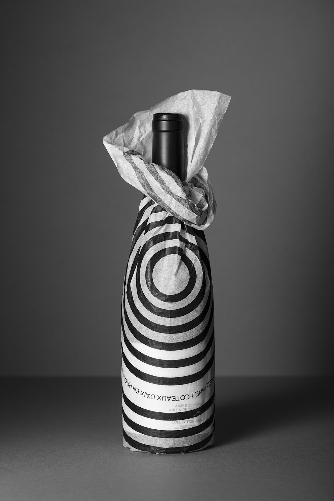
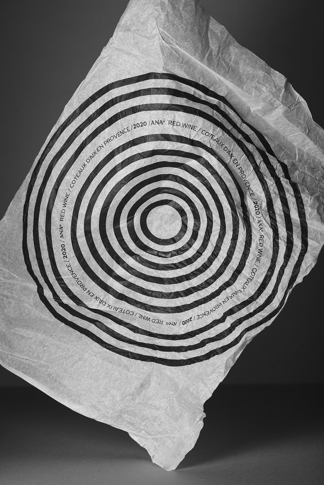
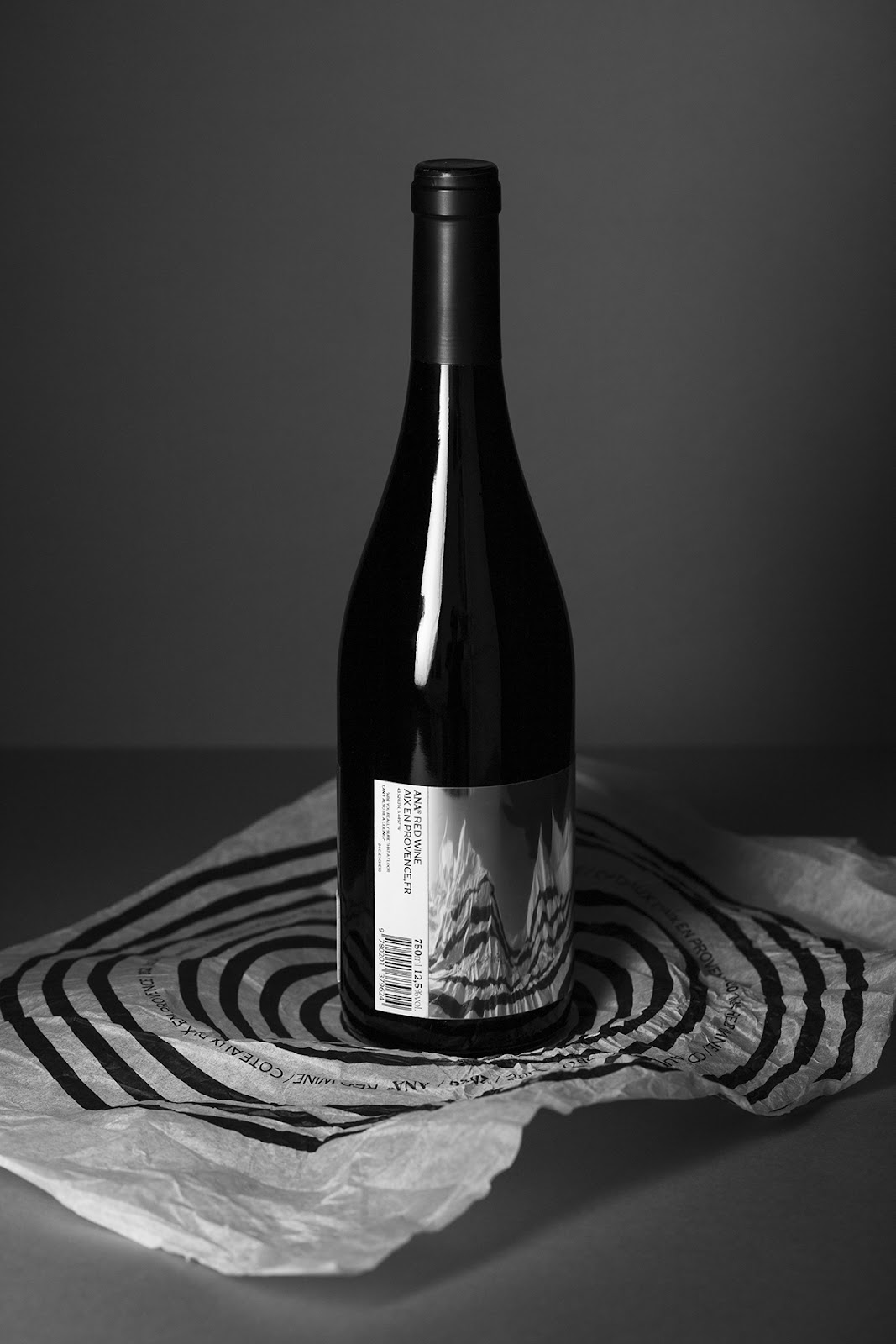
Studio format shared a super elegant branding and packaging design for ANA Red Wine. A mirror can twist or distort our perception. It can cheat the eye, enhancing or fading some traits. More often than not, a mirror raises interest in the eyes of the viewer. Therefore, Studio format has chosen this perspective to design the ANA project: a new red wine brand.

The idea developed here is to create an experience based on the fine line between perception and reality, a visual parallelism with alcohol. This experience will disrupt our senses by creating an anamorphosis using the packaging’s volume, shape and print against the mirror of the tag.

anamorphosis concept glass bottle graphic system mirror Packaging pattern Red wine Silk Paper typography  anamorphosis concept glass bottle graphic system mirror Packaging pattern Red wine Silk Paper typography  anamorphosis concept glass bottle graphic system mirror Packaging pattern Red wine Silk Paper typography  anamorphosis concept glass bottle graphic system mirror Packaging pattern Red wine Silk Paper typography  anamorphosis concept glass bottle graphic system mirror Packaging pattern Red wine Silk Paper typography  anamorphosis concept glass bottle graphic system mirror Packaging pattern Red wine Silk Paper typography  anamorphosis concept glass bottle graphic system mirror Packaging pattern Red wine Silk Paper typography  anamorphosis concept glass bottle graphic system mirror Packaging pattern Red wine Silk Paper typography

For more information make sure to check out Studio format on

Brought to you by