wecircle Visual Identity by +Stüdyo
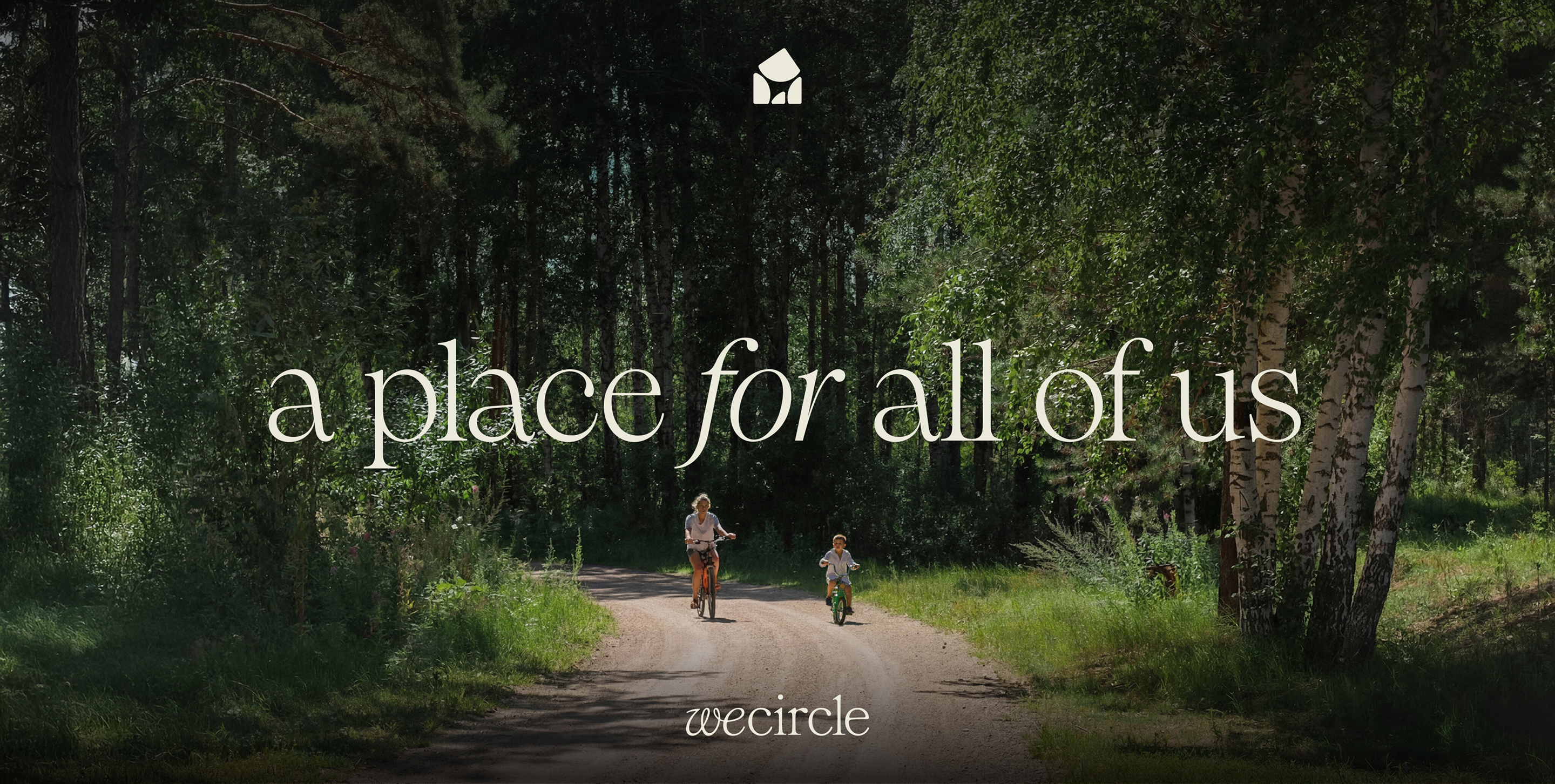
+Stüdyo crafts a visual identity for wecircle, a 600,000m² private community in Turkey, where four geometric forms unite and close into a circle of home.
Fourteen years in the making, wecircle is not a typical residential development. Set on 600,000 square meters of private land in Muğla, Türkiye, it was conceived as a living experiment: a place for 1,000 people to share, produce, and belong. The soil carries centuries of memory. The scale demands a brand that holds that weight without collapsing under it.
Istanbul-based studio +Stüdyo took on the full scope — visual identity, illustration, editorial design, copywriting, naming, and motion graphics. The result is a cohesive system built around a single geometric idea that earns its meaning.
A Visual Identity Built on Four Pillars
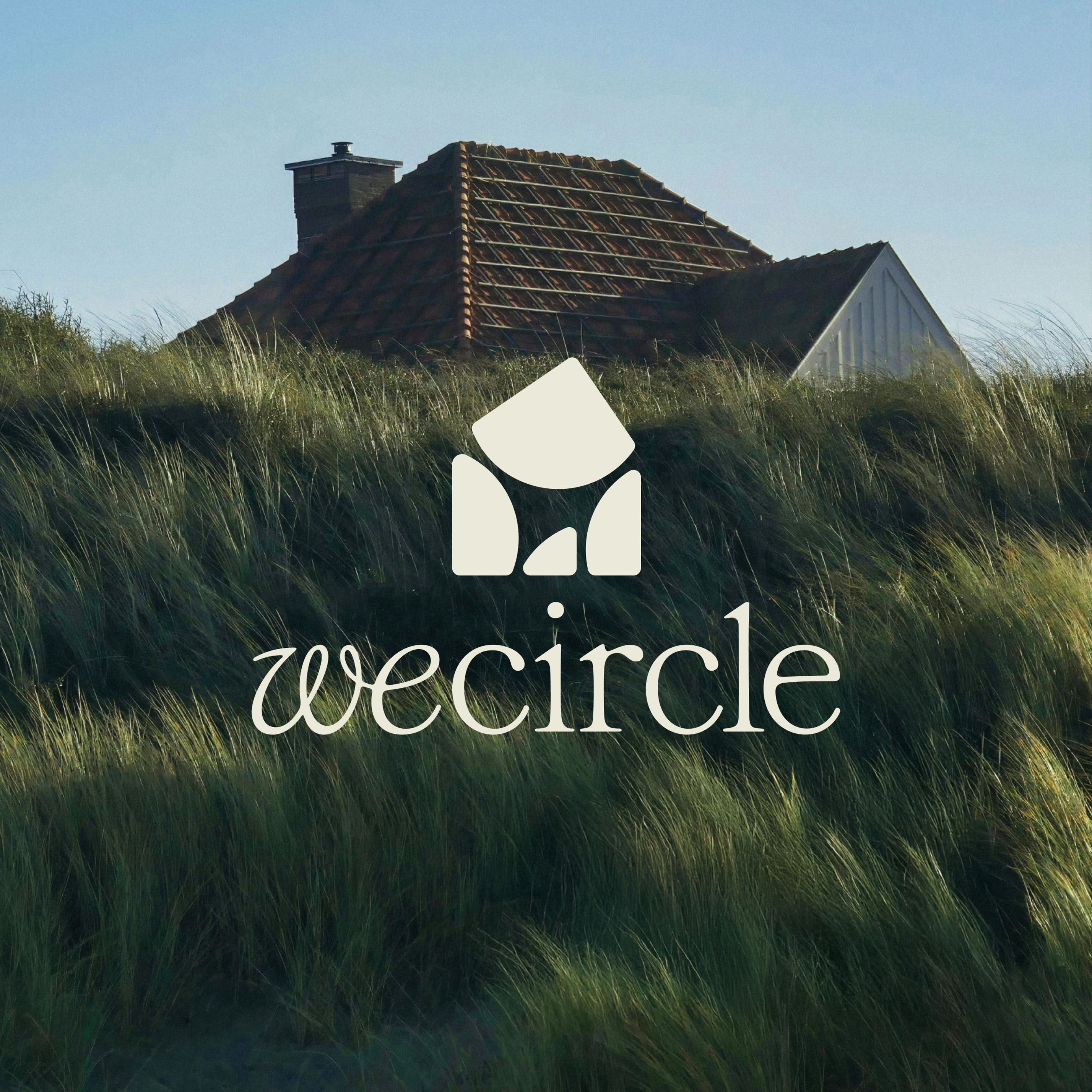
At the core of the visual identity are four geometric forms. Each one represents a foundational pillar of wecircle's values: environment, organization, well-being, and community. Placed together, the four forms close into a perfect circle. The shape reads as both a diagram and a dwelling — a ring that doubles as a roof, a symbol of return and shelter. It is a rare instance of a logo that works conceptually without relying on visual novelty.
The custom logotype reinforces this warmth. Rather than defaulting to a cold geometric sans-serif, +Stüdyo introduced subtle humanist qualities into the letterforms. The type system signals that wecircle is a people-first project, not an architectural sales pitch.
Color, Illustration, and System Depth
The natural color palette grounds the identity in the landscape. Earthy tones drawn from the region's terrain prevent the brand from feeling corporate. This palette carries across every touchpoint — from print collateral to motion graphics — creating consistency without rigidity.
The department emblem system adds a practical layer of identity depth. Each department within the wecircle community gets its own emblem, derived from the master mark. This sub-logo architecture allows the brand to scale across a community of 1,000 people while preserving coherence at every level. The editorial layouts shown in the project photographs demonstrate how the visual identity system performs at full spread — type, color, and form working in balance across magazine-format pages.
Custom illustrations and icons extend the visual language beyond pure geometry. These elements introduce narrative — they describe life inside wecircle rather than simply naming its pillars. It is the kind of system thinking that separates a strong visual identity from a logo plus a font choice.
+Stüdyo's work on wecircle is visible at artistudyo.com. The project demonstrates how a visual identity system can carry genuine conceptual weight when the brief demands it — and when the studio is willing to engage with both the idea and the execution at full depth.