by abduzeedo
For the past few years, or I dare to say decade, we saw a resurgence of the 80s in fashion, movies/TV and design in a way. Look at the work of amazing people like James White for example. However, I have noticed a slow shift to a new trend. We are moving ahead and beginning to see an influx of 90s inspiration. There are a ton of references already in plain site. There’s an amazing movie called the Mid 90s, the blockbuster Captain Marvel is supposed to take place in the 90s and of course, I started to see more projects on Behance, especially from students, capturing the style of that incredible decade. That’s the case of the projects that Dylan Levionnois have been sharing on his profile.
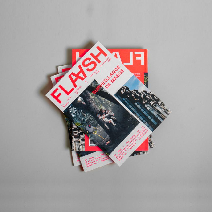
Dylan Levionnois is a graphic designer from Vire, France and his projects definitely have a lot of 90s references. From the dirty/grunge look using some patterns or texture, to probably the most classic reference, the typography. Dark looking images and simple color palettes, white on black, perhaps with a pop of red.
The 90s had a lot of the David Carson, End of Print look and Dylan brings that back on projects like Print - NIKE x BSMNT x ALCH.
One of biggest criticisms of some of the 90s look in terms of graphic design was how difficult things were to read. There was definitely an accessibility issue there. I hope the new designers that take that style and are capable to solve this problem and create a totally inclusive design, yet with that awesome 90s look.
