by jeff
BBH rebrand arrives as the agency's very first visual overhaul in 44 years, featuring three bespoke typefaces and bold zag glyphs made with Studio Drama.
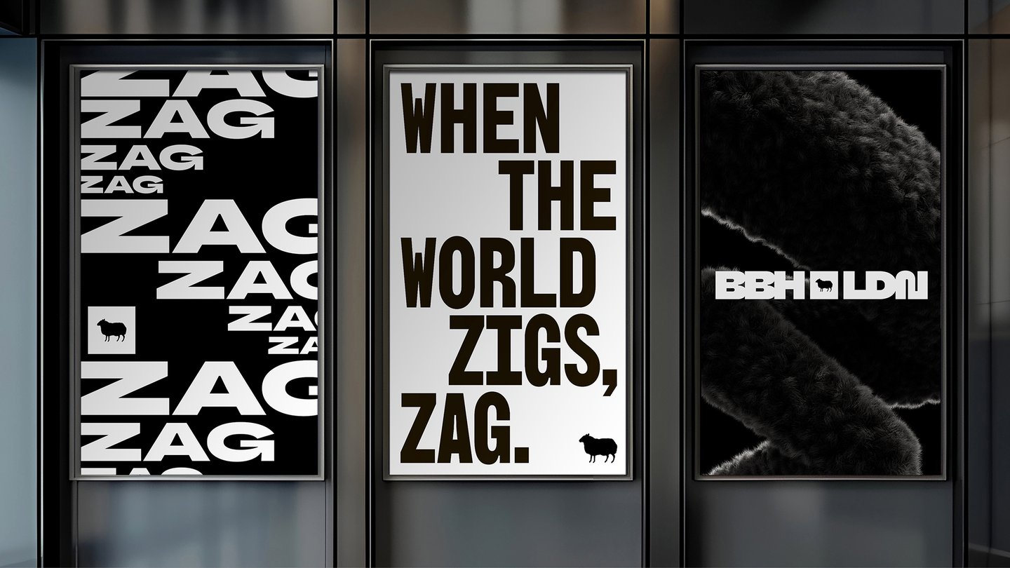
In 1982, John Bartle, Sir Nigel Bogle and Sir John Hegarty founded BBH, a London creative agency defined by a single defiant mantra: "When the world zigs, zag." Forty-four years later, that philosophy has finally shaped the agency's own visual identity. The BBH rebrand — the agency's first in nearly half a century — is a comprehensive system built around three bespoke typefaces, a library of zag-inspired glyphs, and a motion language developed entirely in-house.
The scale and depth of this identity project reflects how seriously BBH approached the challenge of designing for itself. Working in close collaboration with Studio Drama, the London-based type studio behind the Heinz typeface, the agency spent two years developing the visual system. Design director Adam Buckland guided the process, treating the typeface development as an extension of the agency's values rather than a surface exercise.
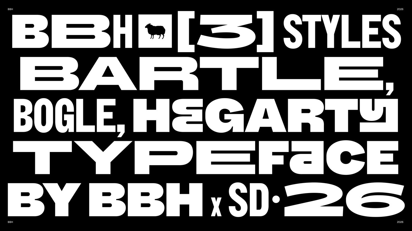
BBH Rebrand Typefaces Honor Three Founders
Each of the three typefaces in the BBH rebrand pays tribute to one of the agency's founders. BBH Bartle is designed for clarity and features broad, confident letterforms. BBH Bogle echoes the heavier pen strokes of the original logo, grounding the identity in its history. BBH Hegarty, the most unconventional of the three, embodies the zany spirit the agency has long celebrated. Chris Nott, co-founder and type director at Studio Drama, described the process as a "true collaboration" — one that pushed both parties to build something that respected heritage while leaving room to move forward.
The decision to release the typeface as open source underscores the agency's ethos. ECD Felipe Serradourada Guimarães framed the BBH rebrand as more than aesthetics: "this wasn't an exercise in making things look pretty — it was about channelling the agency's values with charm and teeth." By releasing the typeface freely to the world, BBH invited other designers and creatives to find their own way to zag.
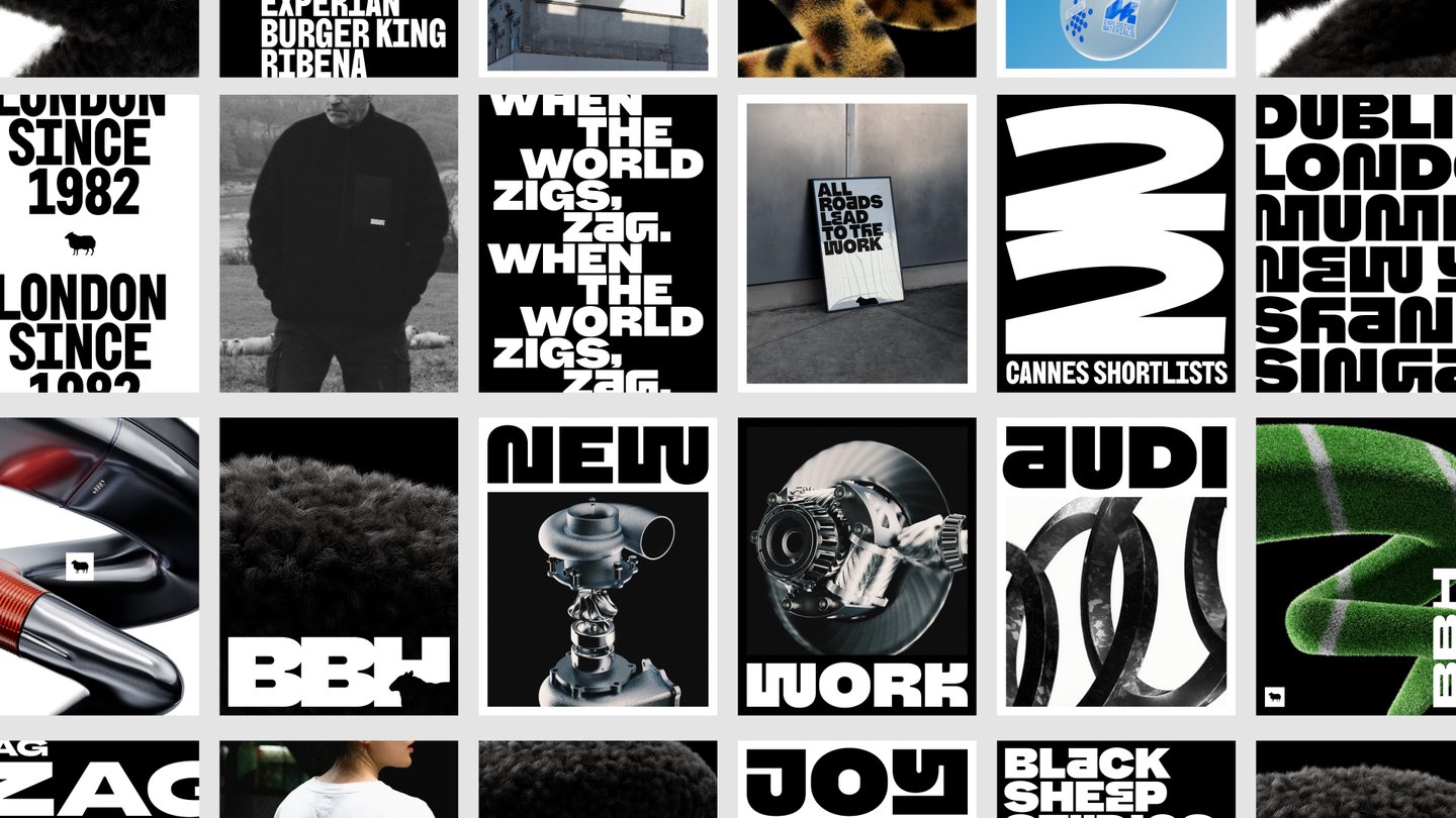
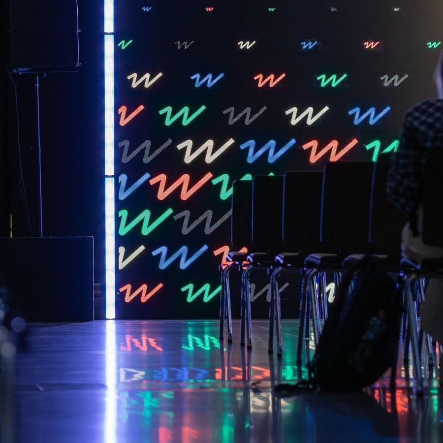
Zag Glyphs and Motion Bring the Identity to Life
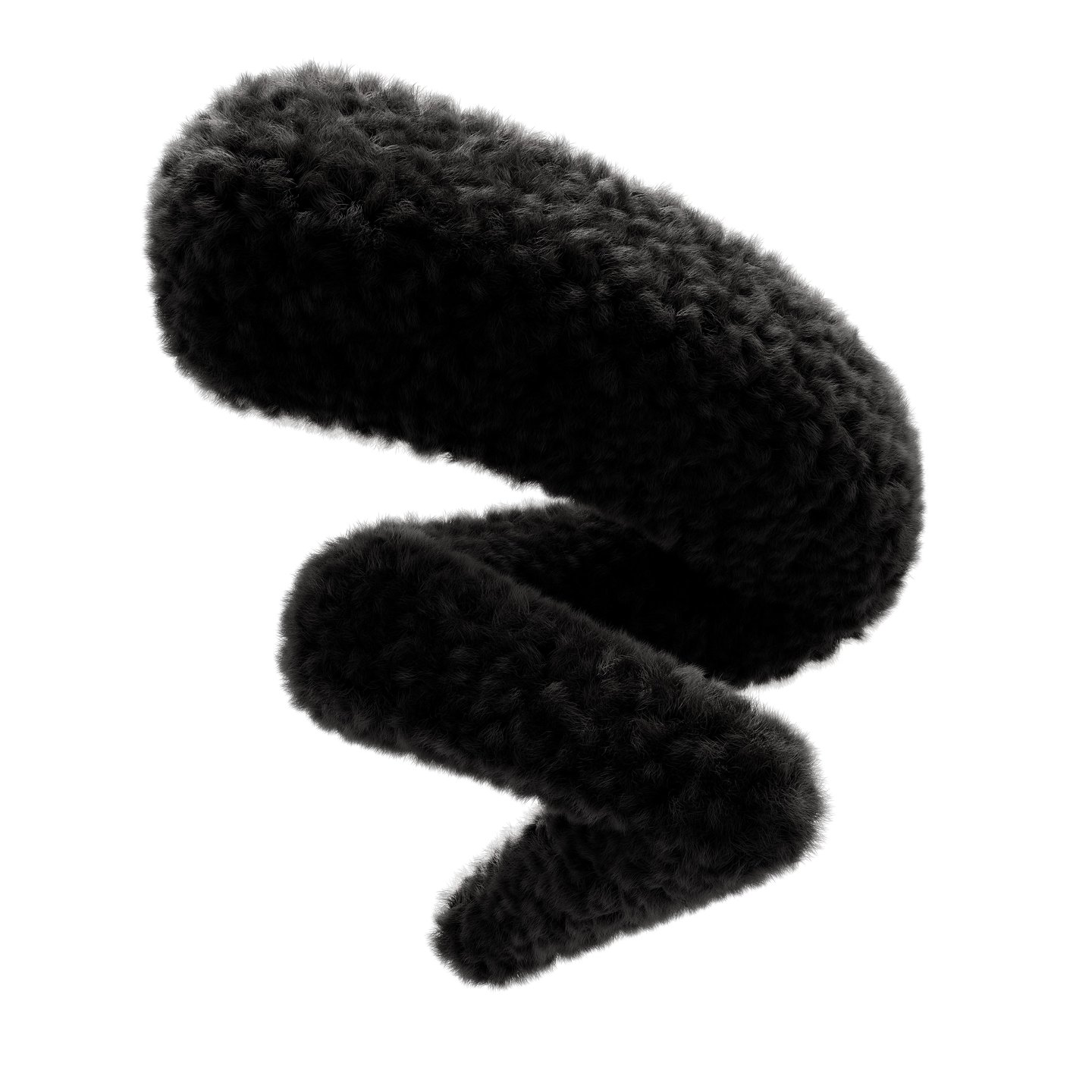
Beyond type, the BBH rebrand introduced a series of zag-inspired glyphs — each one symbolic of a key BBH project. 3D designer Sophie Harper brought the zag shape into physical form, creating what she called "flexible, ownable brand assets." Some of the most striking pieces play with familiar textures: a zag rendered as a melted Tesco shopping trolley, another shaped like a Magnum ice cream. These objects anchor the identity in British cultural memory while remaining distinctly contemporary.
Motion lead Oded Shein developed a definitive movement language using Cavalry and After Effects. Every gesture in the system has a rationale — type movement ranges from fluid to zag-inspired, with weight morphs and dynamic curves that keep energy high without losing control. The result is a BBH rebrand that functions across still, print, and screen with equal conviction. As a project two years in the making, this identity reflects the effort of multiple teams and stands as a clear statement of what BBH stands for now and going forward. More about the project can be found on It's Nice That.