Best of the Week: Dynamic Systems and Tactile Form
INFO
BLOG
Our roundup of the best of the week highlights the structural tension between physical architecture, variable typefaces, and dynamic motion.
We explore how grid discipline and expressive letterforms define modern visual identities across digital and physical mediums:
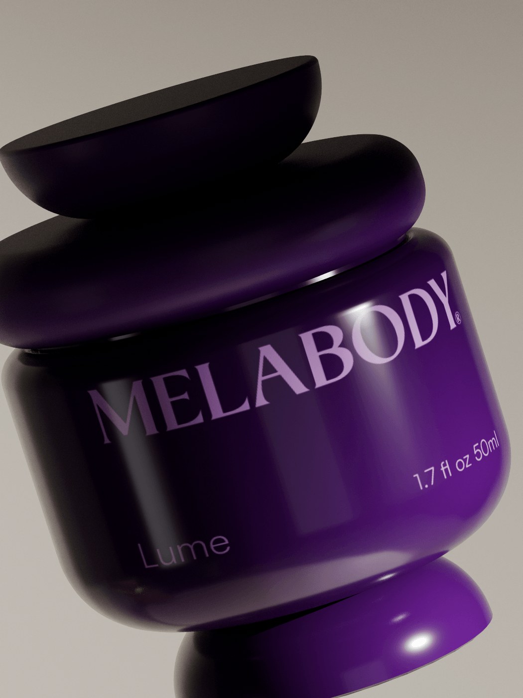
- Melabody Bodycare Packaging Design by Dylan Sidoine: Sculptural beauty packaging designed for melanin-rich skincare. It uses clay-like textures and warm tones to celebrate physical tactility.
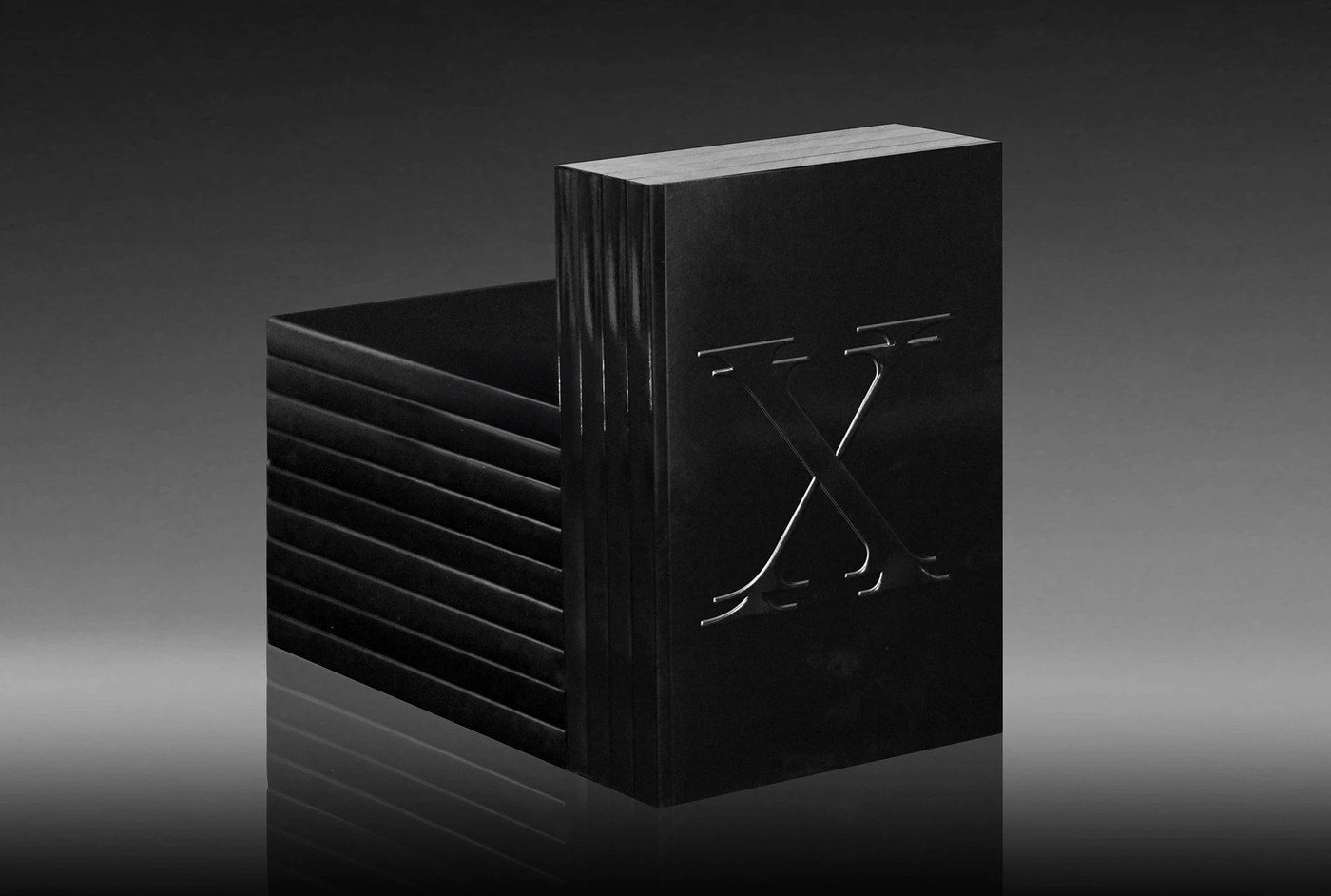
- Drool Type Specimen by Forth+Back Studio: A display serif specimen book inspired by H.R. Giger's biomechanical aesthetics. It pairs dark, blind-embossed textures with extreme typographic scaling.
- Gestaliz Brand Identity by Vilarejo Design: An educational platform rebrand prioritizing grid structure over visual noise. The design system uses overlapping planes to represent educational progression.
- KINETIC TYPE v2 by Knife Motion: A collection of After Effects-native kinetic typography treating letterforms as physical mass. Words move with acceleration and collision.
- Maker Lamp by flowalistik: An open-source 3D-printed designer lamp leveraging spiral vase mode for tactile surface finishes. It bridges digital fabrication and home lighting.
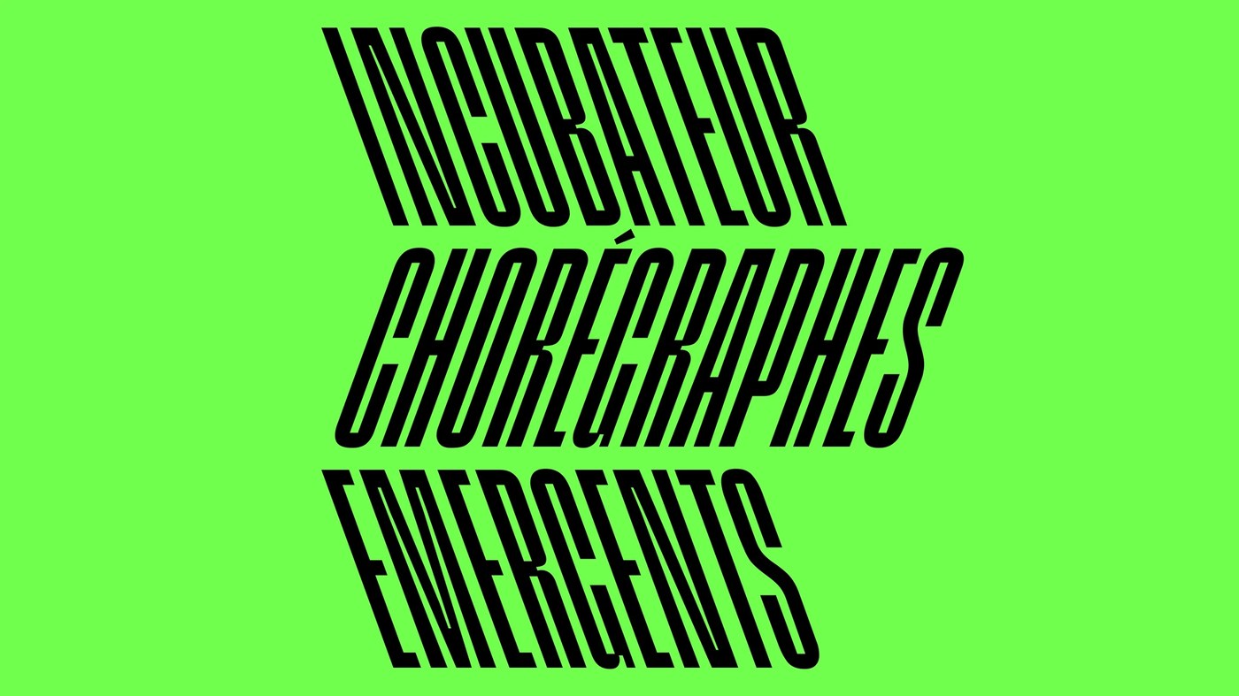
- ACEAC Contemporary Dance Identity by DE_FORM Studio: A variable font-driven dynamic identity translating dance choreography into typography. It pairs vibrant color fields with posters that stretch and tilt.
- HIUT Brand Identity by Pentagram: Visual identity for the Welsh premium denim maker featuring custom typography and raw textures. Hugh Miller's design anchors local craft within a modern layout.
- Norton Museum of Art Rebrand by Koto: An updated visual system reviving an 80-year-old wordmark with a signature 40-degree angle motif. It links the museum’s history with contemporary art direction.
- Imperial College London Rebrand by The Click: A flexible brand identity focusing on belonging through bespoke faculty letterforms. The system scales across print and digital touchpoints.
Next week, we examine how minimalist packaging designs utilize tactile finishes to define physical consumer products.
For more inspiration check out our curated selections on Abduzeedo.

ADS
