by abduzeedo
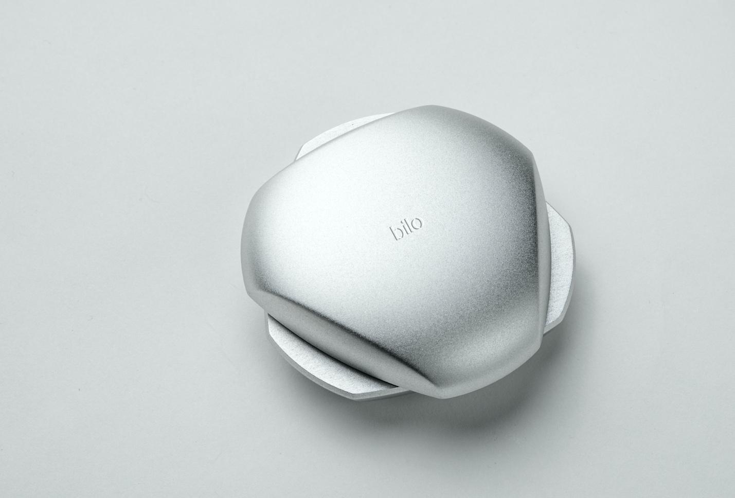
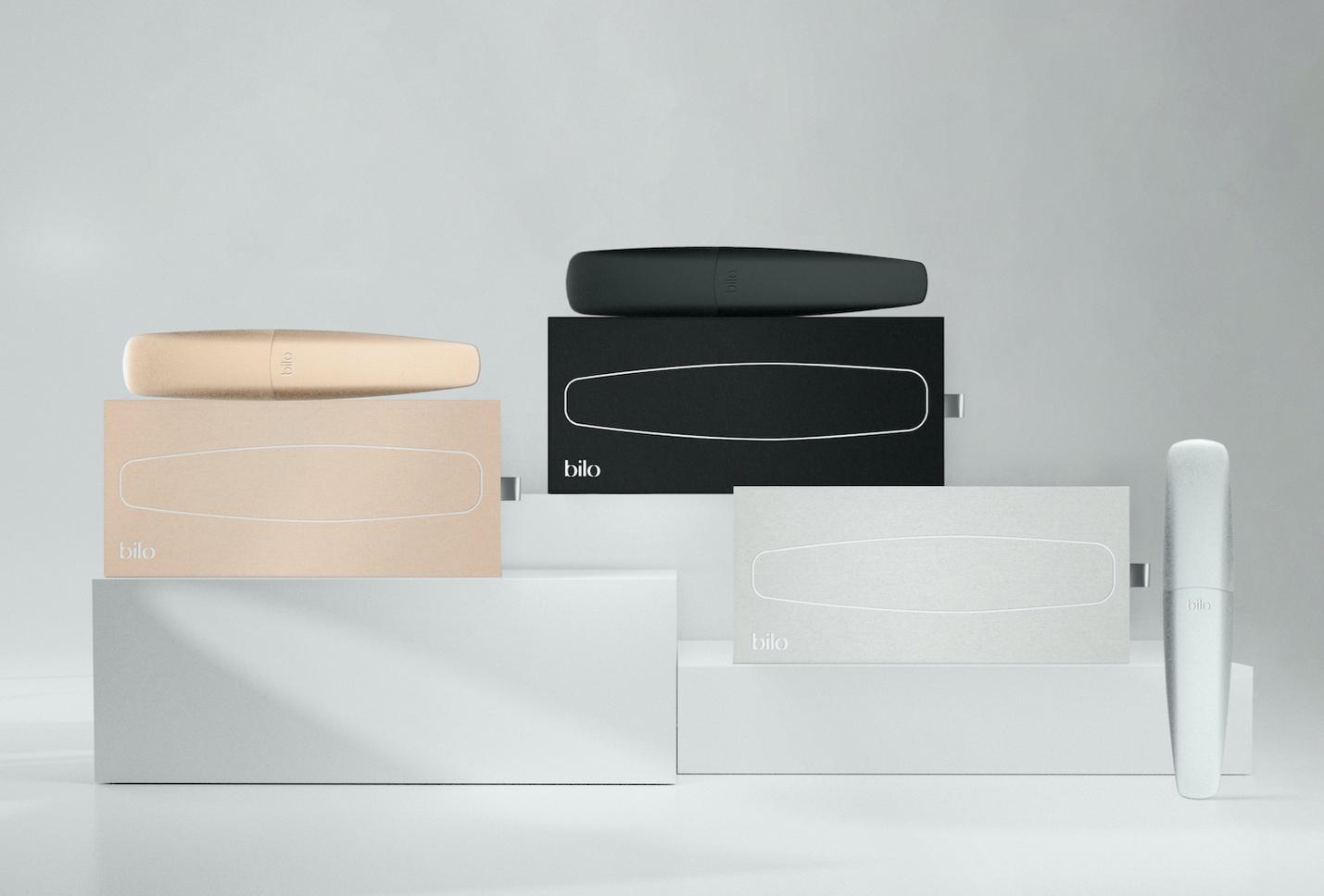
Bilo came to Fagerström to develop their visual identity and packaging design for their products. To do this, we worked on a brand strategy based on pride and self-expression and on a value proposition that is leveraged on quality, beauty and functionality. The goal is to position the brand as a design-driven company that allows you to enjoy while elevating the experience.
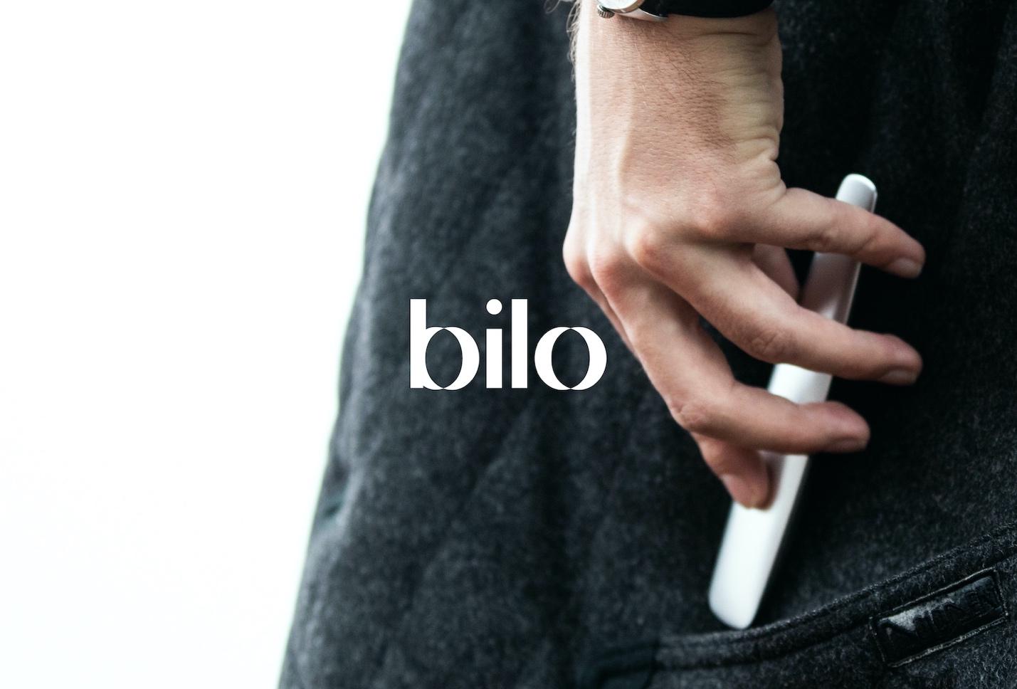
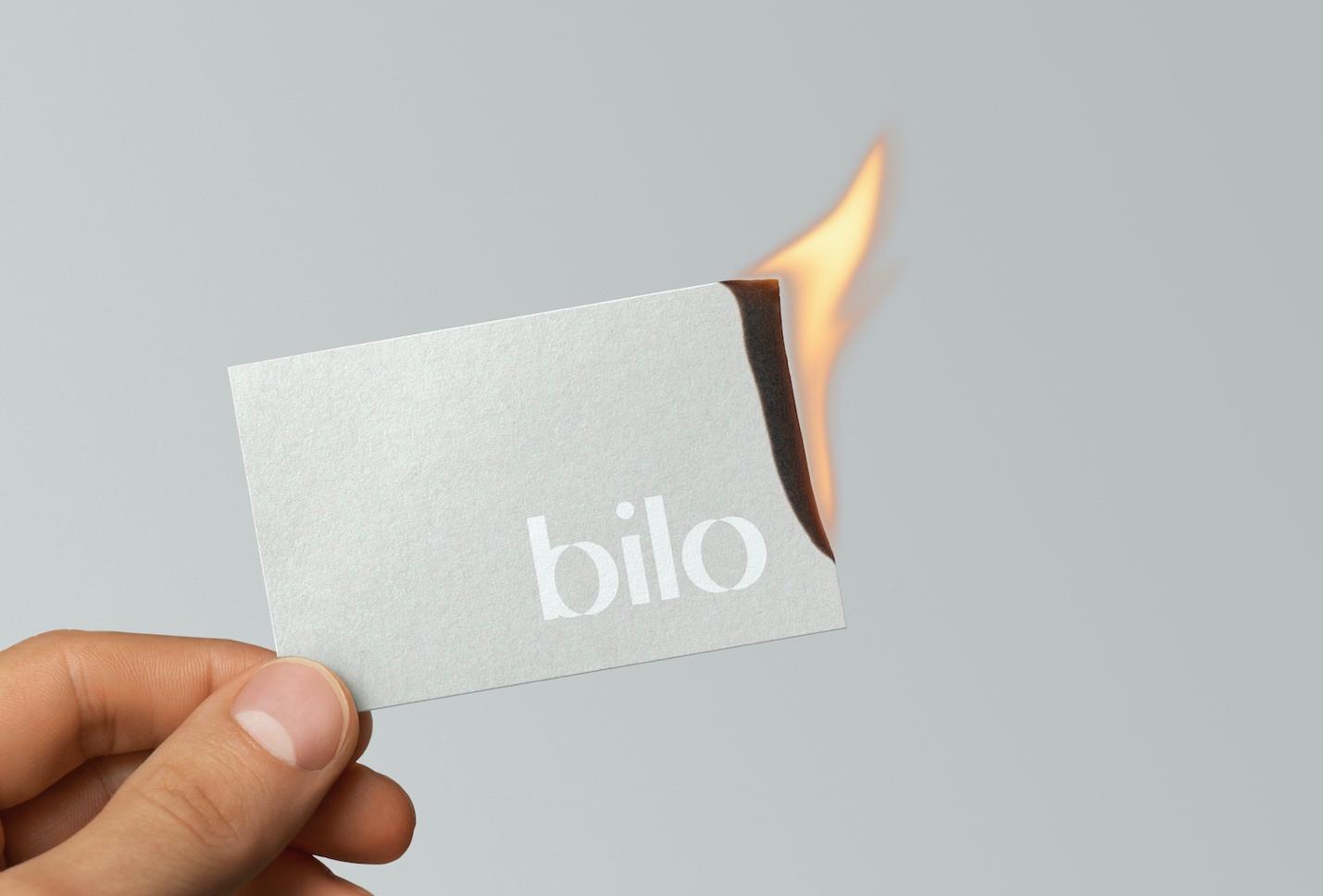
The brand is based on light, an element that, on the one hand, allows us to appreciate the beauty of Bilo’s products, and on the other, represents the initial spark of the act of smoking.
Playing with the idea of lights and shadows we have created a simple and elegant wordmark, which seems to be illuminated from two opposite directions, giving a feeling of lightness despite the boldness of the typeface.
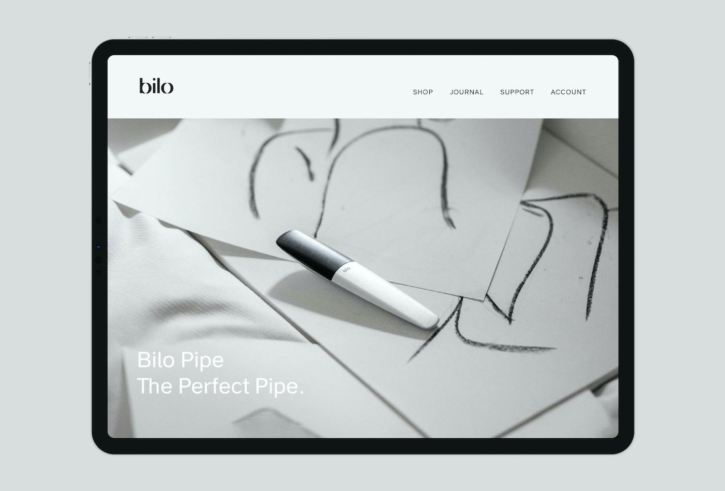
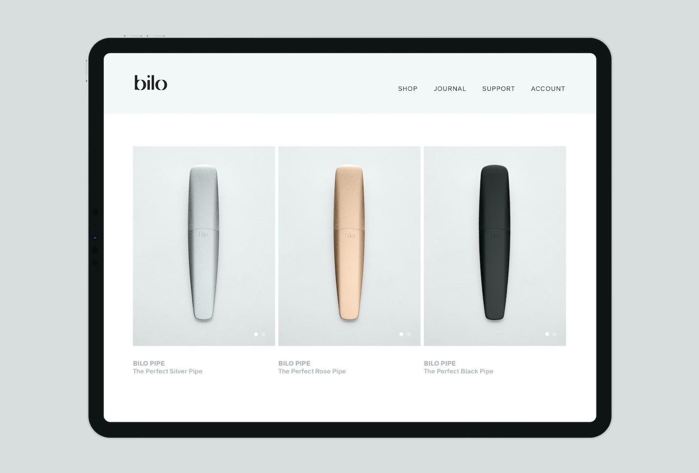
About Bilo
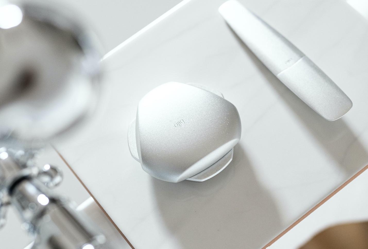
Bilo is a new Toronto-based brand creating hi-end tools for the preparation, consumption and storage of cannabis. The company manufactures design-based products that offer better performance, safety and ergonomics.
Bilo was born out of the need to find products for cannabis consumption that weren’t aesthetically ugly so that they didn’t have to live hidden in a drawer. Therefore, the company created a line of products that are desirable, cohesive and can be proudly displayed as design objects.
In a first stage, the brand will market two products, a pipe and a grinder, and in the near future it will launch other products such as vaporizers, smoking kits and accessories, with the aim of reaching a greater number of consumers.
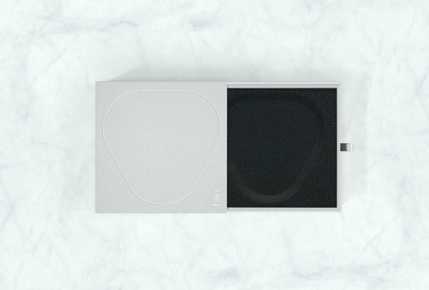
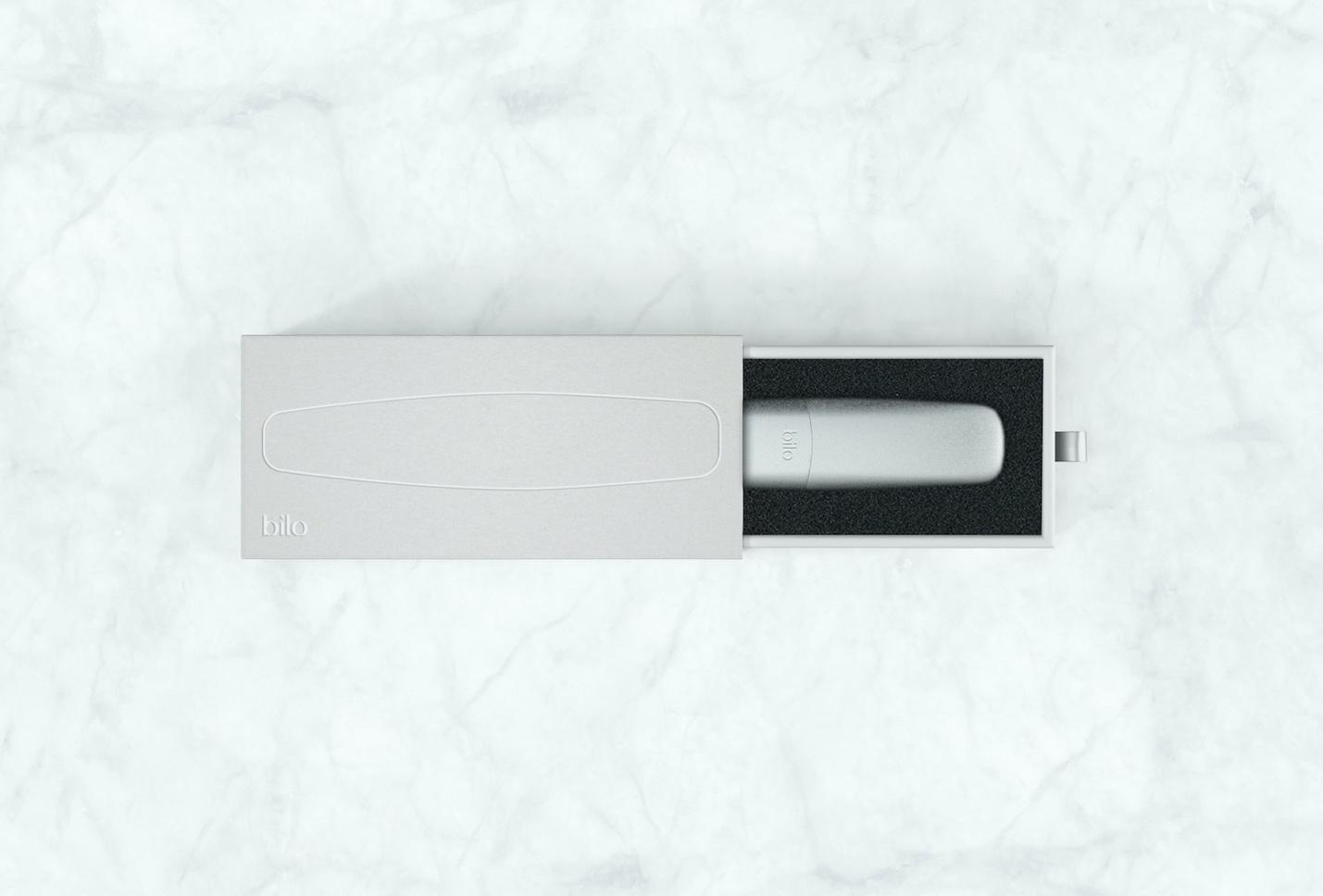
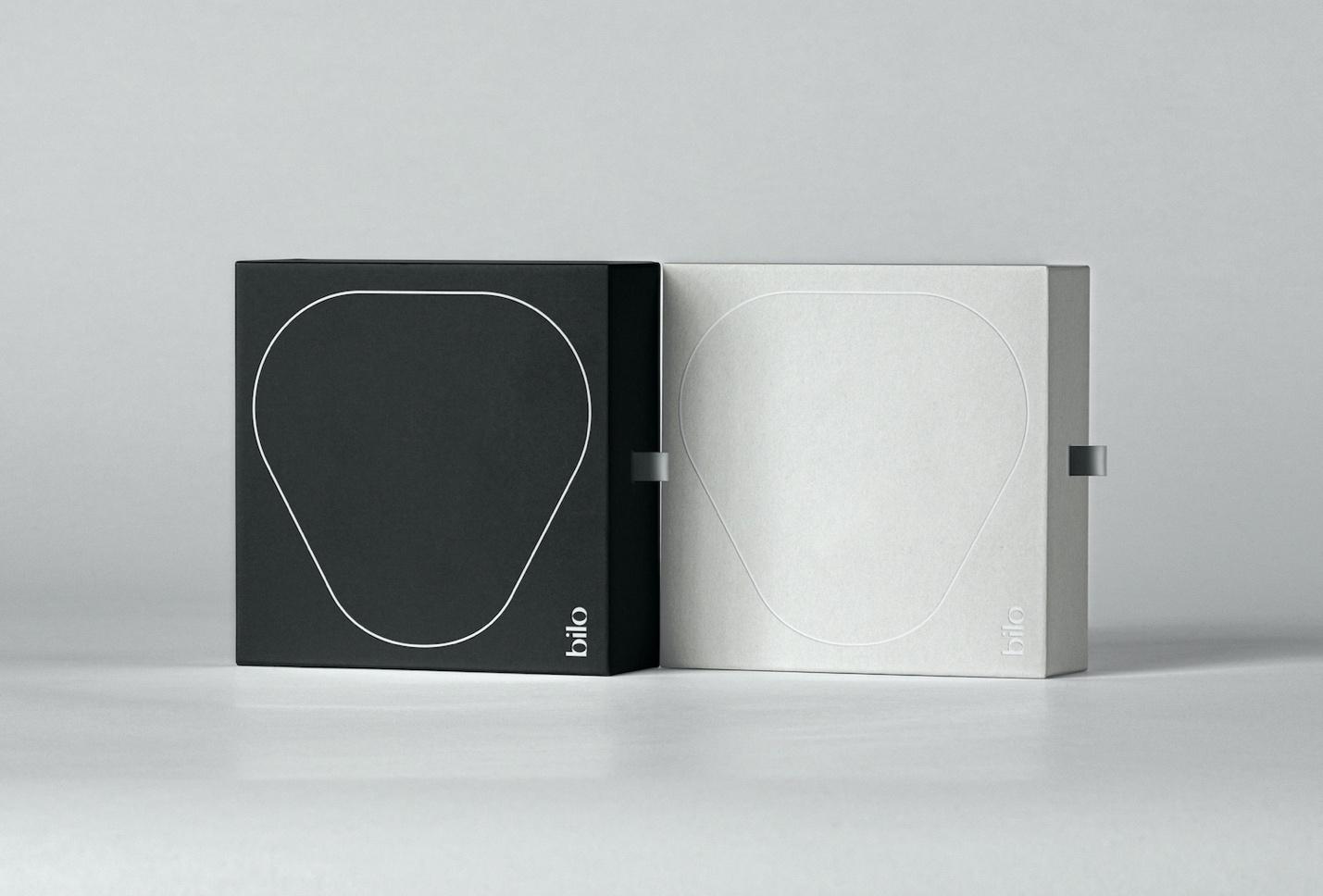
The packaging stands out for using thin and curved shapes to represent the contours of the pipe and the grinder, inviting us to open the drawer to discover the content of the box and display the product.
For more information make sure to visit Fagerström website


