by abduzeedo
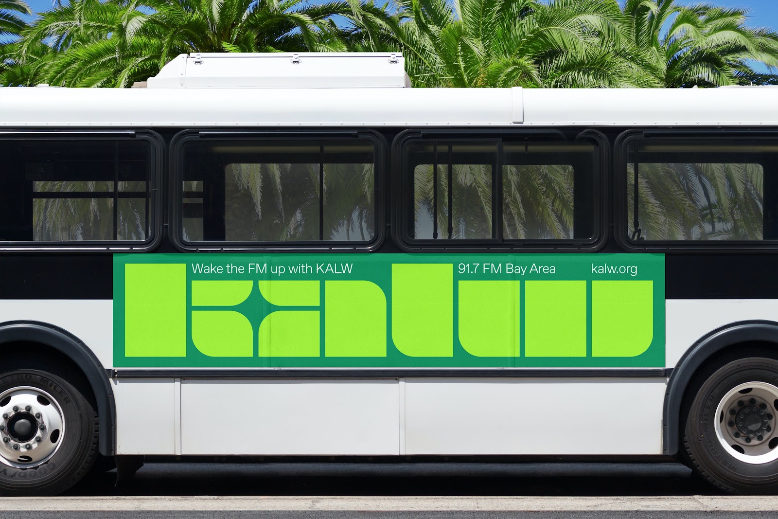
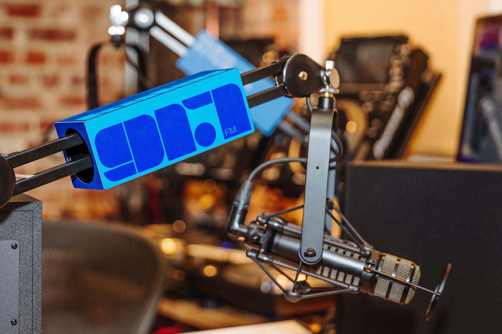
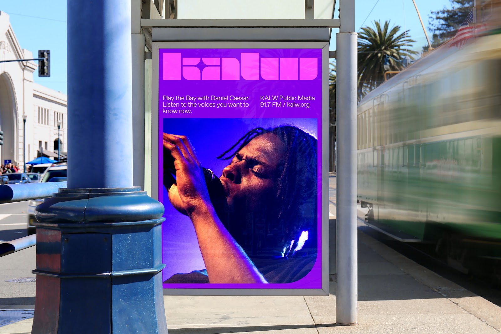
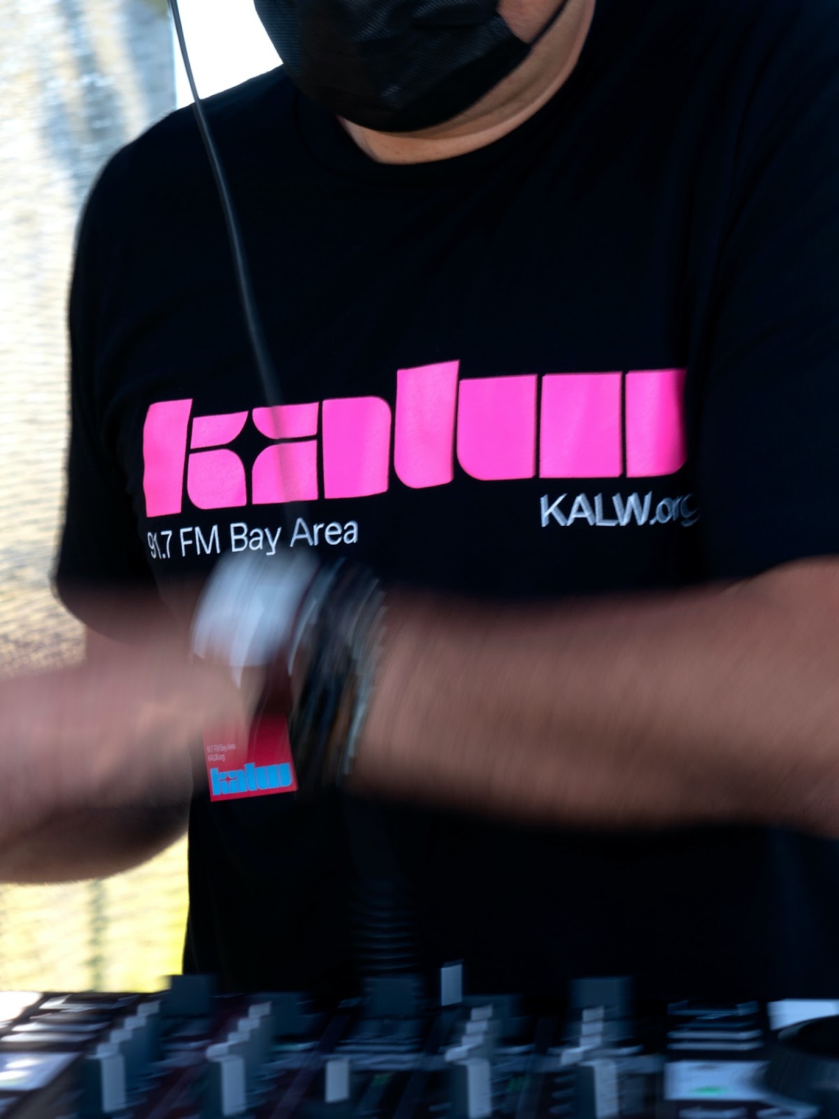
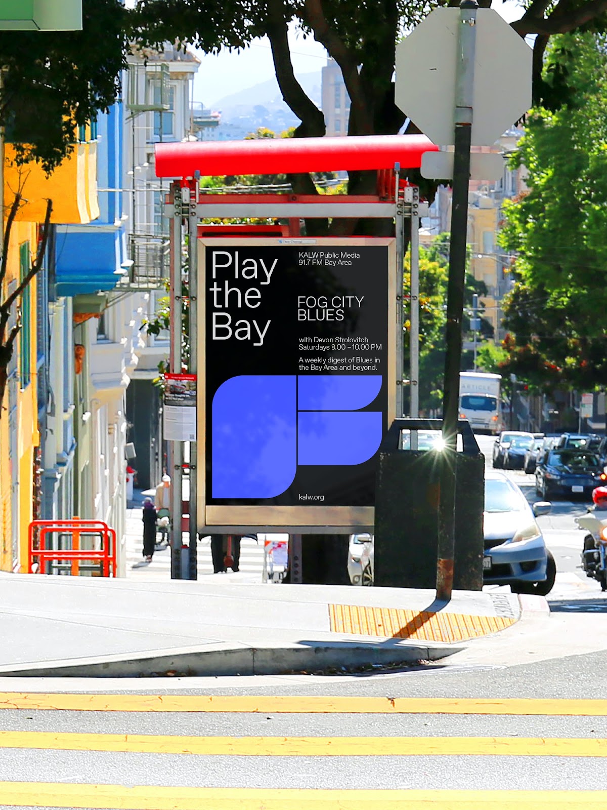
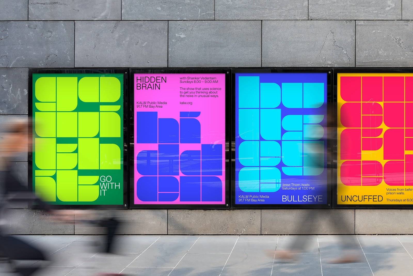
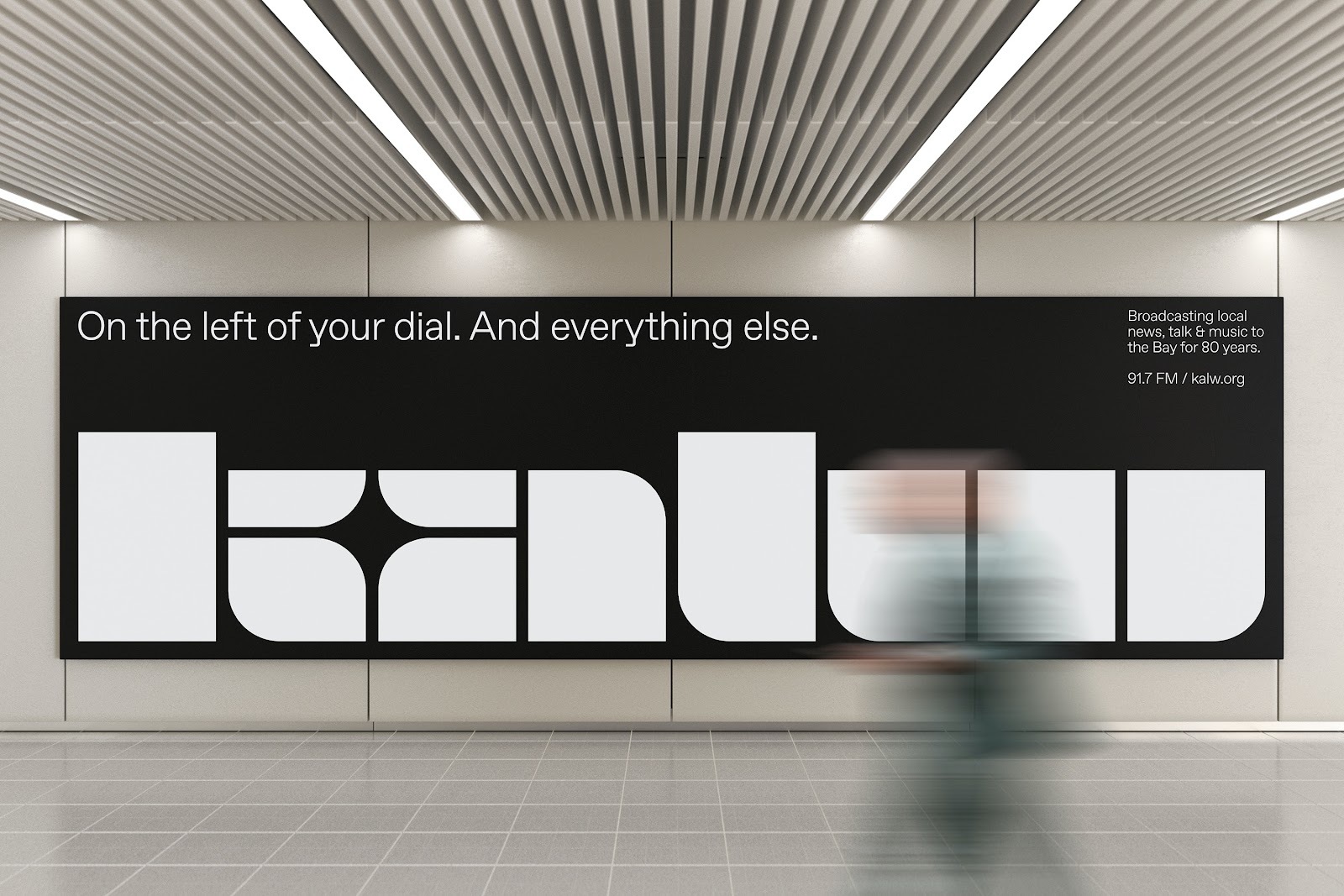
With the endless number of playlists, podcasts, and livestreams we now carry around in our pockets, the idea of listening to a radio station feels antiquated — but we often make exceptions for our local public radio. For the Bay Area, that special local station for the past 80 years has been KALW. With their anniversary on the horizon, COLLINS was challenged with creating a new identity to propel them forward into the next 80 years. They delved into KALW’s history to create a visual identity system that directly reflects its uniqueness and showcases its undeniable connection to the Bay Area. The result is a colorful and bold identity, including a new logo inspired by letterforms of jazz and classical concert posters from the 50s and 60s, that can grow with them as they continue to reimagine and redefine local radio.
Some thoughts from COLLINS Designer Barney Stepney:
“COLLINS has had an office in San Francisco for a number of years now. It's a city we love and owe an incredible amount to, so we aim to work to support our community as much as we can. In 2016, we began our work with the remarkable people at the Exploratorium. In 2019, we started our work with the great San Francisco Symphony. In a large part, San Francisco's vibrancy and perpetual sense of possibility is due to its many music and cultural scenes. KALW is a critical voice for those spaces. They also happen to be one of the most pioneering radio stations in the US. So, it was a unique opportunity. At COLLINS, we’ve worked with Spotify, Warner Music, SF Symphony and Bose, too. The internal well of language and experience in crafting design solutions for musical or music-adjacent organizations is deep at COLLINS. With KALW, we had a special chance to further that experience by working with a station that was such a Bay Area fixture.”
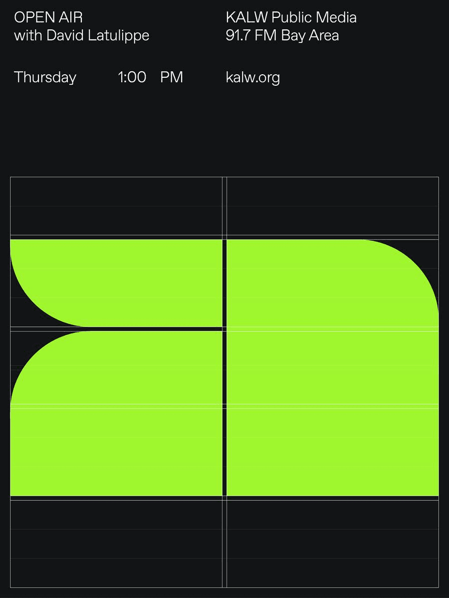
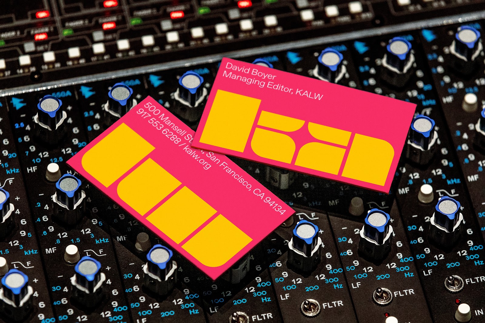
He continues, “In our research we came across a logo that KALW used in the late 70s. It was strange, made from stencil lettering, with weird shapes and dimensions that were entirely inconsistent with each other. In its rigidity of form, we instantly recognized the logo was also inconsistent with the fluid, flamboyant, hippie style of art and design in San Francisco in the 1970s. In that weirdness, though, we found surprising character, memorability and tons of energy. We loved the idea of using a stencil for the new identity. There's a blunt, utilitarian aspect to a stencil that anyone can understand. It is also representative of building blocks coming together to form a whole - and a community - which is exactly what KALW has successfully done over the last 80 years. A bold voice travels far. We wanted to create a logo that would be as unique and powerful as KALW’s voice itself and expresses the vibrant future they continue to build with the Bay Area community. We wanted the logo to act as the main source of imagery in KALW’s communications. This puts the brand identity front and center. The rest of the brand system, including the colors, was inspired by both the simplicity of jazz and classical concert posters from the 1950s and 60s, and a Disney film like Fantasia 2000’s George Gershwin’s musical composition “Rhapsody in Blue”. Those intense color pairings were memorable and delivered life and energy in short, bright bursts. We wanted to do something similar for the KALW brand, so we employed color pairings that vibrate and feel unfamiliar.``
Credits
- COLLINS: Barney Stepney; Alex Wallace; Tom Elia; Dev Valladares; Eric Park
- Photography: Barney Stepney; Monica Semergiu; Graham Holoch; Melissa de Mata
- KALW Public Media: David Boyer; Liz MacDonald; Tina Pamintuan
For more information make sure to check out COLLINS website.


 — Branding and Visual Identity")


