by abduzeedo
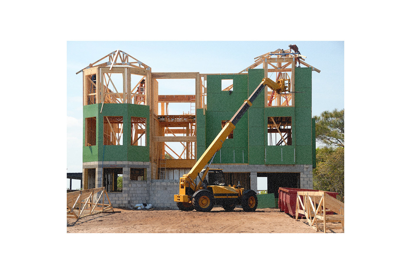
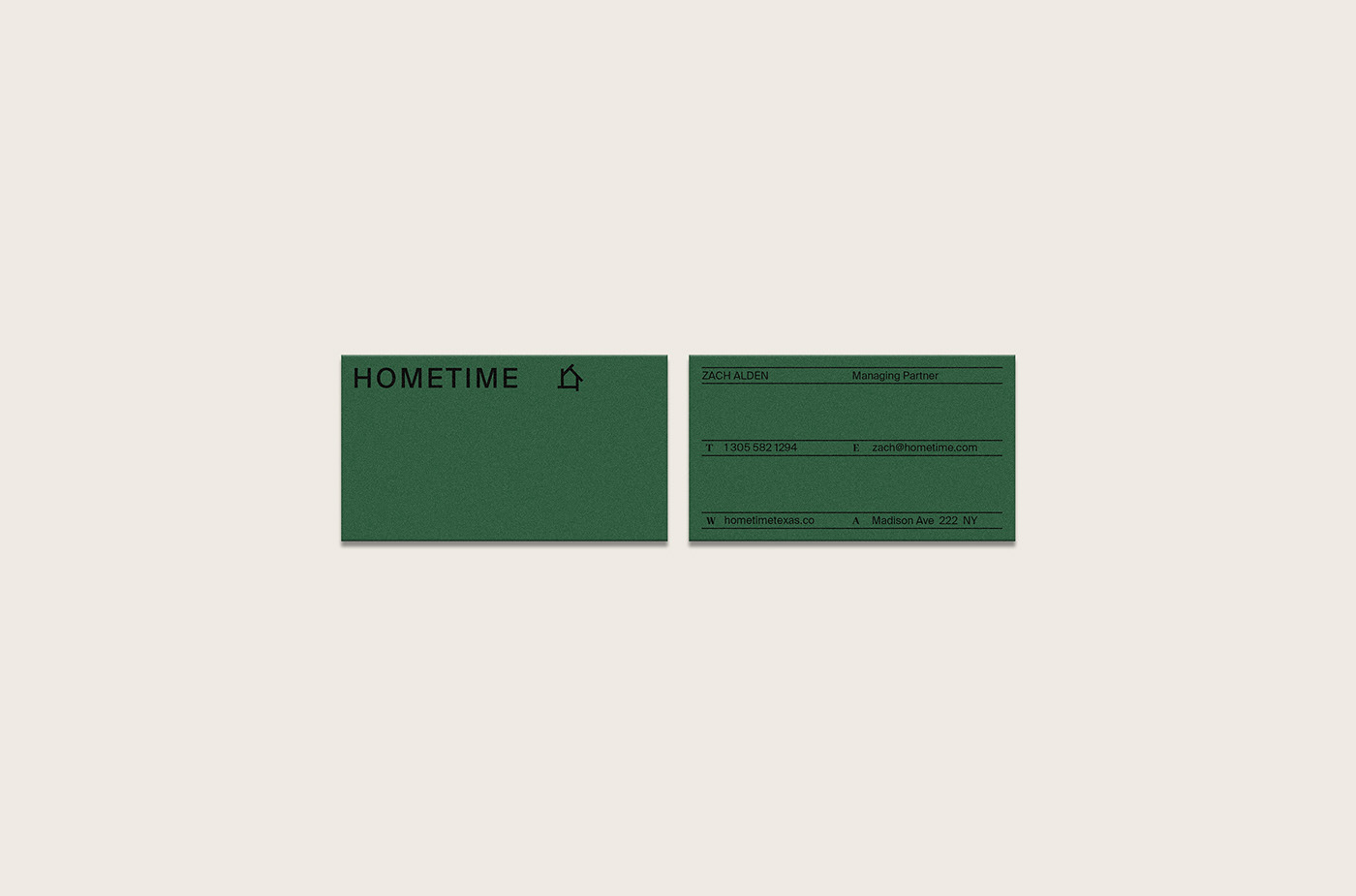
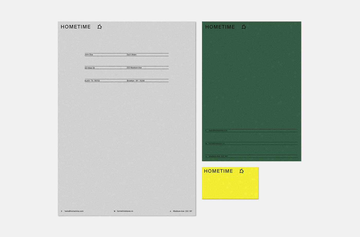
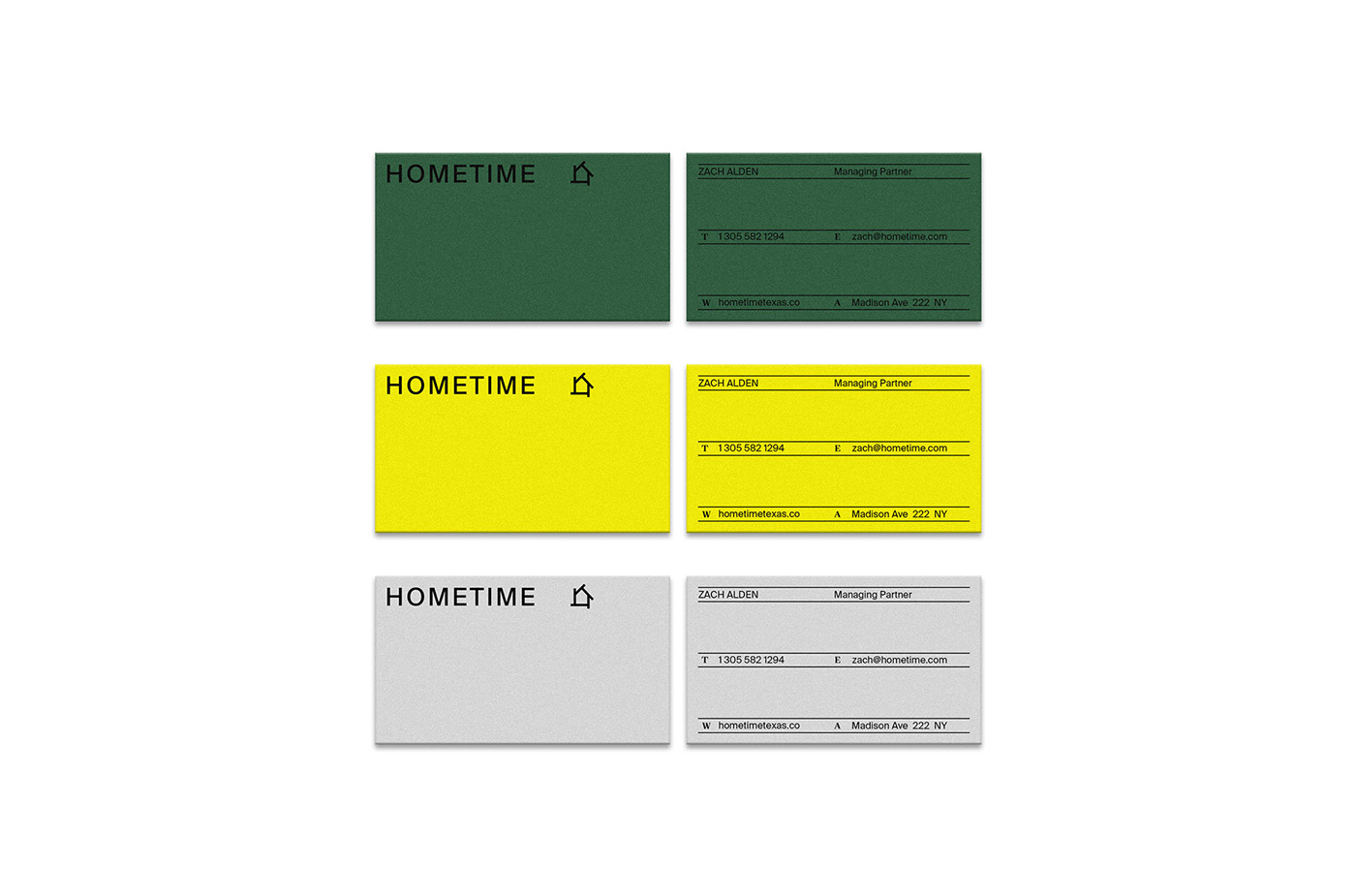
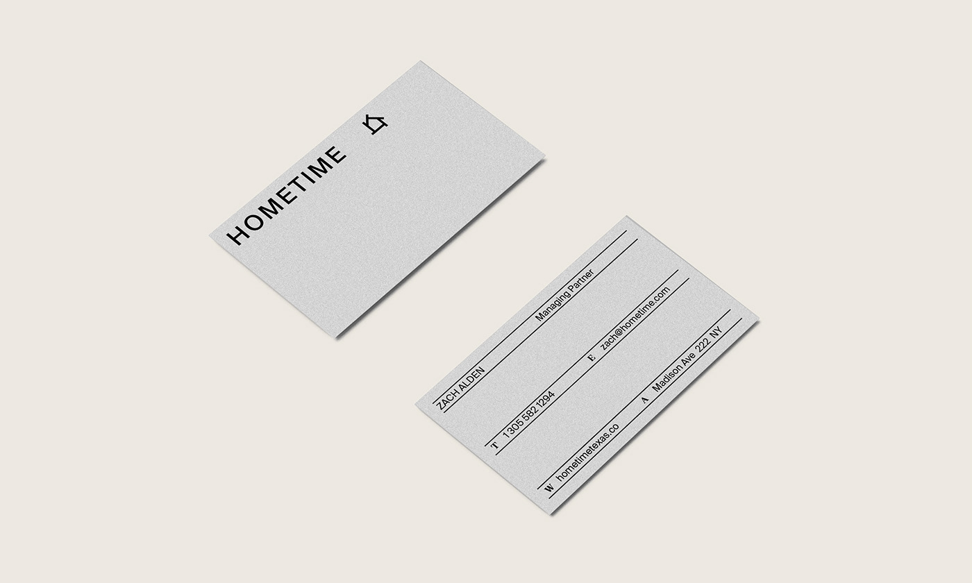
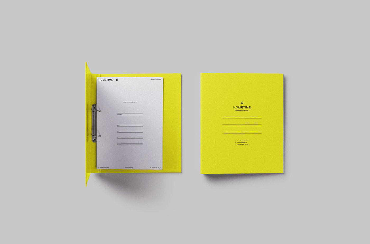
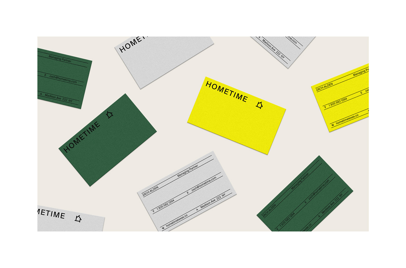
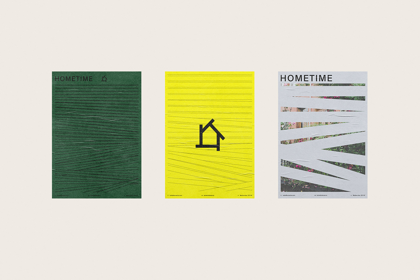
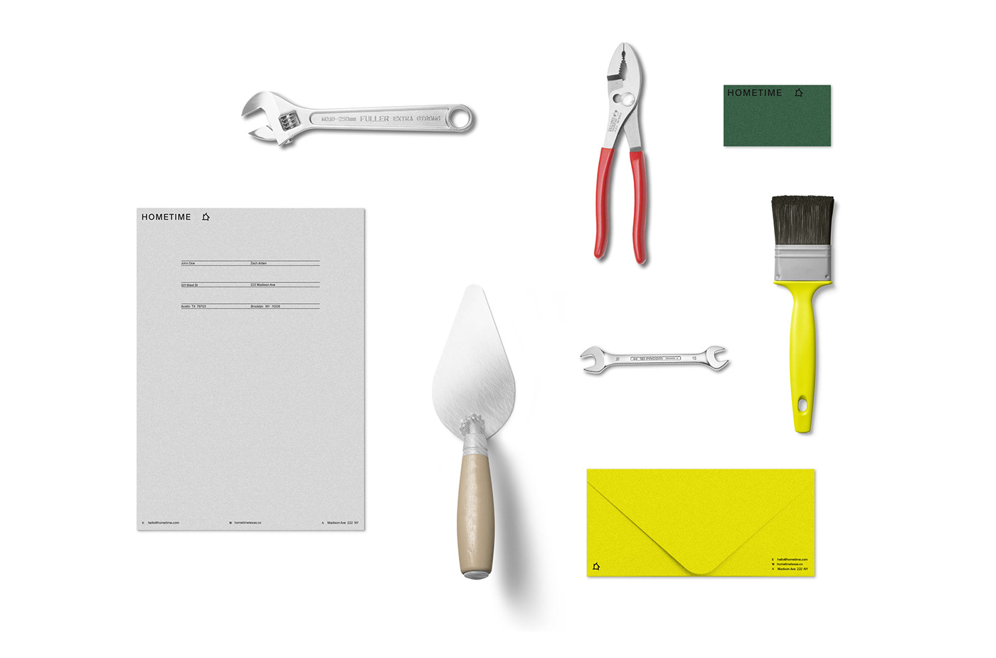
Bruno Canales shared a new project, this time it’s the branding redesign for Hometime, a residential management company in Dallas, Texas. Their main objective is to be a one stop shop for home maintenance, reparation and remodels. The visual solution emerges from paying attention to the tradition found in residential homes, but imbuing with a contemporary and vibrant twist.
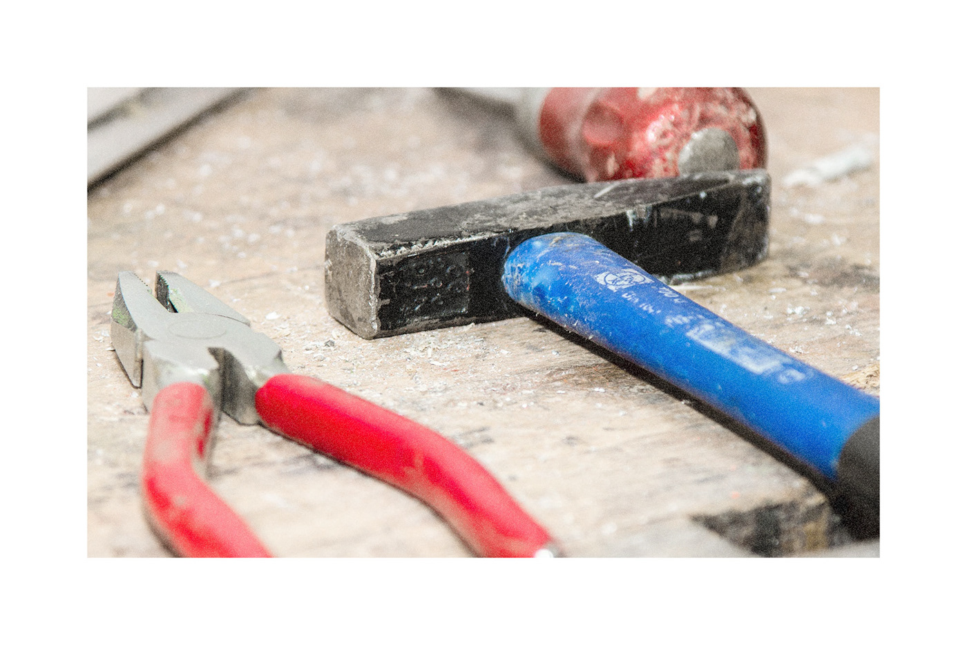
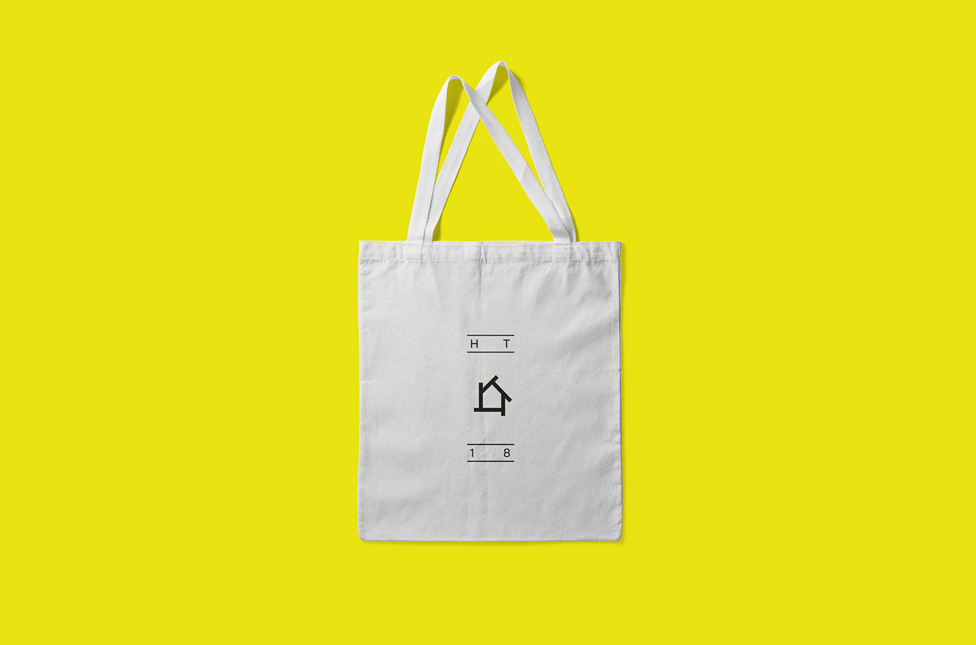
The marks, typography and applications are inspired in an architectural element that is central to American residences: the vinyl siding. Chromatically, the branding draws inspiration from construction sites and handyman's tools. The tension between the new and the old is also represented in the typefaces; a combination between a modernist sans serif and an older transitional serif.