by abduzeedo
Explore the dynamic branding and visual identity for Go Care by Magdalena Czarnecki, designed to attract younger talent to Sweden’s elderly care sector.
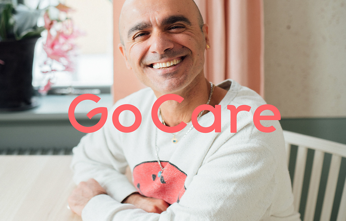
Magdalena Czarnecki’s design for Go Care exemplifies a perfect blend of vibrancy and inclusivity. Go Care, an initiative aimed at strengthening Sweden’s elderly care sector, seeks to inspire a younger generation to join this vital field. Czarnecki’s mission was to create a brand identity that feels young, vibrant, and inclusive, reflecting both heart and honesty.
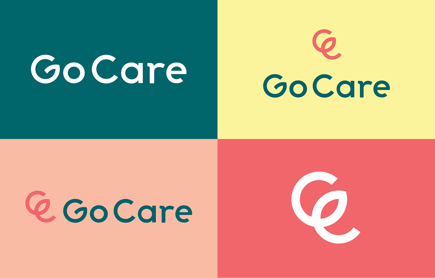
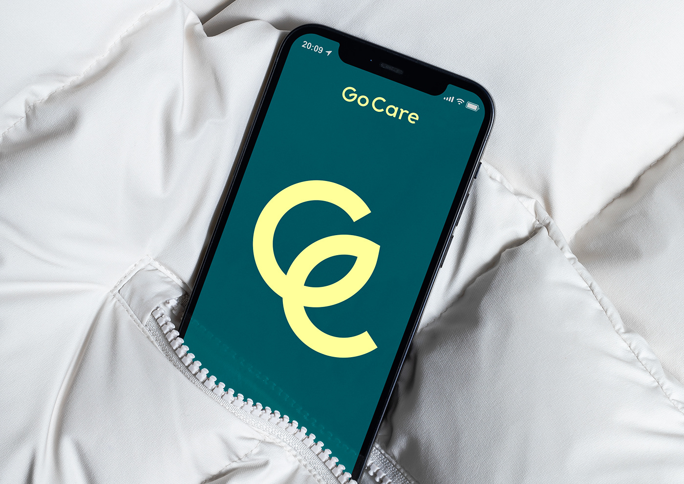
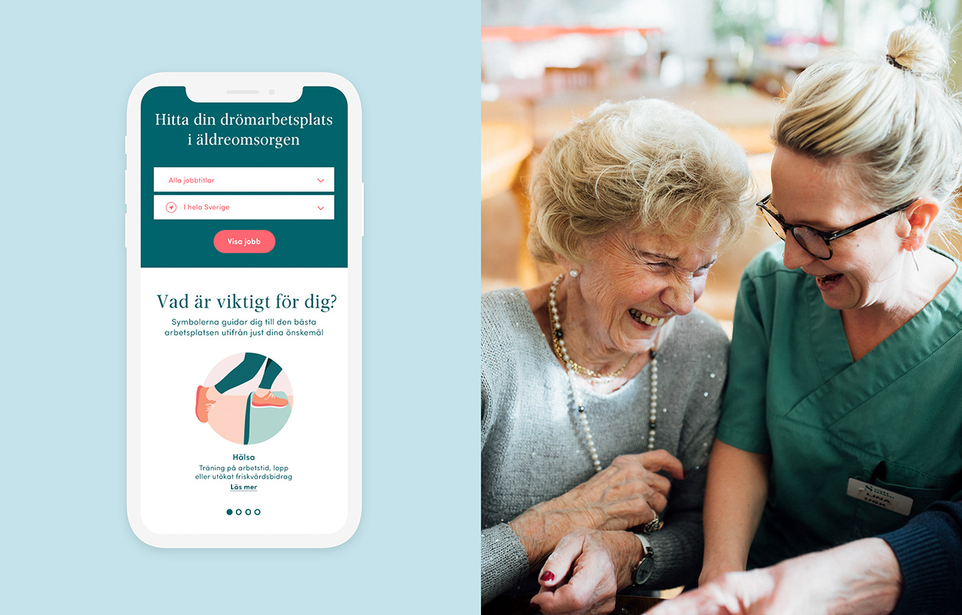
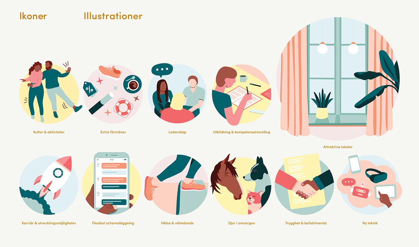
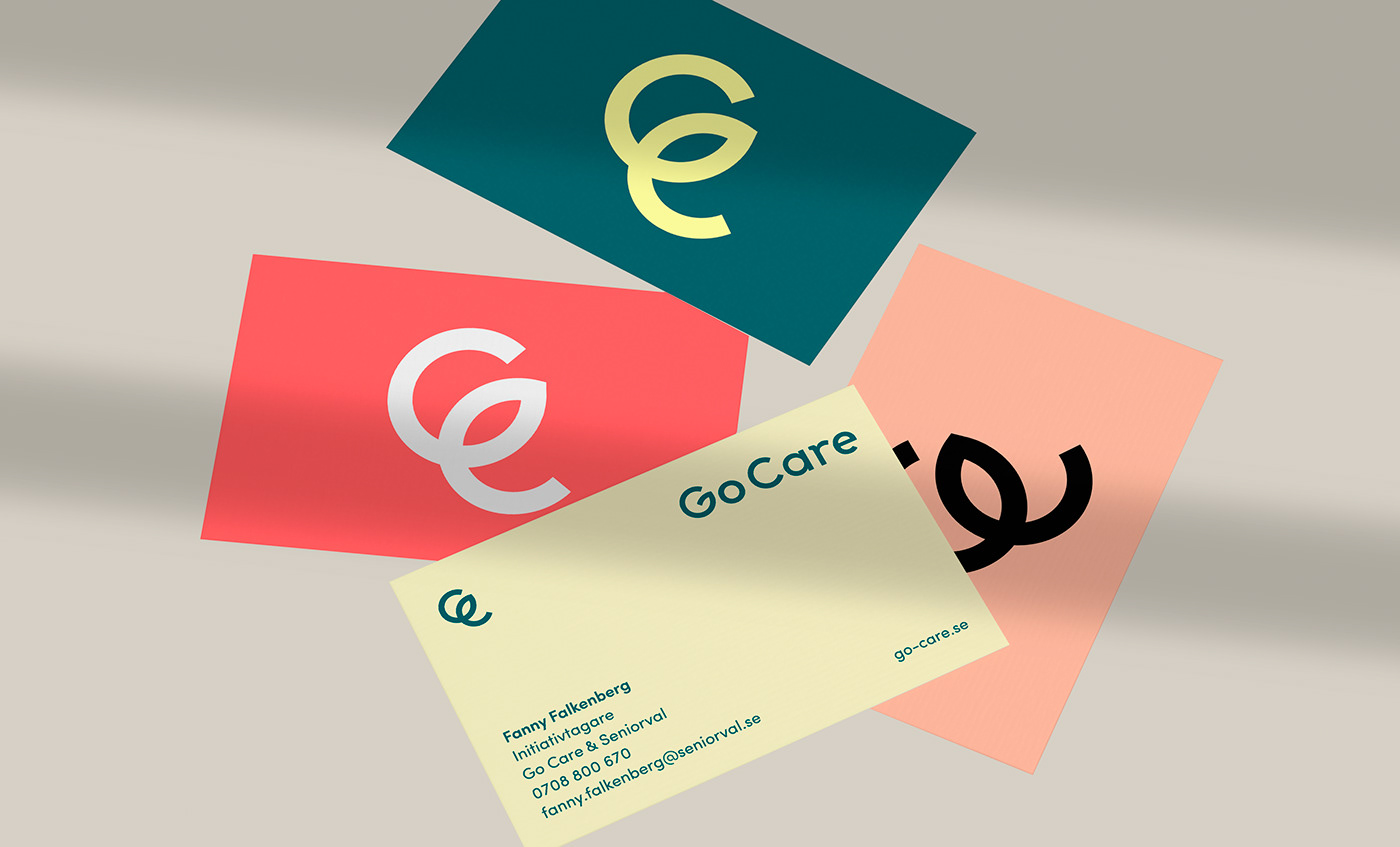
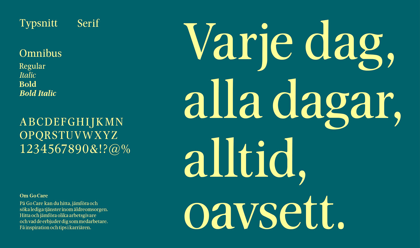
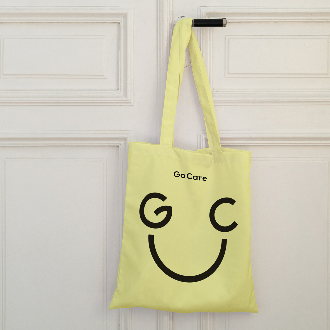
The visual identity developed for Go Care includes a variety of brand elements such as the symbol, logotype, color palette, and supporting illustrative icons. The design strategy focused on making the brand appealing to a younger audience while maintaining a sense of warmth and humanity. This approach ensures that the brand not only stands out but also resonates with its target audience.
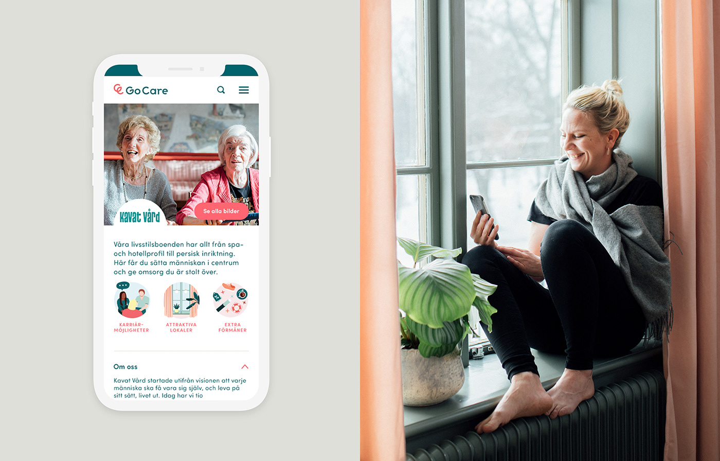
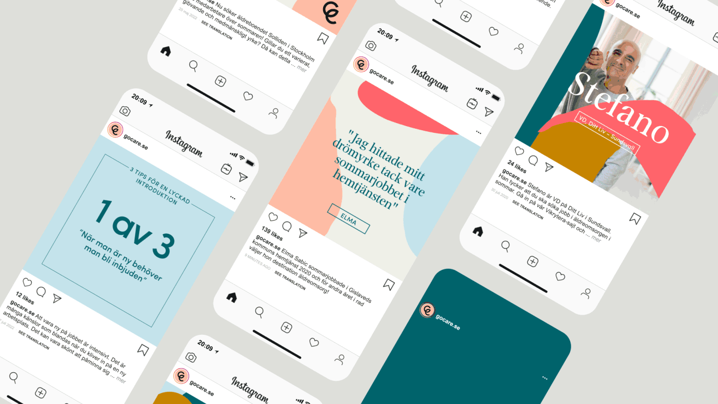
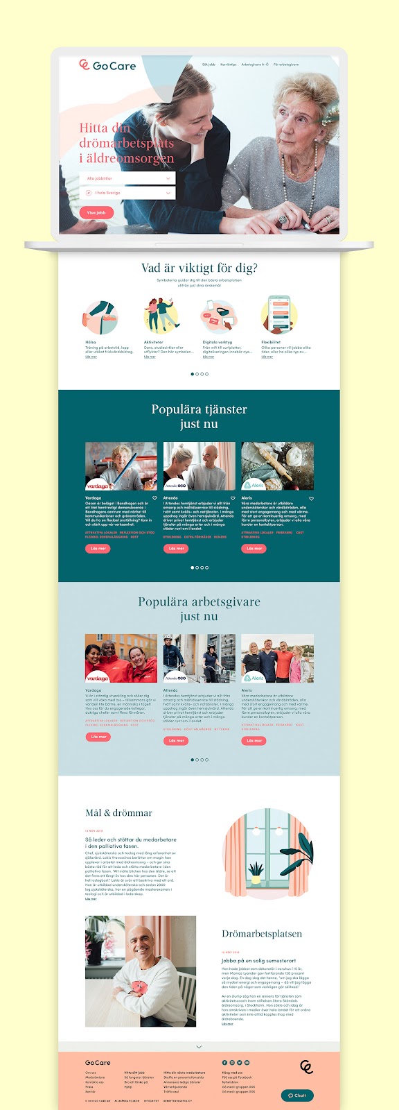
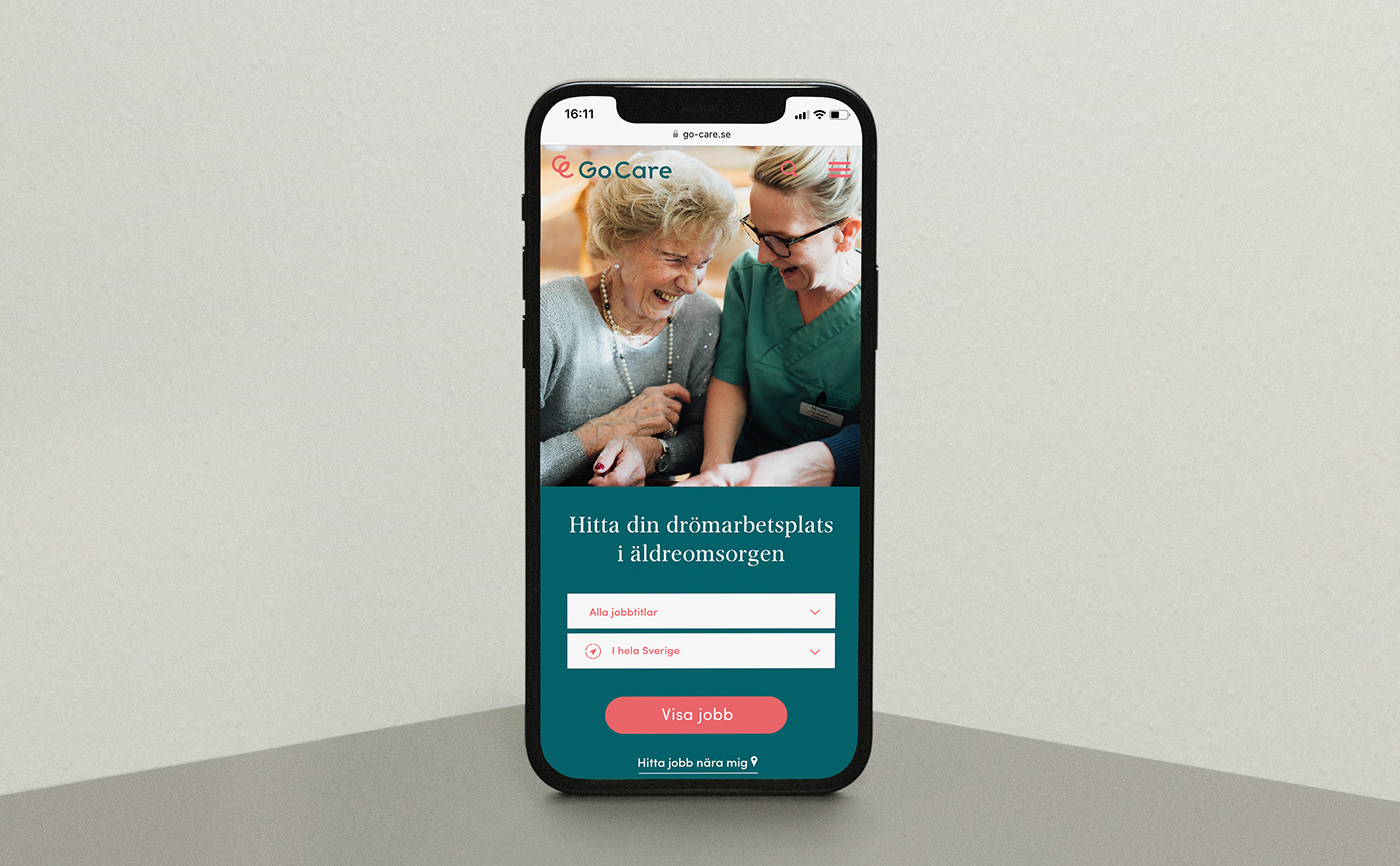
The brand identity guidelines were meticulously crafted, providing a comprehensive framework for consistent application across various touchpoints. These include the website, designed for both desktop and mobile platforms, as well as event and social media templates. Each element of the design was created to ensure a cohesive and engaging experience, whether viewed online or in person.
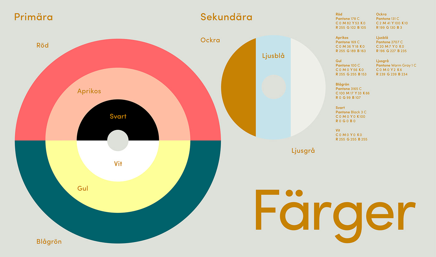
Czarnecki’s use of color is particularly noteworthy. The palette is bold yet approachable, designed to evoke positive emotions and a sense of inclusiveness. The supporting illustrative icons add a playful yet professional touch, reinforcing the brand’s friendly and accessible nature.
The logotype is clean and modern, yet it retains a sense of warmth that aligns with the overall mission of Go Care. This balance between modernity and approachability is a key aspect of the brand’s visual identity, making it both distinctive and relatable.
Overall, the branding and visual identity for Go Care successfully attract younger talent to the elderly care sector. Magdalena Czarnecki’s design effectively communicates the values and mission of Go Care, ensuring that the brand stands out in a meaningful and impactful way.
Branding and visual identity artifacts


Credits
- Go Care Identity – 2018
- Art Direction & Design: Magdalena Czarnecki
- Illustrations: Katarina Fegraeus
- Photography: Malin Mörner


