Display Typography Design: High-Contrast Brutalism
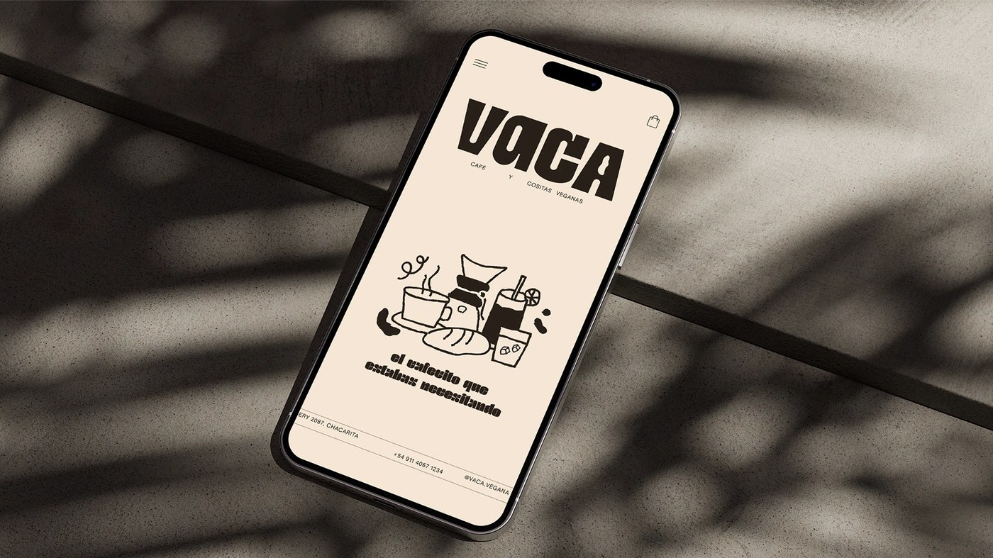
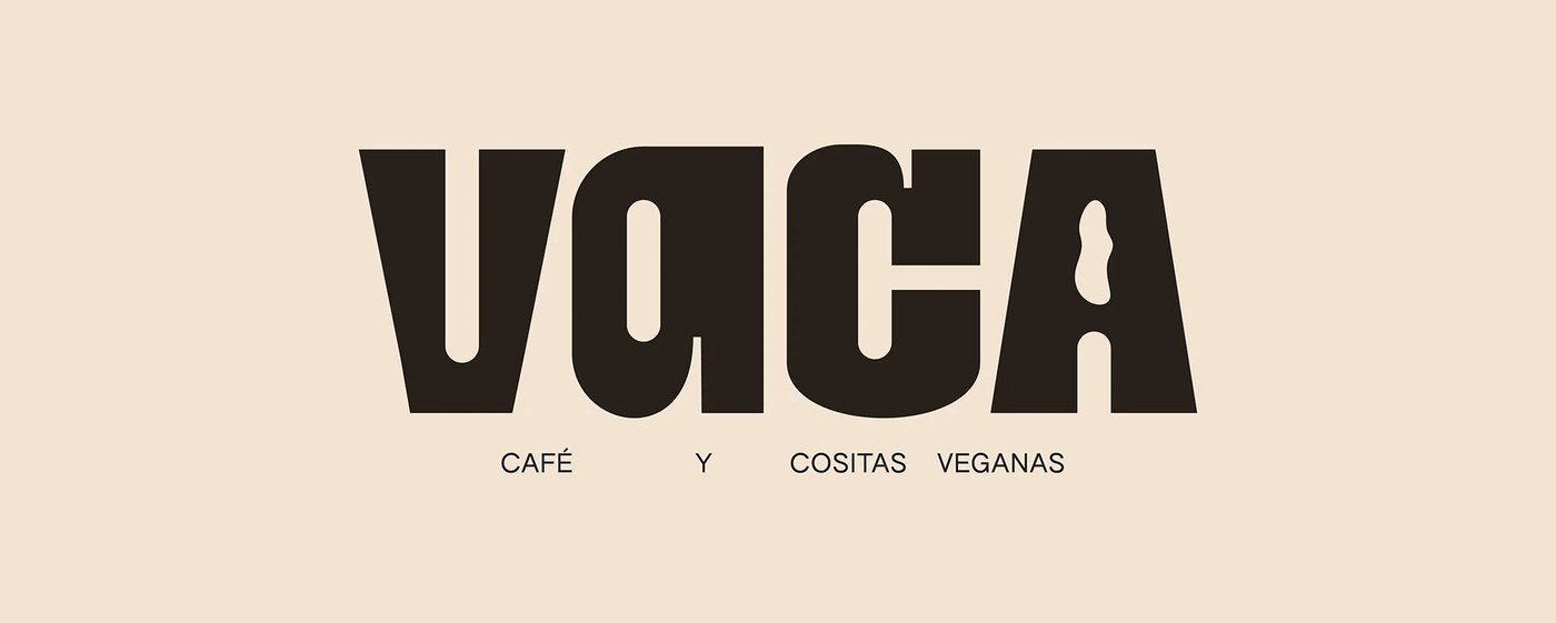
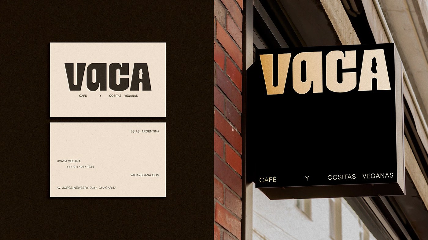
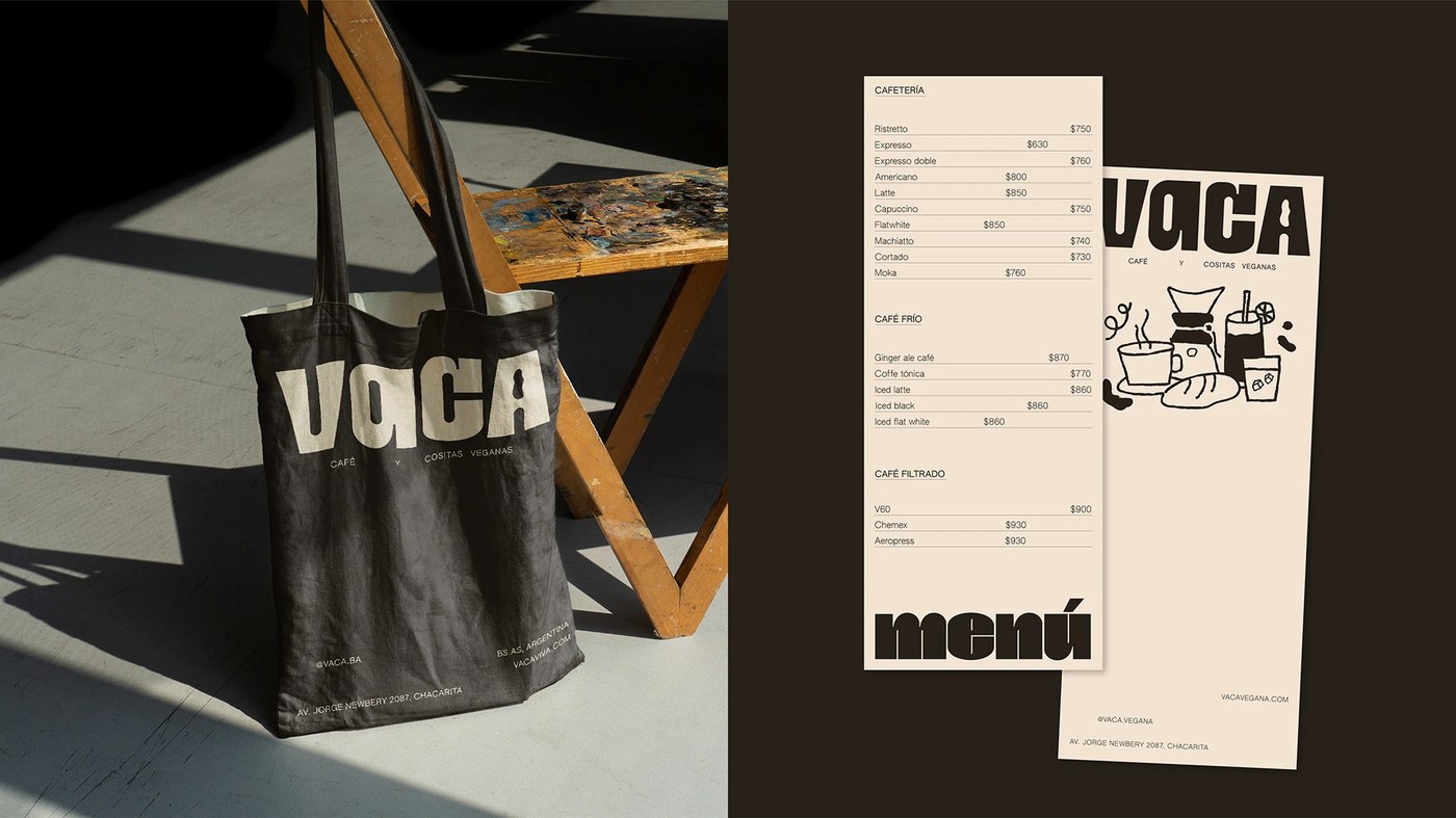
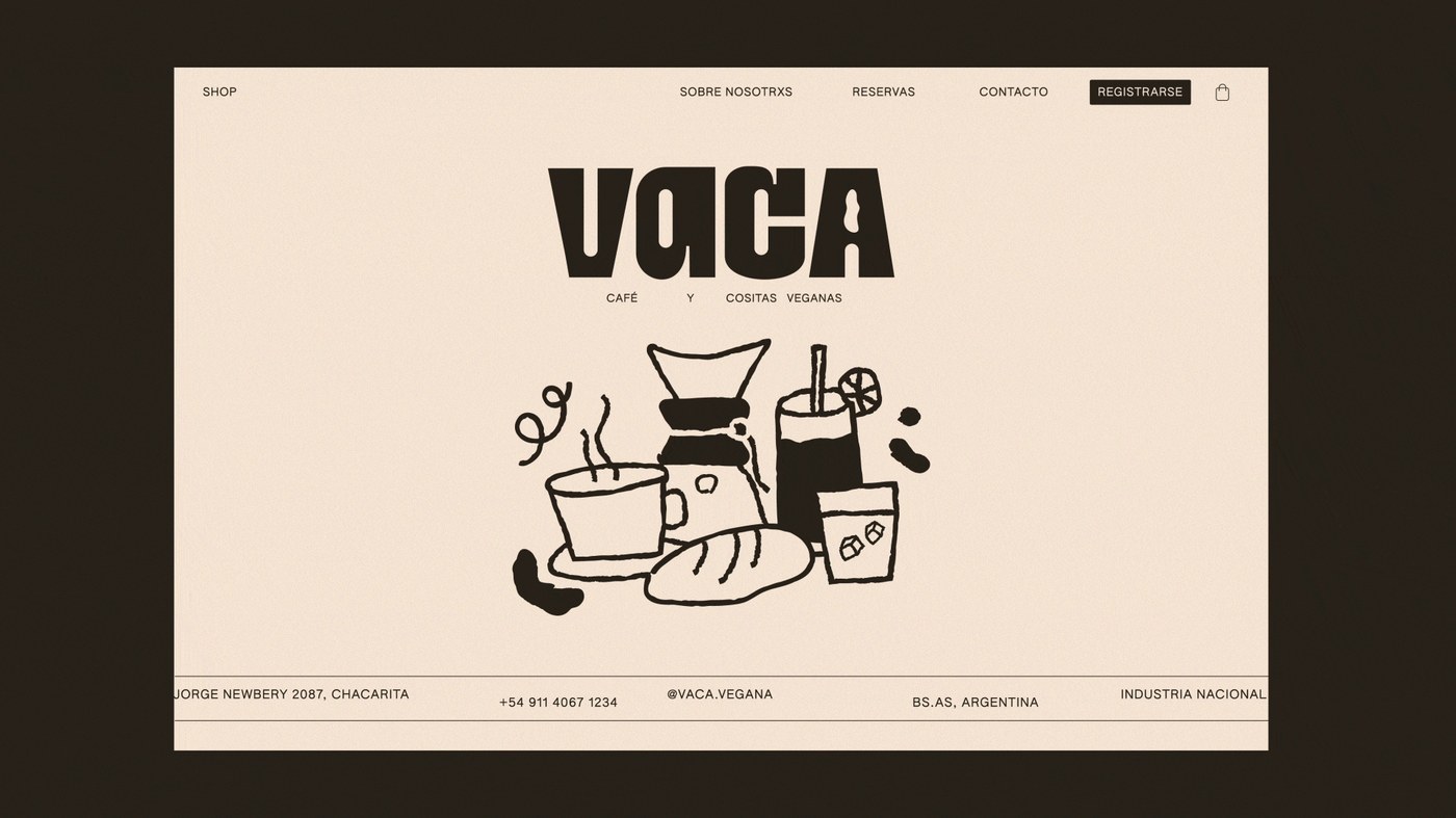
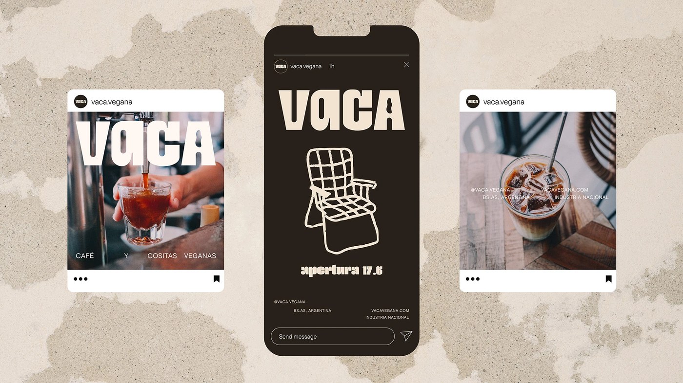
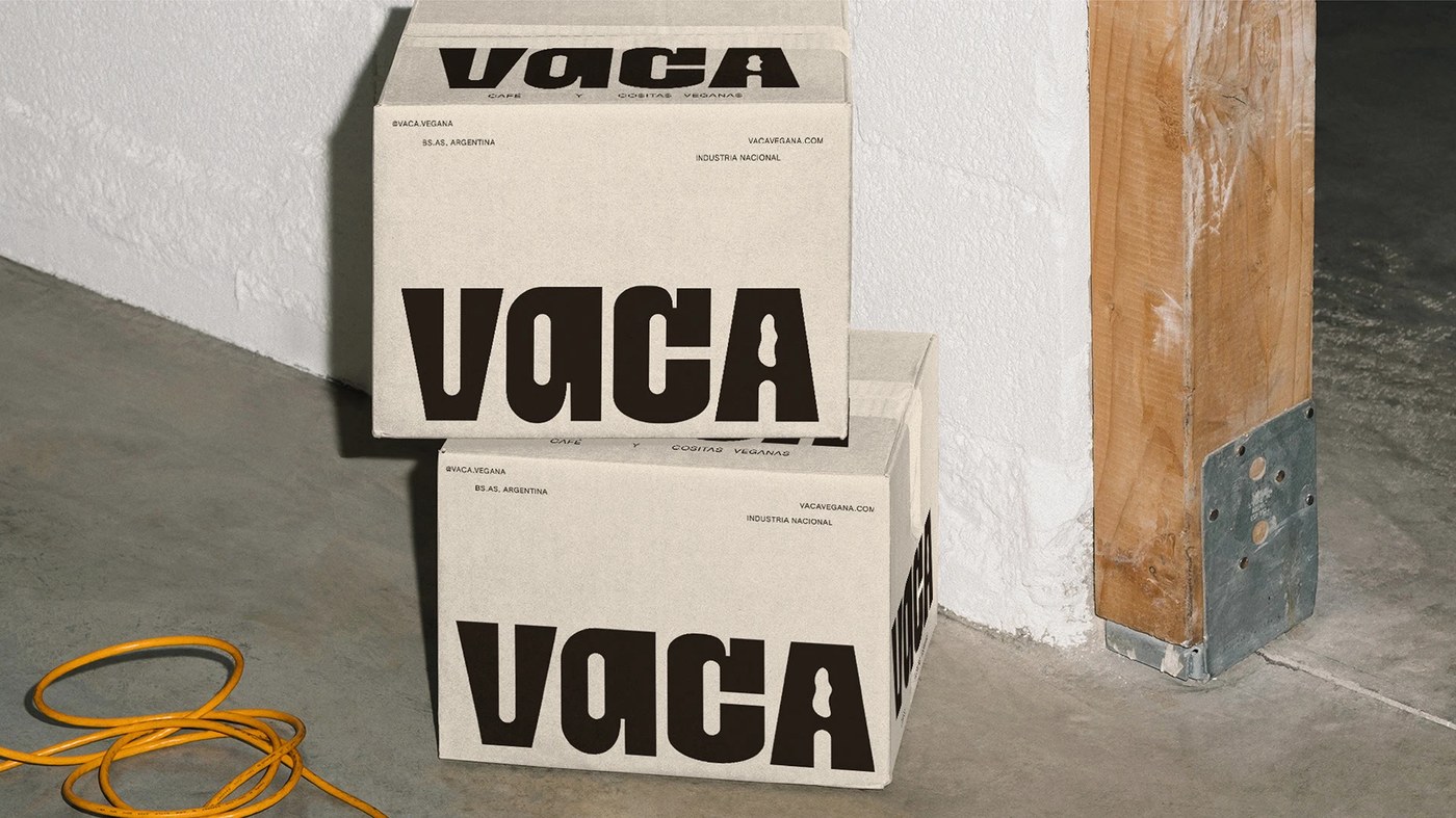
Bold, oversized characters dominate a visual identity that prioritizes high-contrast scales and expressive letterforms. This approach to display typography design relies on extreme weight variations to establish a recognizable brand language. The system uses tight kerning and structural outlines to command attention across different media formats.
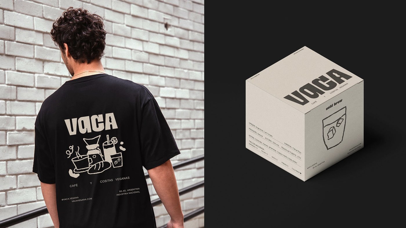
Black ink meets stark white space in an intentional play of heavy mass against emptiness. Micaela Gushiken centers the identity around these exaggerated proportions, using thick strokes that feel almost sculptural. The studio focuses on how massive letterforms interact with negative space to create a hierarchy that works even when the text is partially cropped. A deep black and crisp white palette ensures the primary visual driver remains the shape of the characters rather than decorative elements or complex patterns.
Exploring expressive display typography design
The identity relies on heavy-set typefaces that stretch across the composition to reads as structural scale. Micaela Gushiken utilizes these large-scale glyphs in various layouts, sometimes layering them to change their perceived weight and presence. In one frame, an outline version of the typeface provides a lighter counterpoint to the solid black versions seen elsewhere. This interplay between filled shapes and hollow outlines allows for flexibility when applying the brand to different surfaces or digital screens without losing its core typographic character.
The system functions through a strict adherence to these geometric forms and their spatial relationships. Micaela Gushiken applies the heavy type to various layouts, where the sheer size of the characters becomes the primary graphic element itself. By treating text as an image rather than just information, the studio ensures that even simple wordmarks carry enough visual weight to act as standalone icons. The resulting system is built on how these massive shapes occupy space and interact with their margins.
See the full project by Micaela Gushiken on Behance.