Dutch Film Days Festival Branding by DE_FORM
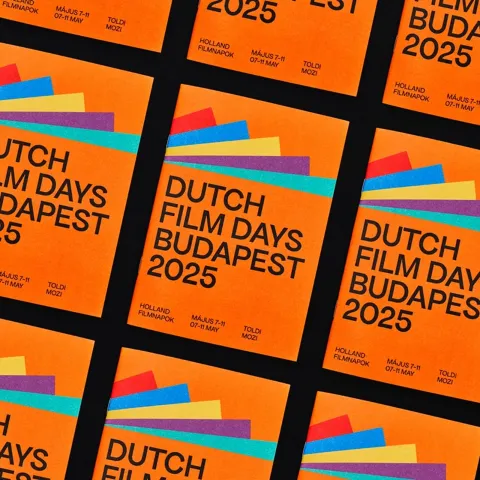
Color does two jobs here. DE_FORM took Dutch orange — the national signal, impossible to miss — and built a six-color system around it. Each of the five festival days gets its own hue. The result is a Dutch Film Days festival branding structure where the program schedule and the visual language are the same thing. Not parallel systems running beside each other. The same system. Posters, social media, printed collateral, and signage all pull from the same palette, so the color tells you where you are before you read a word. The sans-serif typography carries weight without ornament — one confident scale, clear hierarchy, no decoration pulling focus from the color work. When a system runs this clean, nothing needs to explain itself.

Dutch Film Days Festival Branding: Color as Navigation
The brief was specific: first edition of a Dutch cinema event held in Budapest. That gap — Dutch culture landing in a Hungarian context — is exactly where an identity can go wrong. DE_FORM solved it by anchoring hard on Dutch orange. Not as background tone. As the lead element. Orange earns its authority first, and the five secondary colors follow. The palette coheres because the relationships are structural, not decorative — each hue occupies a defined role in the program rather than existing for aesthetic variety. The system is designed to expand: each future edition of Dutch Film Days can absorb new colors without breaking what came before. That kind of structural thinking is what separates festival branding from festival decoration. The identity holds because it was built to carry more than one year.
What makes this Dutch Film Days festival branding work at the first-edition level is restraint. A new event in a foreign city could easily over-explain itself — more copy, more concepts, more visual noise. DE_FORM did the opposite. The orange leads, the Dutch Film Days festival branding structure does the talking, and the system leaves room to grow.