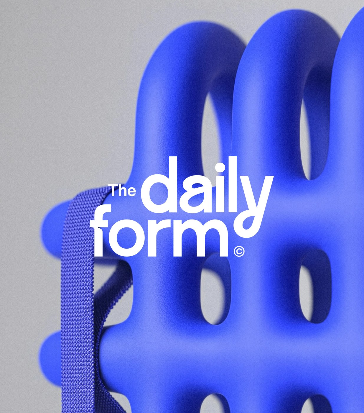
Dynamic brand identity rotating color system: The Daily Form
The Daily Form relies on a dynamic brand identity rotating color system. Souto and Armanini designed this framework to adapt to constant visual changes.
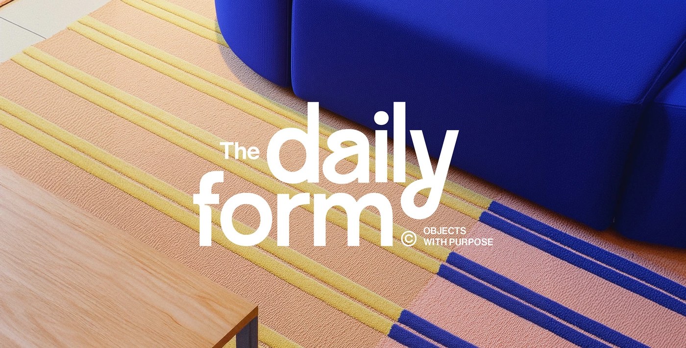
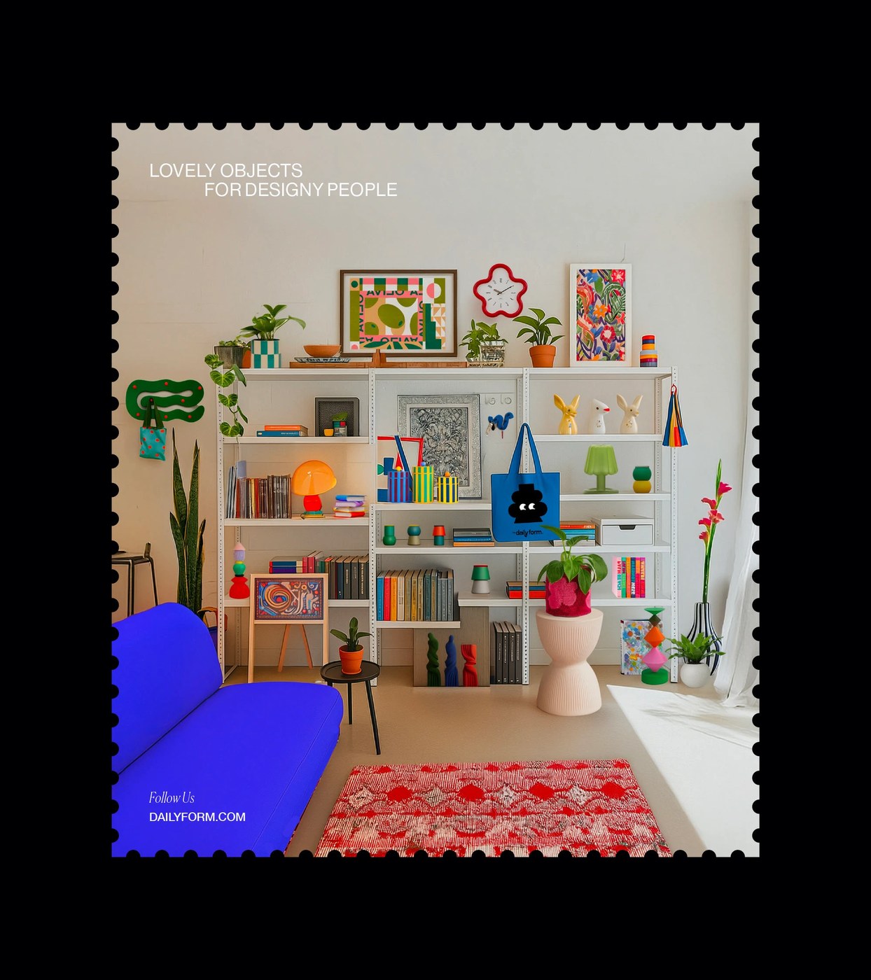
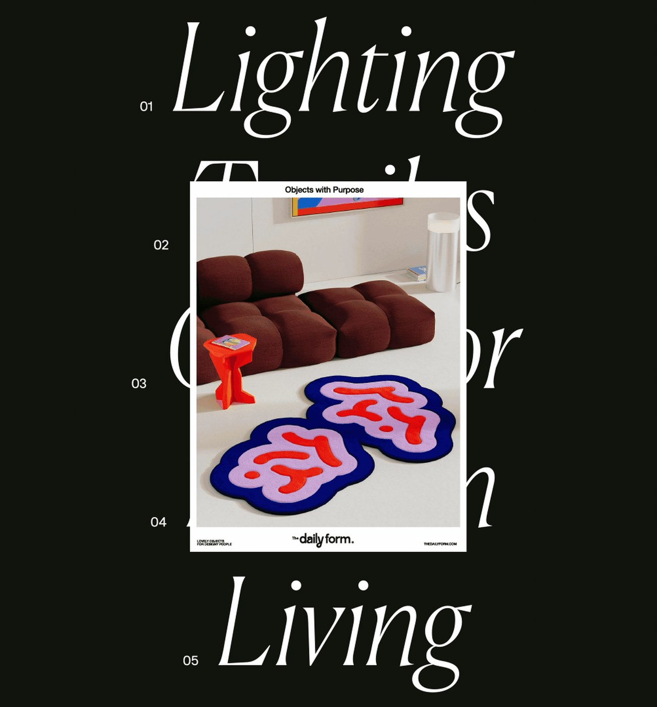
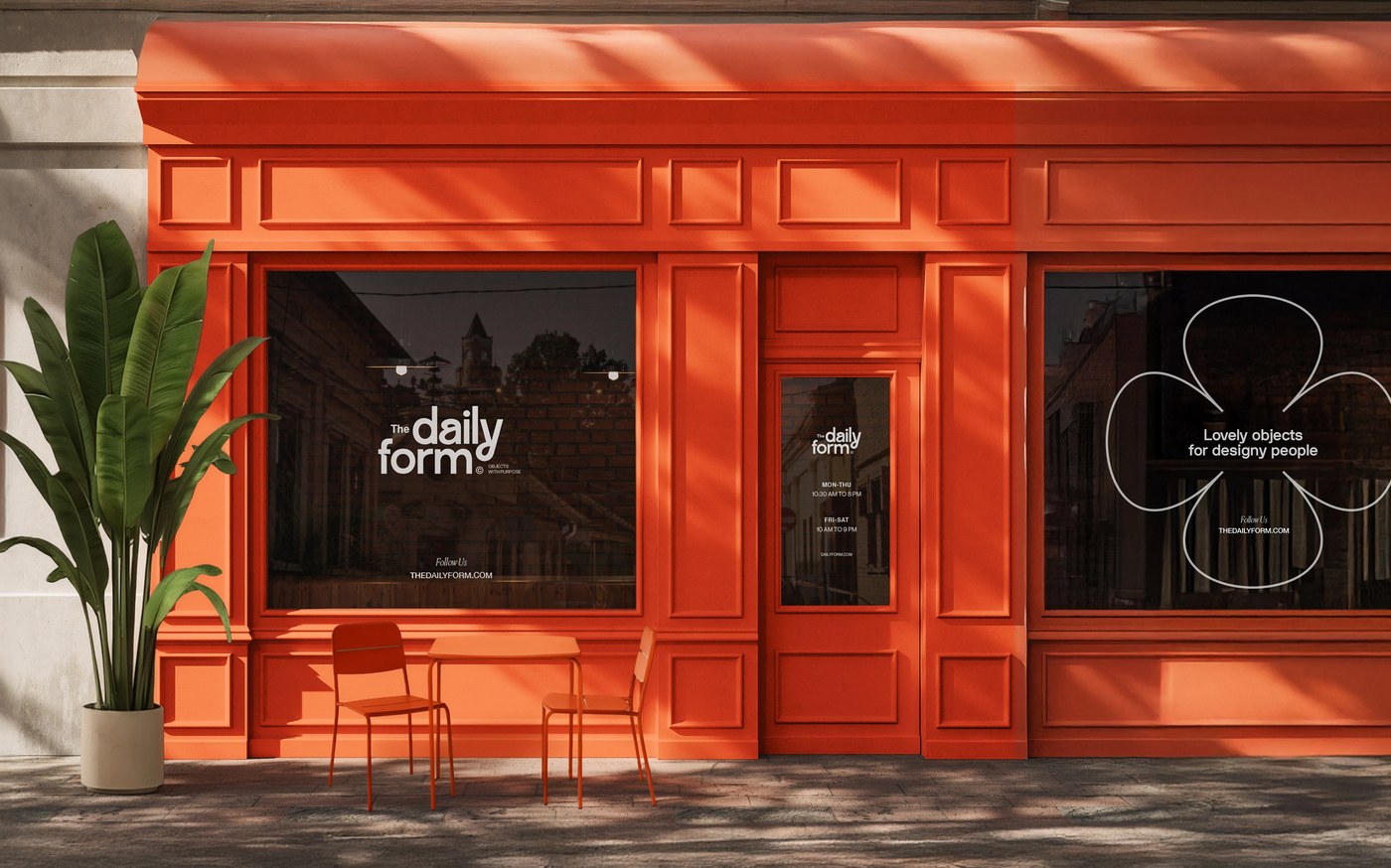
The layouts use a clear grid. This structural hierarchy organizes all physical and digital spaces. Tactile contrast is key. Smooth type balances against raw texture of wood tables. The layout is not static. Shapes scale with the type across many products. This maintains alignment and structural unity. A stamp border frames each scene. This border adds a playful touch. Every item feels tactile. The design uses negative space to build tension.
Implementing a Dynamic Brand Identity Rotating Color System
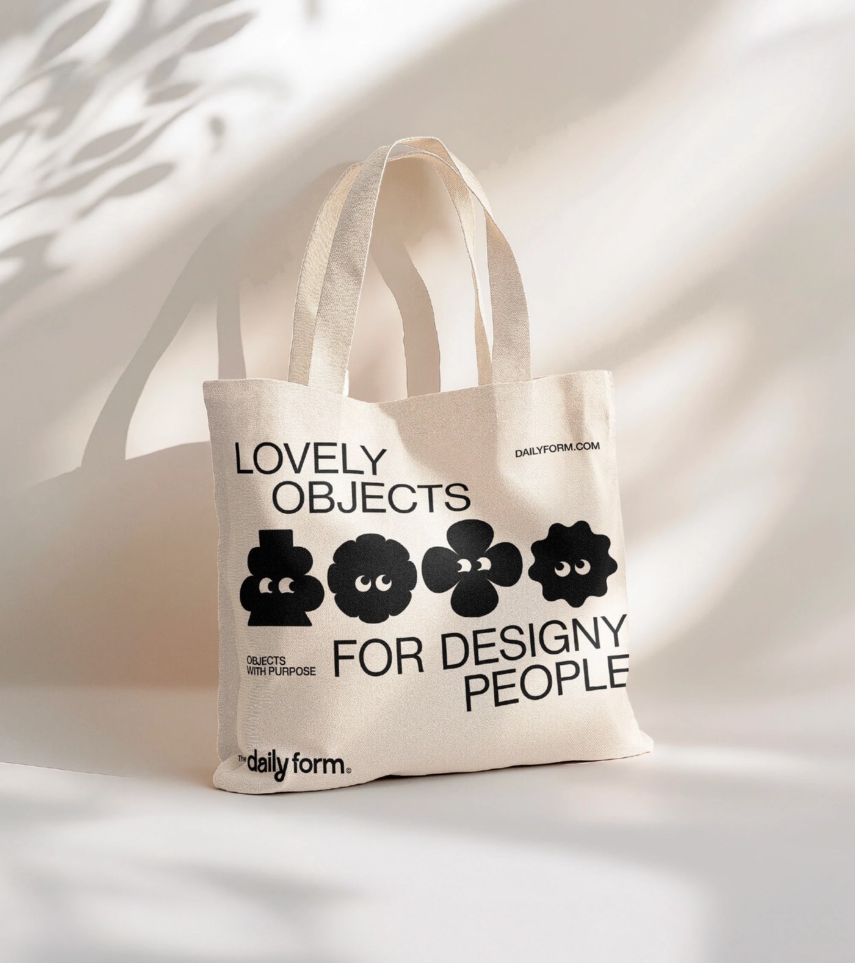
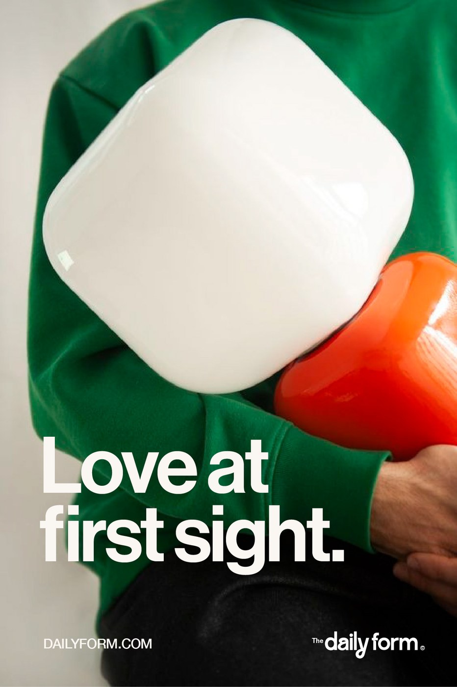
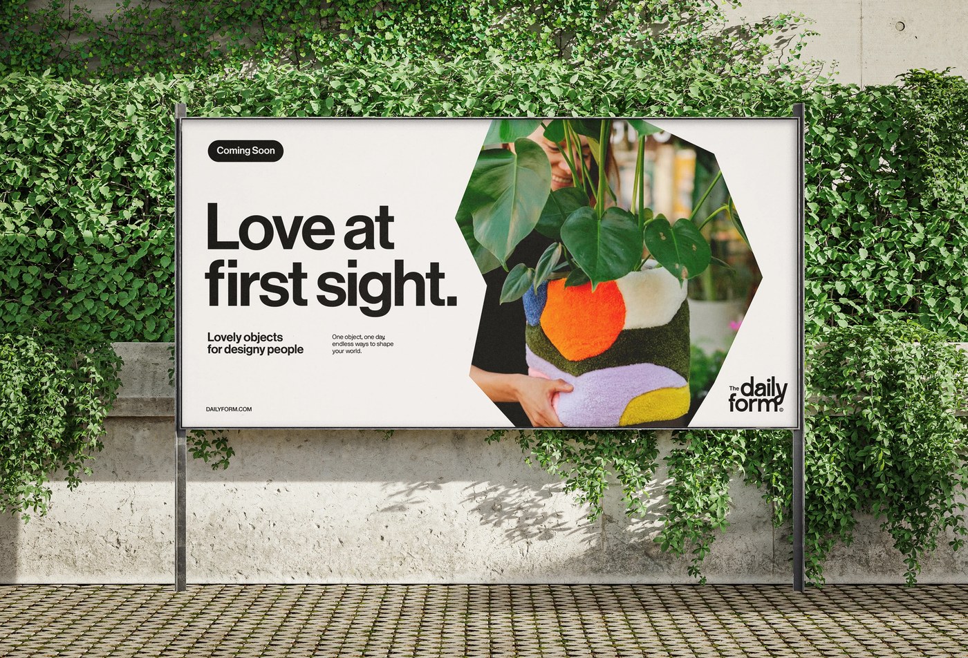
A dynamic brand identity rotating color system shows change. A rotating palette shifts across various objects. The items feature bold colors. The art uses friendly drawings. The type has rounded ends. It makes a clear visual rhythm. Each part feels deliberate. Monograms and stamp borders add a physical feel to the shop. The color palette shifts from warm yellow to deep blue. A bold flower graphic sits on a wall print. A black cloud icon marks the blue tote bag. Checkered boxes hold small cups on the shelves. The team uses a dynamic brand identity rotating color system across mediums. These include bags, posters, and web banners. Color shifts keep the brand fresh.
Designing for a fake store lets creators try new ideas. Souto and Armanini show the power of change. The identity acts as a curated object. It makes the store a leader in taste. The result uses geometric restraint. It balances open access with a special feel. The team uses simple shapes. They mix these shapes with playful drawings. The style recalls mid-century posters. Yet it feels fully modern.
More details can be found on Florencia Souto and Nano Armanini.