by abduzeedo
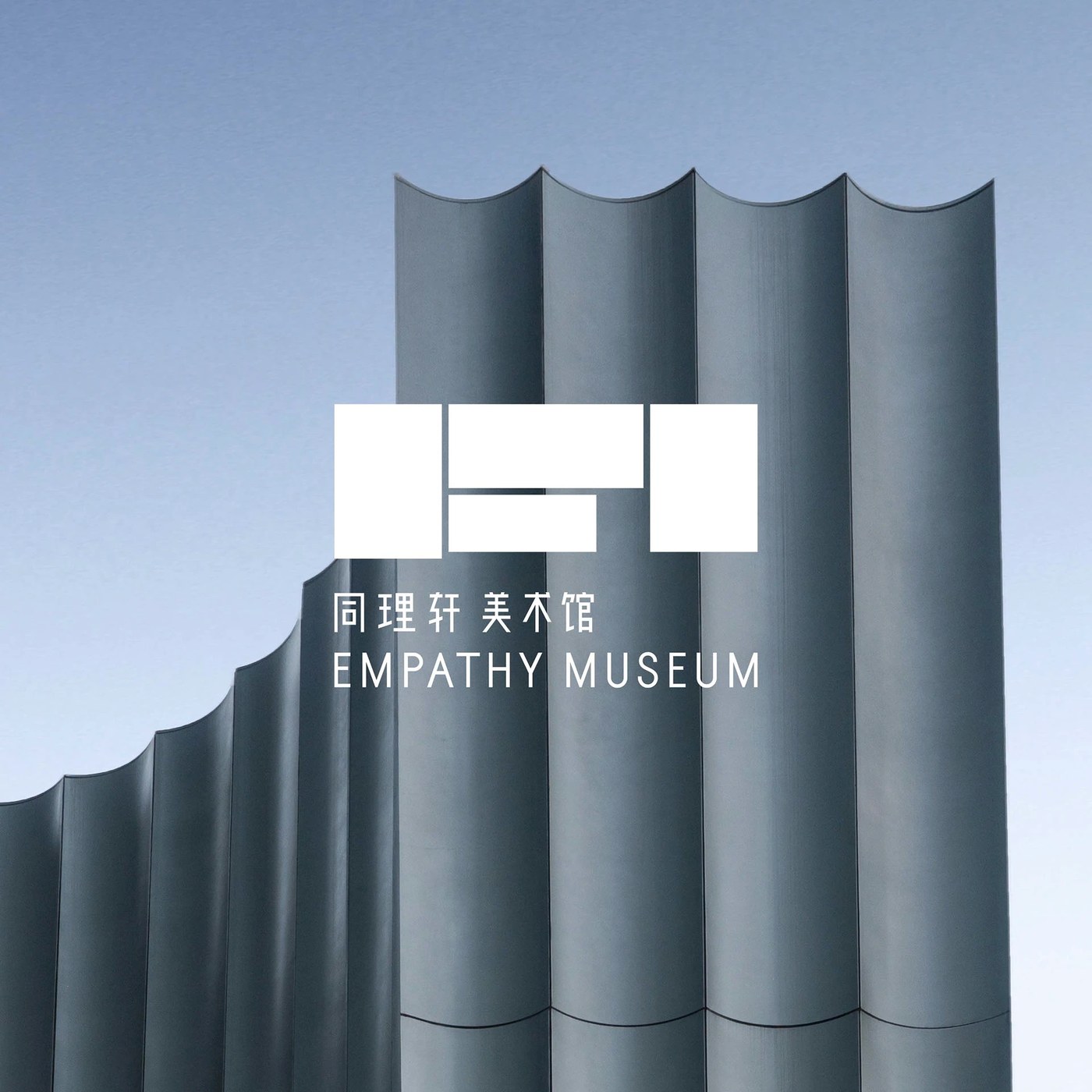
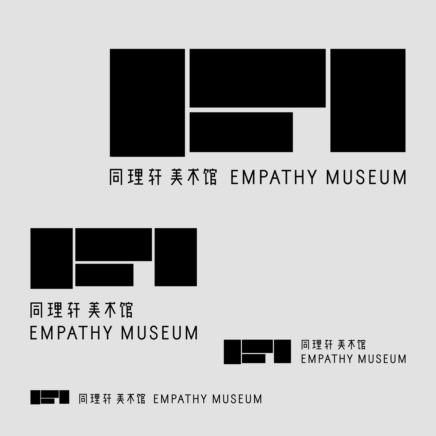
Han Gao’s Empathy Museum branding derives its logomark from the Chinese character 同, resolving the character’s skeleton into a geometric, bilingual mark.
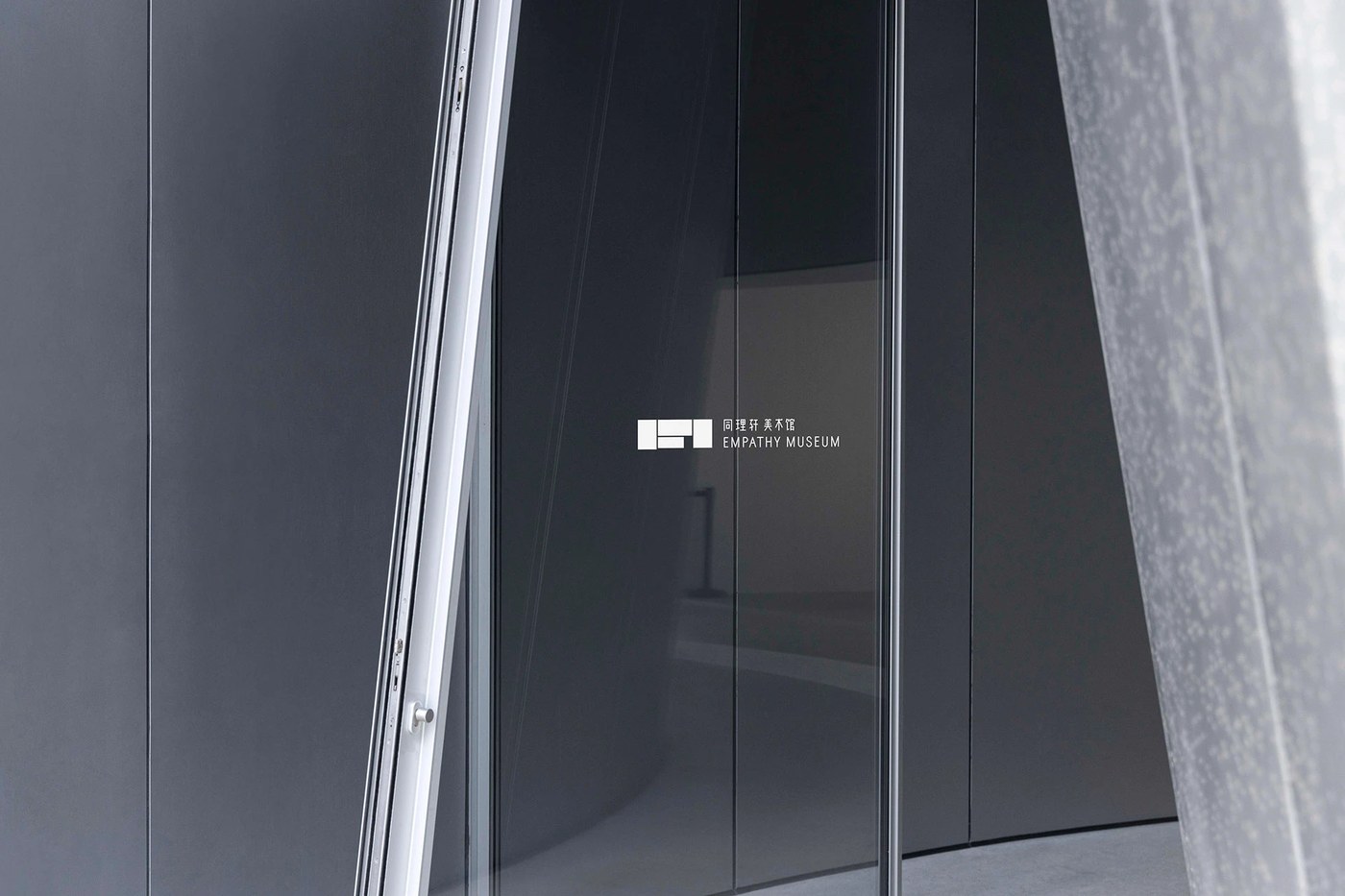
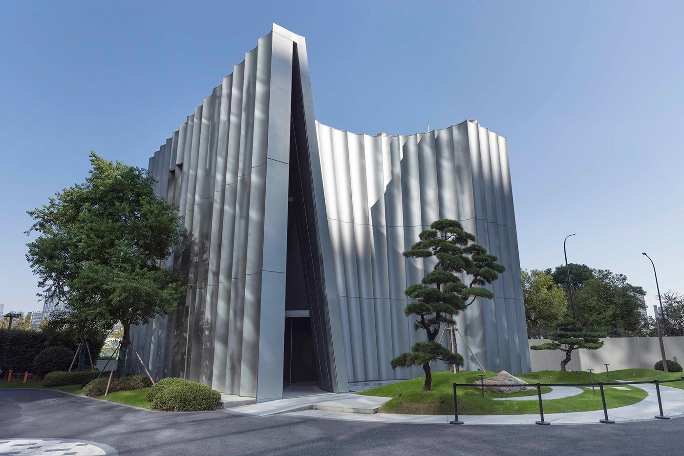
The mark is five white rectangles — two tall verticals flanking a stepped central cluster — set on a cool grey field. At full display size it reads as a confident geometric logo. At 80mm on a dark glass entry door, silk-screened white, it holds just as cleanly. The same Empathy Museum branding structure appears reversed white on the museum’s corrugated silver-grey metal facade, where the building’s fluted surface texture rhymes with the mark’s rectangular rhythm. Three scales, one reference sheet, no decoration: the identity system is essentially a proof.
Empathy Museum Branding: One Character, Two Scripts
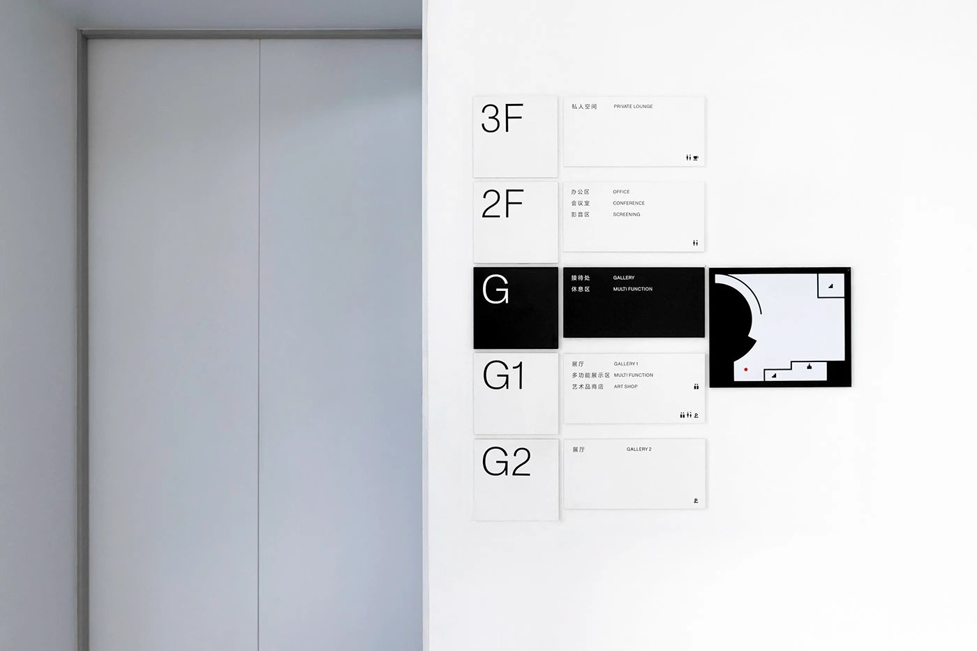
Han Gao’s wayfinding extends the same logic — modular white acrylic panels, large geometric sans at floor designator scale, one black inversion panel for the ground gallery. The bilingual wordmark pairs Chinese characters and Latin caps at two distinct sizes, never competing. Most bilingual identities run two parallel systems and call it done. The Empathy Museum branding finds the geometry both scripts already share instead. That geometry is 同 — and it was there all along.
See the full Empathy Museum branding project by Han Gao on Behance.