FH Premier Collection: A Grotesque Font Family by Fatih Hardal
Turkey-based Fatih Hardal's FH Premier is a grotesque font family spanning three subfamilies and six weights, built for signage, transport and editorial.
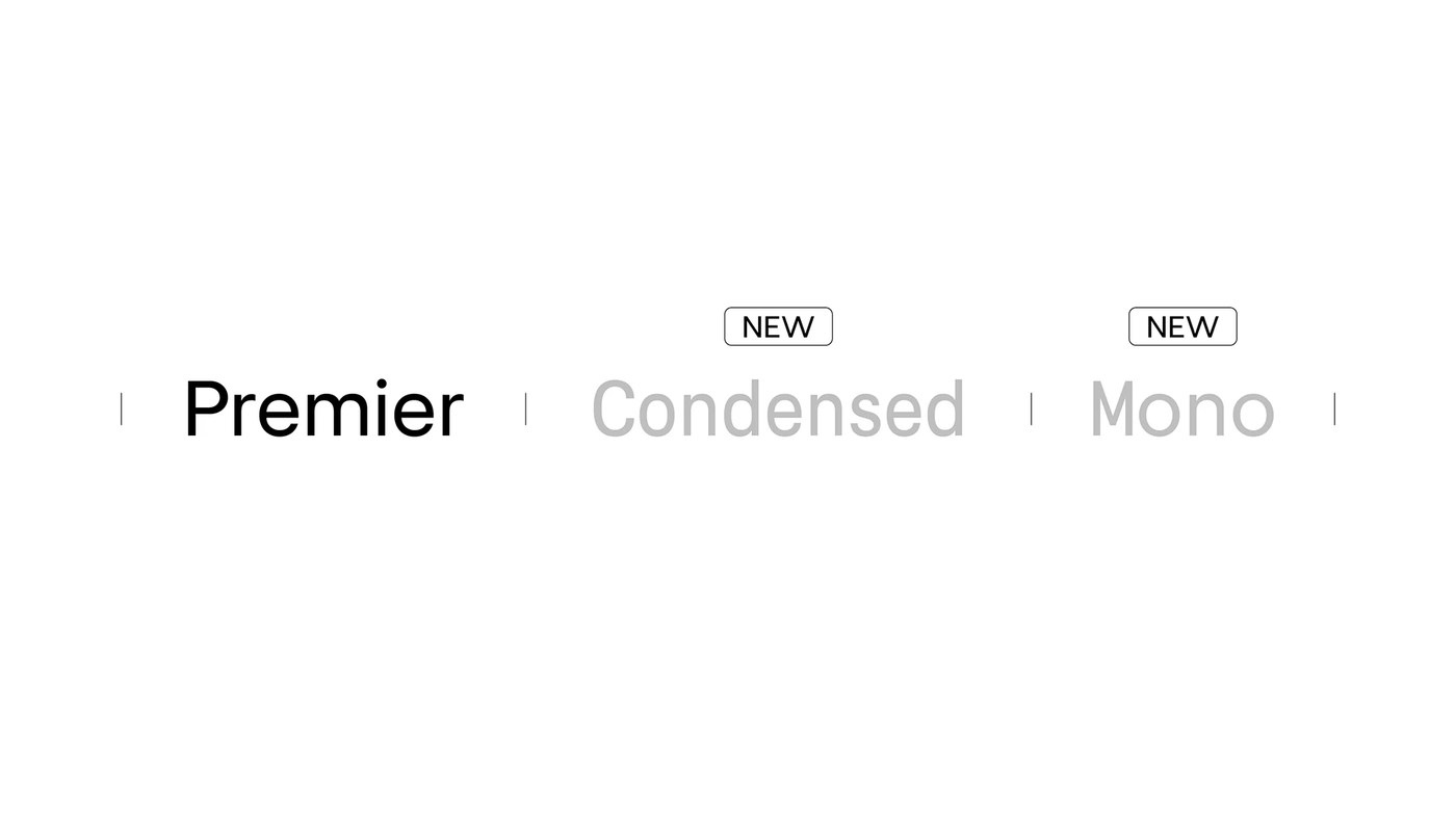
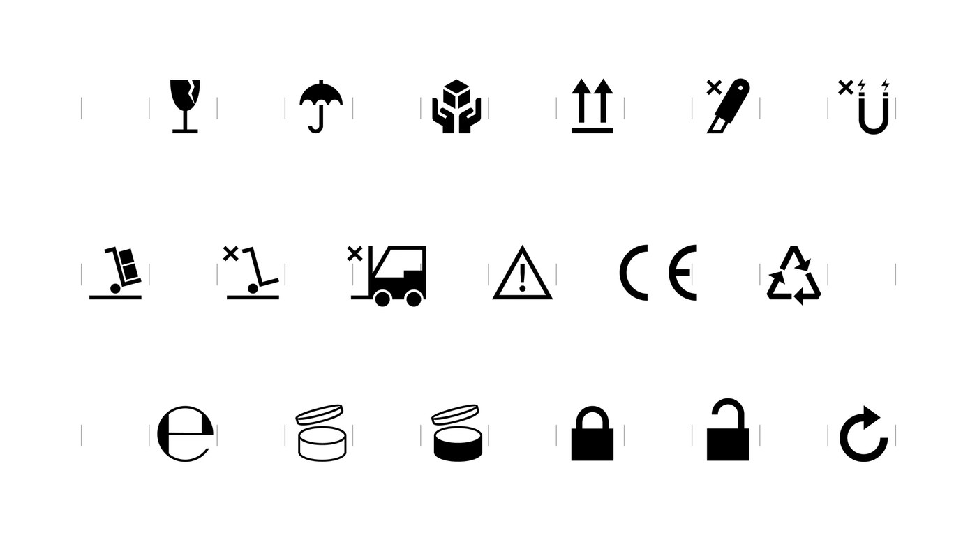
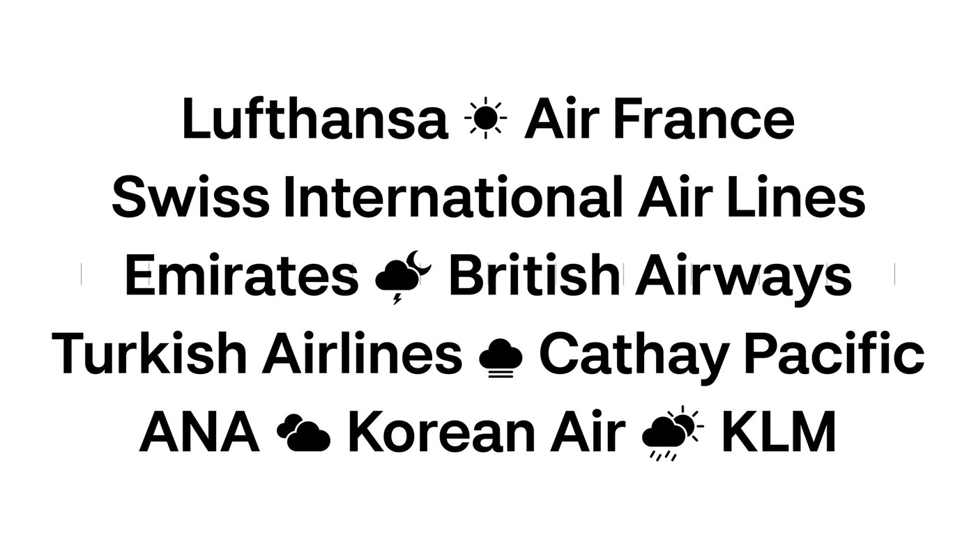
The hero image puts the case plainly: black letterforms — a double-story 'g', a wide 'a', the curve of a capital 'E' — set at roughly 200pt alongside gray transit glyphs (a bicycle, a parking 'P', currency signs), all on white. The grotesque font family pulls its structure from Akzidenz Grotesk and mid-century modernist precedents, but the weight range, Light 300 through Black 900, gives it more latitude than its 19th-century forebears. The three subfamilies — FH Premier, FH Premier Condensed, and FH Premier Mono — share the same optical logic. A wayfinding specimen makes the use case concrete: "GATE K19 / FLIGHT AA0046" and "CHICAGO ORD — LONDON LHR" set in Black weight with a mid-gray directional arrow. The type holds at display size without apology.
FH Premier Grotesque Font Family: Three Subfamilies, Six Weights
Hardal also built in four OpenType stylistic sets — single-story and double-story alternates for 'a' and 'g', dotless 'i' and 'j', umlaut variants — so the grotesque font family adapts to tone without switching faces. Brand context specimens set "Braun Leica Olivetti" in a mixed-weight horizontal line and "USM Haller / Ligne Roset / Herman Miller" in medium gray, locating FH Premier within precision industrial heritage. The family ships in OTF and WOFF2, available exclusively from Typografische.com.
See the full grotesque font family project by Fatih Hardal on Behance.