Footer Design Inspiration: The Only Gallery on Earth
Explore Footer.design by NOOON Studio, the world’s only gallery for website footer design inspiration. Discover a curated vault of unique UX styles, from bold typography to interactive grids.
Most designers treat the footer as an afterthought. After the hero, the features section, the testimonials, and the call to action, the footer gets whatever is left — a copyright line, a few nav links, maybe a social icon row. The result is a graveyard of missed opportunity.
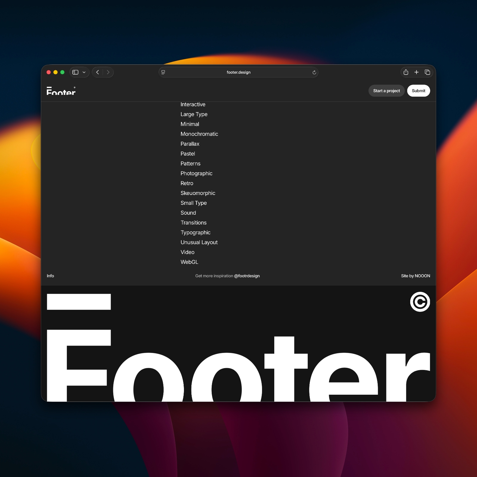
Footer.design exists to fix that thinking. Built and maintained by NOOON Studio, it is a curated gallery focused entirely on one thing: the footer. The site calls itself the only footer gallery on earth, and that claim holds. Nothing else online catalogs footer design at this scale or with this level of editorial care.
The collection is organized by visual approach rather than industry or brand. The navigation runs through categories like Typographic, Small Type, Illustrative, Grid, Flat, Animated, Cards, Bright, Dark, and Large Type. That taxonomy is itself a design statement. It reframes the footer not as a functional leftover but as a design zone with its own vocabulary, and it gives designers a language for discussing what they are actually trying to achieve.
Looking at the featured entries makes that vocabulary concrete. Nabhi Shah's footer fills the entire canvas in electric blue. A handwritten signature sits center stage above a "Let's Get in Touch" label, with social links arranged in a clean pill-shaped button. The warmth of the handwritten gesture against the flat saturated ground creates a personal tone that most designers would be afraid to put anywhere other than the about page — but here it anchors the site's final impression.
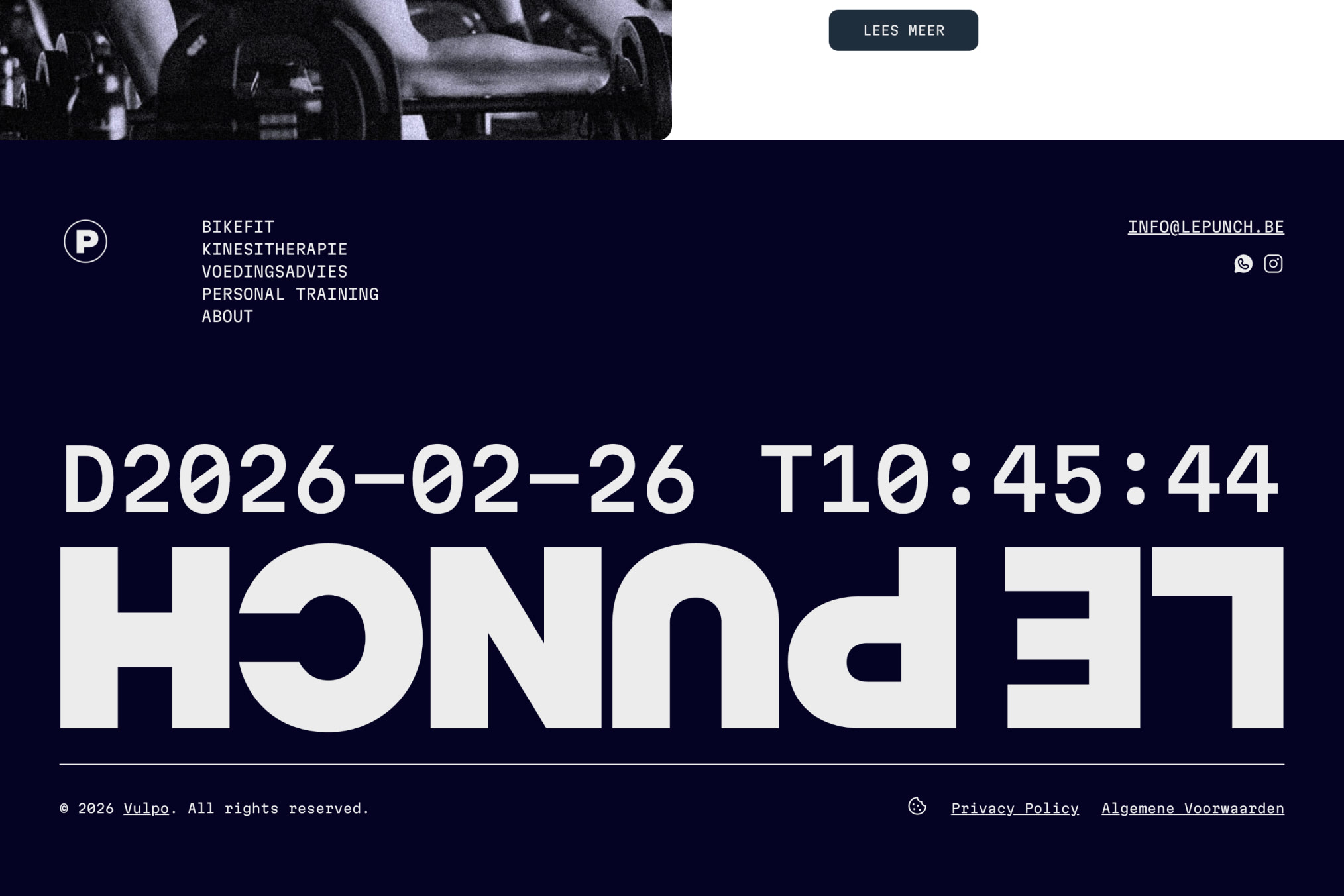
Le Punch takes a completely different path. The Belgian brand's footer runs a live timestamp in monospaced type at full width, with the brand name set in a massive condensed grotesque and flipped vertically — so it reads upside down below the horizon line. The effect is disorienting in a calculated way. It communicates that the site is dynamic and technically confident without saying so in copy.
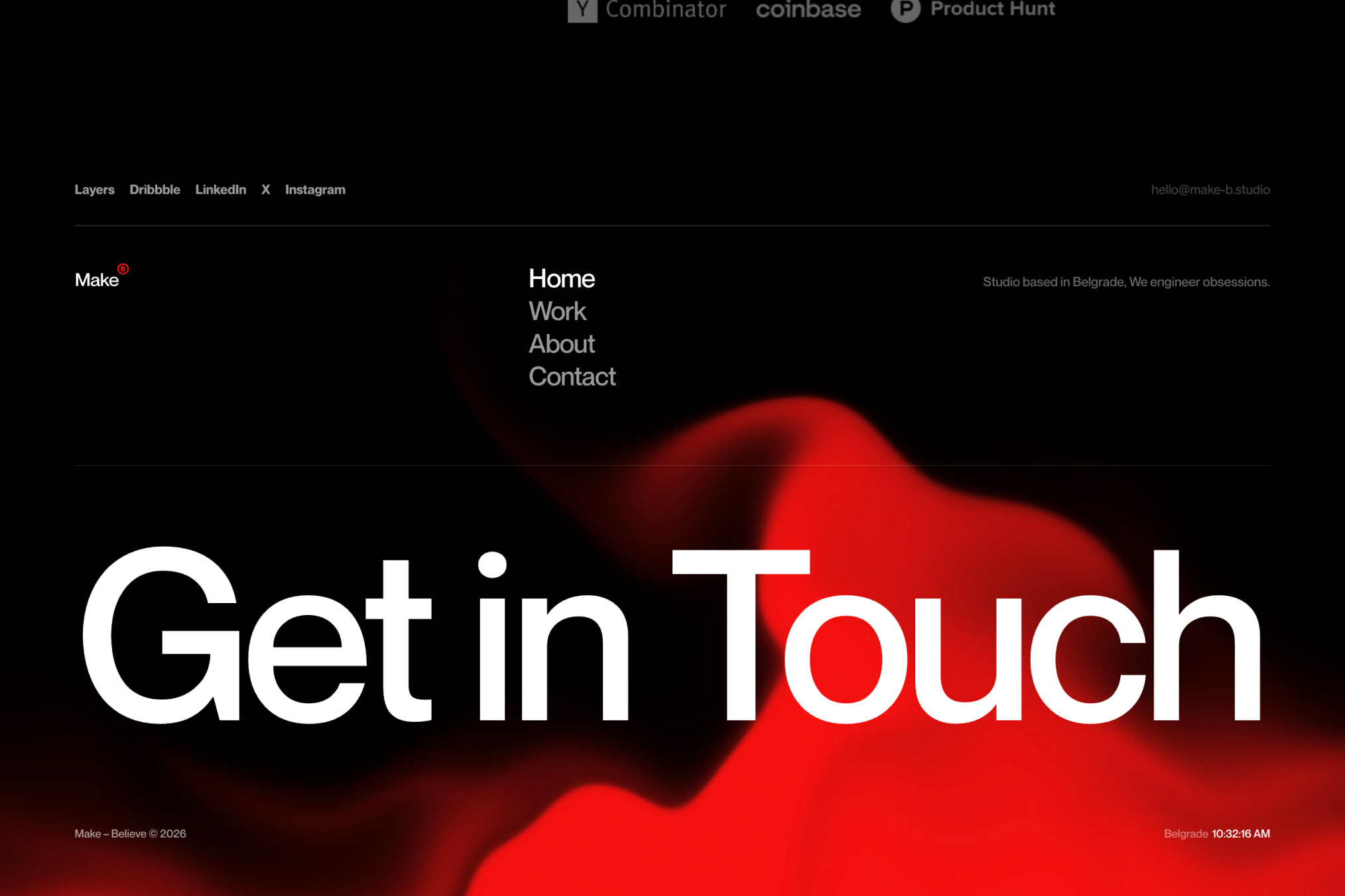
Make-Believe, a studio based in Belgrade, uses the footer as pure atmosphere. A black field, a red volumetric gradient blob bleeding from center, and a single line of heavy sans-serif type reading "Get in Touch" scaled to the full browser width. No links below the fold. No columns. The simplicity is load-bearing.
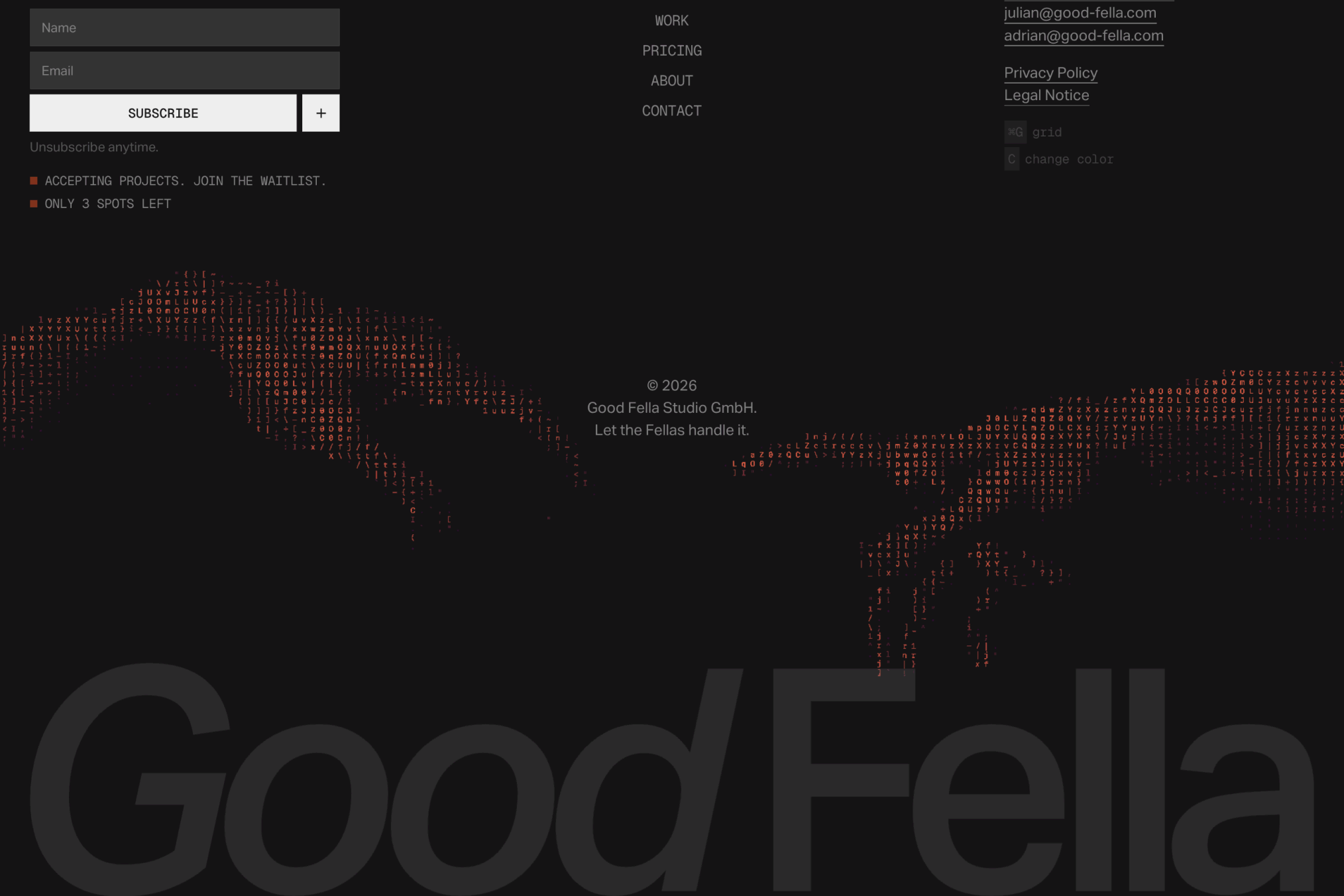
Good Fella's footer pairs an ASCII art creature — rendered in scattered orange-red characters against near-black — with the studio name blown up to fill the entire lower frame as a ghosted watermark. The structural hierarchy is inverted: the decorative element is louder than the functional one, and the brand name functions as texture rather than label.
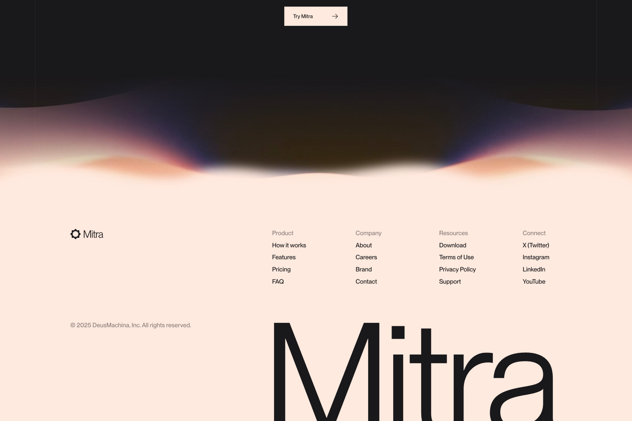
Mitra shows the opposite end of the spectrum. A warm cream background, a soft gradient haze fading in from the top edge to signal a content transition, and a four-column navigation grid laid out in light-weight type. At the bottom, "Mitra" is set in an enormous black wordmark that bleeds off-frame. Serious, orderly, and still typographically memorable.
What Footer.design does well is surface the range. Seeing these approaches side by side makes it easier to make intentional choices. The difference between a typographic footer and a dark footer is not just aesthetic preference — it is a UX decision about how a site ends, what information it leaves users with, and how the brand feels in its quietest moment.
NOOON Studio updates the gallery regularly. The current collection spans 55 pages. Users can submit their own work or browse by style. The site also accepts sponsored placements, though the editorial selections appear independently maintained.
For any designer working on a web project and wondering what to do with the last 200 pixels, this is the right reference to bookmark.
Website footer design inspiration