Guesthoo Rebrand: Smart Branding & Visual Identity
Rhombus Studio crafts a warm, tech-savvy branding and visual identity for Guesthoo's short-term let service. See the case study.
Finding the right vibe for a service that blends tech efficiency with a personal touch can be tricky. That's the challenge Rhombus Studio tackled when rebranding Guesthoo, an end-to-end management service for short-term lets and holiday homes. Guesthoo handles everything from bookings and guest communication to housekeeping and maintenance, aiming for a stress-free experience for property owners. Let's dive into how Rhombus Studio refreshed their branding and visual identity.
Starting with Strategy
Guesthoo isn't just another property management company. Founded by former holiday homeowners, they get the nuances of letting out a personal space. Rhombus Studio tapped into this core understanding right from the start.
The goal wasn't just a facelift; it was about building a brand reflecting Guesthoo's commitment to clients, smart tech, and a genuinely personal approach. The strategy focused on balancing three key elements: property, people, and technology. This foundation informed everything that followed, including the verbal identity. Rhombus defined a tone of voice that is Direct, Warm, and Reassuring – hitting that sweet spot between professional efficiency and friendly support.
Crafting the Visuals
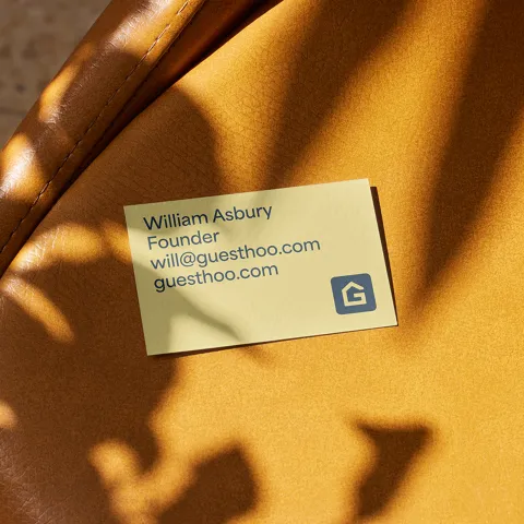
With a solid strategy, Rhombus moved to the visual elements. The logo needed an update. It evolved from the original mark into a clever combination representing a 'G' (for Guesthoo), a house, and a key – neatly summarizing the business. It feels modern yet approachable.
The color palette plays a huge role in setting the mood. Rhombus chose cool, calming colors like 'King Blue' and 'Twin Blue', balanced with a welcoming 'Queen Yellow' and clean 'Cot White'. This combination feels trustworthy and puts potential clients at ease.
For typography, they selected Area Normal. It’s a clean sans-serif font that feels contemporary and tech-aligned, but it also has enough personality to avoid feeling cold or impersonal. This choice perfectly mirrors Guesthoo's blend of smart technology and human interaction. The simple type hierarchy keeps things clear and easy to read across all materials.
Building the Digital Experience
A rebrand isn't complete without translating it to the digital space. Rhombus Studio designed and built a custom website for Guesthoo. The challenge here was integrating a sophisticated booking system while showcasing inspiring case studies and lifestyle imagery that captures the spirit of the South West UK, where Guesthoo operates.
The website aims to build trust and convey reliability and quality. It avoids the generic feel of many competitor sites by balancing technical features with beautiful visuals and clear messaging. To ensure consistency, Rhombus also developed a custom set of icons. These icons share the same visual DNA as the logo, creating a cohesive look and enhancing user experience across the website and other digital touchpoints.
The Result: Ready for Growth
The outcome is a comprehensive branding and visual identity that feels both modern and deeply personal. It successfully communicates Guesthoo's unique proposition: meticulous management powered by smart tech, delivered with a human touch.
As Guesthoo founder William Asbury noted, the work provided "the foundations it needs to take us into the next phase of our growth." It’s a great example of how thoughtful strategy and design execution can prepare a brand for the future.
This project highlights the power of aligning brand strategy, verbal identity, and visual design to create a cohesive and compelling narrative. It’s about finding that perfect balance.
Interested in seeing more of their work? Check out the full case study and Rhombus Studio's portfolio
Branding and visual identity artifacts