by abduzeedo
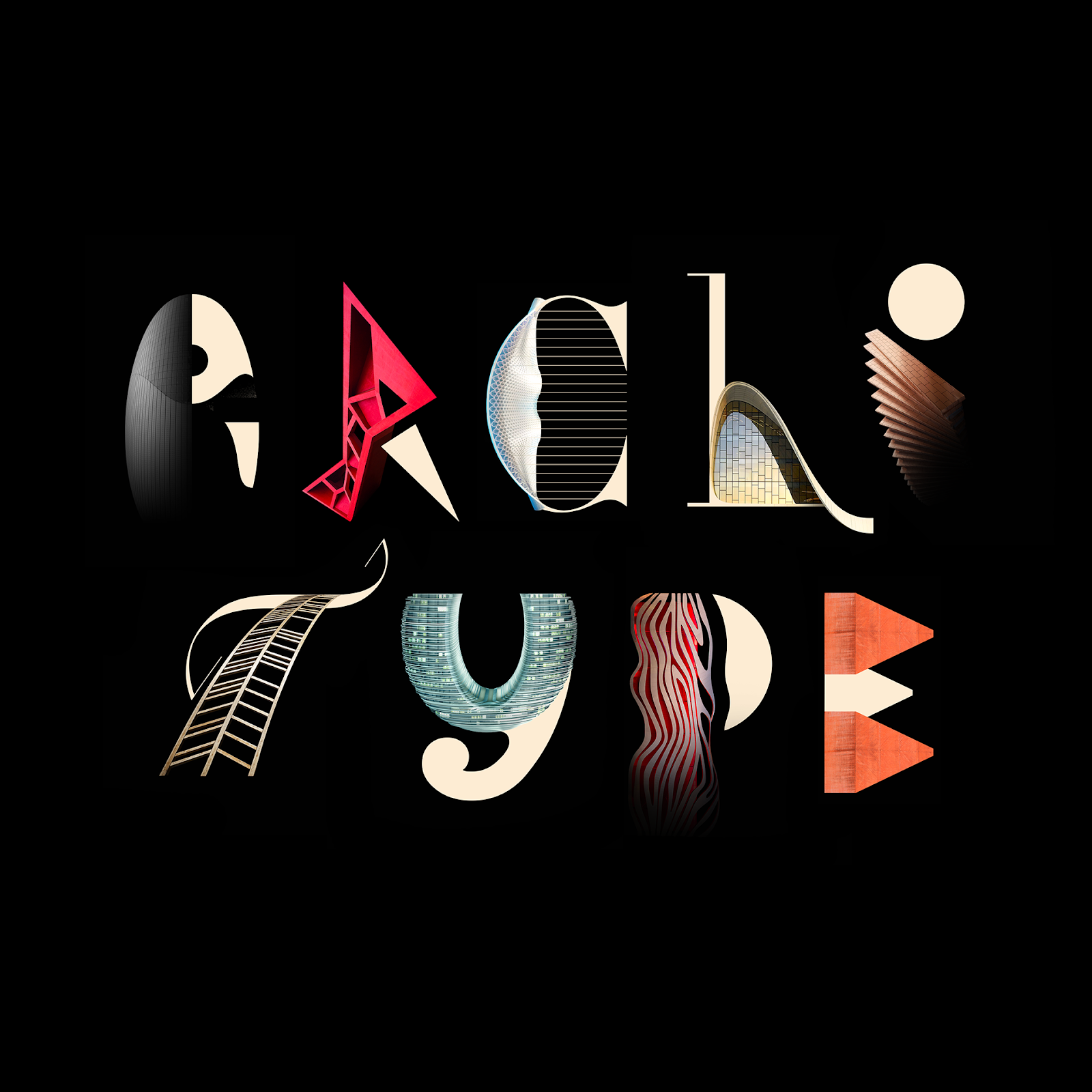
Johann Lucchini shared a really awesome project mixing architecture, illustration and typography. Titled Architype Alphabet Poster, this project explores a simple concept, combine typography and architecture to create a custom typeface. For each letter of the alphabet, Johann was inspired by a famous architect and one of its buildings.
The link between the construction of a typographic character and architecture, the construction of a building has always amused and fascinated me.
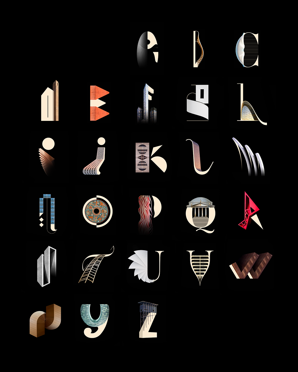
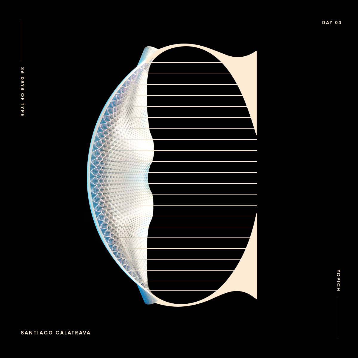
C for Santiago Calatrava and the incredible Chicago o’hare airport
G for Franck Gehry, inspired by the Vitra Design Museum. One of my favourite character for an amazing architect who designed a lot of stunning structures as the Fondation Louis Vuitton

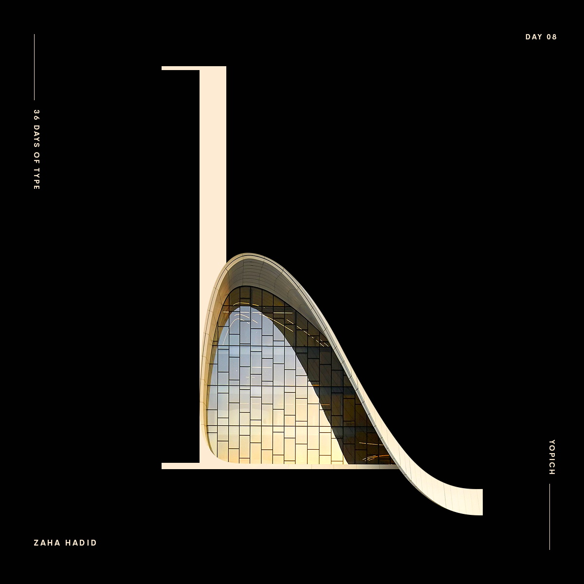
H for Zaha Hadid. First woman to get the Pritzker prize, nobel prize of architecture ? The inspiration for my H is found in the awesome Azerbaijan's Heydar Aliyev Centre. Mixing curves, angles, lines to find the perfect balance, and the right degree of abstraction is a long and difficult exercise! For a huge building, an airport but also for every little character of a typography.
I for Bjarke Ingels and his structure for the Isenberg School Of Management

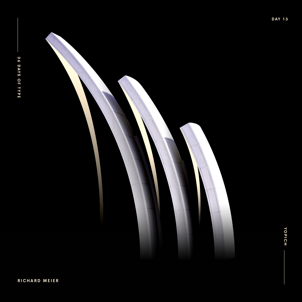
M for Richard Meier and the Jubilee Church, perfect moove for my M
N for Jean Nouvel, the famous french architect. I was inspired by the masterpiece Institut du Monde Arabe in Paris . A pleasure to play with the N and the beautiful moucharabiehs of the southern facade, made with photographic diaphragms
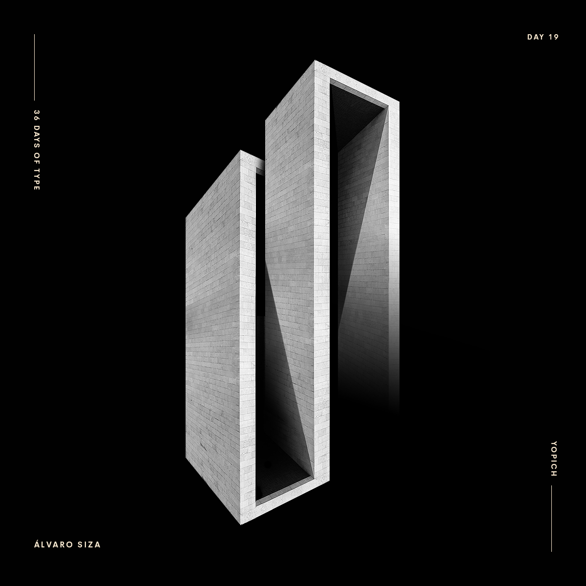
S for Alvaro Siza and it’s Pabellón de Portugal Expo'98
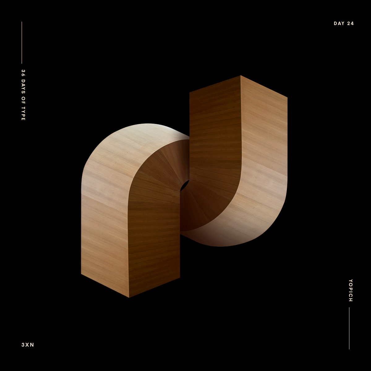
X for 3XN Architects and the Uppsala University in Sweden. I played with the beautiful wood stairs.