by abduzeedo
Discover the bold graphic design of Yeah! Indie Club by Quim Marin, featuring vibrant colors, unique typography, and a modern look.
The Yeah! Indie Club campaign, crafted by the talented designer Quim Marin, serves as an exemplary model of innovative graphic design. This campaign is a vibrant testament to how design can embody the ethos of a brand while standing out visually. Focused on capturing the spirit of indie and underground music, Marin’s work is a masterclass in using bold graphic elements to create a distinct identity.
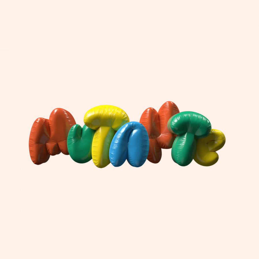
One of the standout aspects of the Yeah! Indie Club campaign is its fearless use of color. Marin embraces bold, vibrant tones that mirror the energetic and rebellious spirit of indie culture. This choice not only draws attention but also reinforces the club's commitment to being a haven for alternative music lovers.
In terms of typography, the campaign takes a classic yet modern approach. The fonts are chosen carefully to balance readability with aesthetic appeal, ensuring that they complement the overall design rather than overpower it. The result is a visually striking yet cohesive design that communicates the club’s identity at a glance.
The layout design in this campaign is another critical component of its success. Marin's approach is clean and structured, yet it leaves room for creativity. The use of space guides the viewer’s eye across the design, making sure that each element, from text to imagery, is given its moment to shine. This attention to detail ensures that the message is clear and the design remains engaging.
The Yeah! Indie Club campaign is a prime example of how graphic design can be used as a powerful branding tool. By carefully selecting colors, typography, and layouts, Marin creates a visual language that speaks directly to the club’s target audience. This campaign doesn’t just advertise events; it builds a community around a shared love for indie and underground music.
In conclusion, the Yeah! Indie Club campaign by Quim Marin showcases the impact of thoughtful graphic design in creating a unique and memorable brand identity. With its bold use of color, beautiful typography, and structured layouts, this campaign is a reminder of the power of design in shaping the perception and success of a brand.
For more inspiring graphic design works, you can explore Quim Marin's portfolio on [Behance](https://www.behance.net/quimmarin).
