by abduzeedo
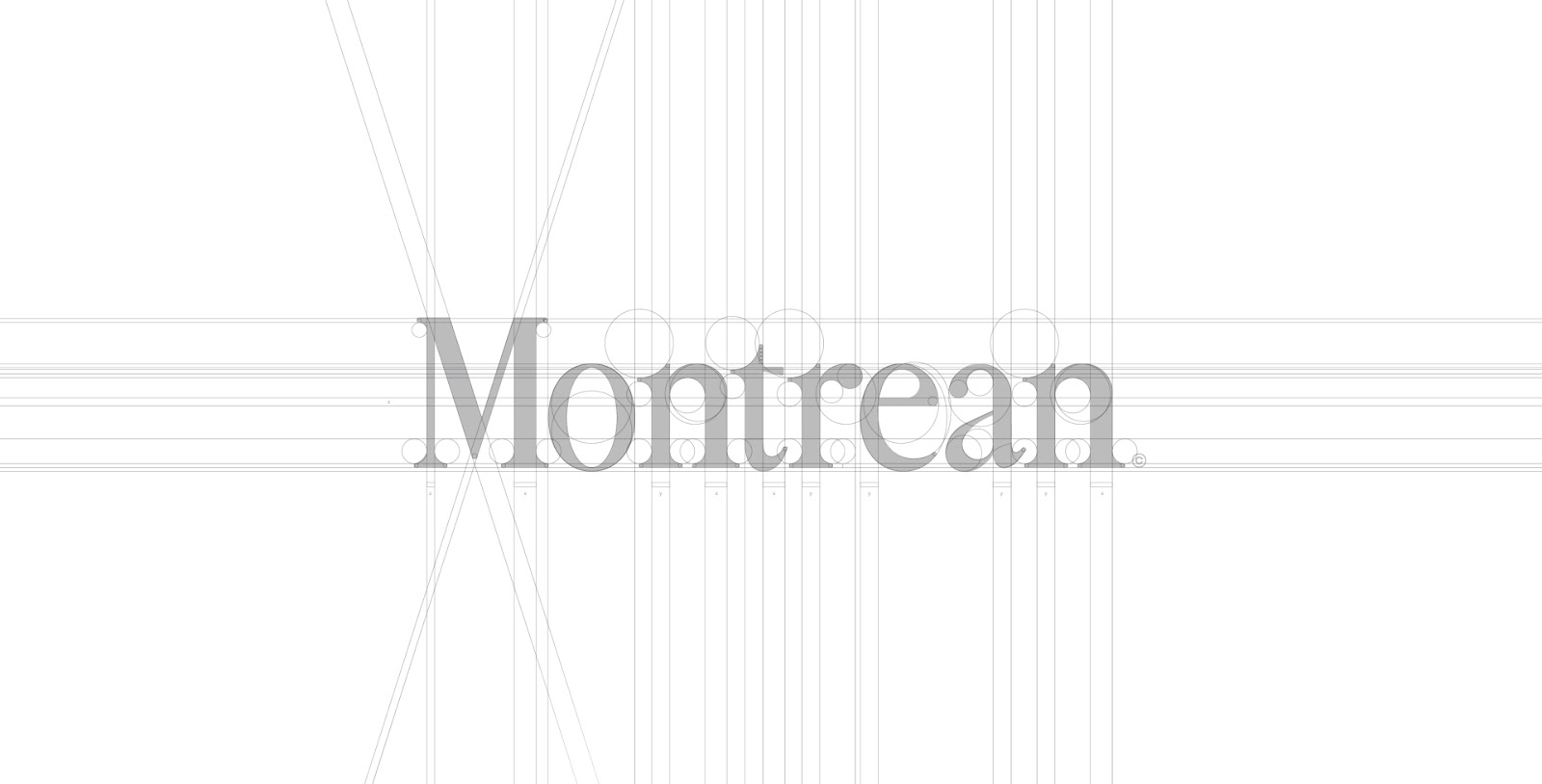
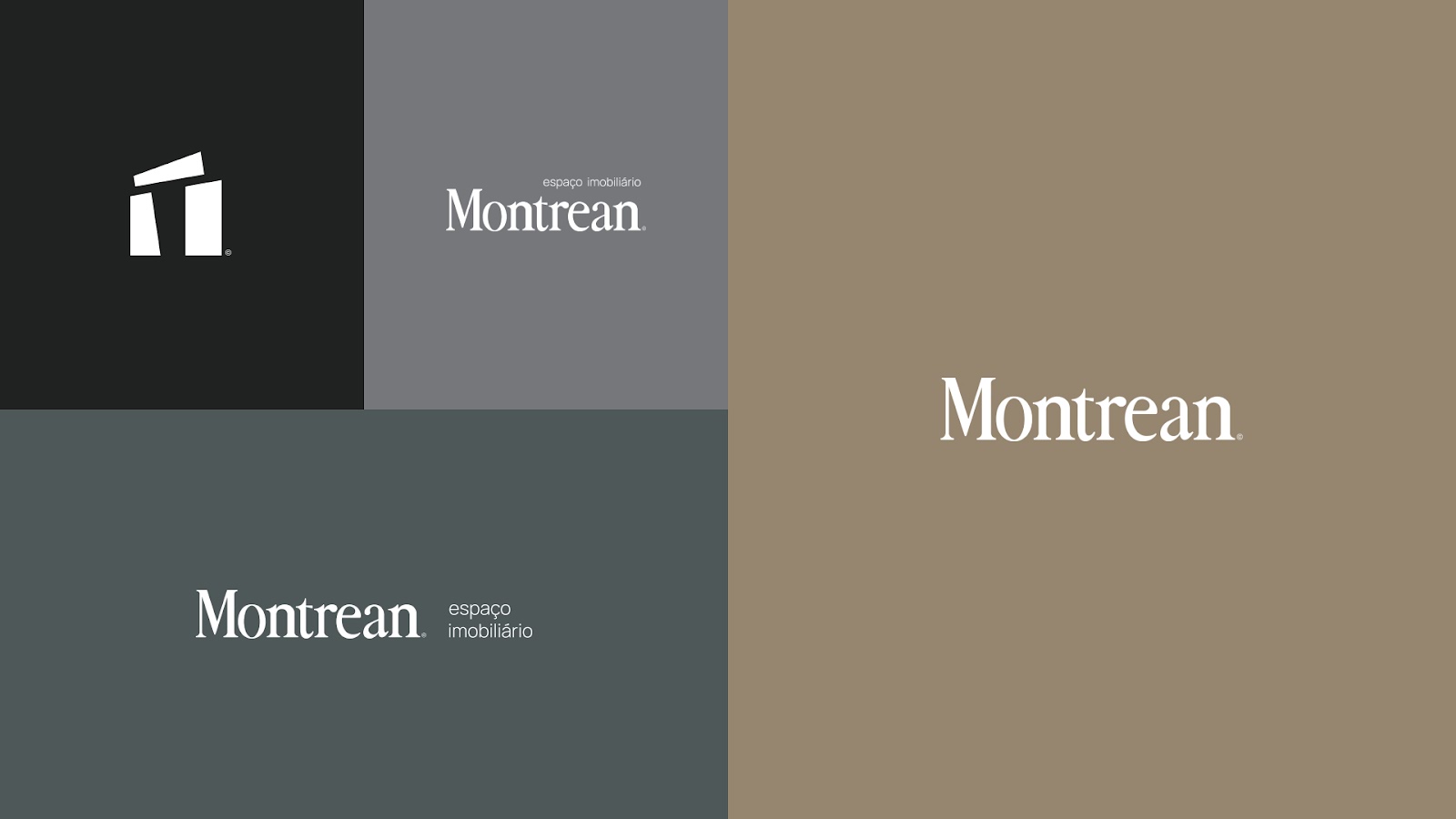
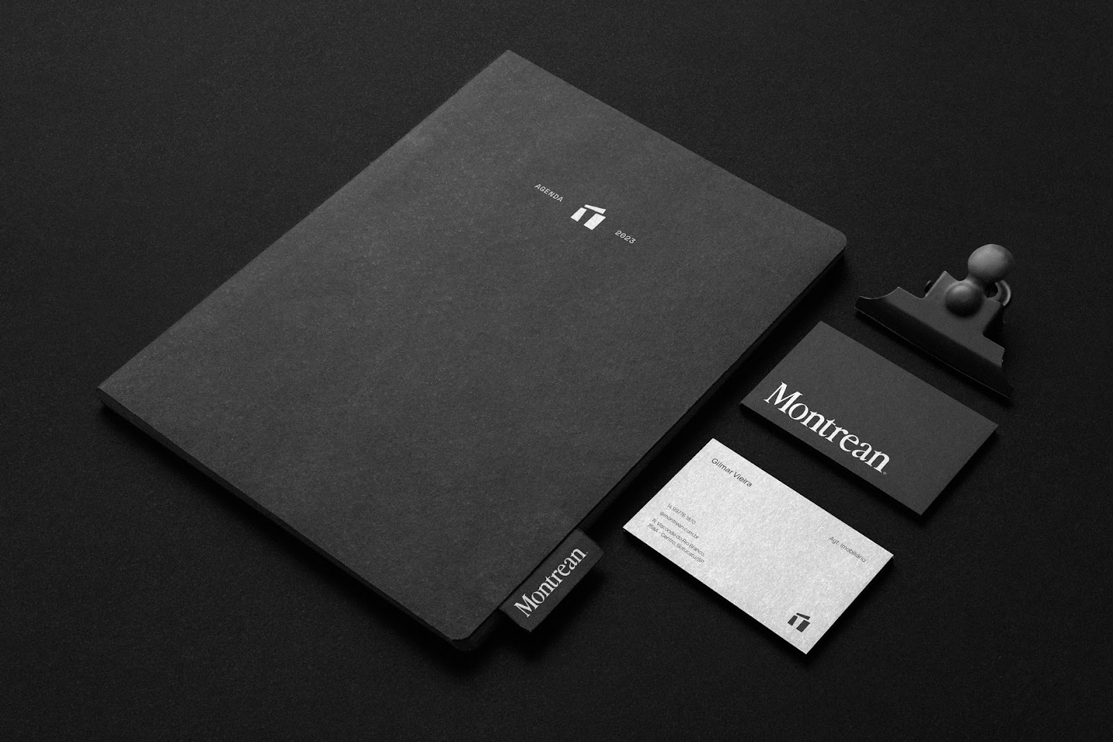
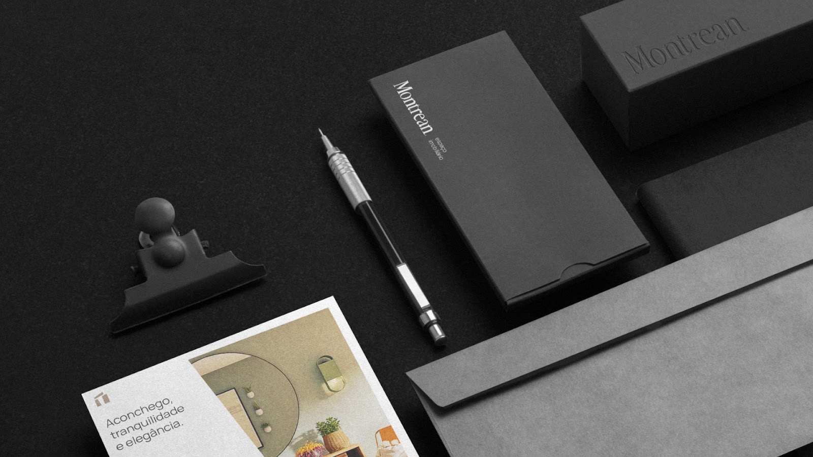
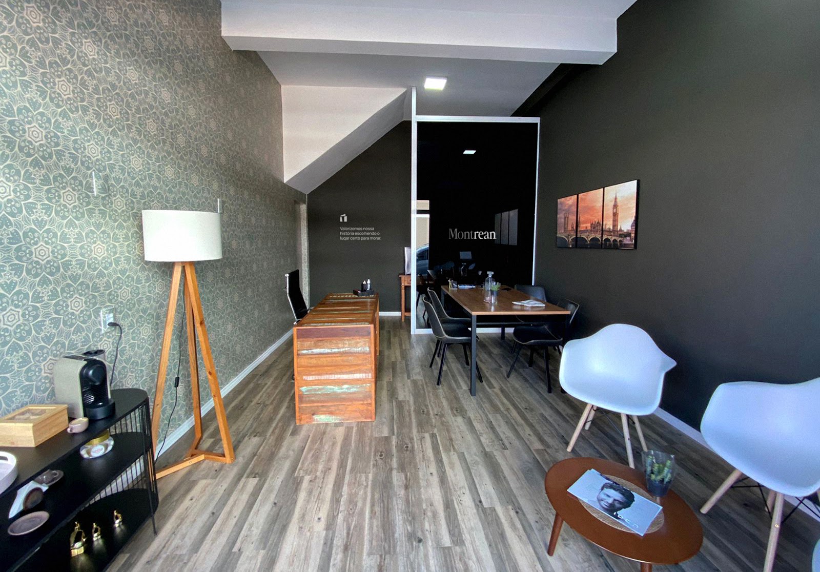
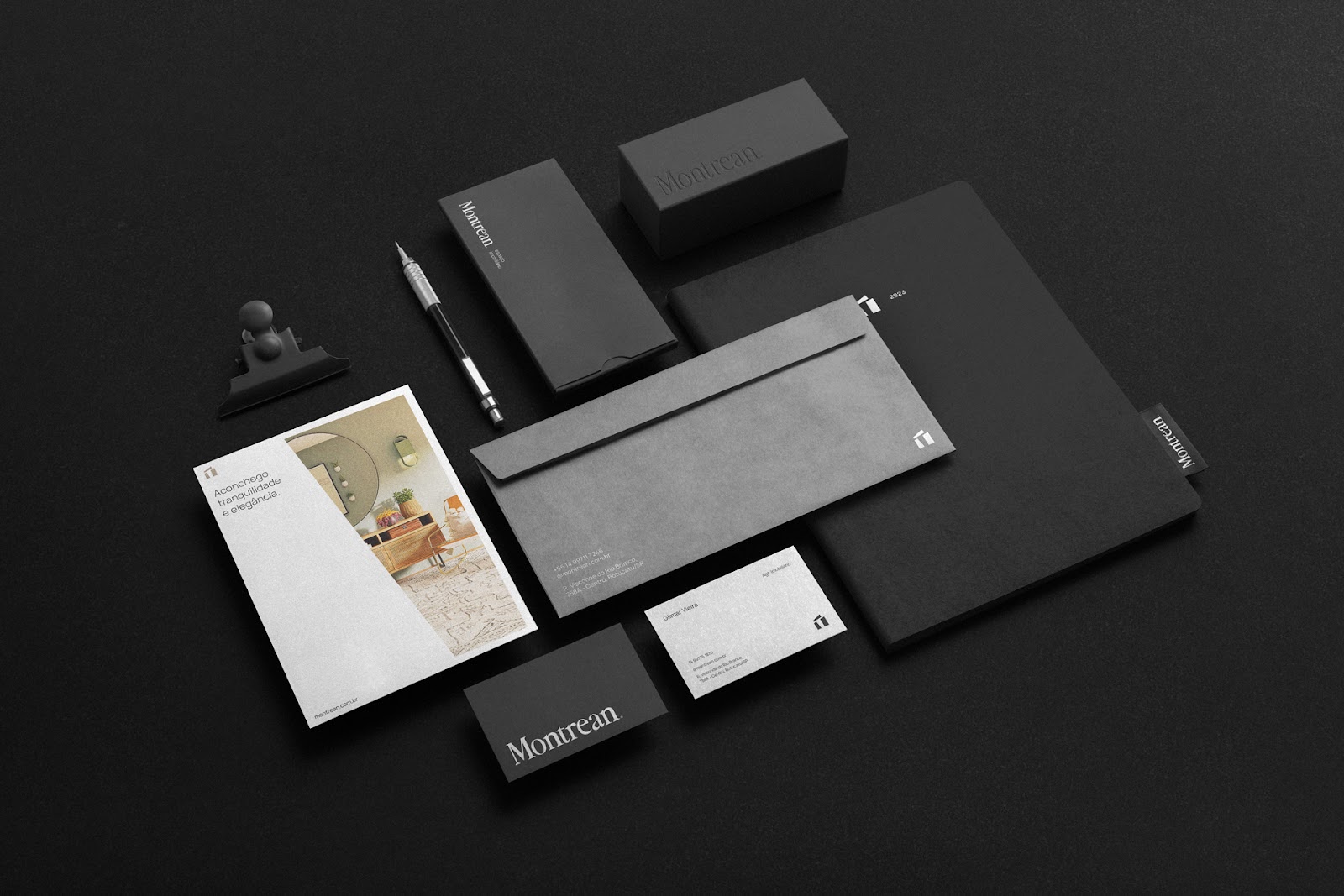
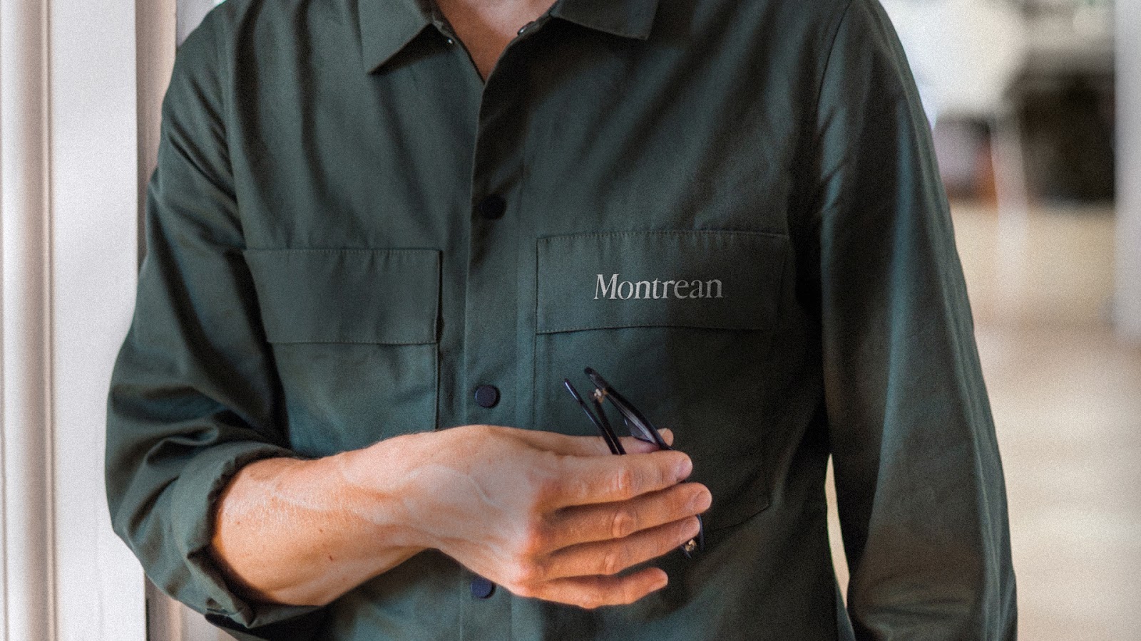
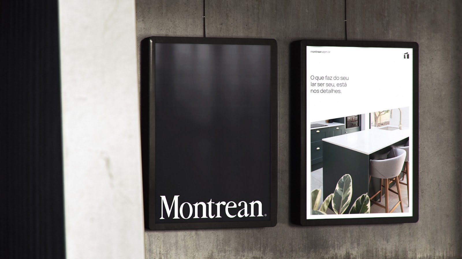
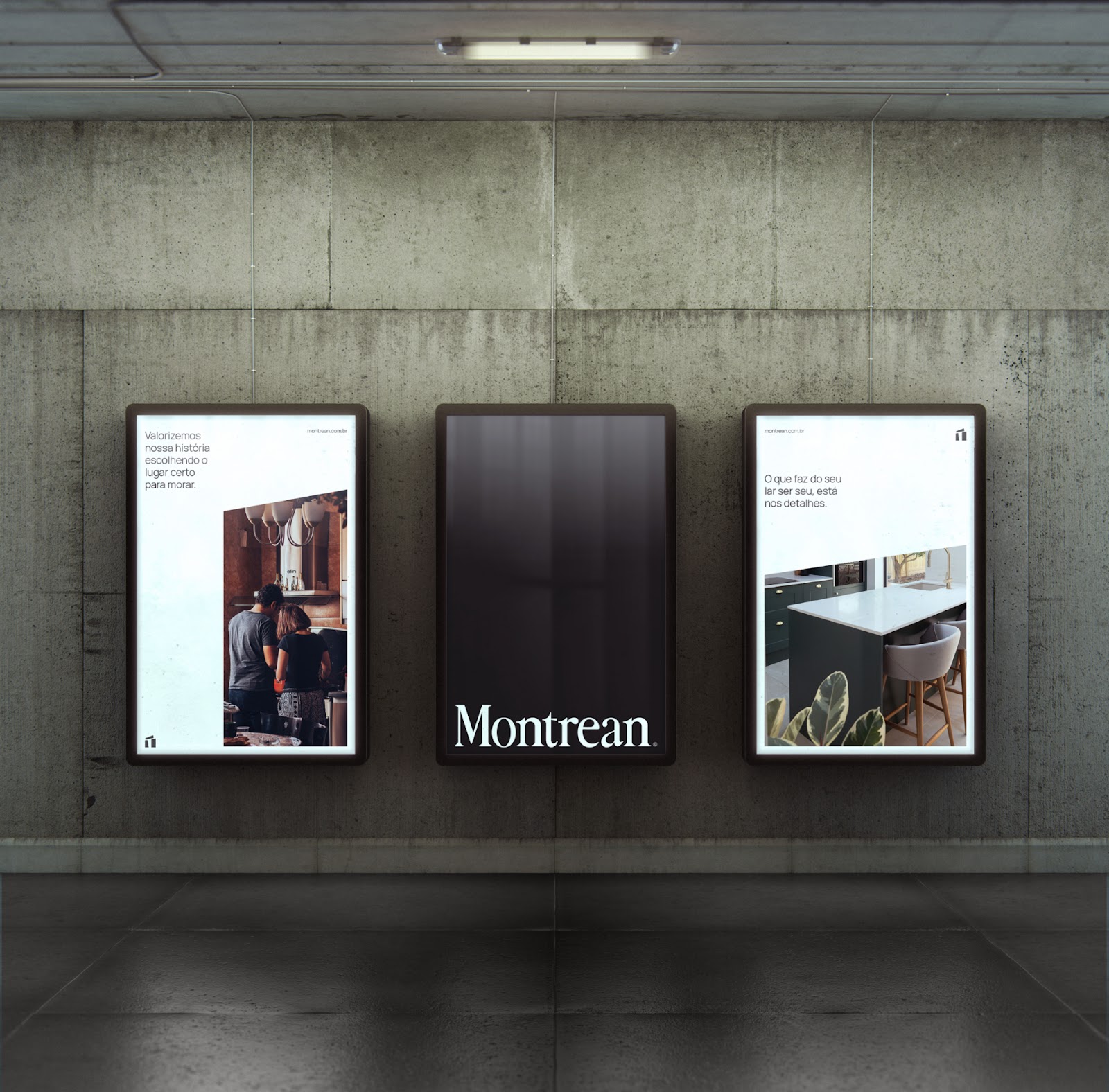
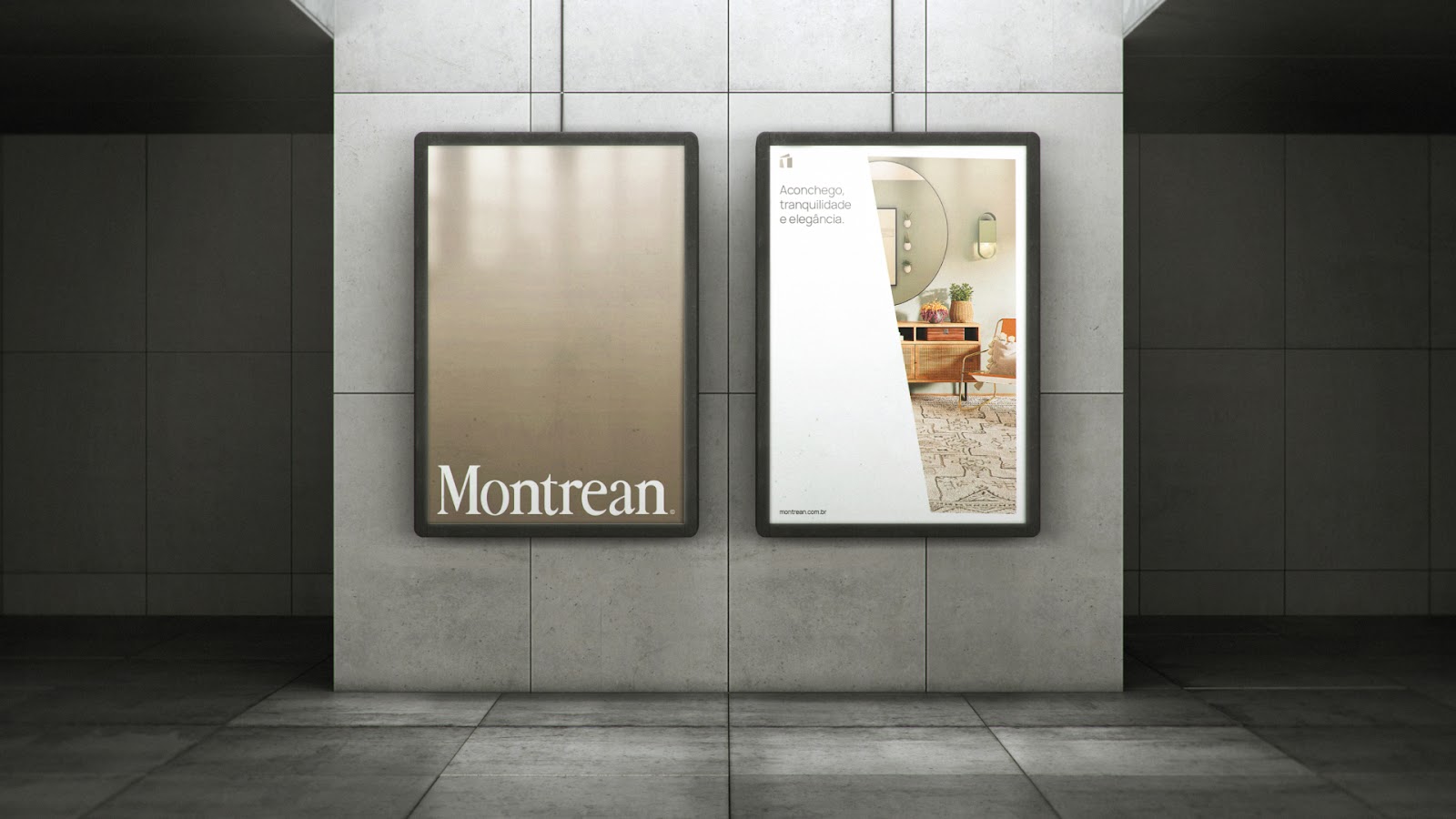
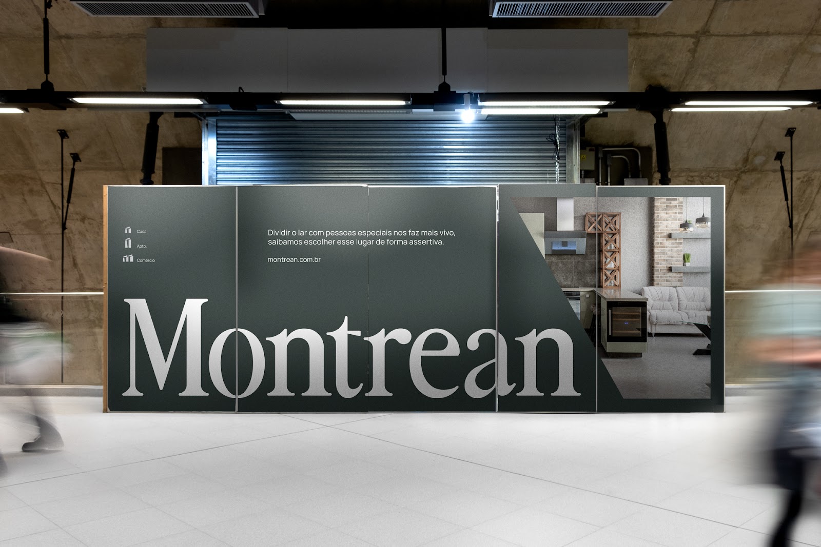
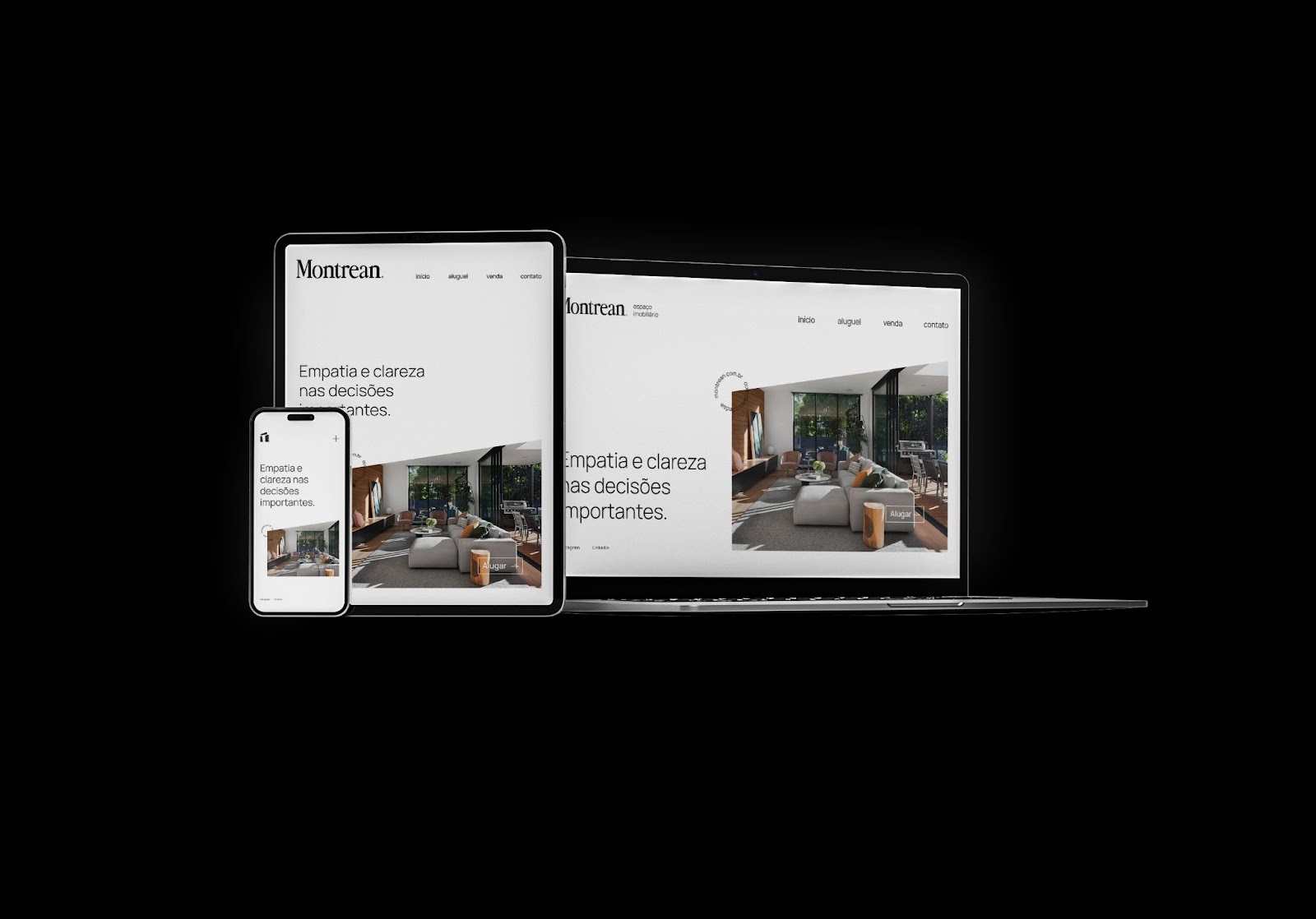
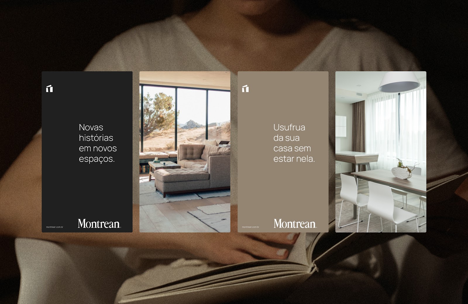
Ryan Pinheiro and team took the saying “we value our history by choosing the right place to live” to drive the direction of their branding and visual identity project for Montrean real estate company.. A family-owned real estate office brand from the interior of São Paulo, Brazil. For the project, there was a need for a name with strong phonetics that conveyed tradition and security, that was familiar but that did not use the owners' last name, so "Montrean" appears.
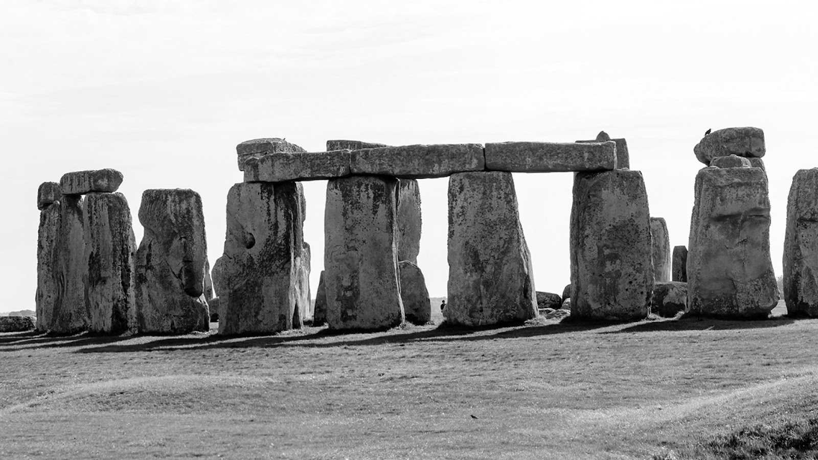
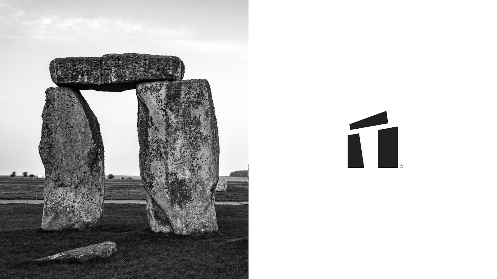
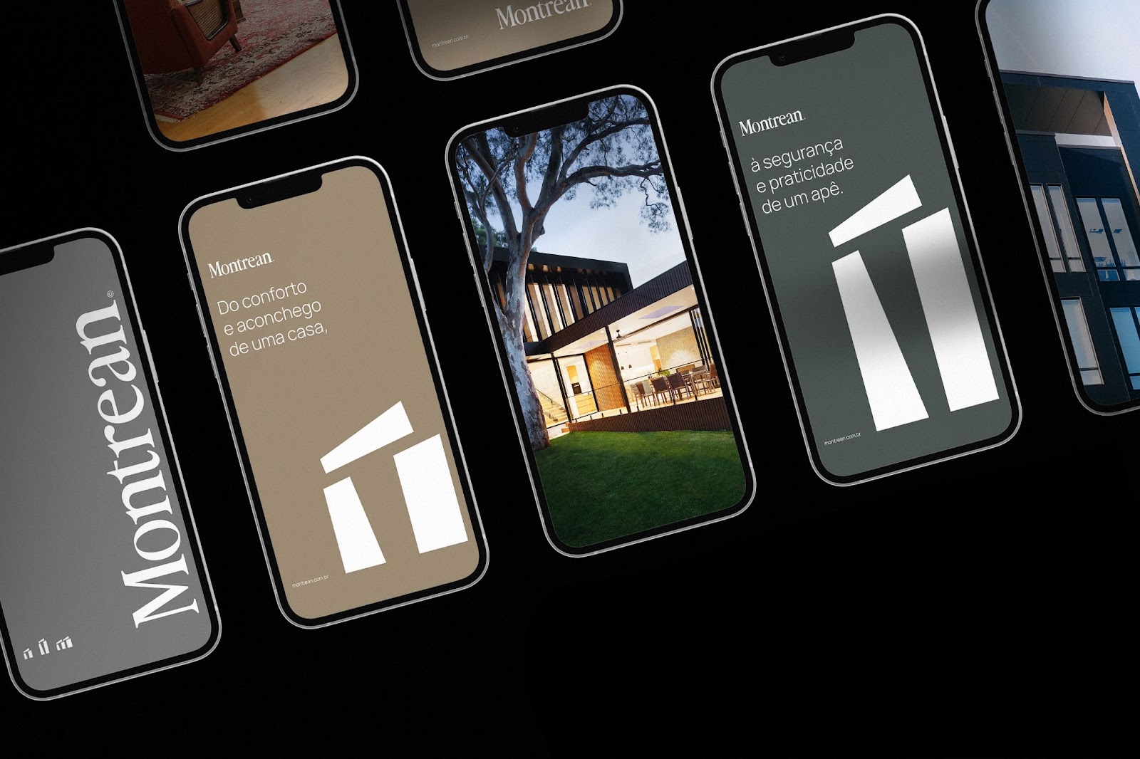
Going back to the past, the team analyzed that in the Neolithic period, during the construction of the historic monument Stonehenge (England), people began to leave nomadism and begin the search for strategic places to live. The brand carries the concept of Stonehenge stones, in addition to the great historical reference, the stones form a kind of house, composing the perfect house to live in, the exact purpose of the brand.
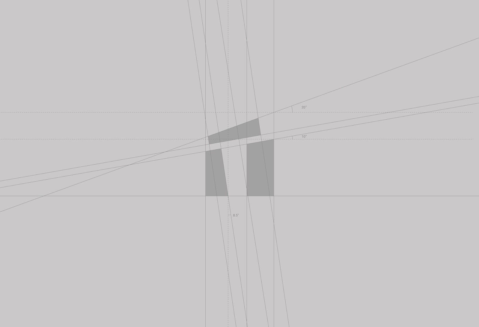
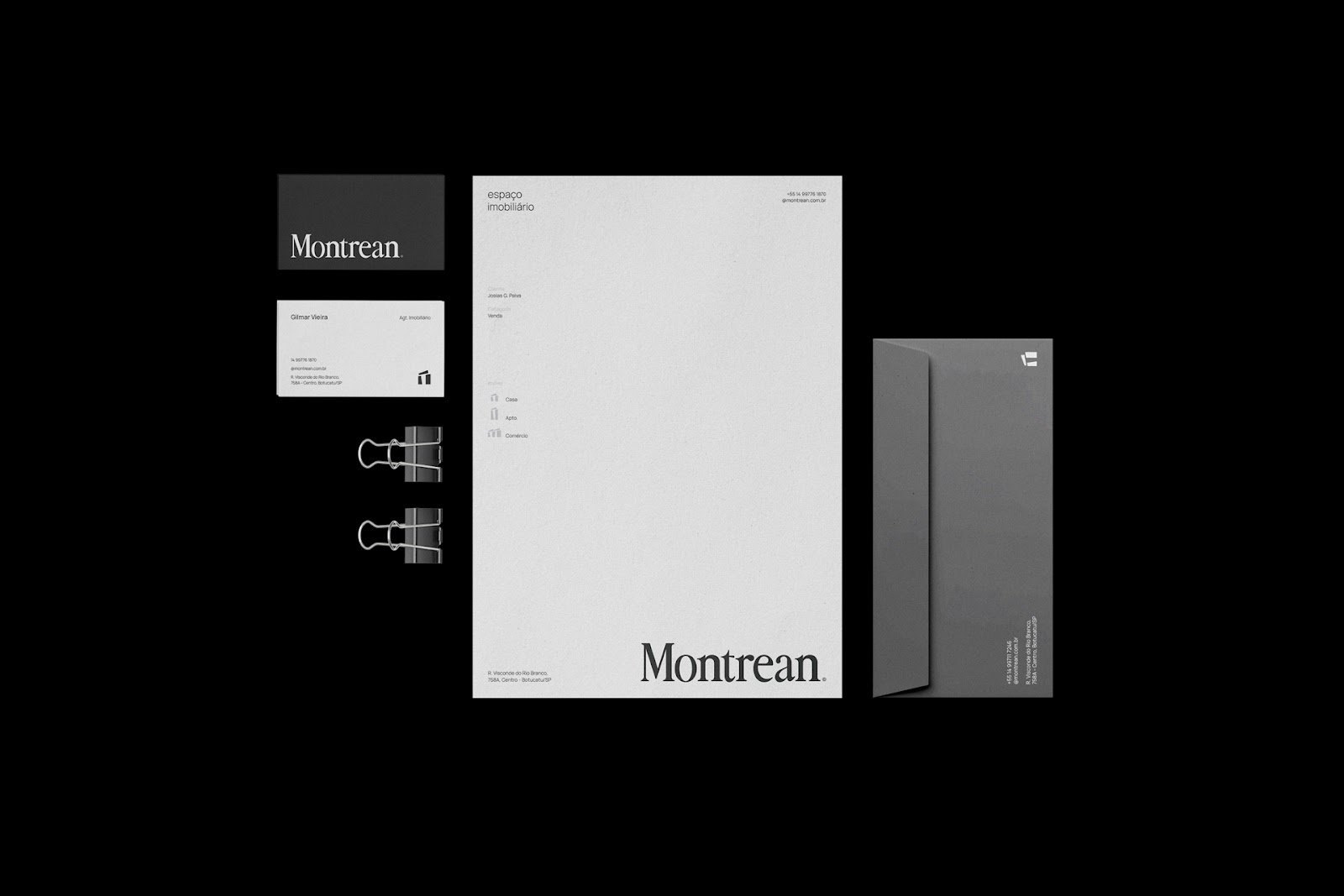
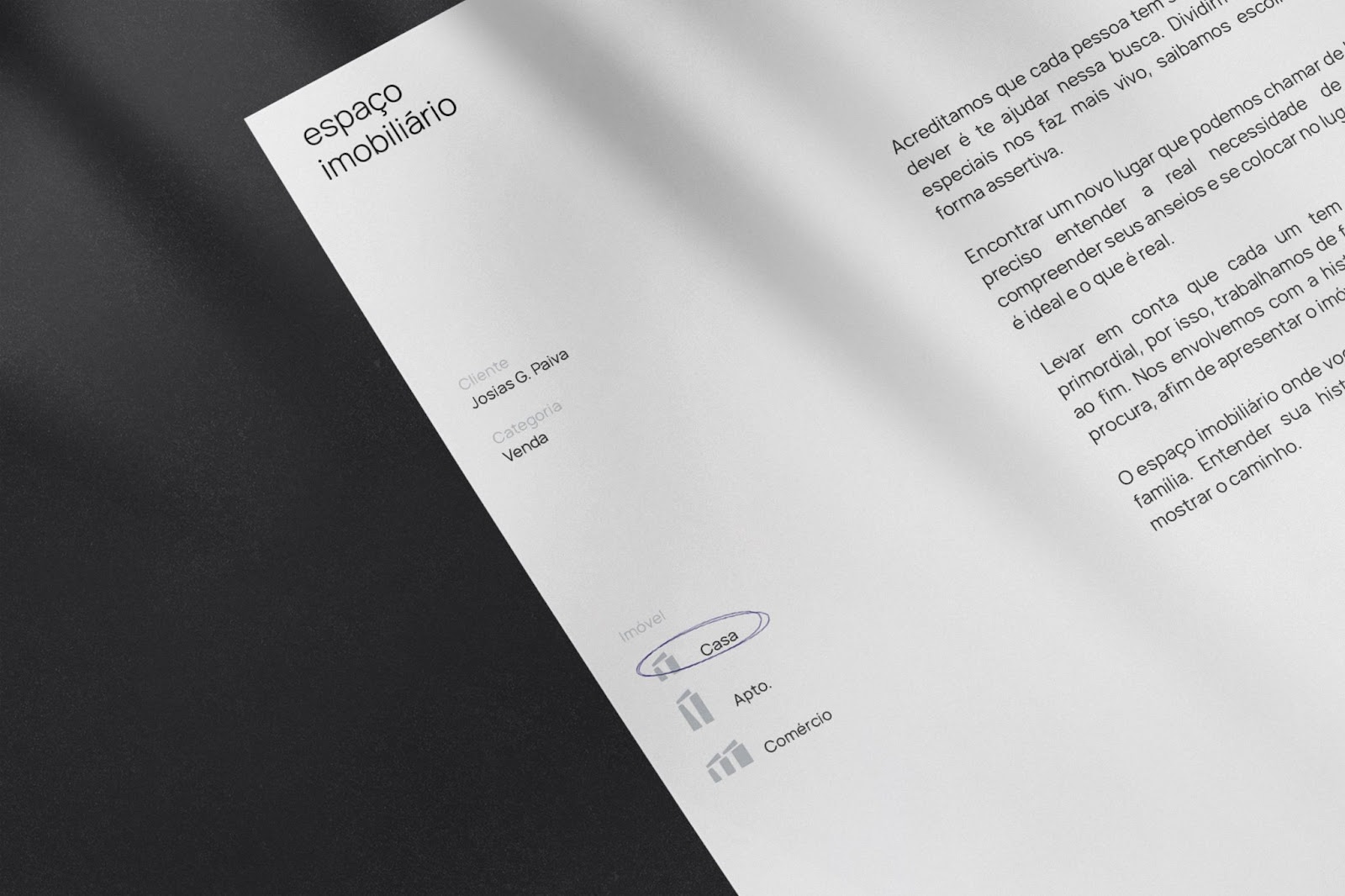
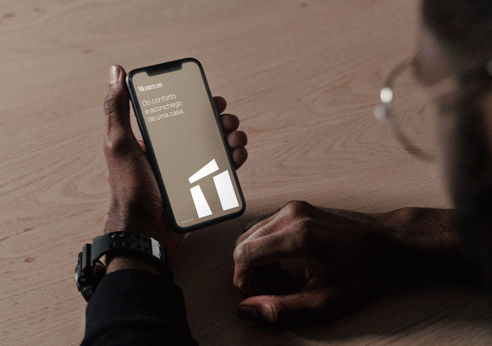
To make the brand more didactic for your customers, Ryan and team look to translate Montrean's services into its own symbol. The same being changeable, covering the types of real estate worked on, such as houses, apartments and commercial properties.
Brand Manifest
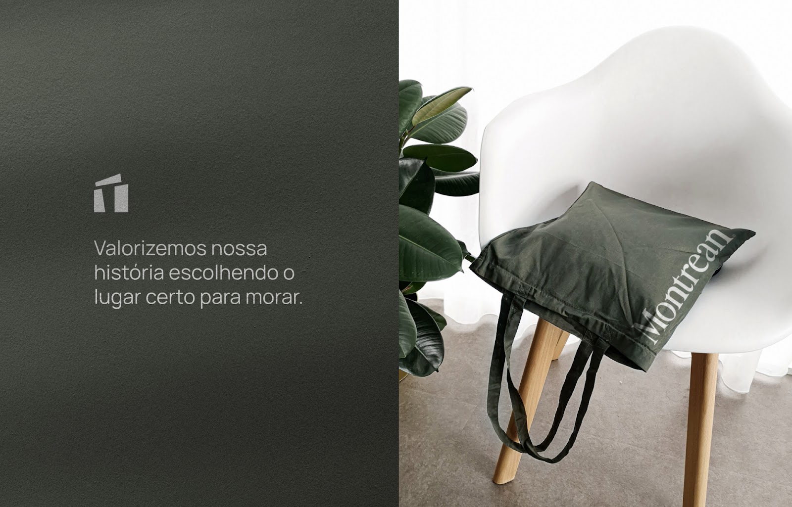
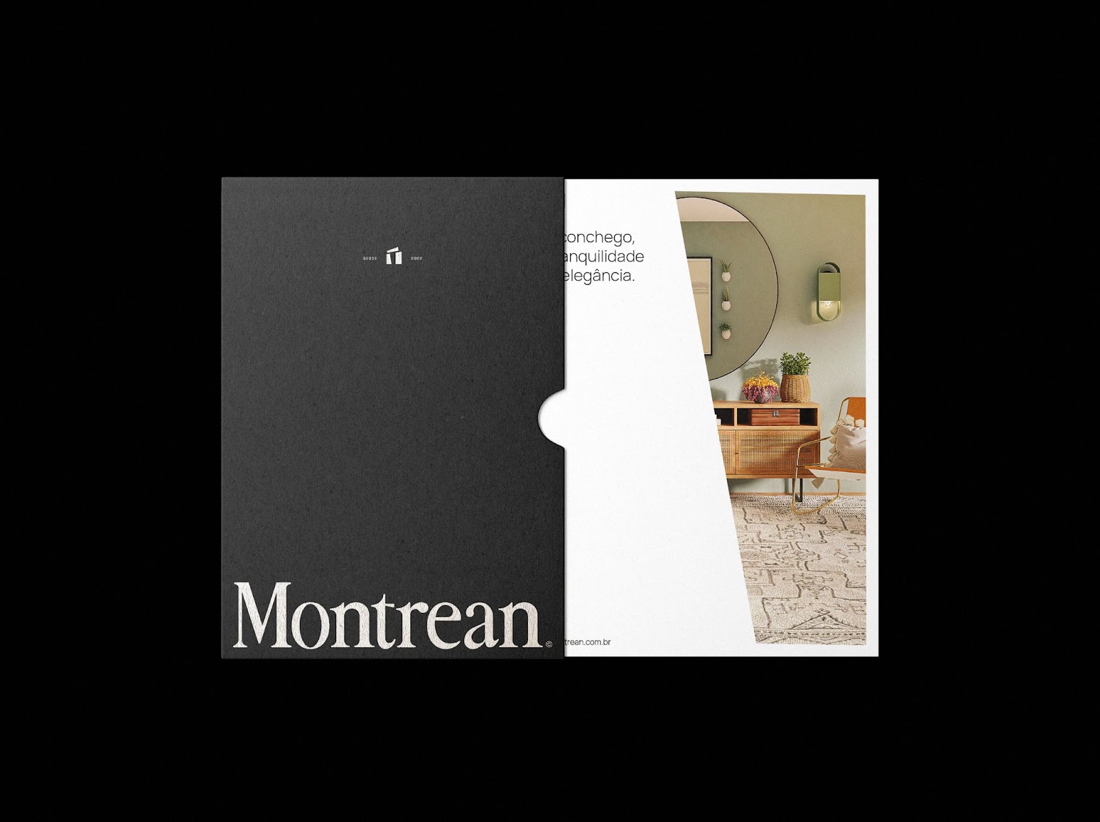
"We believe that each person has their space in the world, our duty is to find it for you. We are involved with the history of each family that seeks us out, in order to present the right property for the right person. Makes it more alive, we know how to choose this place assertively."
Stonehenge (England), inspiration for the Montrean’s symbol.


For more information check out Ryan on:


