by abduzeedo
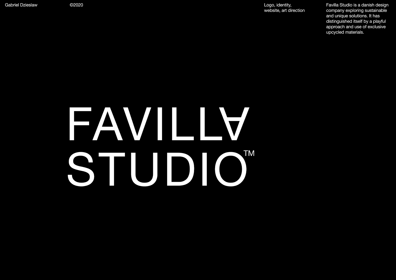
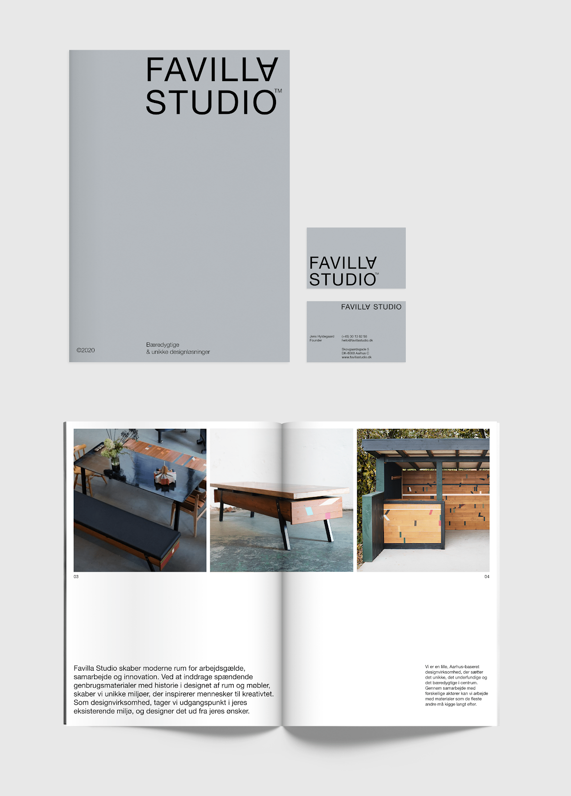
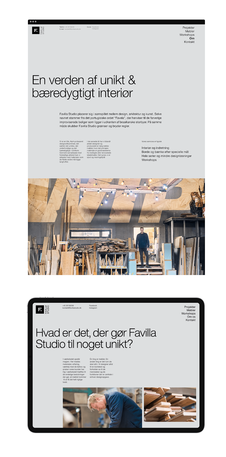
Gabriel Dzieslaw shared one of those branding and visual identity projects that made me jealous because of how awesome it is. It was created for Favilla Studio, a Danish design company exploring sustainable and unique solutions. It has distinguished itself by a playful approach and use of exclusive upcycled materials.
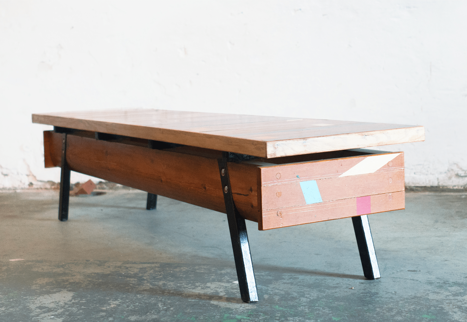
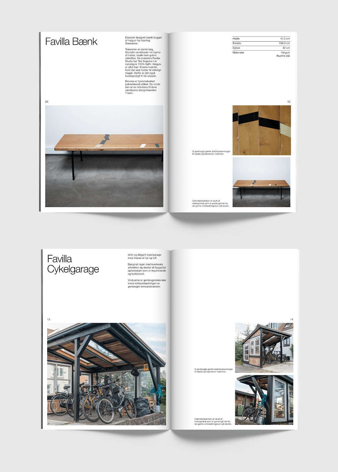
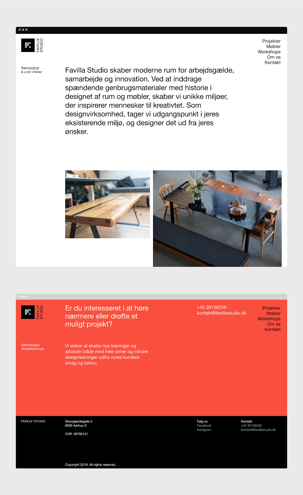
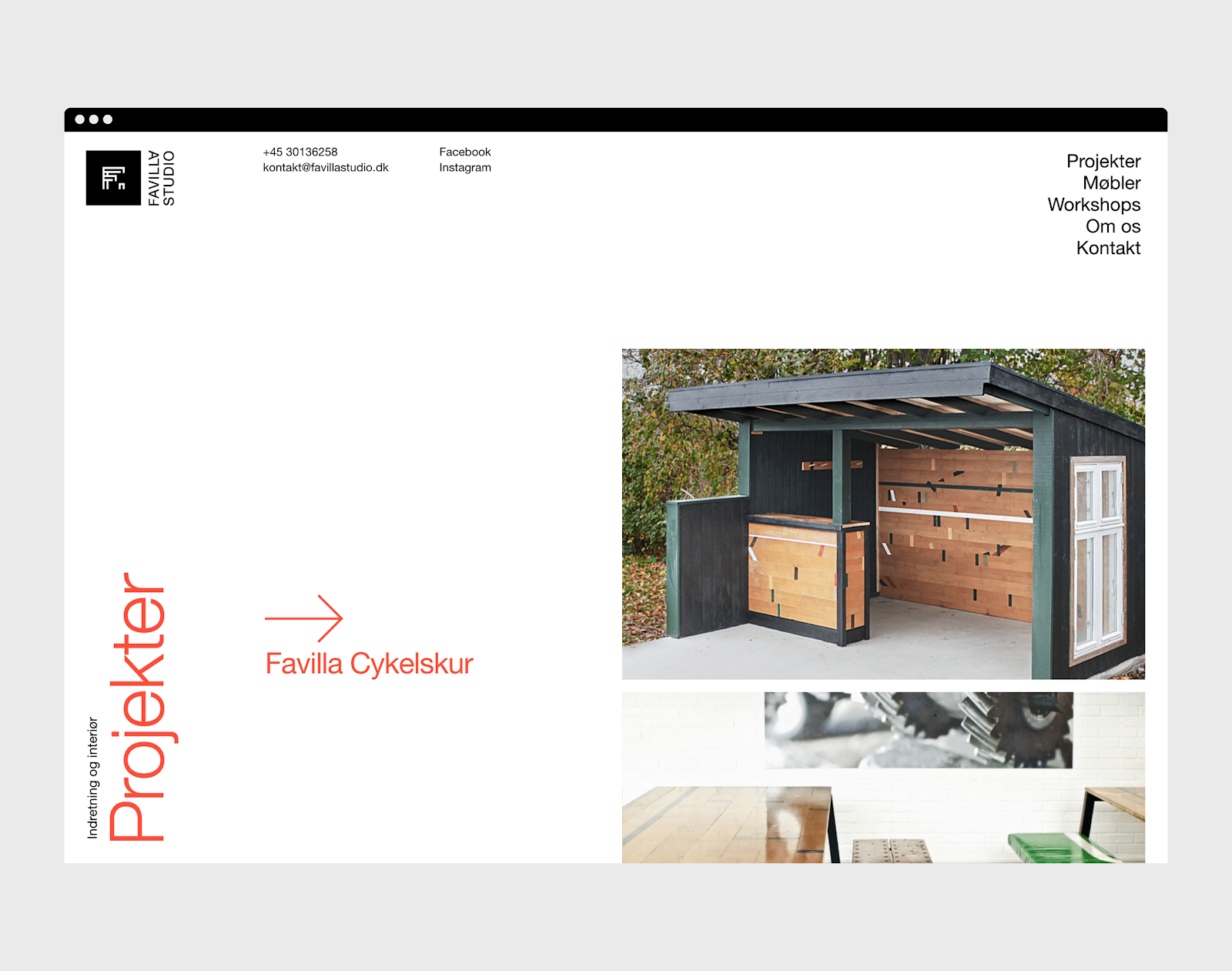
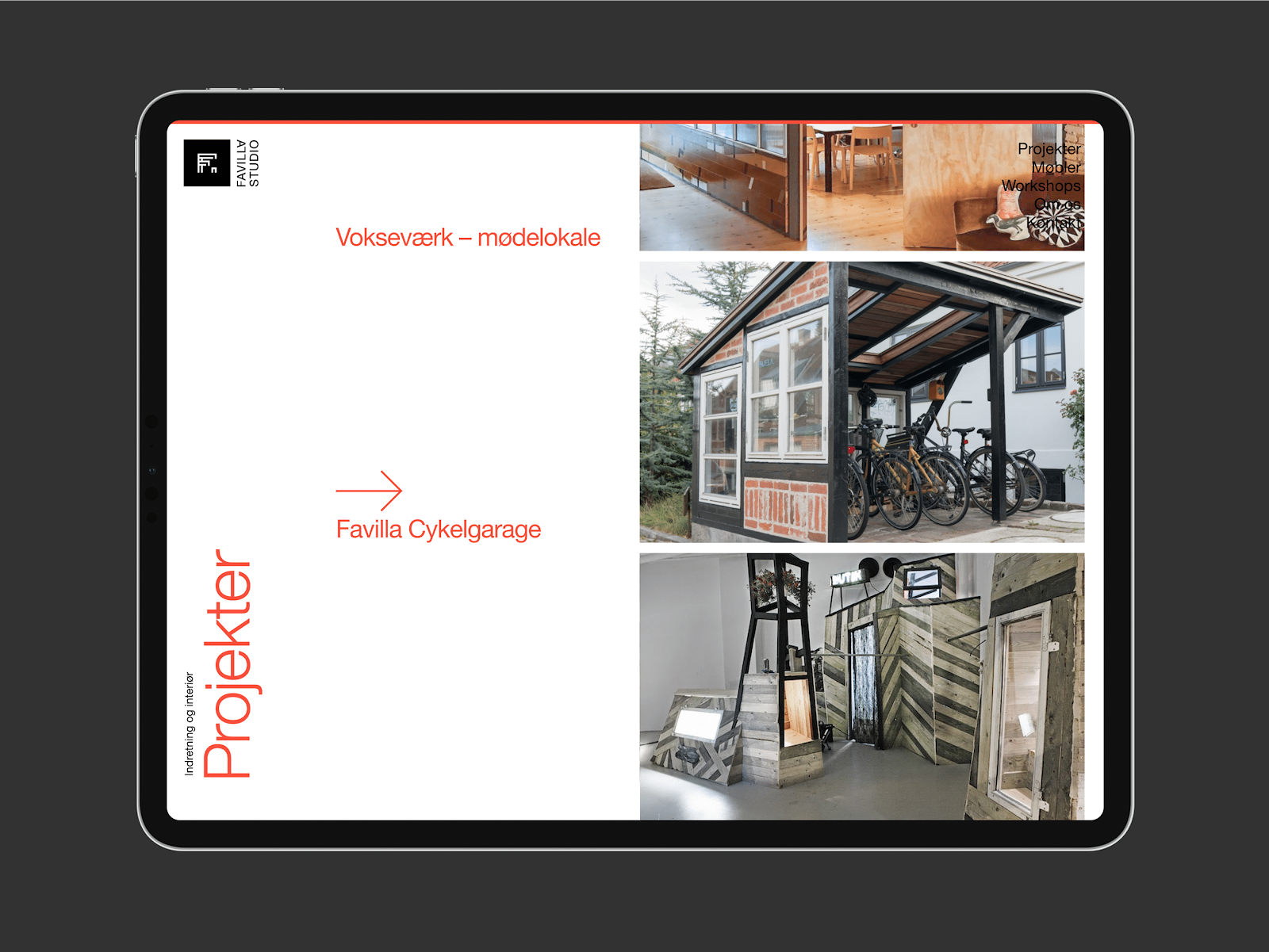
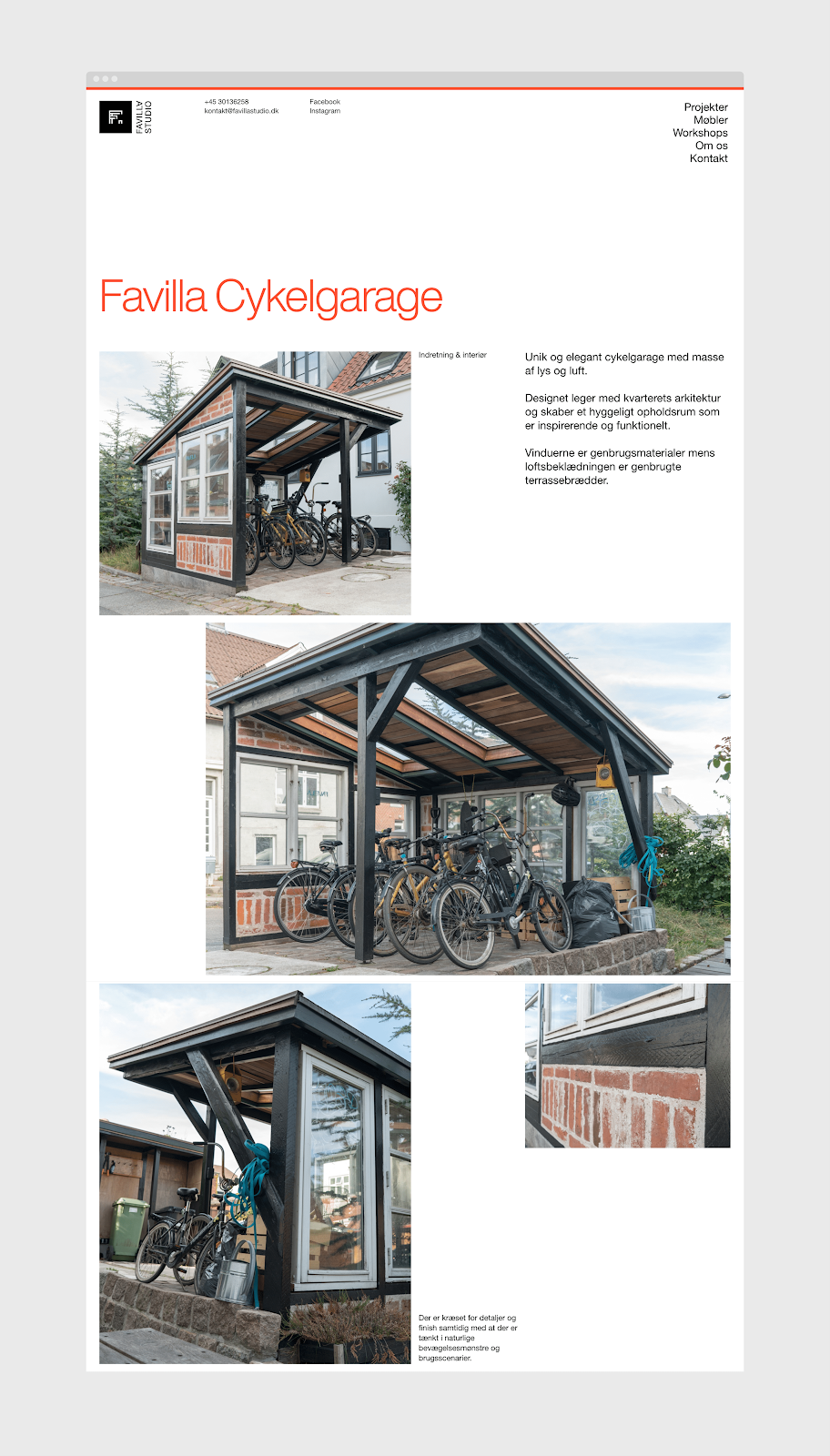
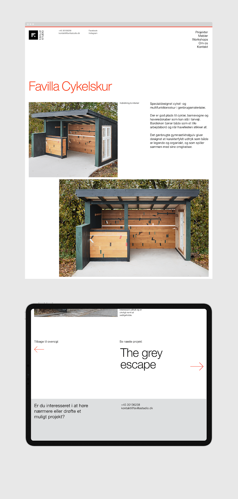
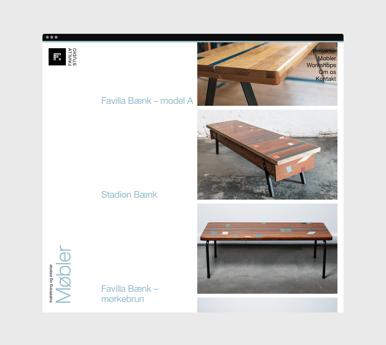
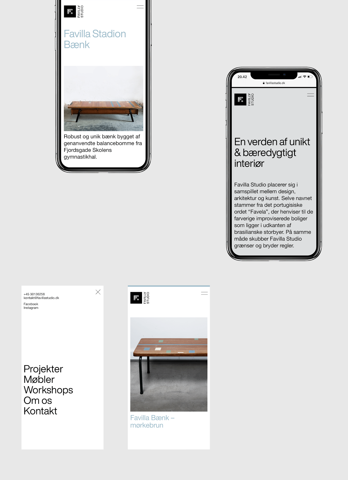
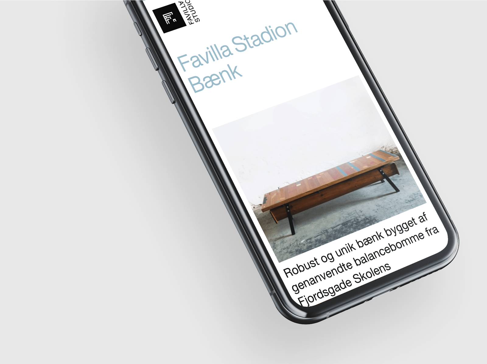
Favilla Studio places itself in the interaction between design, architecture and art. The name itself derives from the Portuguese word ”Favela” referring to the colorful improvised housing like on the outskirts of Rio de Janeiro. In the same way, Favilla Studio pushes borders and moves beyond rules and regulations. Their work tends to transcend traditional categories, rethinking materials and functions, turning negative into positive. Sustainability is the absolute core of the company’s credo, and it would be typical for them to reuse i.e old gym floor boards, giving the material new life as a totally different function.
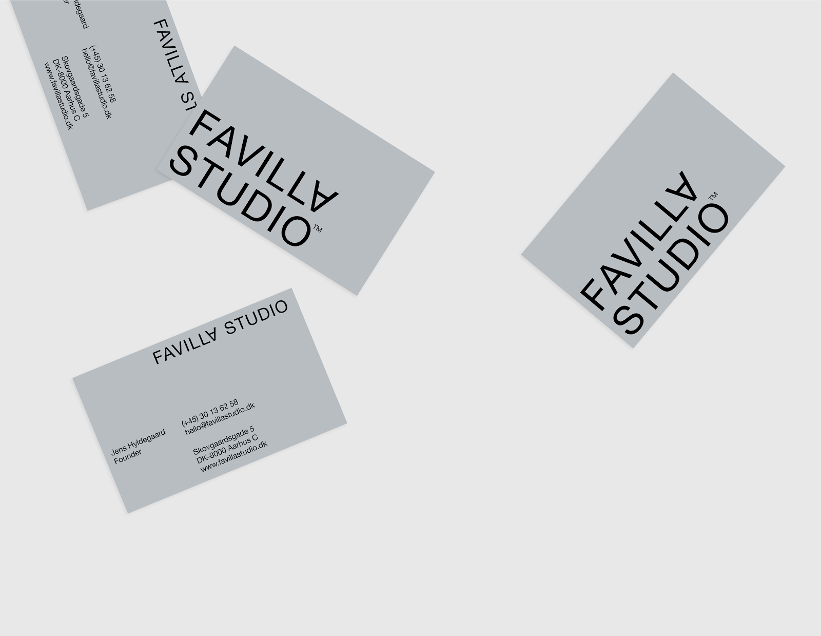
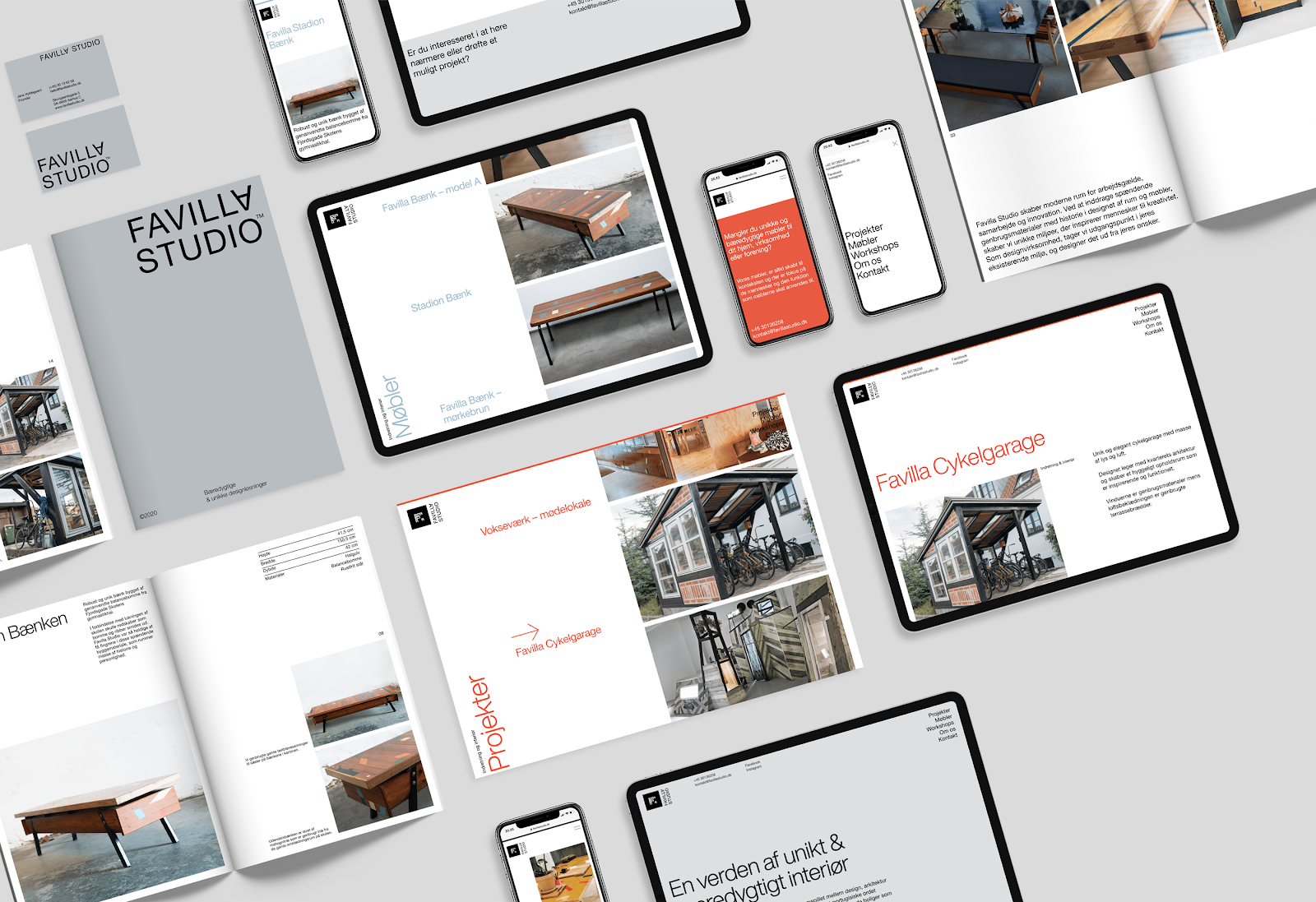
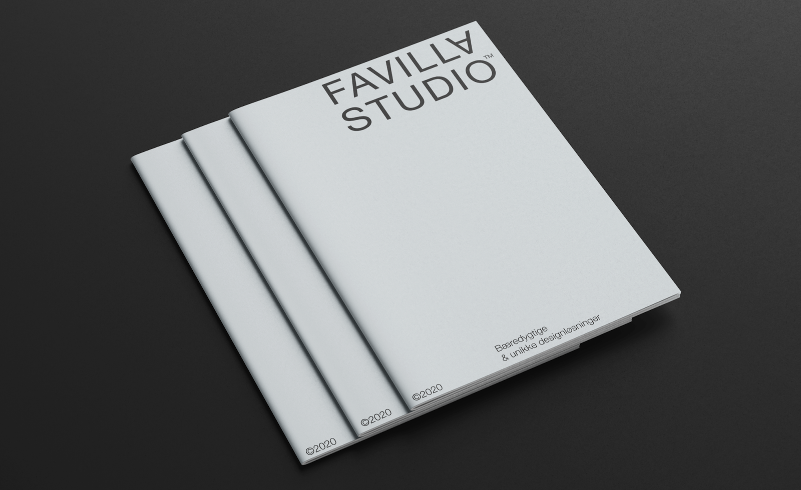
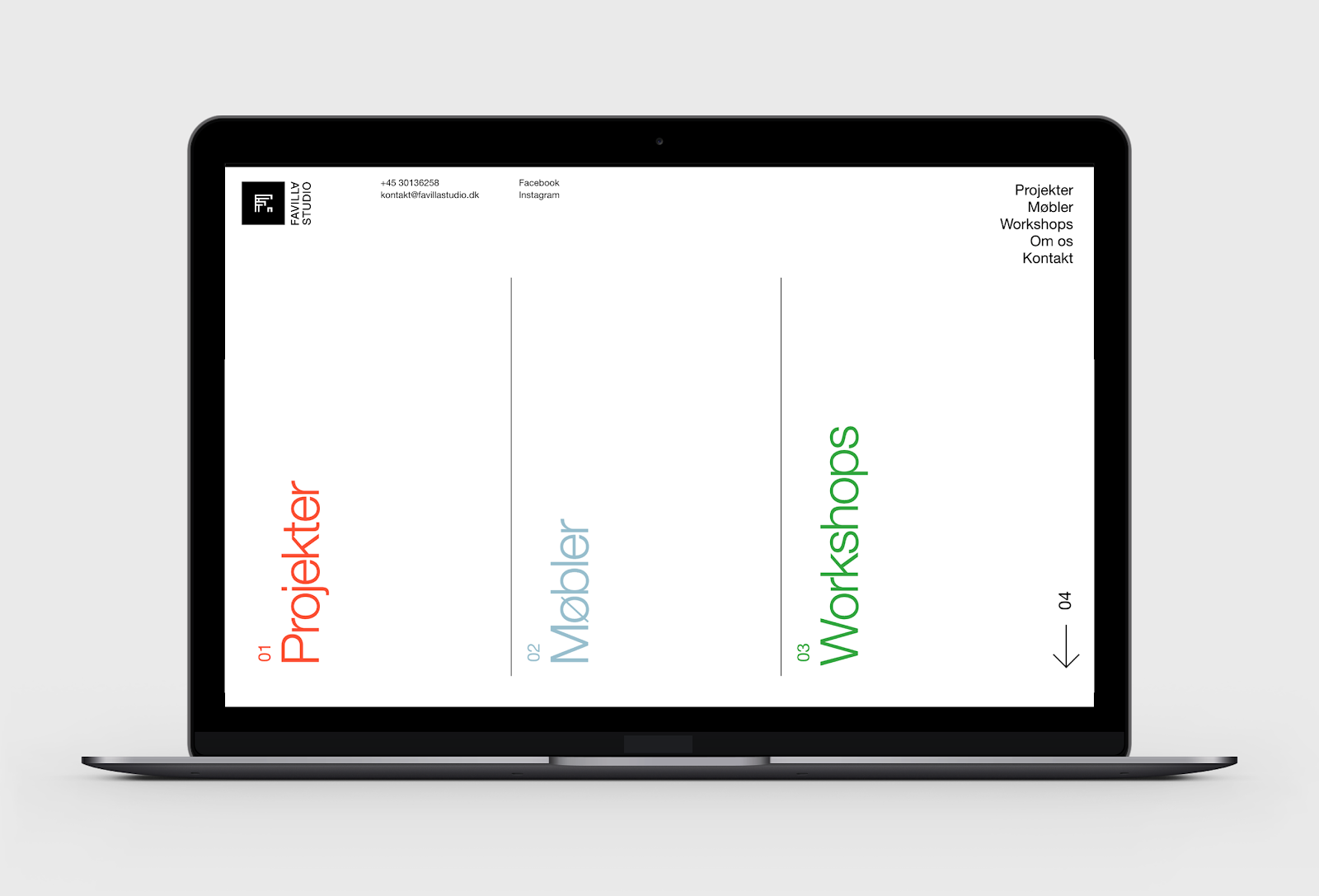
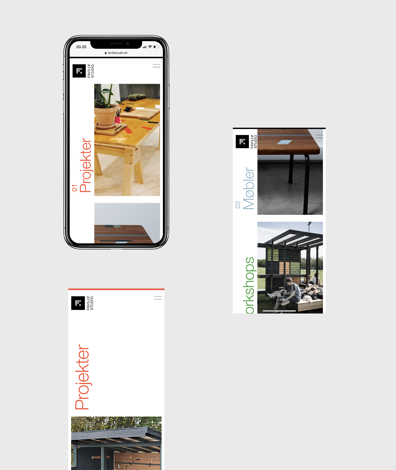
The objective was to develop an identity and an online and offline catalog to showcase the design solutions and main fields of work while reflecting their brand values.
Concept
The concept was built around Favilla Studios playful approach to design and typical materials of use.
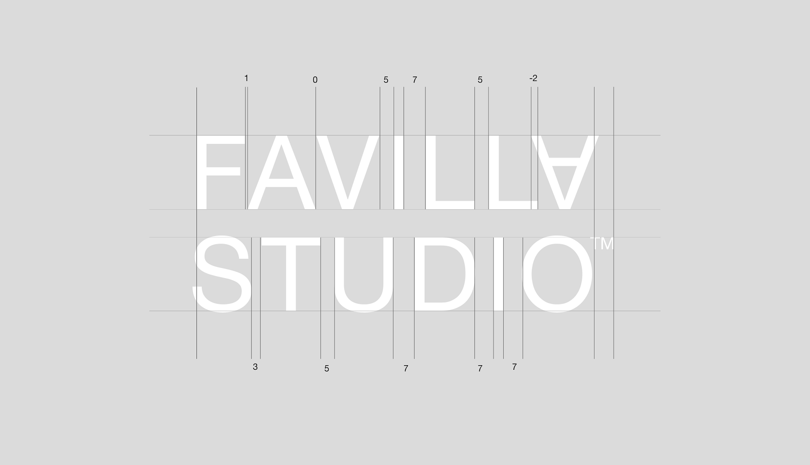
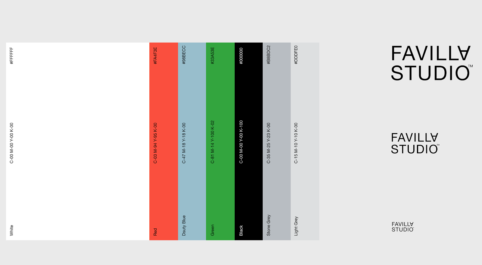
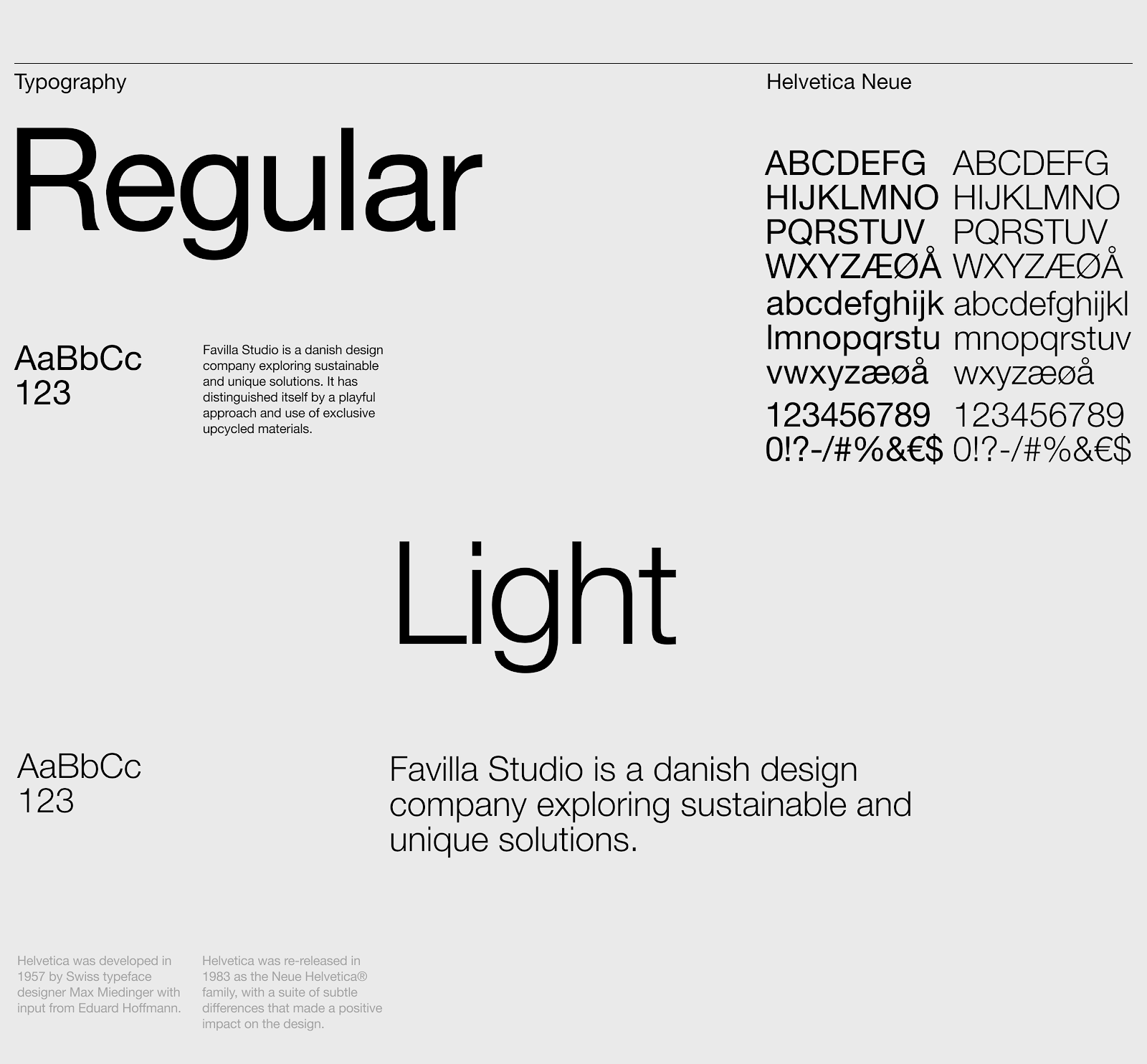
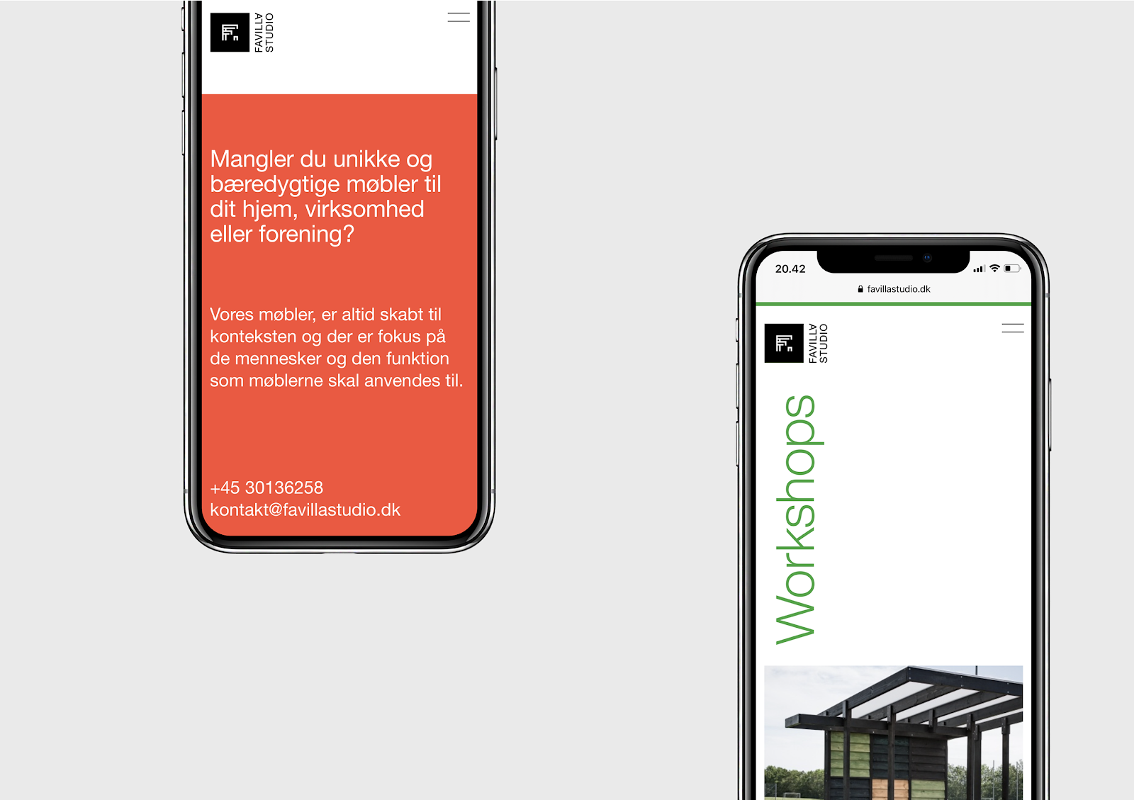
The wordmark is kept minimal and elegant but with a playful twist. The color scheme is inspired by the markings often found on materials. The combination of clear typography and a playful use of the grid produces a result that is impactful and elegant with lots of tension and contrast
Branding and Visual Identity