by abduzeedo
Explore Siyu Shen's minimal branding and packaging design for Dou Soymilk. Pure ingredients meet bold typography.
Finding standout branding and packaging design in the food and beverage space is always a treat. Today, we're looking at Dou Soymilk, a project by designer Siyu Shen that really nails the minimal yet bold aesthetic. It’s a great example of how simplicity in design can speak volumes about the product itself.
Keeping it Pure
Dou Soymilk prides itself on simplicity. The ingredients? Just water and organic soybeans. That’s it. When your product is that straightforward and transparent, the design needs to match. Siyu Shen leaned into this beautifully.
The core idea was to create a minimal and bold identity that reflects this purity. Forget complex illustrations or flashy graphics. The star here is typography. It’s a choice that feels confident and direct, letting the product's natural appeal shine through.
Typography Takes Center Stage
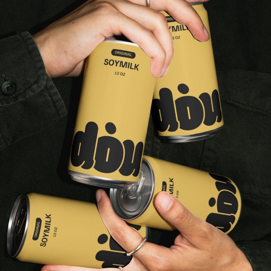
The branding relies heavily on a custom logo for "dou". It's warm, rounded, and almost tangible – feels friendly and approachable, right? This is paired with a clean, modern sans-serif font for the supporting text, like "SOYMILK" and the ingredient list.
This contrast works well. The custom logo gives the brand personality, while the sans-serif keeps things feeling contemporary and easy to read. It’s a smart balance often seen in effective branding and packaging design. The way the logo interacts with the can shape, especially how it wraps around, is also quite satisfying.
Packaging That Pops
The packaging itself comes in simple aluminum cans – shown in both a clean white and a warm, earthy yellow. The minimal color palette reinforces the brand's natural and pure message.
The design clearly states what’s inside: "UNSWEETENED SOYMILK," "MADE ONLY WITH WATER & ORGANIC SOYBEANS." There's no hiding behind marketing fluff. This directness builds trust. It tells you exactly what you’re getting. Even the secondary packaging, like the cardboard carriers, maintains this clean, type-driven look. It all feels cohesive.
Beyond the Shelf
The project also includes visuals showing how the soymilk can be used – with coffee, tea, oatmeal, smoothies. This adds a lifestyle element, suggesting versatility. The design feels modern and could easily appeal to a wide audience looking for authentic, simple products.
Siyu Shen mentions the goal was to bring "authenticity and care to diverse cultures." The clean, universal language of the design certainly helps achieve that. It avoids specific cultural tropes, instead focusing on the shared value of purity and simplicity.
Final Thoughts
The Dou Soymilk project is a strong case study in less-is-more branding and packaging design. By focusing on typography and a minimal aesthetic, Siyu Shen created an identity that feels honest, modern, and appealing. It perfectly mirrors the simplicity of the product inside the can.
It’s a reminder that you don’t always need complexity to make an impact. Sometimes, the clearest message is the most powerful.
Check out more details on this project directly from the designer: Siyu Shen: https://siyushen.com/dou_more-1
Branding and packaging design artifacts
