by abduzeedo
The saying "don't judge a book by its cover" simply means that outward appearance is not an indicator of someone or something's value or worth. While this a beautiful saying to live by, the truth is that people are always judging books, people, places and things by their covers. Regardless of the inherent value a brand, book, or product holds, the face presented to the world is the underlying factor in how it will be perceived or judged by others looking in.
Graphic design’s purpose is to mold and shape the “look” of something to aesthetically and accurately represent its inherent value, information and meaning. YUNGBLD’s purpose is to deliver designs that allows for people to accurately judge your brand by its cover - the cover you portray to the world - as you are and deserve to be seen.
“The Power of Now” was a book that I was not interested in reading simply because of the boring cover. After I read it, I found this book was filled with life-changing principles that I wouldn’t have been able to access had I not given it a chance. So I decided to create a new cover - one that makes you feel as good as you do when you read the contents of the book. A cover that represents the eye-opening ideas contained within.
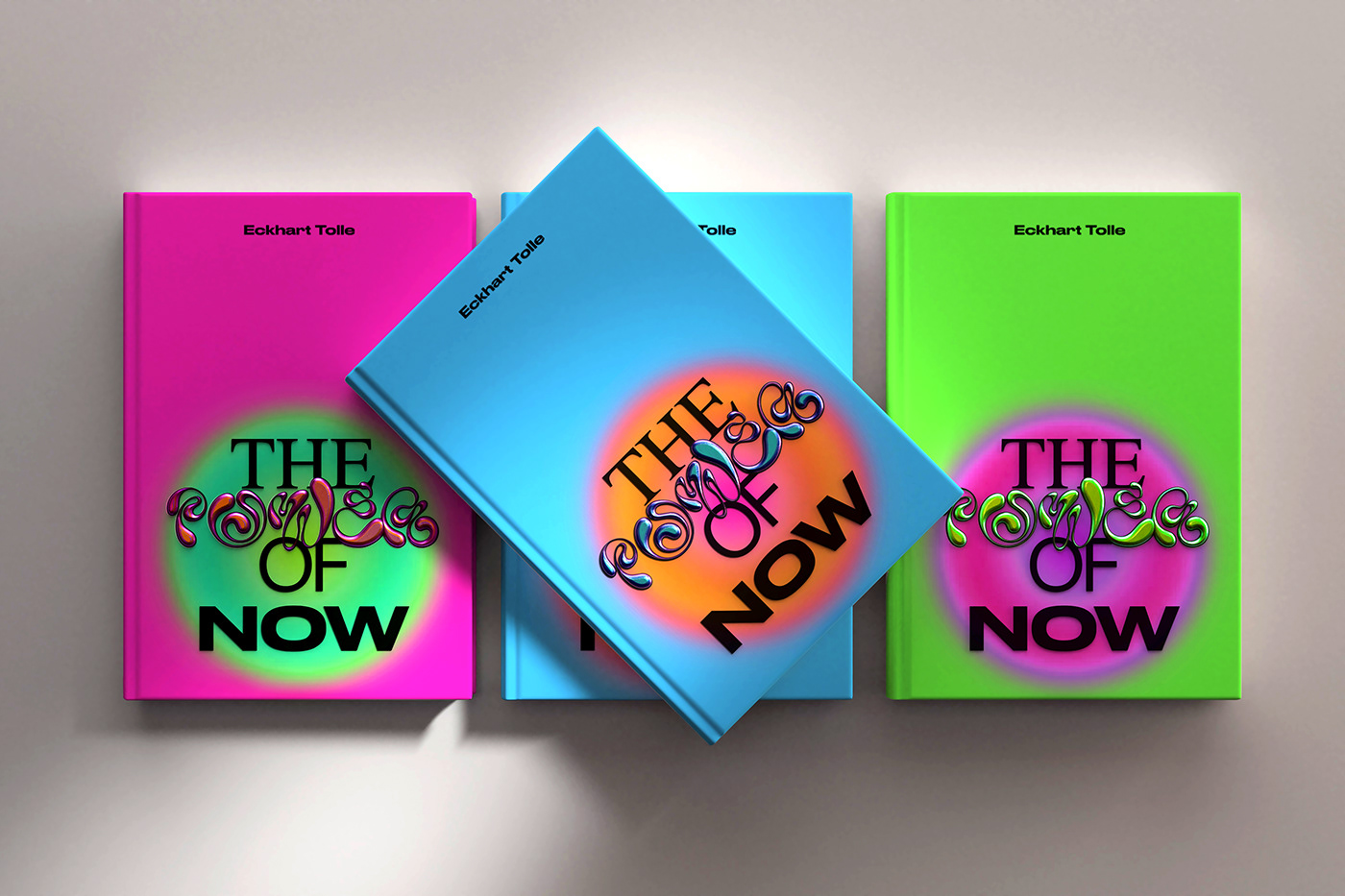
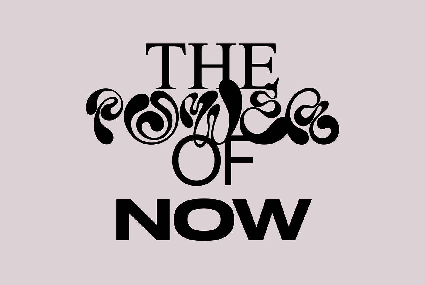
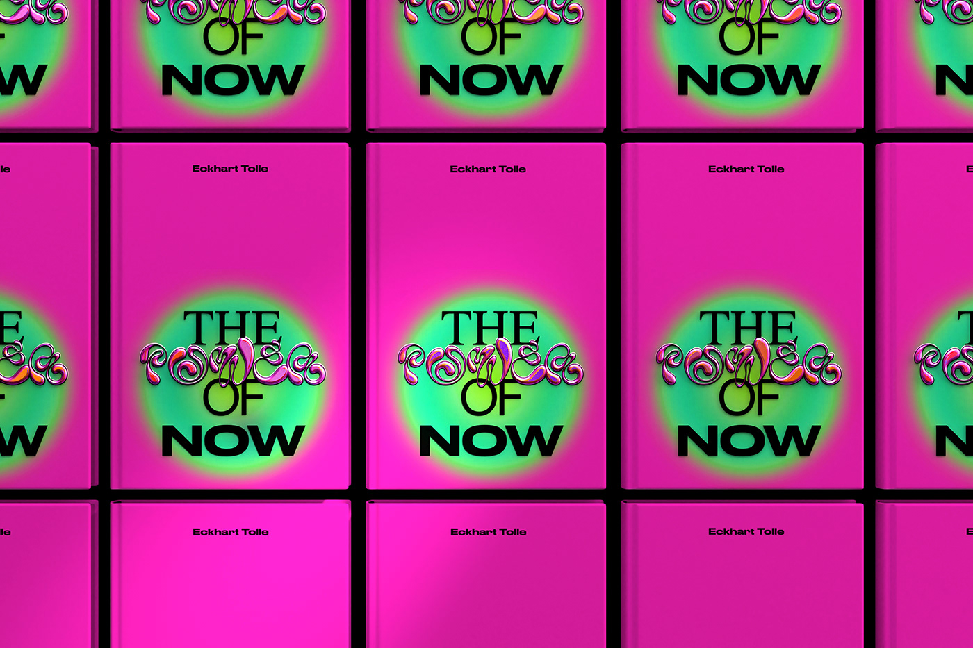
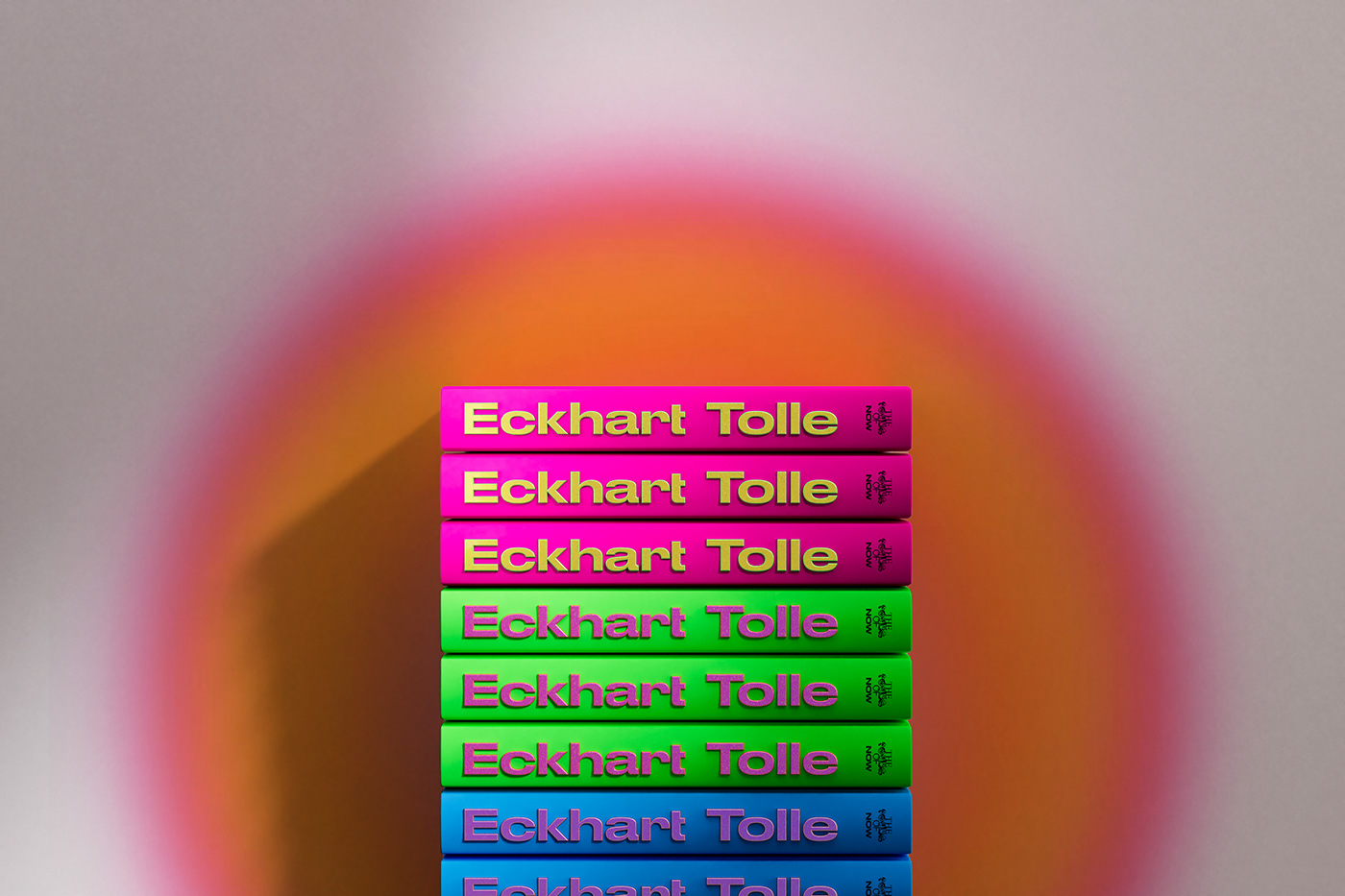
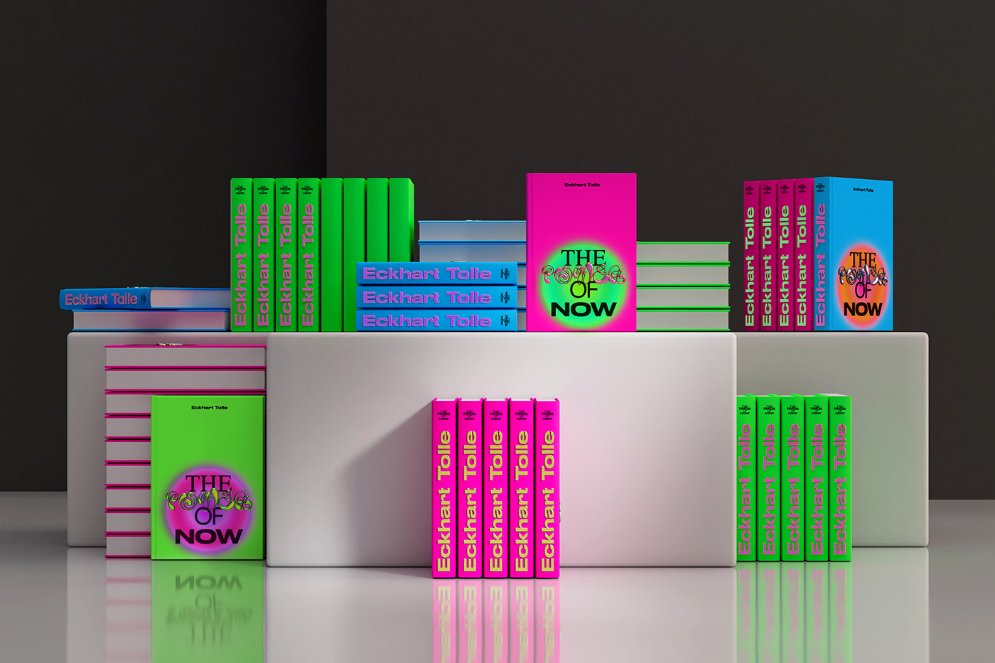
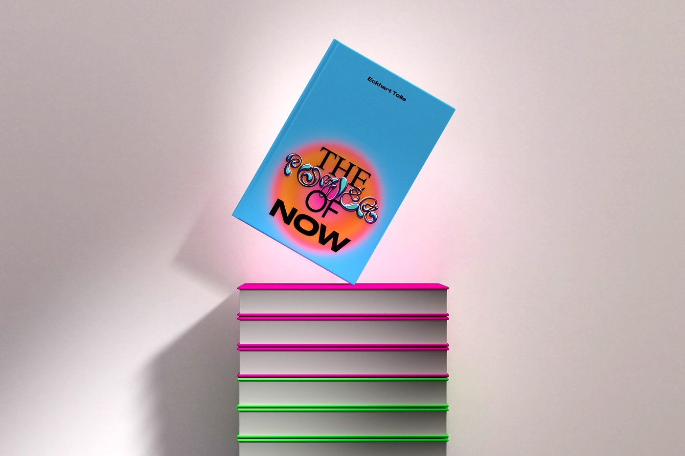
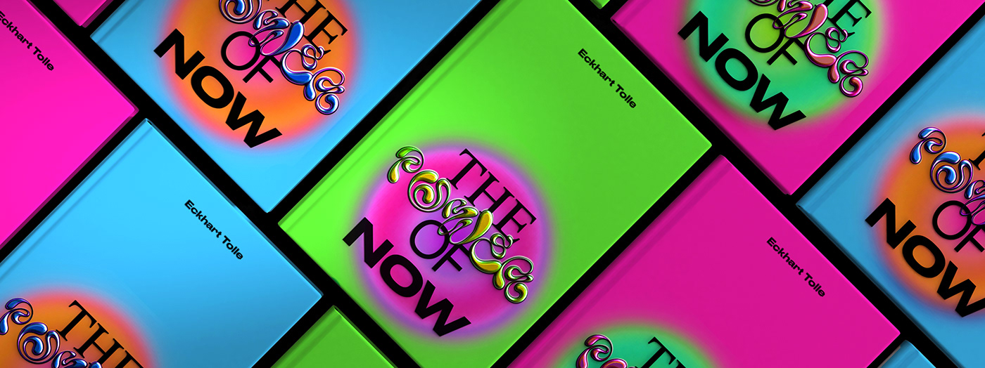
To achieve this, we used elements of bright, rebellious, unapologetic “Dopamine Design” (clashing full-color saturation, bold textured type, primary colors with neons and freehand drawn elements). This type of design makes us feel good and lights up our neurotransmitters, a stark contrast to the flat, pastel, minimal millennial design of the last decade. We hope you love our take on this classic book.
For more information make sure to check out YUNGBLD studio on:


