by abduzeedo
Spicer Warin, an esteemed brand known for its fine jewelry and stones, is expanding its business and aiming to appeal to a younger generation while maintaining its reputation for superior quality and provenance. The brand's collection includes pieces from prestigious historical houses such as Cartier, Van Cleef & Arpels, and Boucheron, each designed as an eclectic work of art. To capture the spirit of the pieces and appeal to a broader audience, Spicer Warin has developed a new logo design and brand identity with a focus on finding a balance between timeless and modern.
The new identity features a new logotype and typeface, using Quadraat, a classic and delicate high-contrast serif typeface designed by Fred Smeijers, paired with Relative, a well-proportioned, geometric sans-serif typeface designed by UK-based type foundry Colophon.
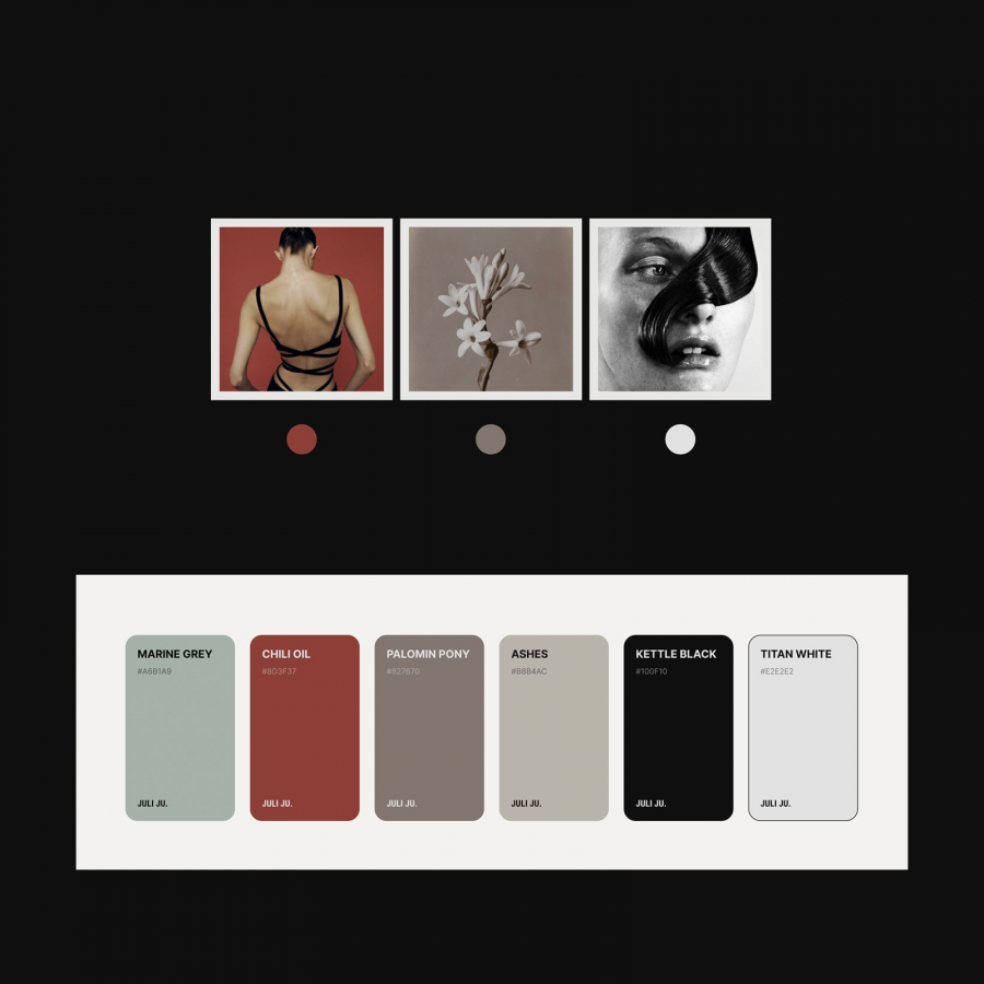
The ethereal imagery used in the new brand identity enhances the beauty of the creations and transports us out of the everyday and into a place of mystery, contemplation, and even enchantment. Spicer Warin's new design is contemporary yet timeless, making it relevant today and in the future.
While Spicer Warin has a loyal customer base, the brand's ambition is to expand into new territories and appeal to a younger generation. The new designs build a stronger and more contemporary identity that reflects the brand's diverse historical collection and is as relevant today as when it was first conceived.
In conclusion, Spicer Warin's new brand identity captures the spirit of its pieces and appeals to a broader audience. The use of Quadraat and Relative typefaces and the ethereal imagery create a contemporary yet timeless design that reflects the brand's superior quality and provenance. With a focus on finding a balance between timeless and modern, Spicer Warin is set to expand its business into new territories and appeal to a younger generation.
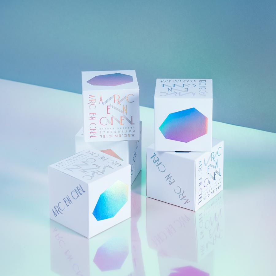
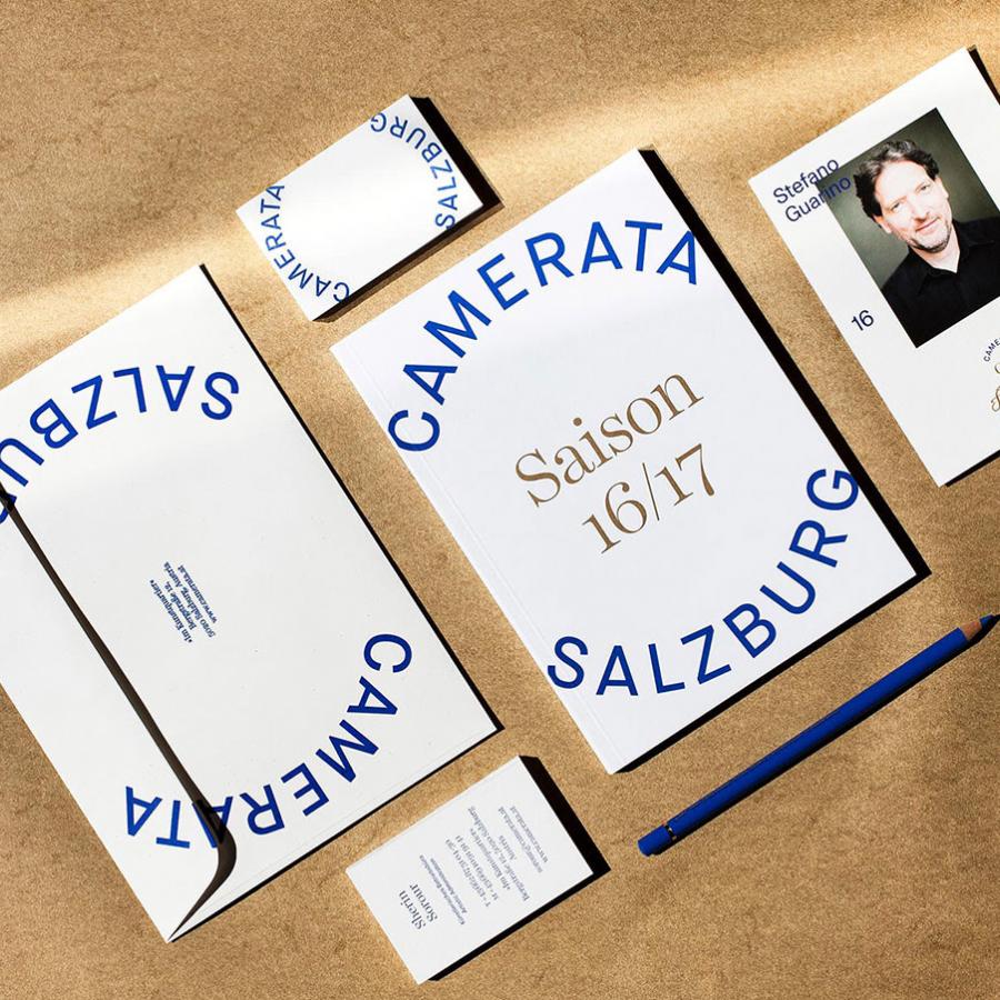
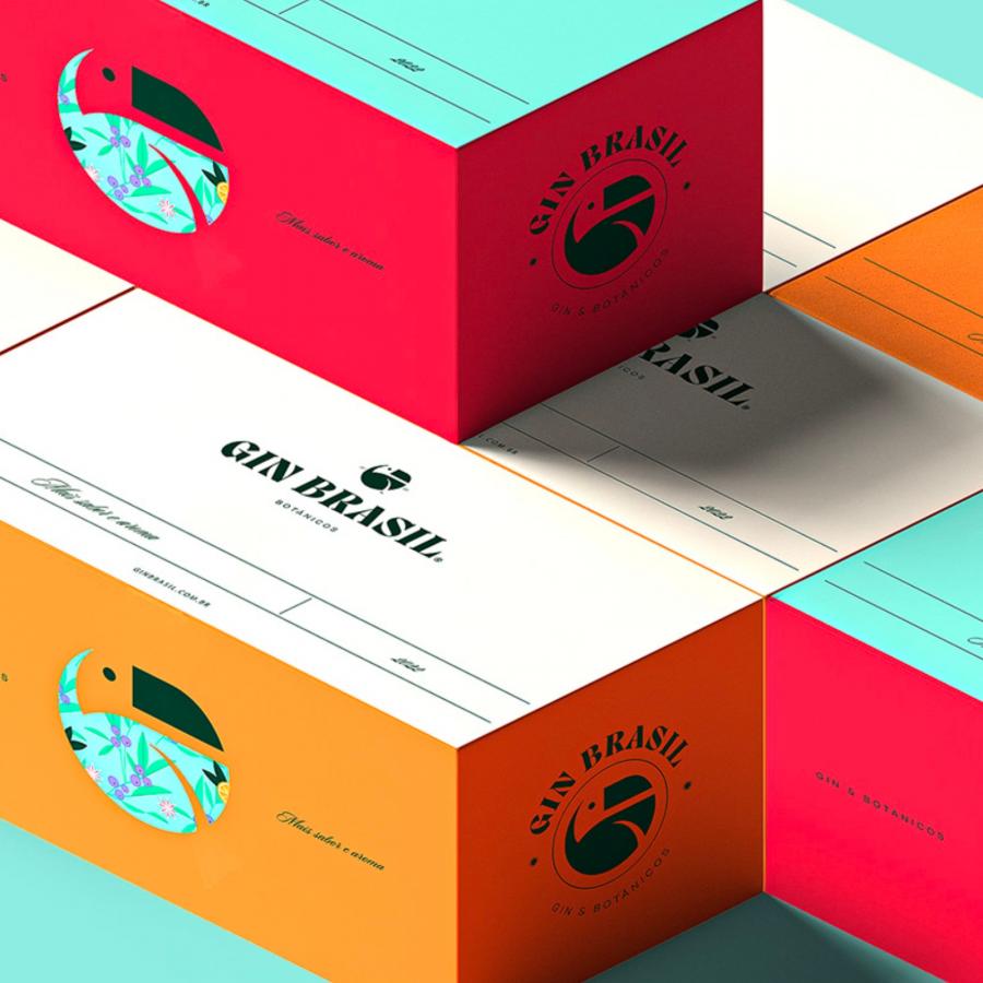
Logo design and brand identity artifacts
For more information make sure to check out Studio Bright Green website or follow them on Instagram.
