by abduzeedo
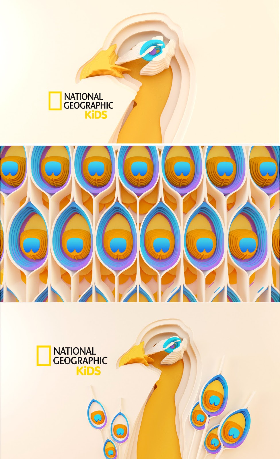
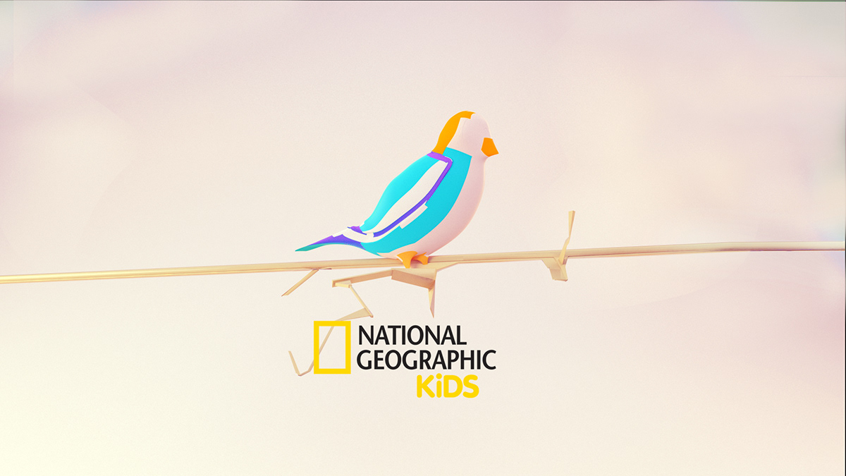
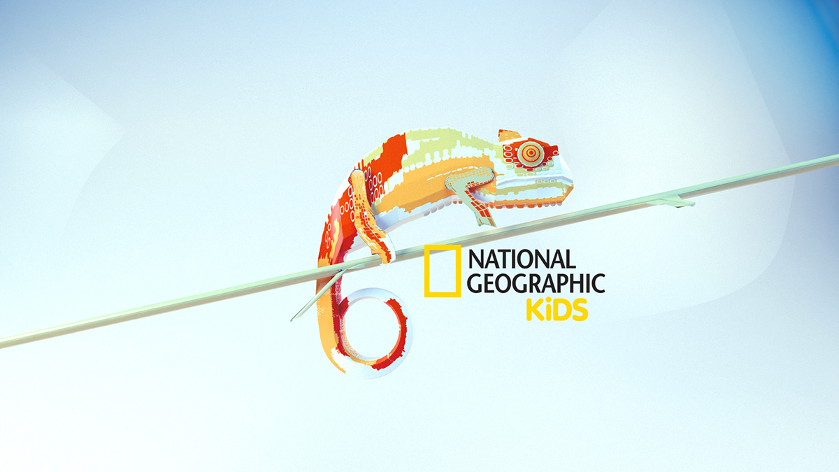
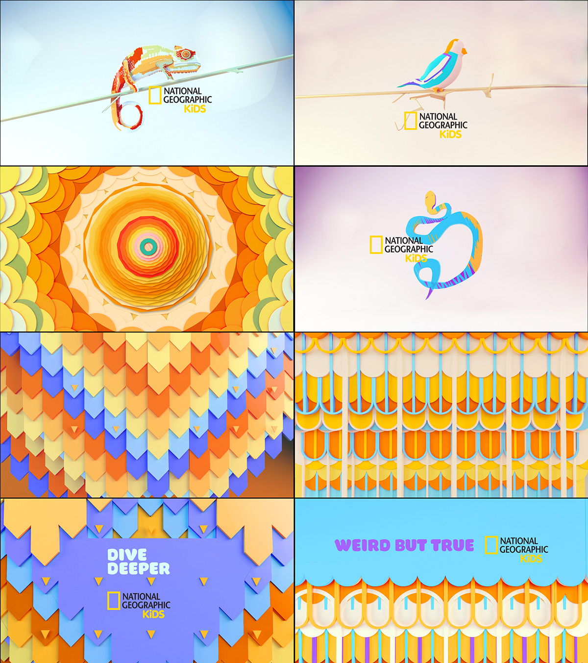
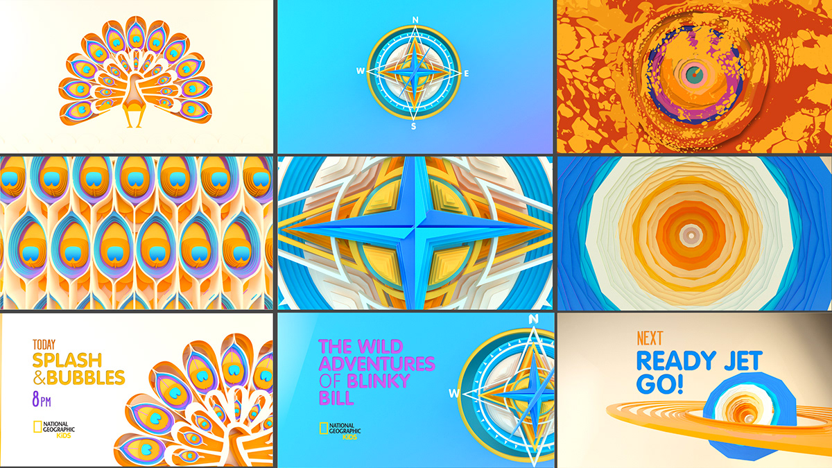
Negro Studio got a call from their friends at PLENTY to work with them on some proposals for NATGEO kids branding (rebranding). I cannot imagine the excitement that receiving a call like that might have been. For me National Geographic is one of those iconic brands. The yellow rectangle is so simple, yet recognized everywhere. It’s funny to think of these memorable brands. If I ask you the brand of a blog or social media influencer would you be able to describe it? Not for instant think about a brand like National Geographic, it’s simply a yellow outlined rectangle.
I know, this is not really relevant for this post, but I just wanted to highlight how cool it might have been to work on these explorations for the Natgeo Kids redesign. Here are some boards of what they've been working on!
Branding


Credits
- Client: Natgeo Kids
- Art Direction: PLENTY / Negro Studio
- Design & Concepts: Negro Studio
- Producer: PLENTY


