by abduzeedo
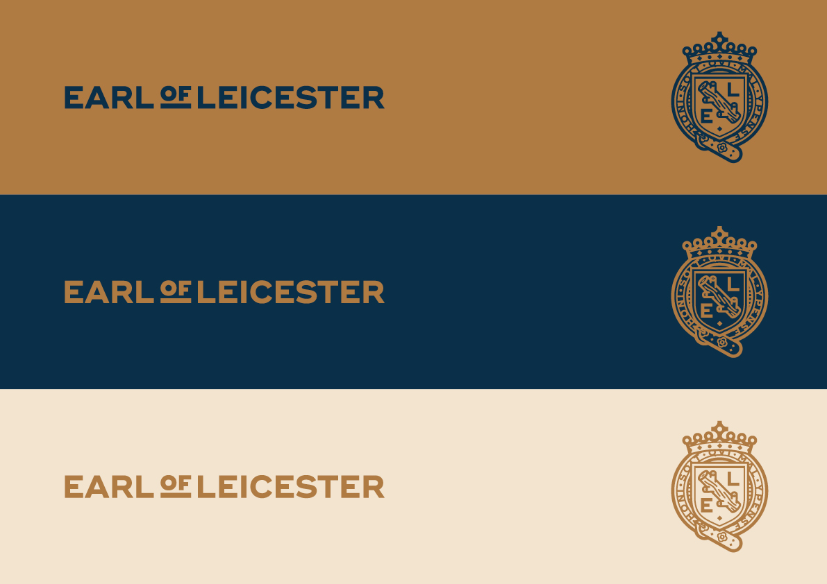
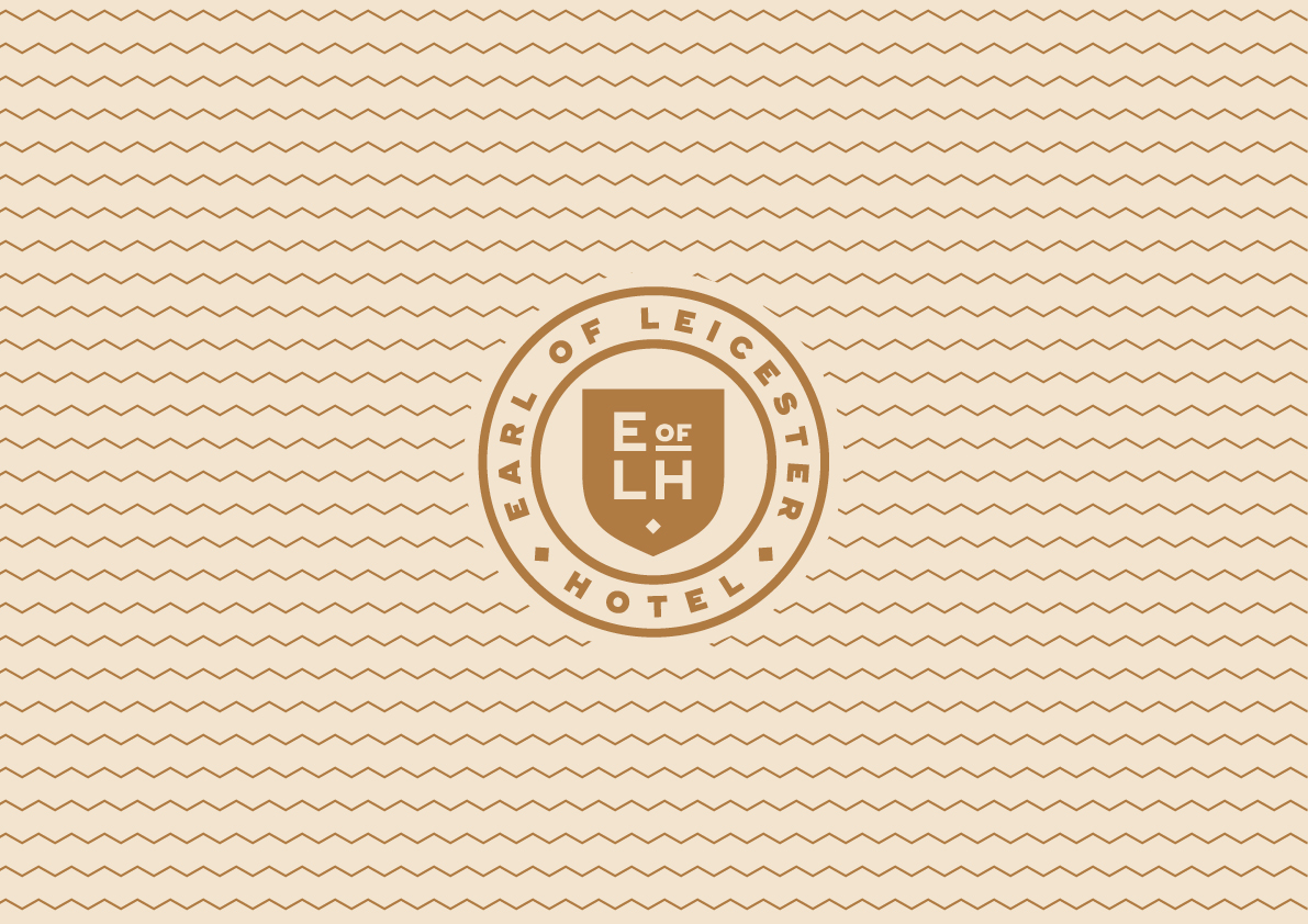
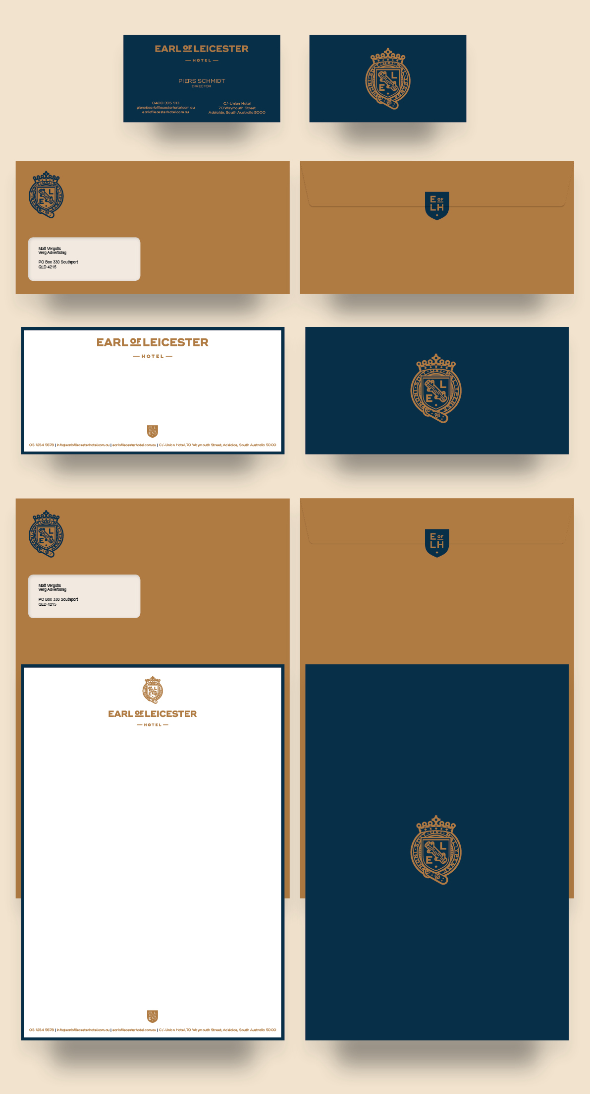
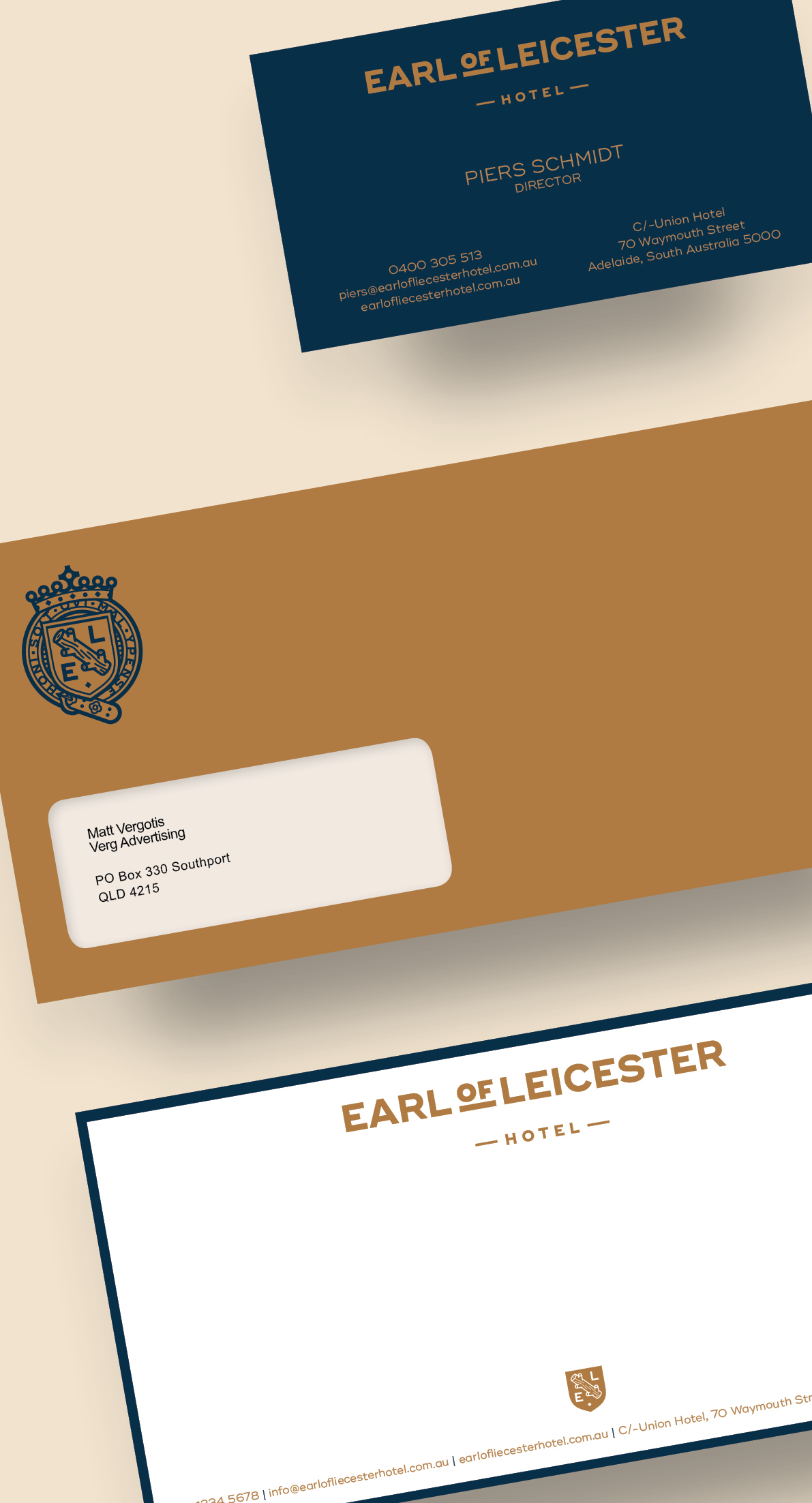
Matt Vergotis share a cool visual identity project on his Behance profile. It's for a a pub in Adelaide, Australia called Earl of Leicester. I love the look of the crest he created, it keeps alive the idea of being a very old pub, with tradition of offering an abundance of beers and good food.
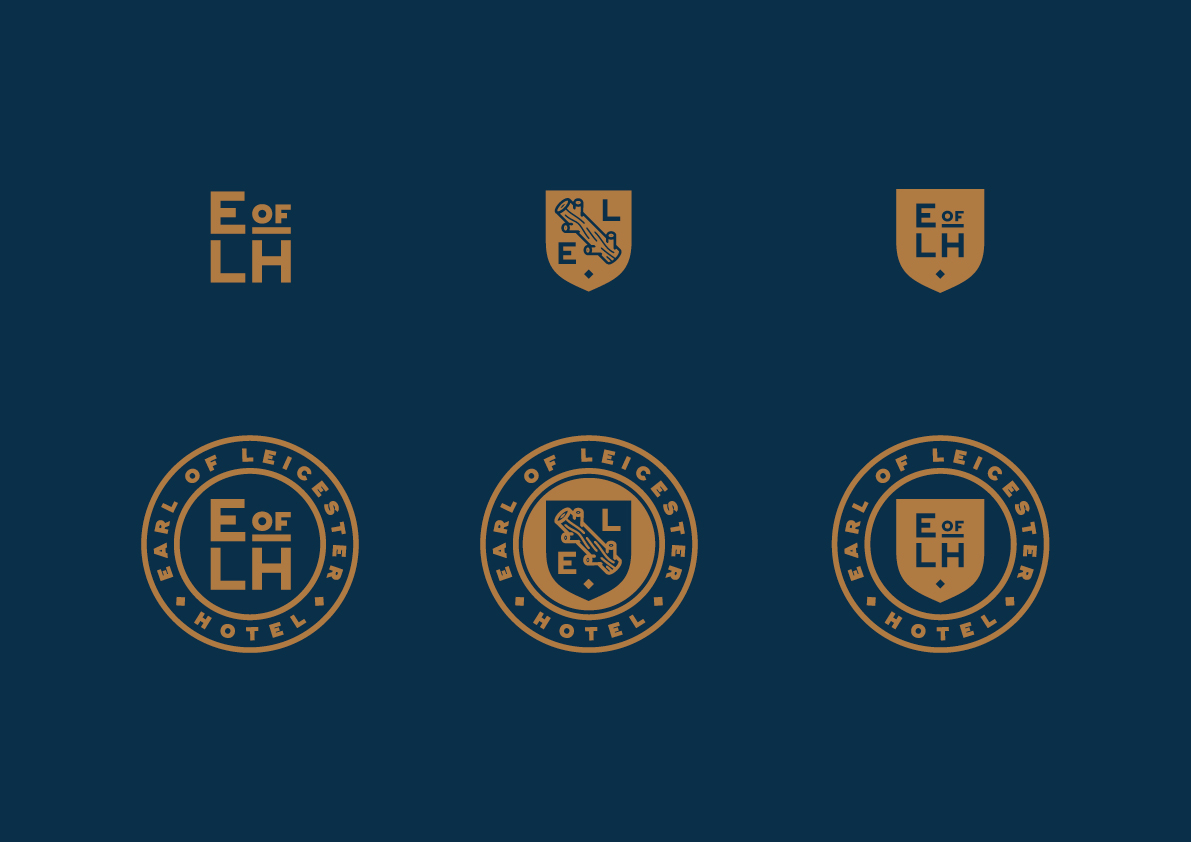
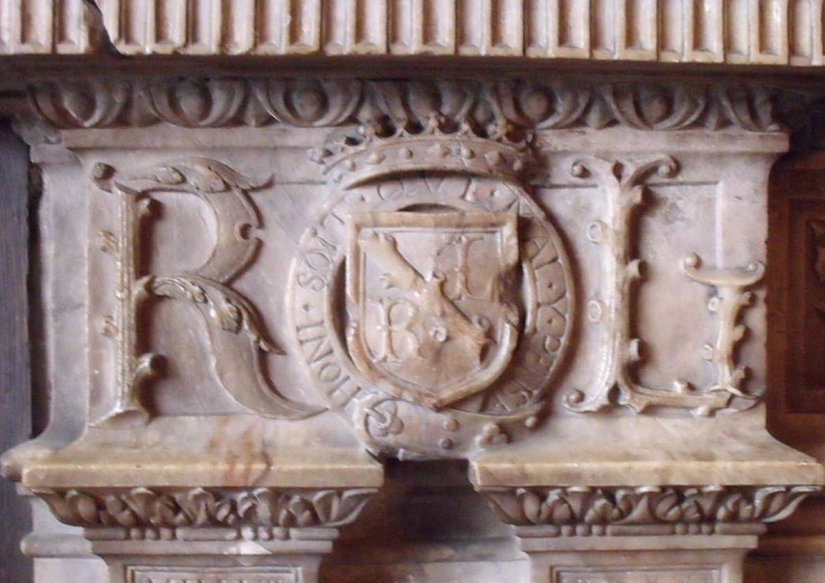
I’m currently in the process of rebranding a very old pub in Adelaide that has an abundance of craft beer and good food. It’s getting a little visual love in the way of a refurb and to compliment this reufb I was asked to give it a new fresh corporate identity. To do this I went back in time to research Sir Robert Dudley, the 1st Earl of Leicester and found a really cool fireplace (final image) of his that had an old heraldic emblem masoned out of marble. So that gave me the idea to recreate a modern and contemporary adaptation of this circular crest and provide a flexible logo suite that could roll out across the new improved pubs, stationery, menus and signage. I'll update this presentation with photographic imagery as it comes through.
Visual Identity
