by abduzeedo
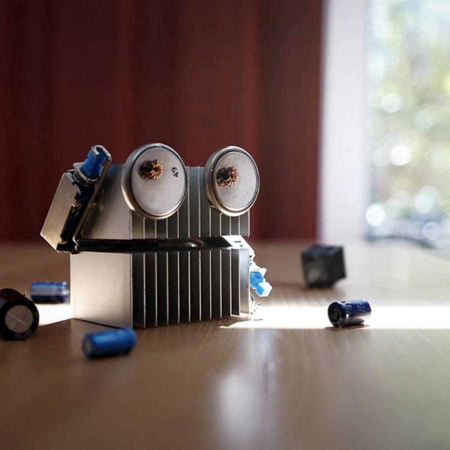
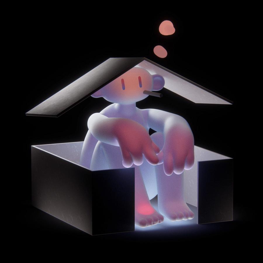
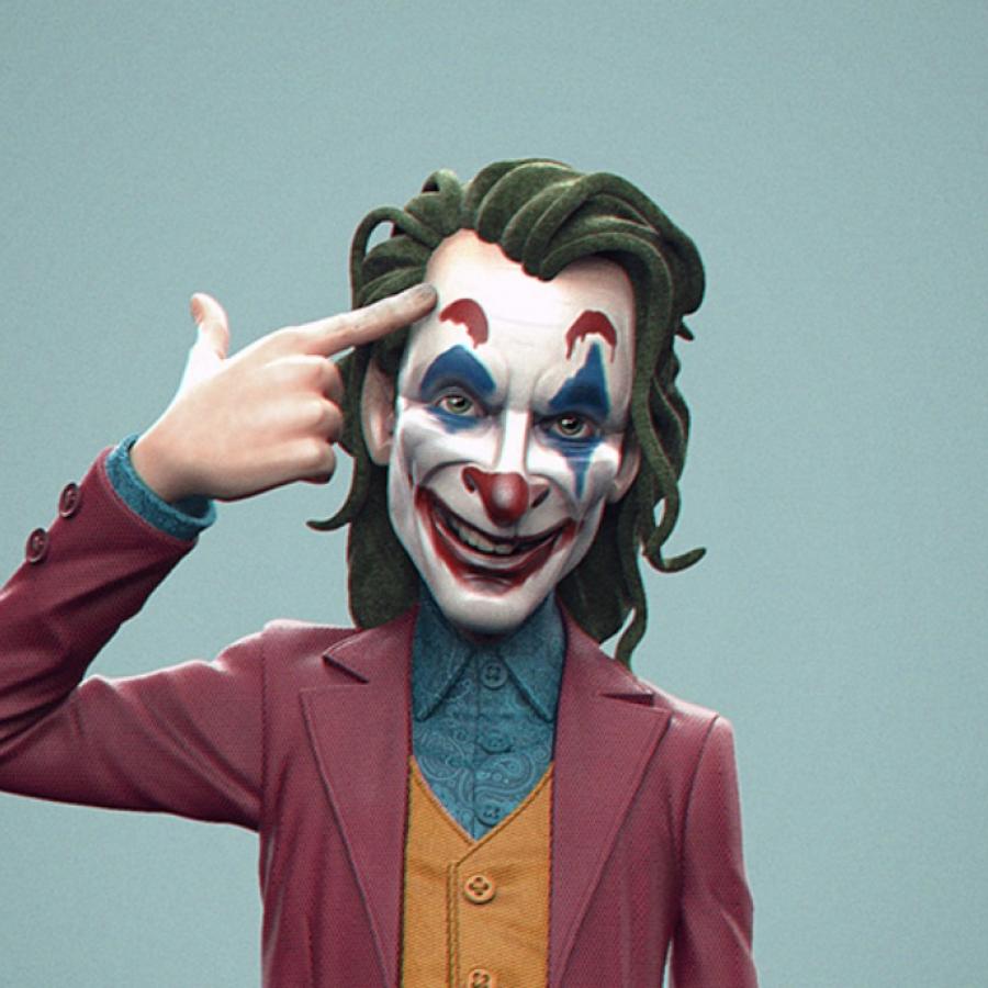
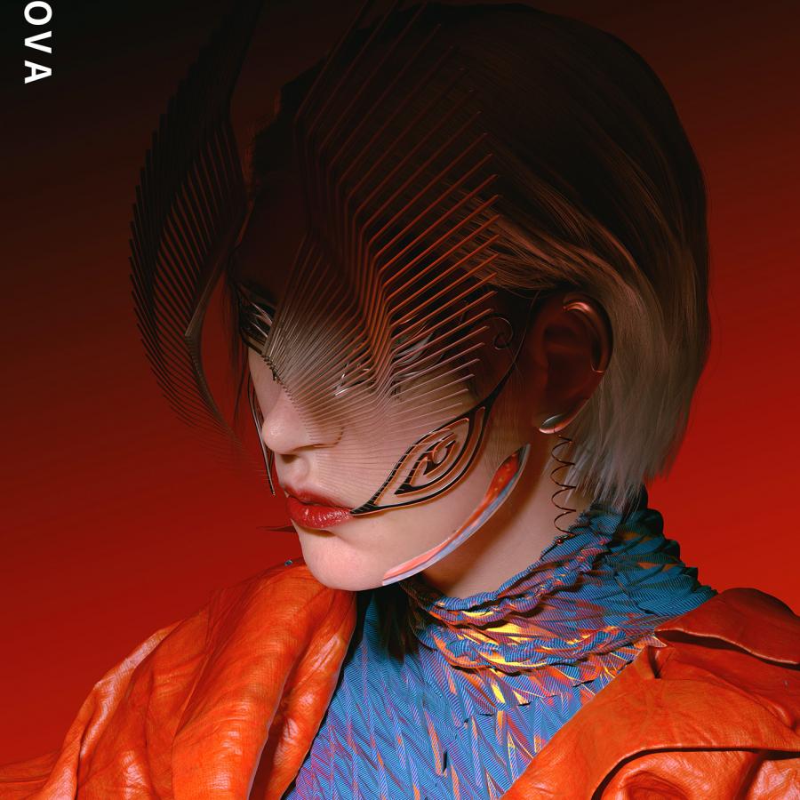
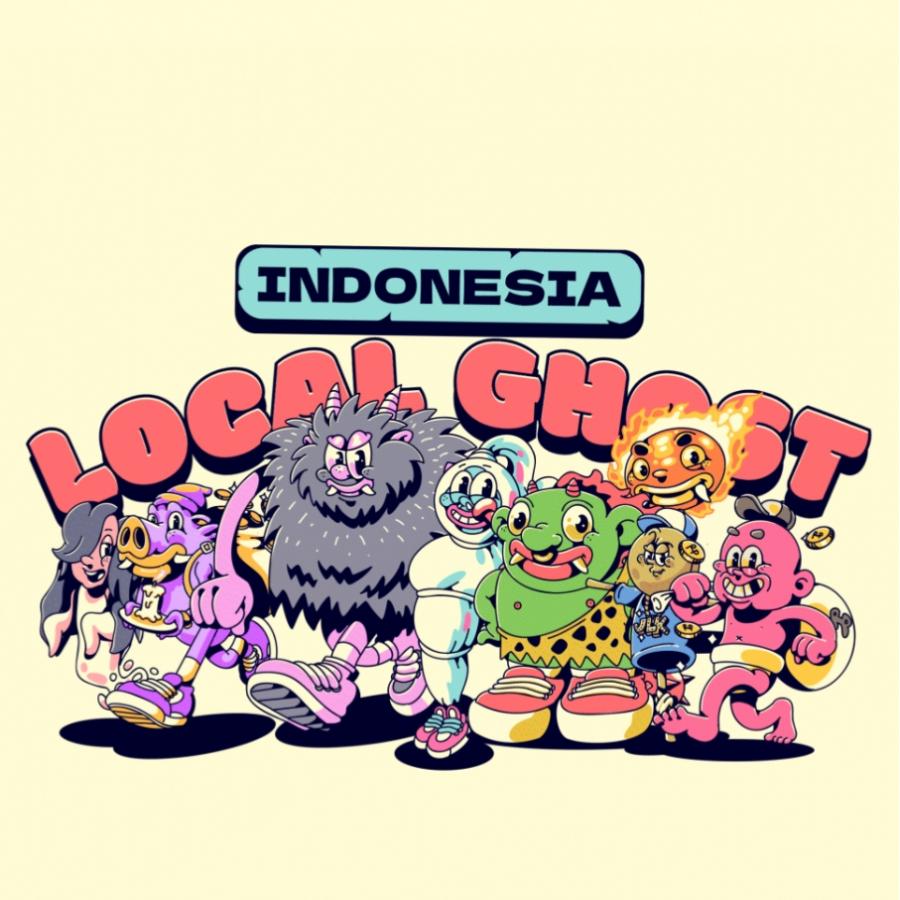
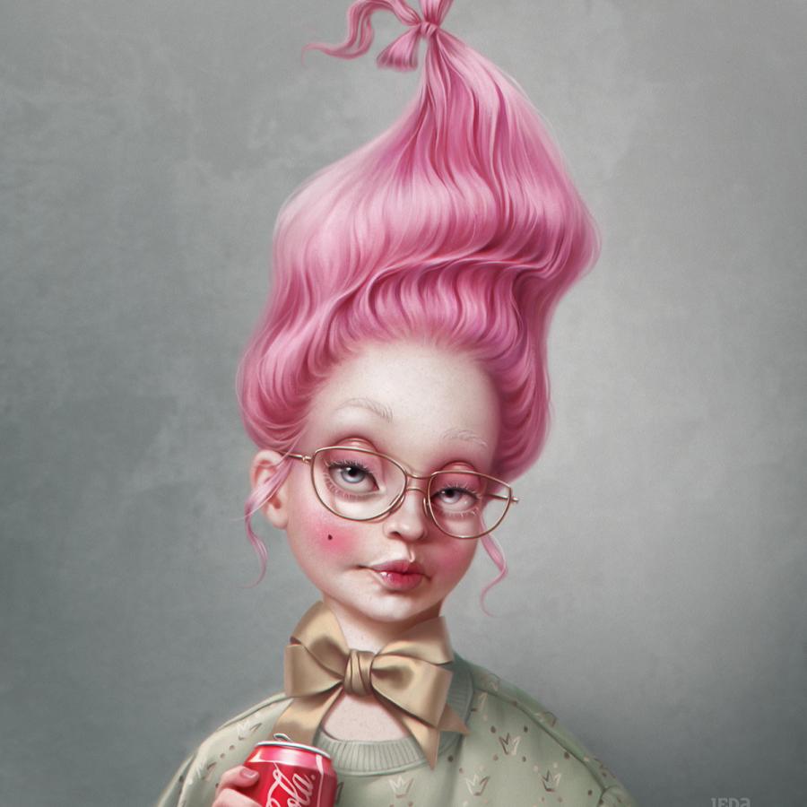
Gustavo Henrique shared a beautiful character design project on his Behance profile. He created simple shapes in 3D and added some simple 2D draw on them. Gustavo mentioned that he wanted to give some personalities to these shapes using very simple lines. As he said: "I tried to use less shapes and lines as possible to give them some personality. Although they are very simple I really liked how everything looks good together." In addition, I quite love the way Gustavo played with depth of field, really exaggerating the blur of the background. That created a nice separation between foreground and background.
I tried to use less shapes and lines as possible to give them some personality
