by abduzeedo
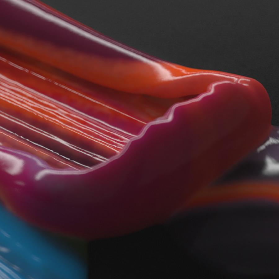
I own an iPhone 11 Pro and the Pixel 4 XL and I have to say. Pause here, the Pixel 4 is much nicer from the industrial design point of view than the iPhone. I am talking about just the way that it feels when holding. There's something about the black rails, the pop of color of the white one and the simplicity that makes it especial. Before you ask me, I hate the chins and wish it was like the One Plus 7 Pro but anyways, pack to this post. Buck was called by Google to create a comprehensive visual system for the Pixel 4 launch. Daniel Rodrigues was the animator behind the super awesome campaign. Inspired by the Bauhaus elegant modernism, Pixel 4 is an exercise in playful simplicity.
Credits
- Directed by Buck.co
- Animator: Daniel Rodrigues
- Full credit list at Buck.co
Motion Design
