by AoiroStudio
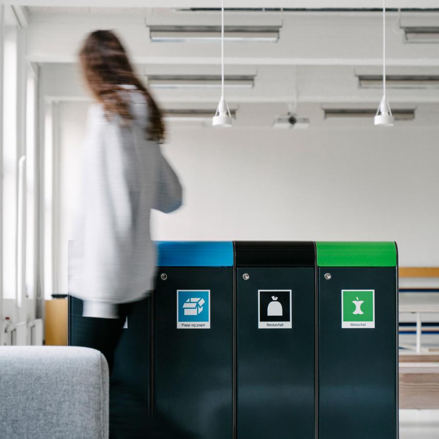
We are taking a look at Norway's National Recycling 'Symbols' and also its usage as a system throughout various use cases. Behind the conceptualization, we follow the collaboration work of Heydays Design Agency and also Goods ⠀. I can't even imagine how insane it must have been to first establish the use cases on defining what would be the most effective style of icons to use for everyone's understanding without being too abstract and yet too general. I also enjoy how they are defining how the 'symbol' will look vertically, on a recycling station, packaging and etc. Give it a look!
- View the full case study on : Behance
The National Recycling Symbols in Norway is a system to label products, public litter bins, and recycling facilities. Lowering the hurdle for recycling all your waste. It's accompanied by an app where you can search for anything and quickly see where it goes.
