by abduzeedo
In his long-form special project, Stas Aki deconstructs the way Readymag is designed by breaking it down into small chunks: i.e. underlying design principles. From the fundamental “An interface is communication” to the paradoxical “The best interface is no interface”, these principles combine into an elaborate manifesto.
Seven key principles are revealed in the format of an interactive longread:
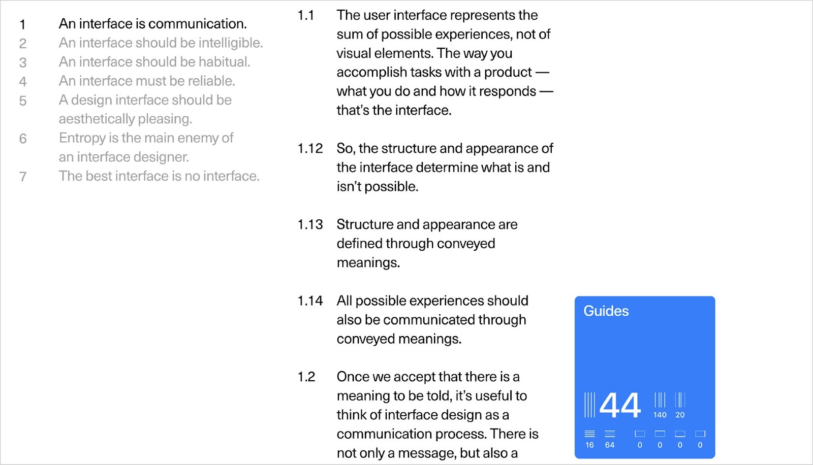
- An interface is communication.
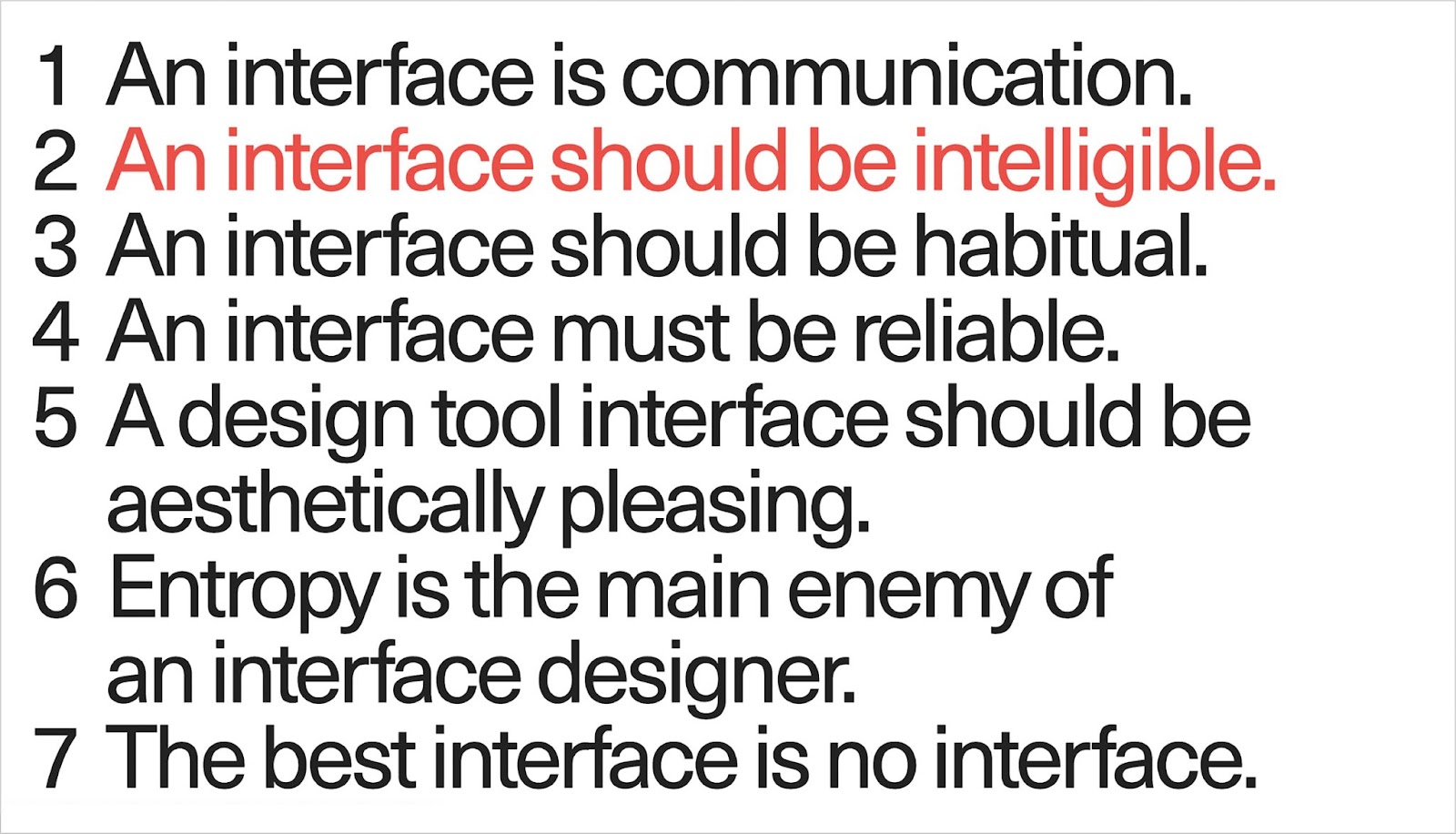
- An interface should be understandable.
- An interface should be habitual.
- An interface must be reliable.
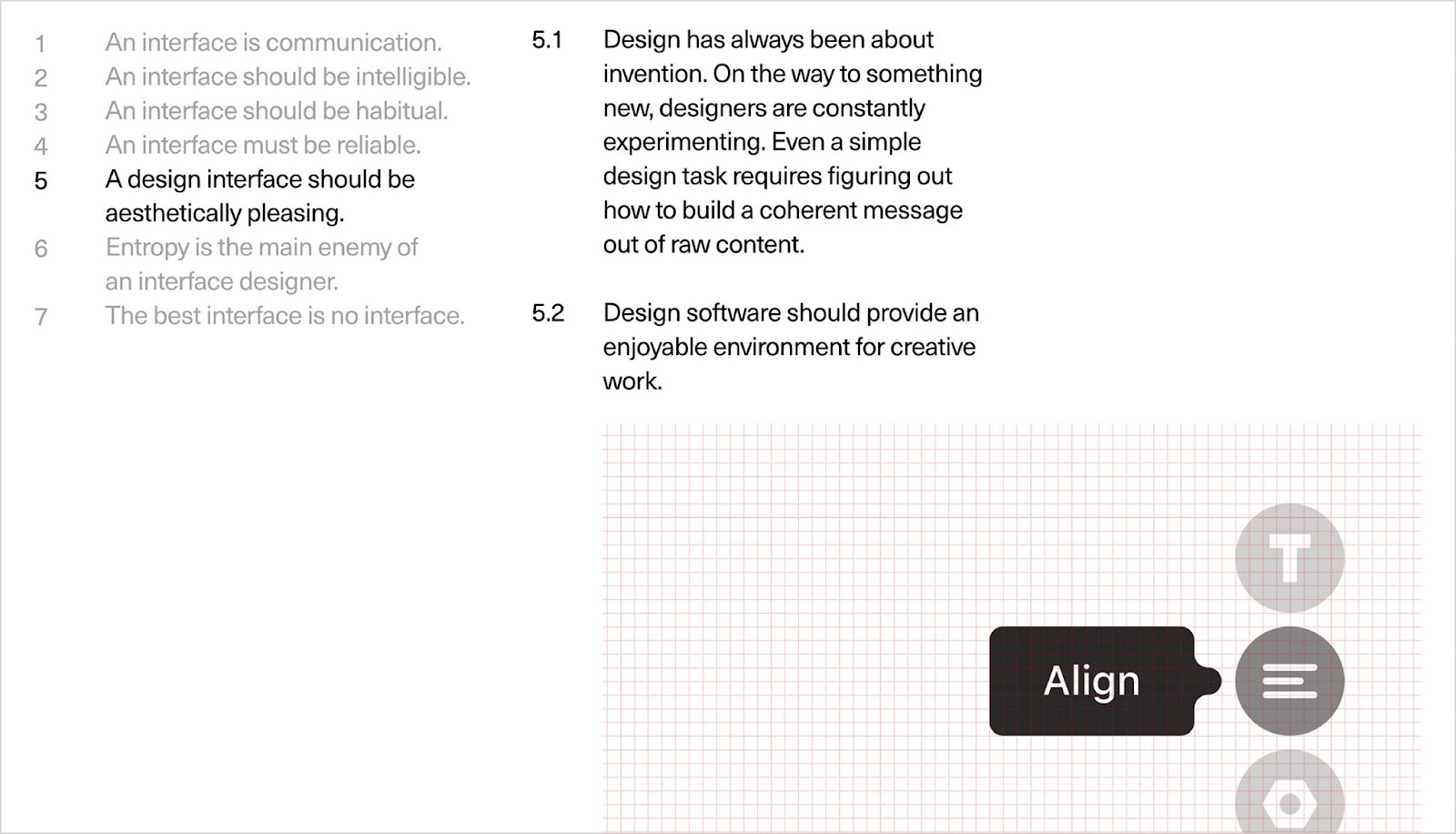
- A design tool interface should be as useful as aesthetically pleasing.
- Entropy is the main enemy of an interface designer.
- The best interface is no interface.
Exploring this interactive longread, the audience can try this set of values that help to keep consistency in design and make product decisions. Readymag is a browser-based design tool that helps create websites, portfolios and all kinds of online publications without coding.
Entropy is the main enemy of an interface designer
As a product grows, new features are always being added. The interface tends to get messier. As a result, users need to apply more effort to use the interface.
- Complexity harms everyone.
- For developers, it leads to incidents and bugs. The service delivery system becomes less reliable.
- For users, it becomes time-consuming to learn and work with. The creative process slows down.
- So: keep things simple. Though simplicity is one of the most important principles behind good design, it’s still one of the most neglected.
- Don’t hesitate to trade off other values for simplicity. No matter how complex the overall system is, there is no excuse for complicating simple tasks.
- Features are very easy to add, but almost impossible to remove.
- Simplicity doesn’t happen by itself. Simplicity has to be designed.
- Simplicity comes from a thorough understanding. The point here is to know the ins and outs of the process. If you do not, the result of your efforts will be ‘simplistic’ rather than simple.
- While designing a feature, constantly ask yourself: which elements convey information, which elements serve as decorations, and what will happen if you remove the element.
- Get rid of anything that is not essential.
- Add multiple functions to a single element.
- Look for universal solutions to solve general problems.
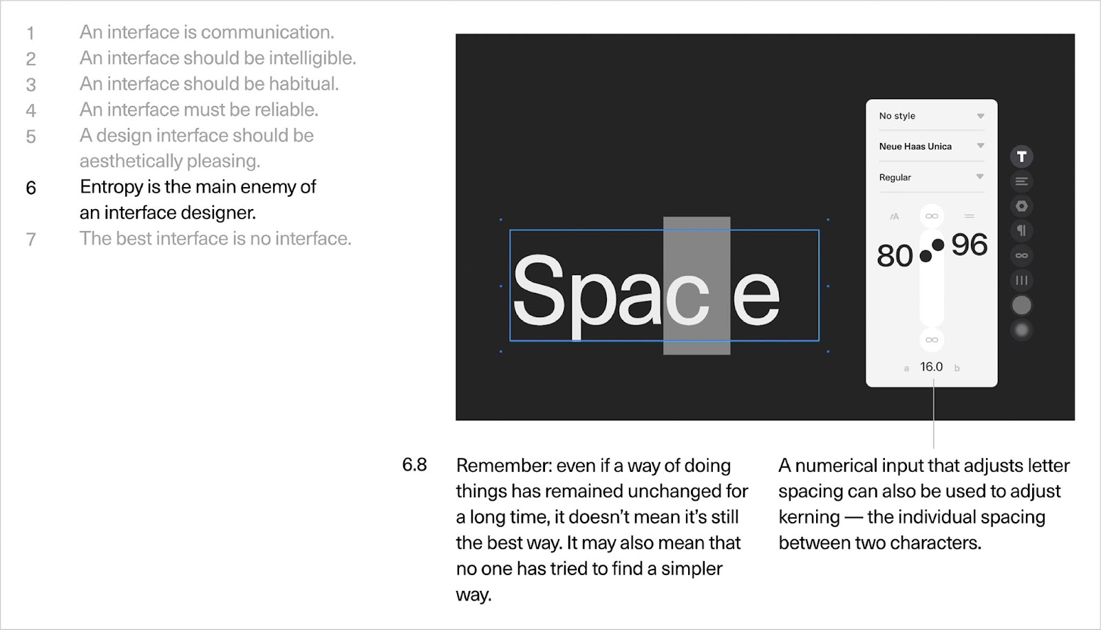
- Remember: even if a way of doing things has remained unchanged for a long time, it doesn’t mean it’s still the best way. It may also mean that no one has tried to find a simpler way.
Stas Aki, product designer
Stas Aki has over fifteen years of experience in graphic design, branding, and interfaces, throughout which he has focused on bringing simplicity and clarity to information. He has been responsible for the Readymag user interface and its identity since 2016. Alongside his role at Readymag, Stas Aki has designed an interactive journey exploring the work of musician Andrey Lee; written several essays on design (such as ‘Designer as Writer’ and ‘A Travel Guide in Your Wallet’); created a 4:52-minute long film on Le Corbusier's Modulor (part of the 100 years of design almanac); designed the layout of Readymag Stories; created three interactive longreads (‘Enso’: ‘Eames’, ‘I’, ‘Pencil’, ‘Ornament and Crime’, as well as an experiment with national flags). In his capacity as an educator, Stas has also given public talks, run workshops, shared his ‘most us shrtcts’ in the form of an animated story. Stas Aki on Dribbble and Behance.


