by abduzeedo
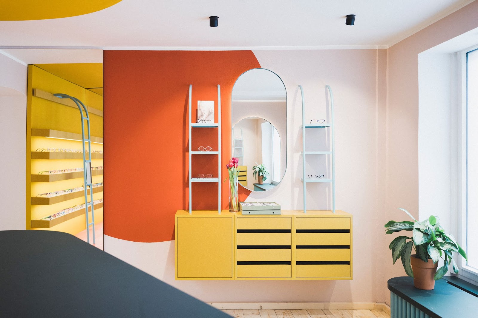
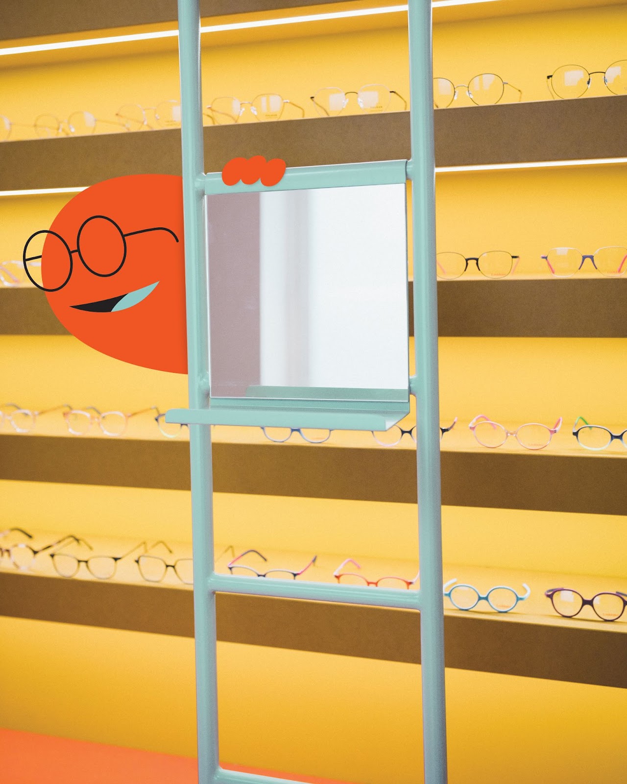
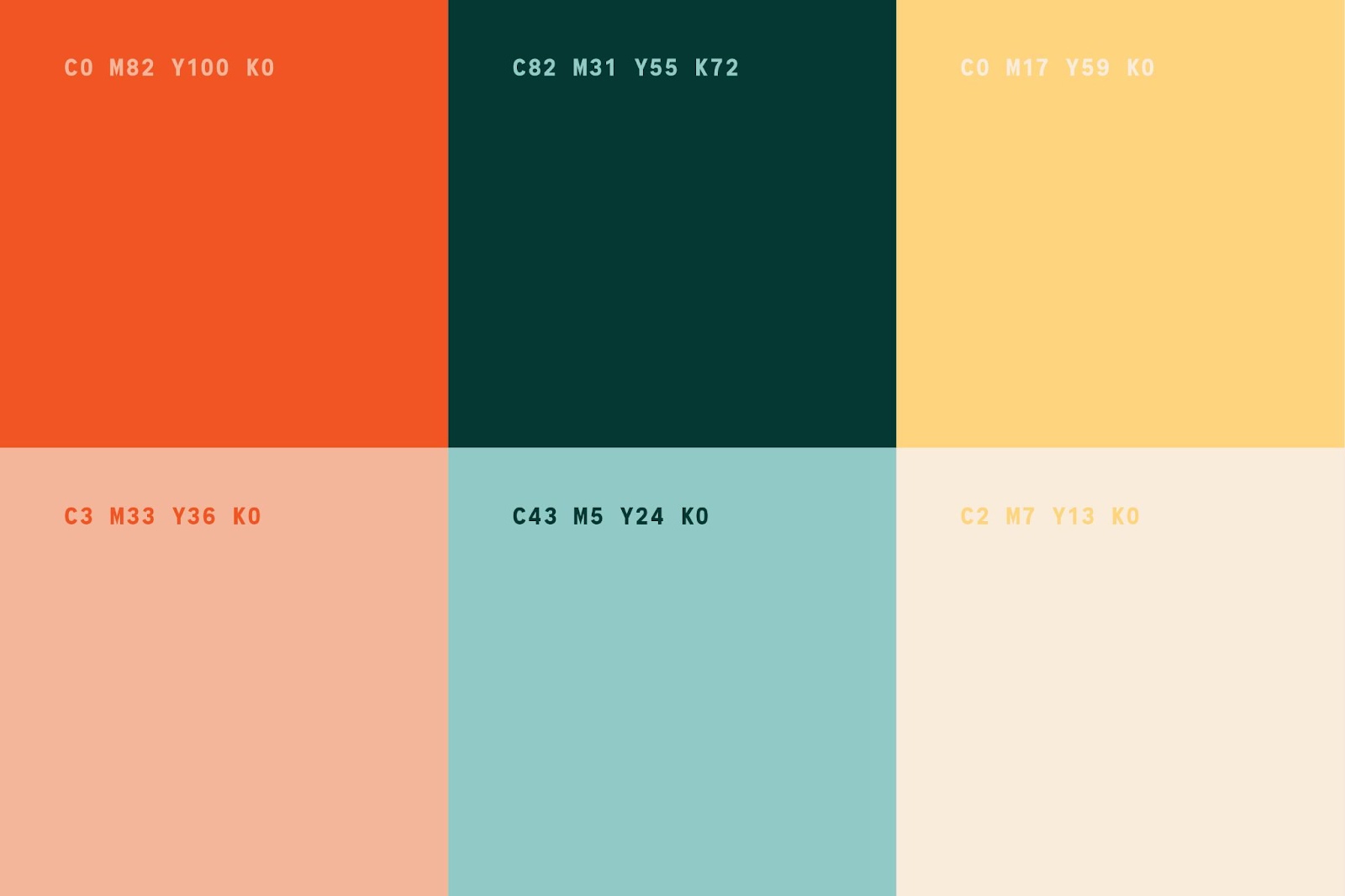
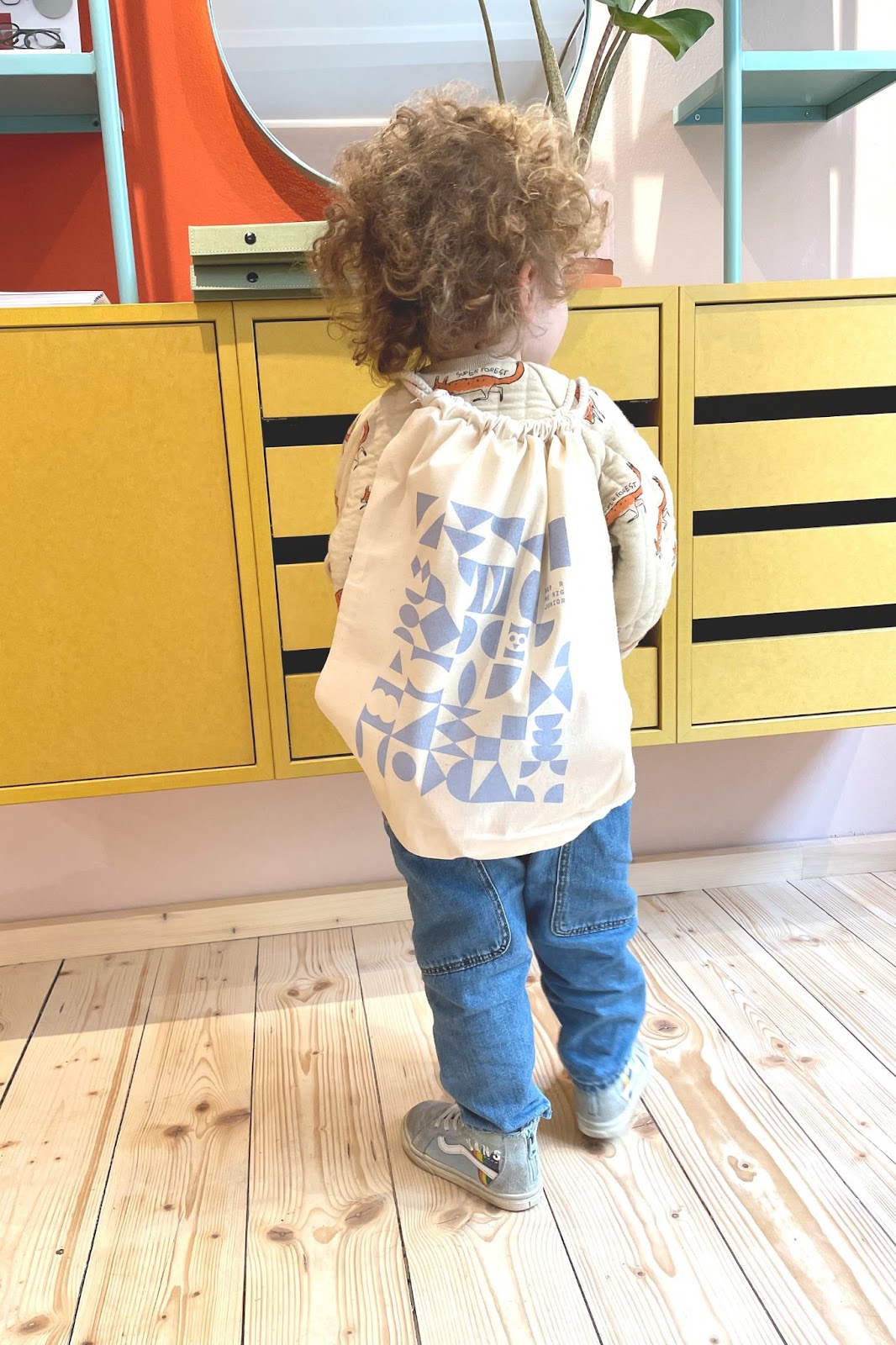
Transatlantica Brand Design created a world of fun shapes and quirky characters that roam the colorful retail interior (designed by Raum Klaue). The friendly color palette is inspired by classic toys. It is accompanied by geometric forms that suggest they can be played with like building blocks. The typography hints at the spacing of letters in optometry tests.
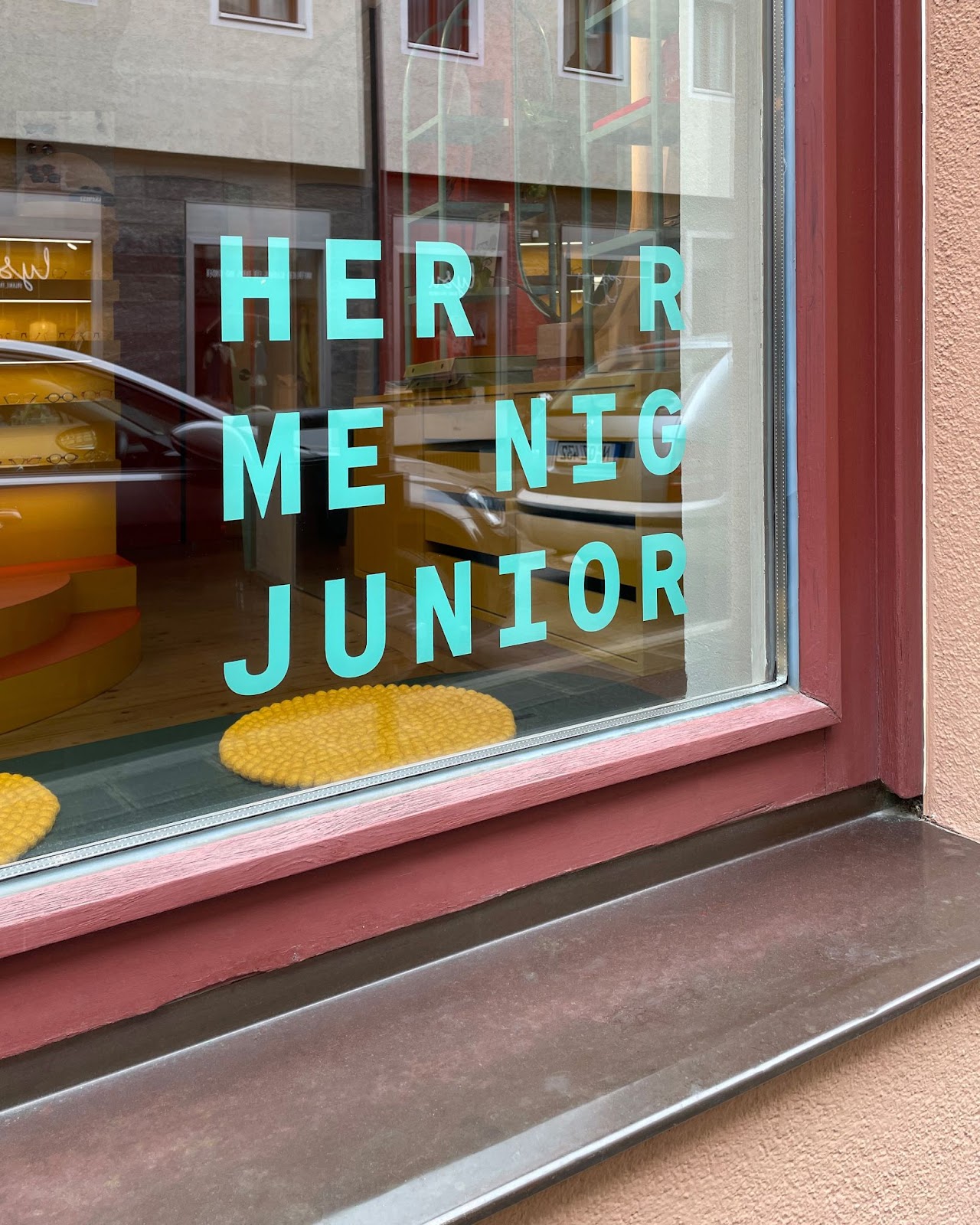
The retail shop is a playful offshoot of Herr Menig Optik, an established Optometrist in Nürnberg, Germany. The brand identity for this optometry shop for children features colorful geometric shapes that suggest they can be played with like building blocks. They are accompanied by wacky illustrated characters which are inspired by classic toys.
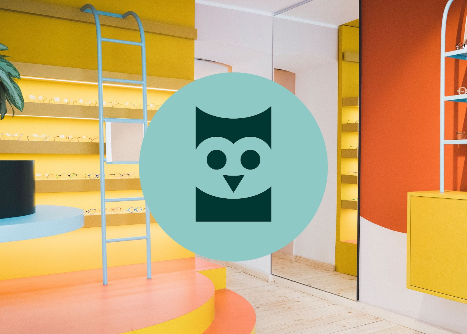
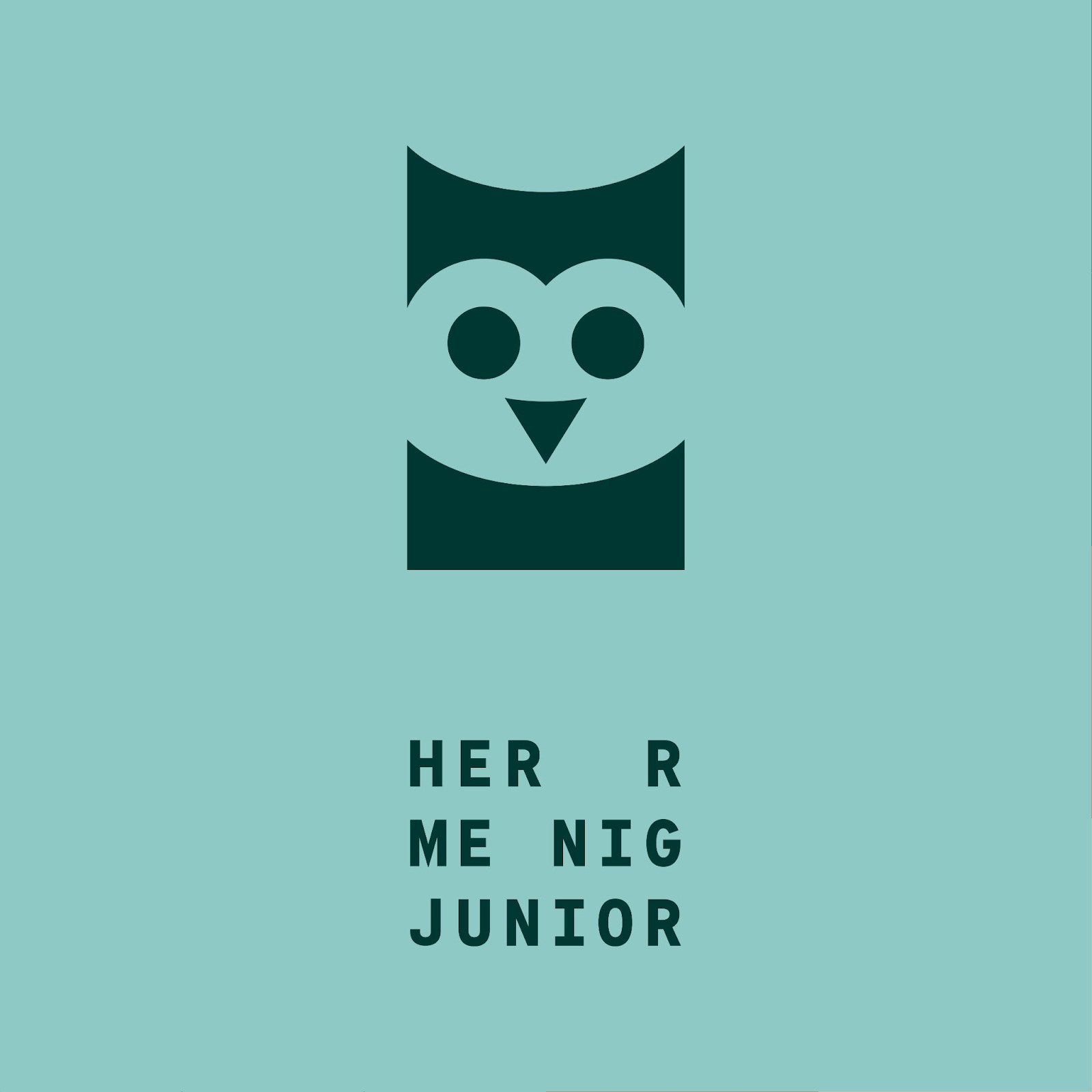
The Herr Menig Junior logo relates to Herr Menig Optik’s initial owl logo, which is used for the shop for grown-ups. The owl parent had a child!


See the full case study here: https://transatlantika.co/herr-menig-junior
Credits
- Creative Direction & Illustration: Transatlantika Brand Design / Philipp Zurmöhle – transatlantika.co
- Retail Store Photography: Maria Bayer – mariabayer.net
- Retail Interior Design: Raum Klaue – raum-klaue.de