Monaro naming and visual Identity
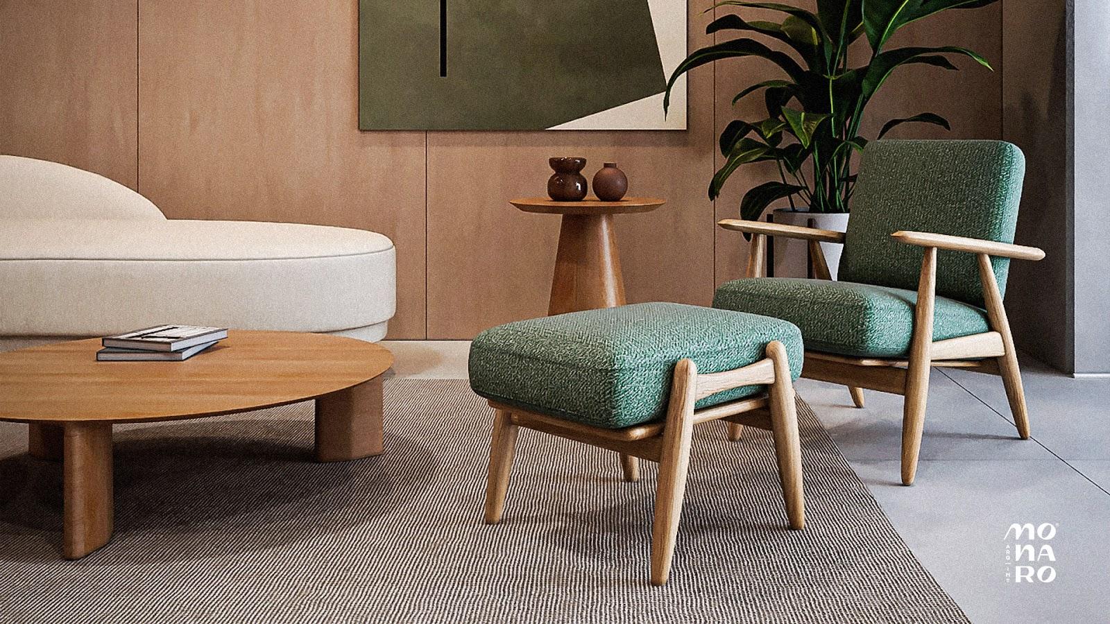
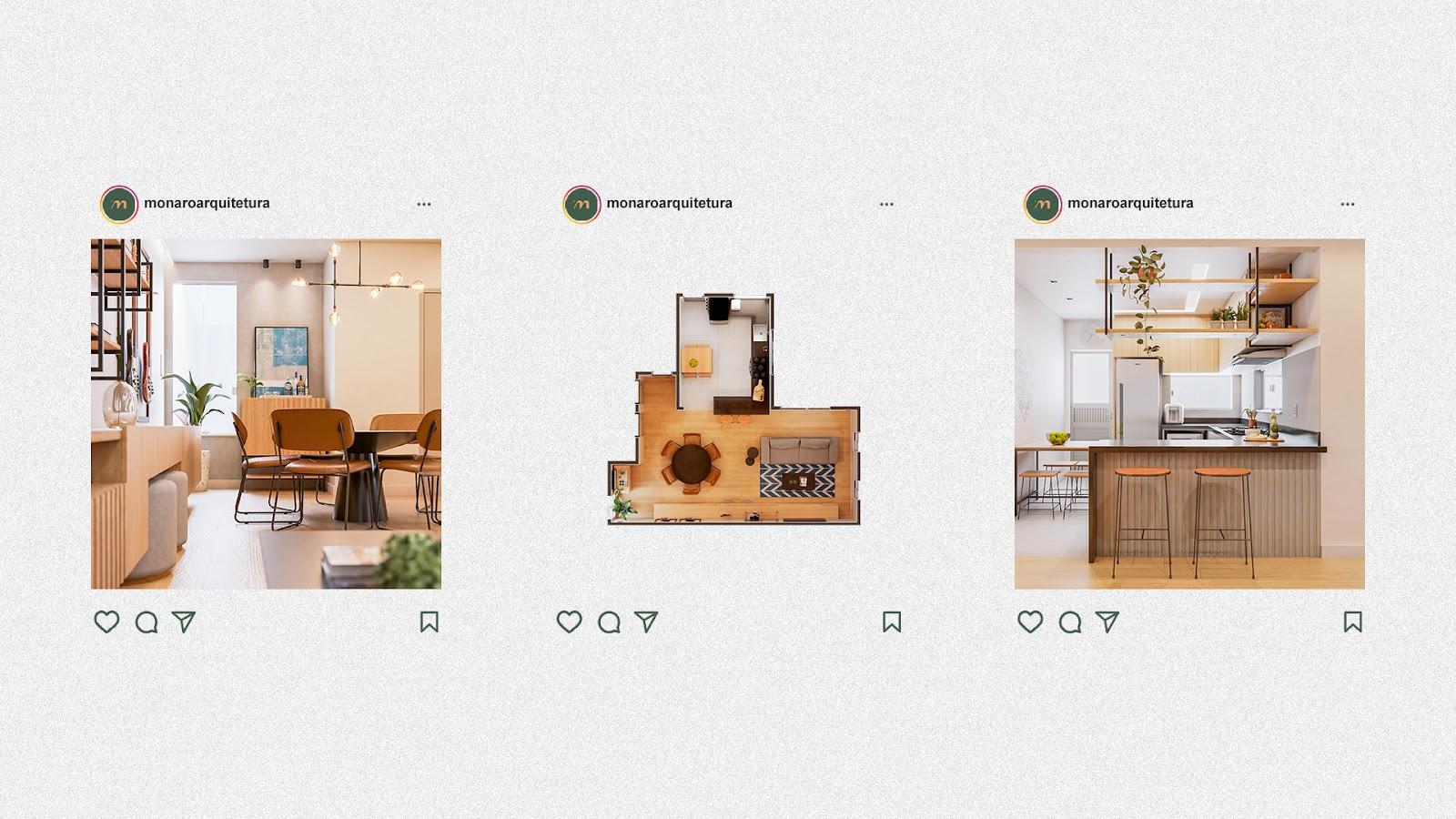
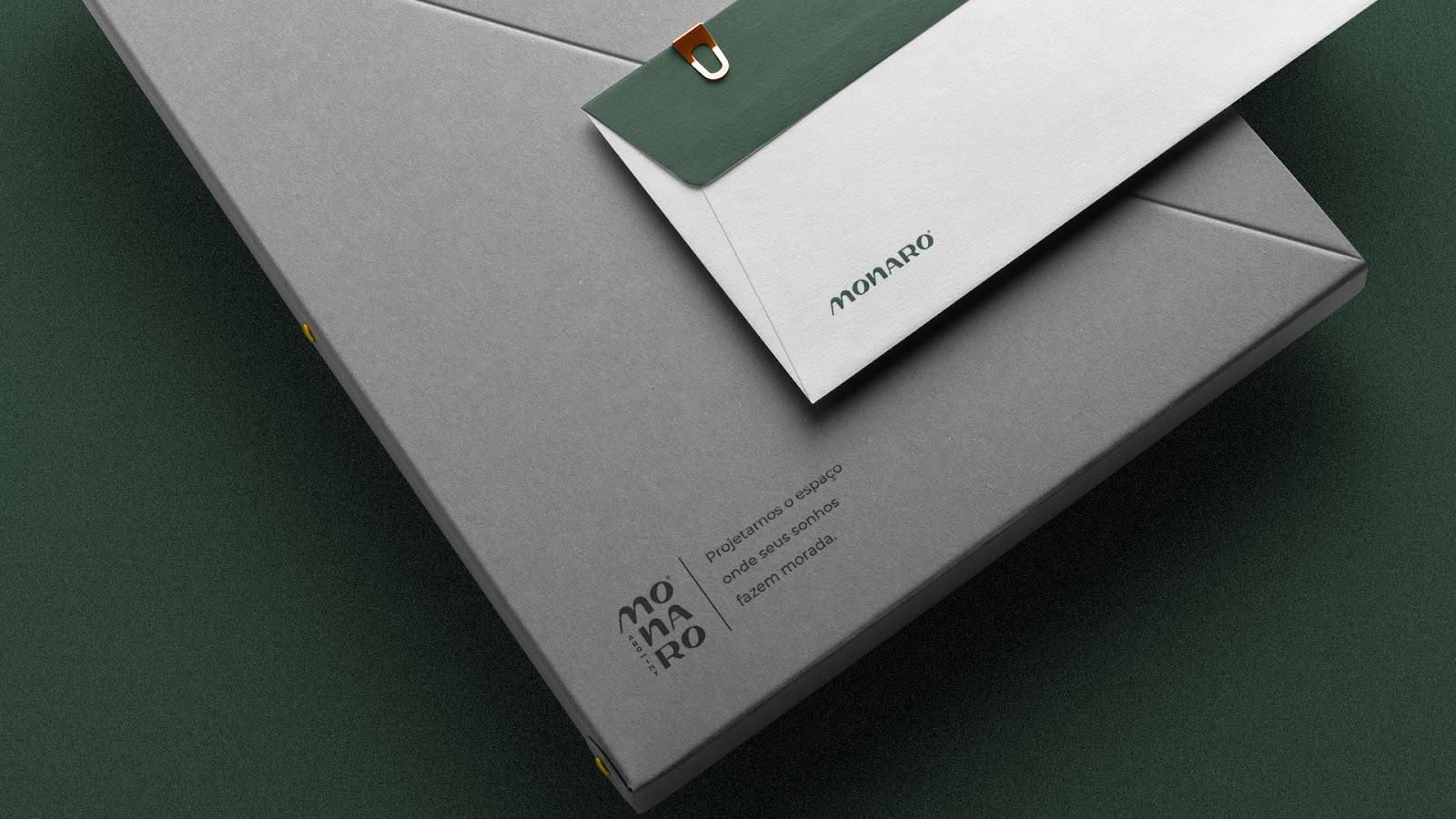
Caio Costa shared a branding project for Monaro including naming and visual identity. Monaro is an architecture firm based in São Luís (MA), Brazil, originated from the partnership between Ingrid and Victor, a duo of architects driven by the pleasure of materializing dreams through their projects.
Naming
Whether it's a residential project, where the client wants a comfortable space to call their own, or a commercial project, where space will be a key part of the client's business experience, an architectural project is the dream of many.
That's the reason we searched for the word “domanaro” in the Esperanto dialect, which means “household”.
Through our constructive process, this word gave rise to the name “Monaro”, thus bringing the essence of a brand that wants to create not only an architectural project, but a space where the dreams of each client can live.
- Building Process: Domanaro > Manaro > Monaro
- Building Method: Subtraction + Substitution
- Classification: Neologism
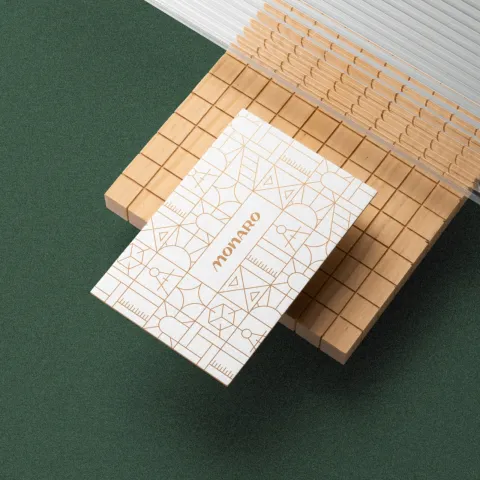
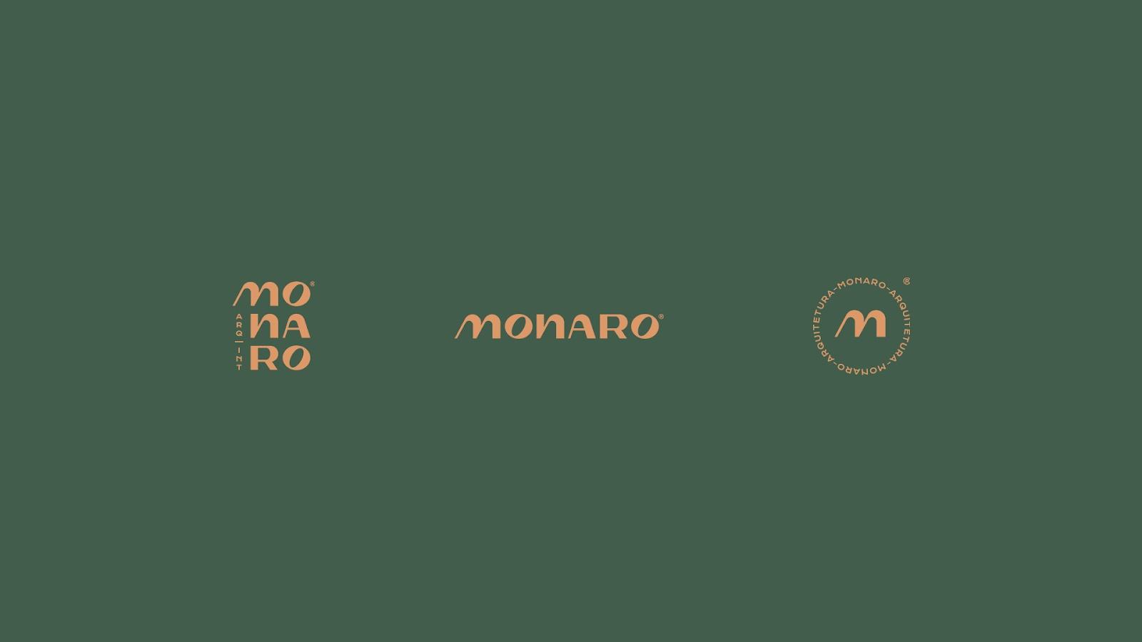
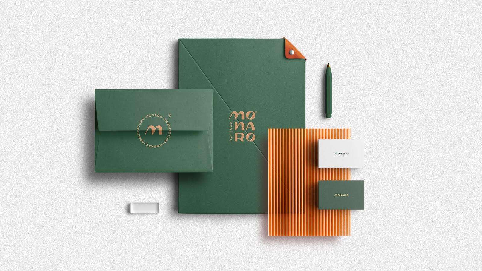
Visual Identity
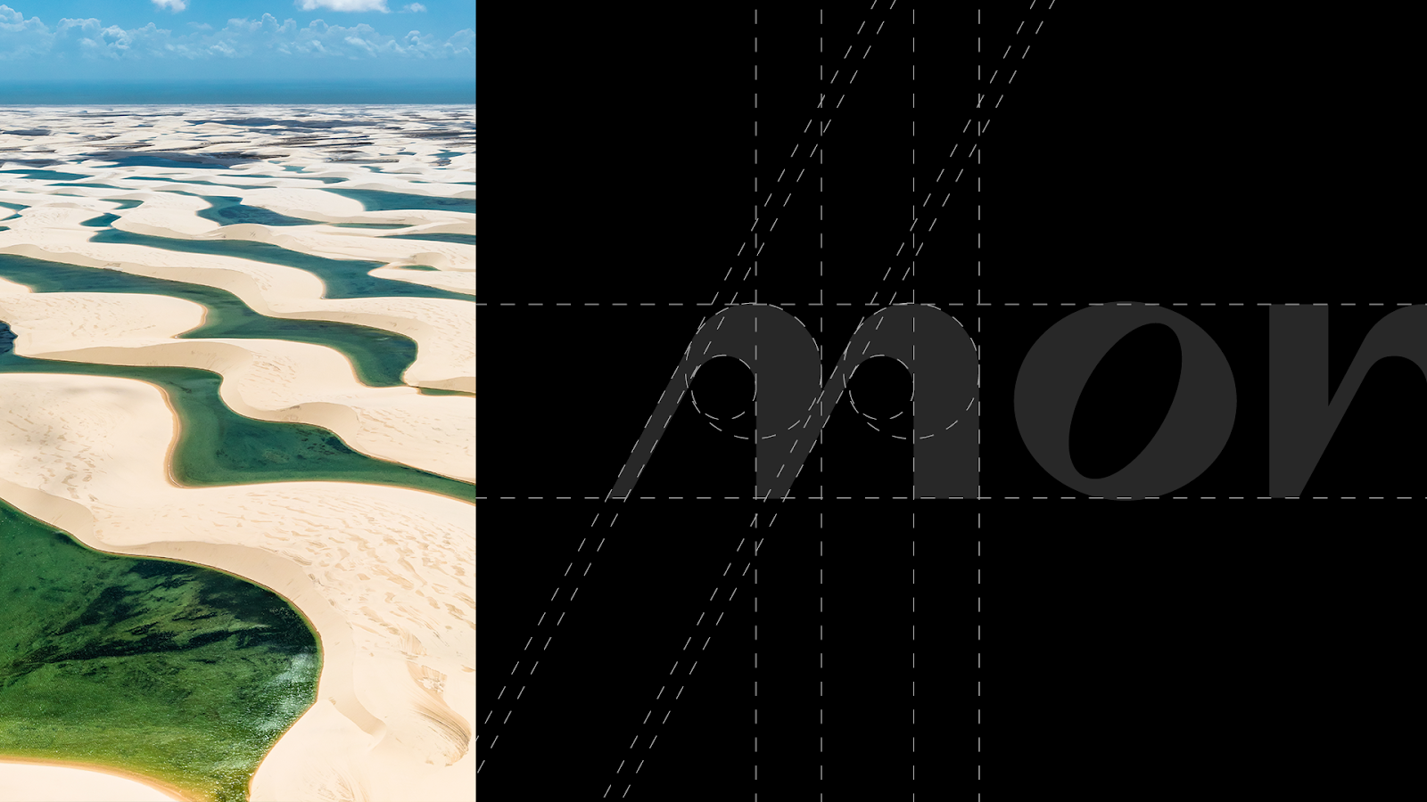
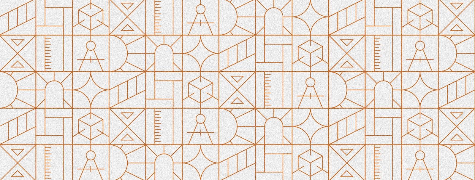
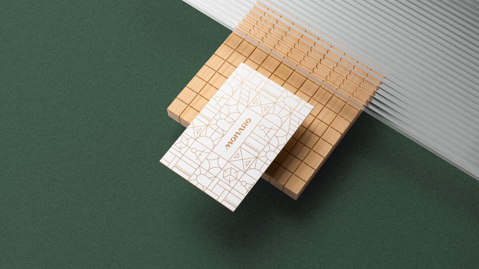
The main reference used to create Monaro’s typography was the Lençóis Maranhenses National Park, and this association was added to the brand not only to bring the regional aspect that Ingrid and Victor requested at the beginning of the process, but also to bring something related to the work of every architect that is very present in the park: the sand.
A grain of sand can be considered as the smallest part of a whole that together with other raw materials, form several other materials applied in architecture; from glass to concrete; bringing unique buildings to life.
In the same way, the dream idealized by each client can be considered the initial part of a whole that, together with the work and knowledge of Ingrid and Victor, can come to life in a unique and cozy project.
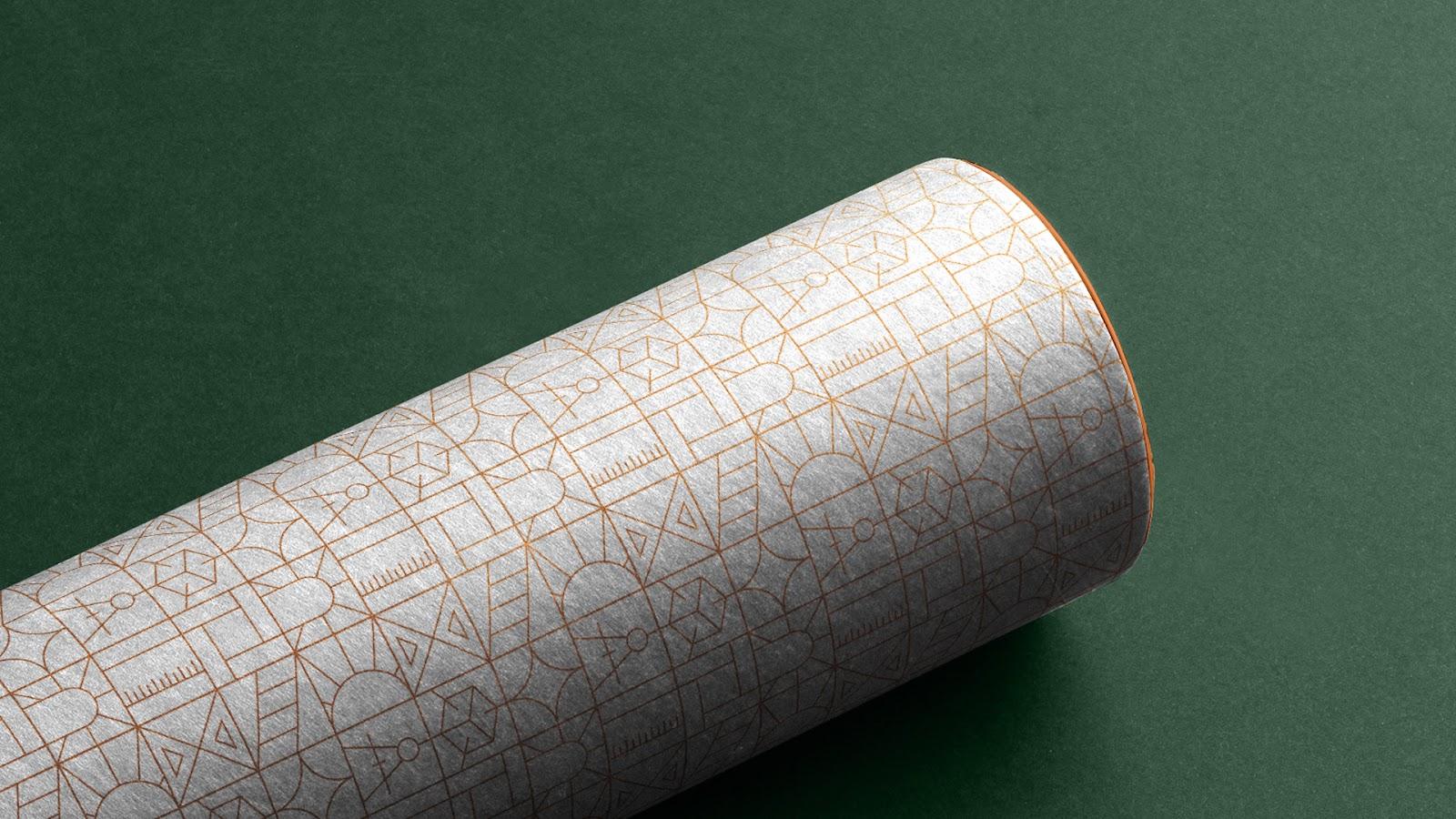
This way, the concept behind the creation of Monaro’s logo seeks to represent, in a minimalist and metaphorical way, not only an element present in the materials they work with, but also all the intangible benefits behind their services.
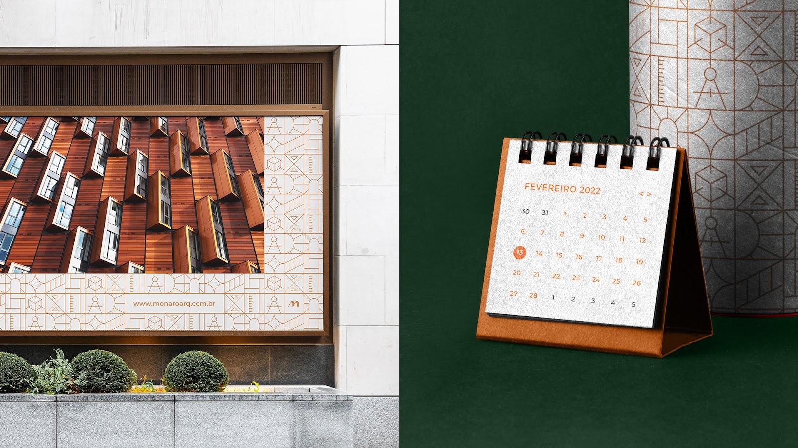
All of this, along with the color palette and identity elements, made exclusively for the brand as will be presented next, contributed to the creation of a modern visual identity that conveys all the quality and empathy that permeate the essence of Ingrid and Victor’s work.
Credits
- Clients: Ingrid and Victor
- Service: Naming and Visual Identity
- Year: 2021
- Name and Design: Caio Costa
For more information make sure to check out: