by abduzeedo
Mubariz Yusifzade shared a branding and visual design system for Manifold. Equipment for TV studios for live broadcasting, offer a new, reliable, flexible and efficient technical solution. High processing density, flexibility and density, a compact and very strong team of engineers who have already proven themselves in this area. We help every broadcaster around the world manage their cloud to the highest global standards.
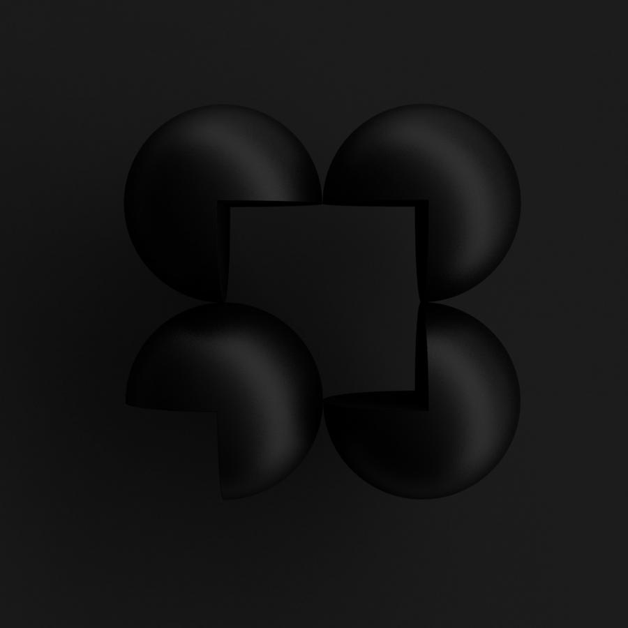
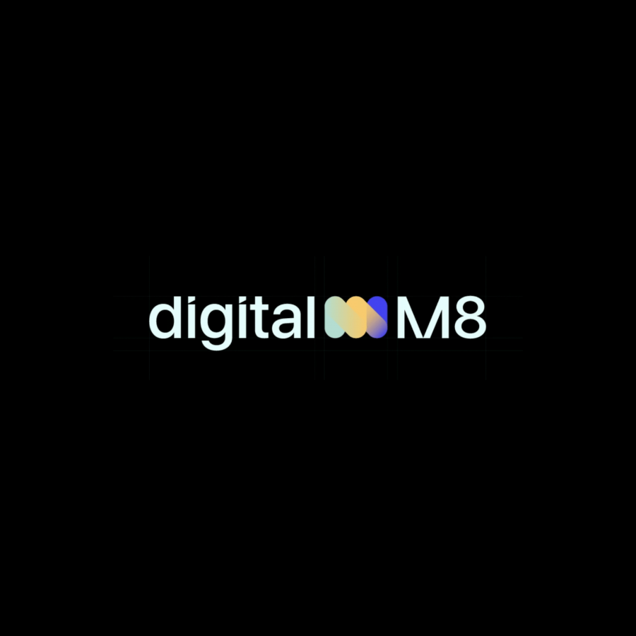
Explanation of the logo.
For the main visual element, Mubariz used the letter m, the first letter of the word Manifold, and they gave it an aesthetic image by making the letter m look like a cable. The cable is the most important for transferring data between devices. Cables help us transmit more colorful information, which is why they have so many colors. These colors combine to create a color gradient.
For more information make sure to check out Mubariz Yusifzade on:
