by abduzeedo
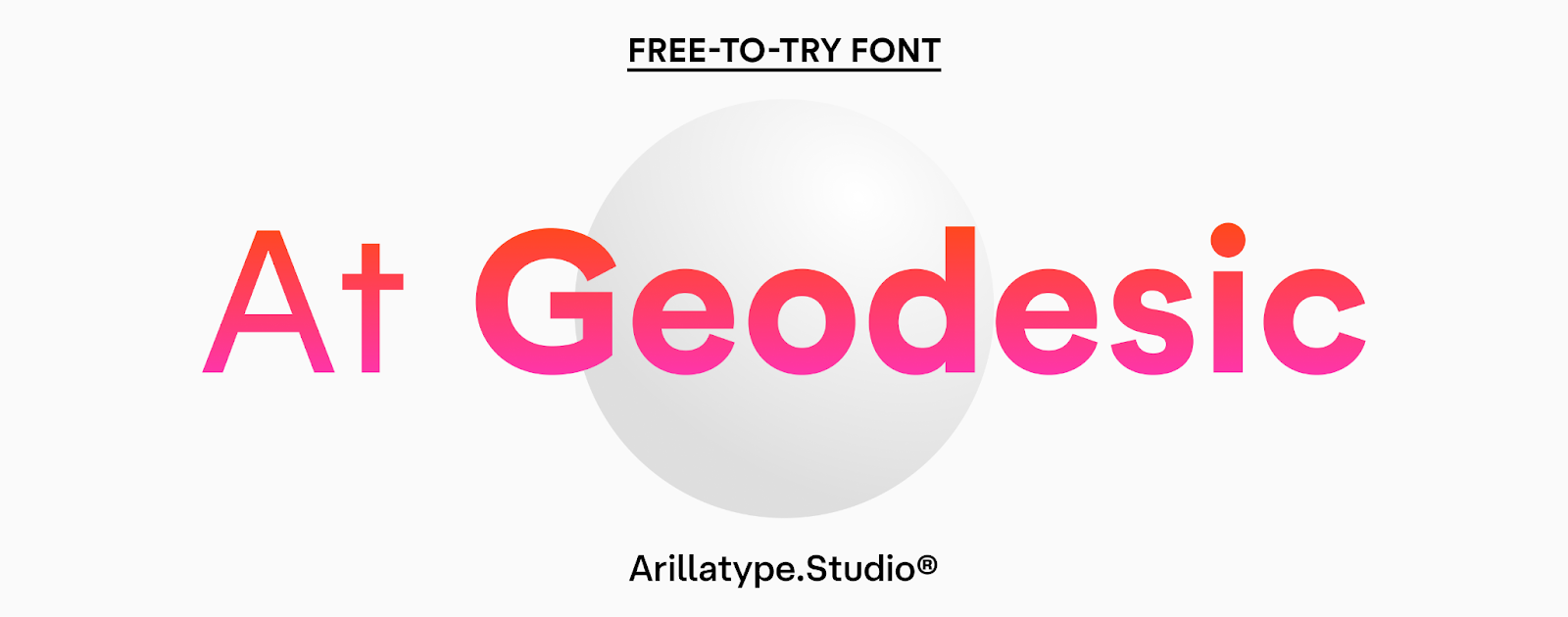
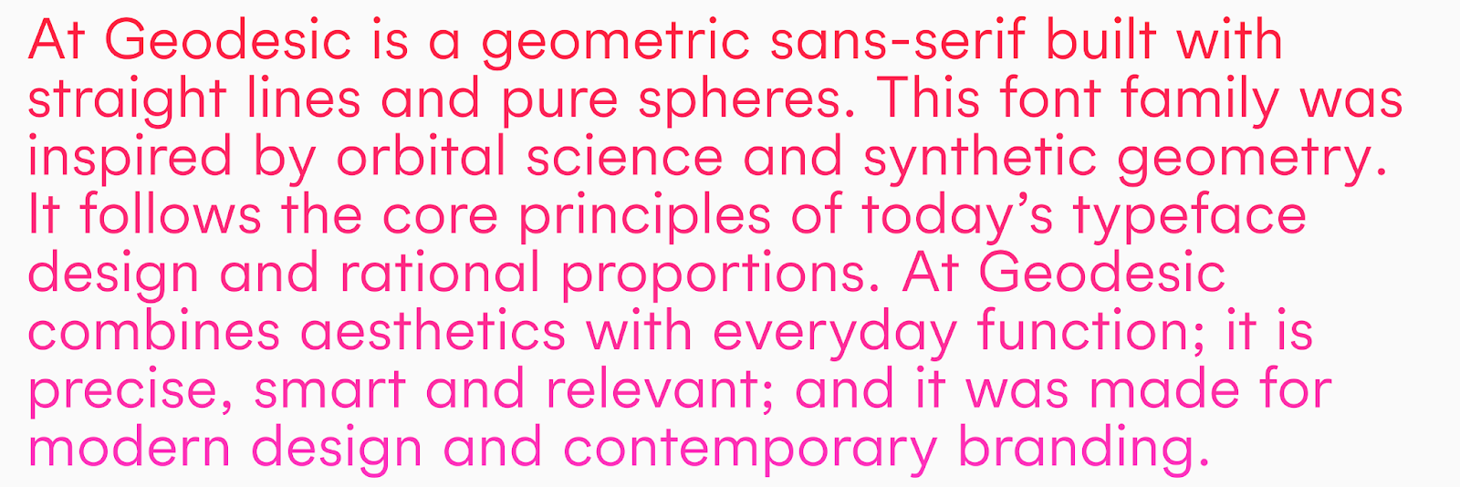
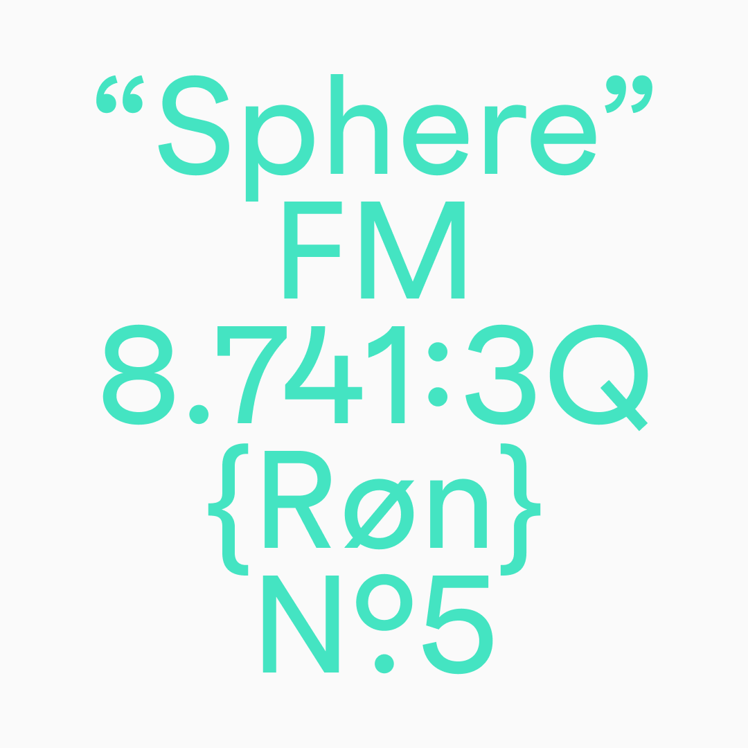
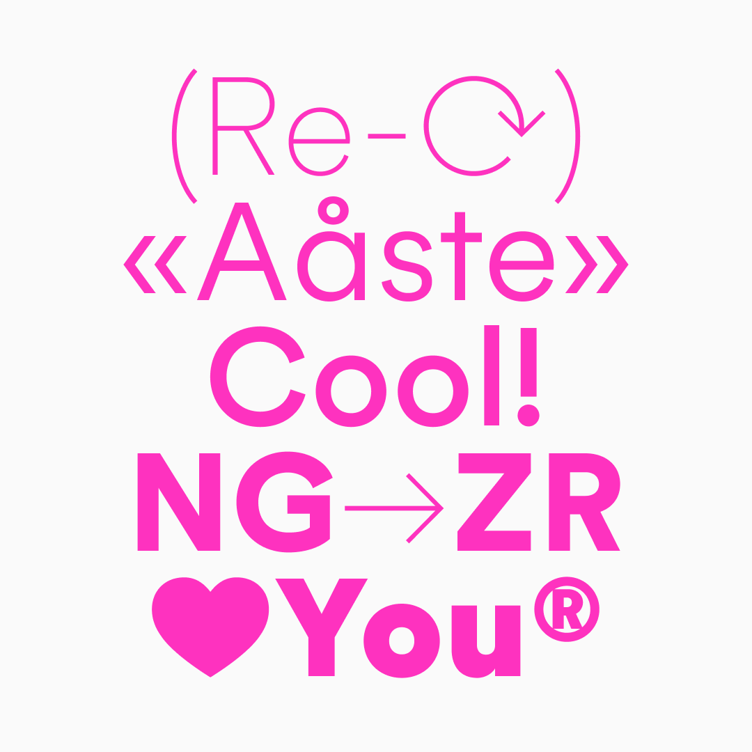
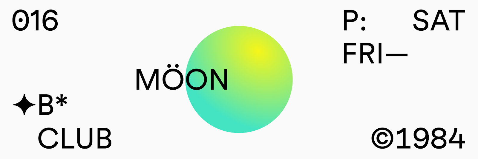
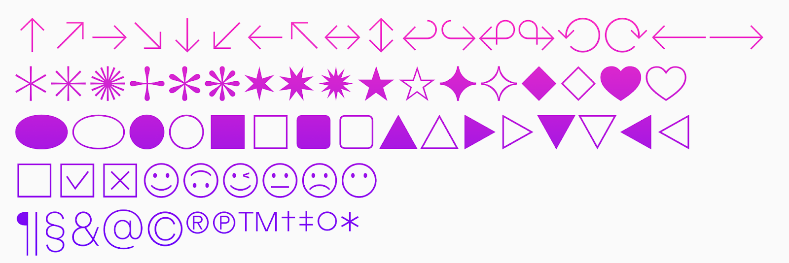
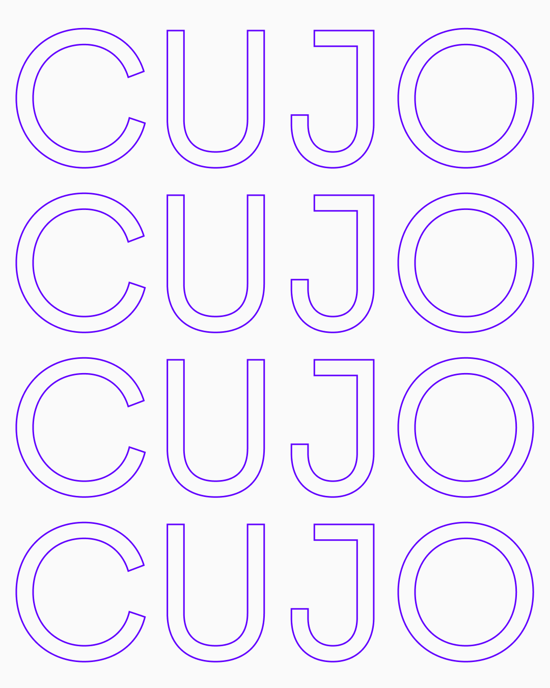
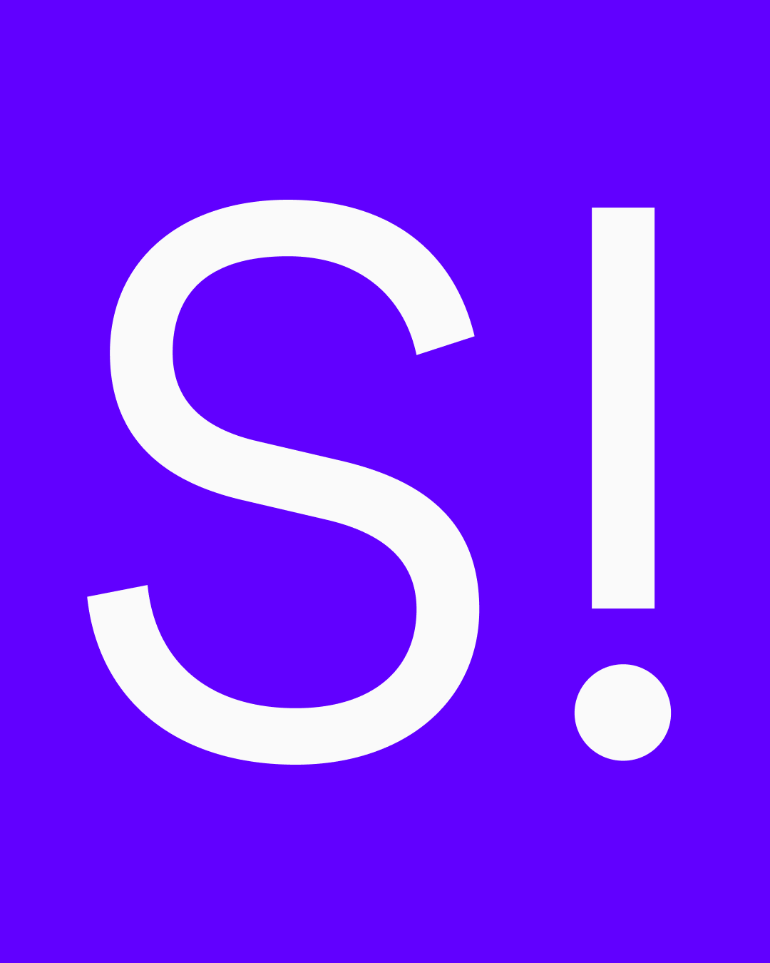
At Geodesic is a geometric sans-serif built with straight lines and pure spheres. This font family was inspired by orbital science and synthetic geometry. It follows the core principles of today’s typeface design and rational proportions. At Geodesic combines aesthetics with everyday function; it is precise, smart and relevant; and it was made for modern design and contemporary branding.
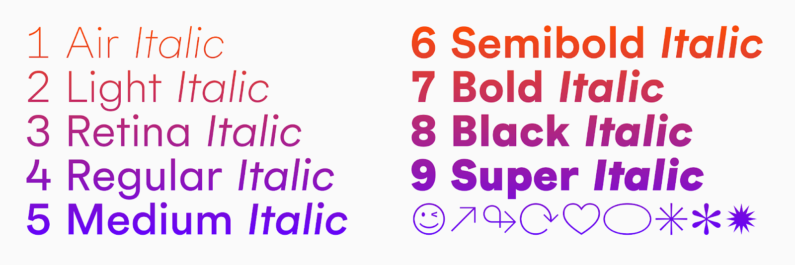
At Geodesic is available in 18 styles — starting with the delicate Air, crossing paths with the optimised for high- density screens Retina, and arriving at the robust Super. At Geodesic is also available as a variable font with two axes: Weight [Air—Super] and Italic [0°—8°]. By purchasing the full family you get the variable font.


Available exclusively at arillatype.studio/font/at-geodesic
Arillatype.Studio®
Arillatype.Studio® is a design studio with a passion for typography exploring the intersection of creativity, craft and technology. We design contemporary retail typefaces and charismatic custom fonts. We work with designers and agencies worldwide on helping brands to encapsulate their voices typographically.
We are an international team holding decades of creative expertise and a wide range of backgrounds. Our headquarters are located in Málaga (Spain).
For more information check out arillatype.studio


