by abduzeedo
Explore Fresta's innovative approach to branding and visual identity in architecture, as envisioned by Mateus Araújo. Discover how light and perspective shape design.
In the bustling heart of São Paulo, FRESTA stands as a testament to architectural and emotional excellence. Founded by the visionary Danilo Pena and Raissa Gattera, this architecture and interiors office is not just about creating spaces; it's about crafting experiences. Every project, regardless of scale, is imbued with deep architectural and emotional value, meticulously detailed to resonate with both the space and its inhabitants.
The genesis of FRESTA's name harks back to a unique challenge faced by the founders. In an area marked by high social vulnerability and dense construction, the importance of each crevice was magnified. These gaps were not merely empty spaces but opportunities to bring in light, air, and unique visuals, transforming the environment dramatically.
Enter Mateus Araújo, a maestro in the realms of 3D, graphic design, branding, illustration, and interface design. Tasked with encapsulating the essence of FRESTA, Araújo embarked on a journey to merge light and perspective as pivotal elements of the brand's visual identity. The goal was clear: to create a graphic reference that not only symbolized the brand's core values but also was accessible and resonant with its audience.
The resulting branding is a symphony of symbolism, a narrative of light traversing through minuscule gaps, creating a tapestry of perceptions and interpretations. The logo, a cornerstone of this visual identity, underwent a transformation under Araújo's skilled hands. It now exhibits a newfound solidity, with the interplay of the letters F and T, merged uniquely with the letter A, crafting a subtle yet profound narrative. The horizontal alignment at the top of these letters introduces a linear continuity, subtly hinting at the concept of a gap — a small yet significant space that defines FRESTA's ethos.
This rebranding is not just about a visual facelift. It's a reflection of FRESTA's philosophy — that in architecture, the voids are as consequential as the solids. They define, shape, and give meaning. In FRESTa's world, these voids are not just empty spaces; they are canvases of potential, waiting to be filled with life, light, and meaning.
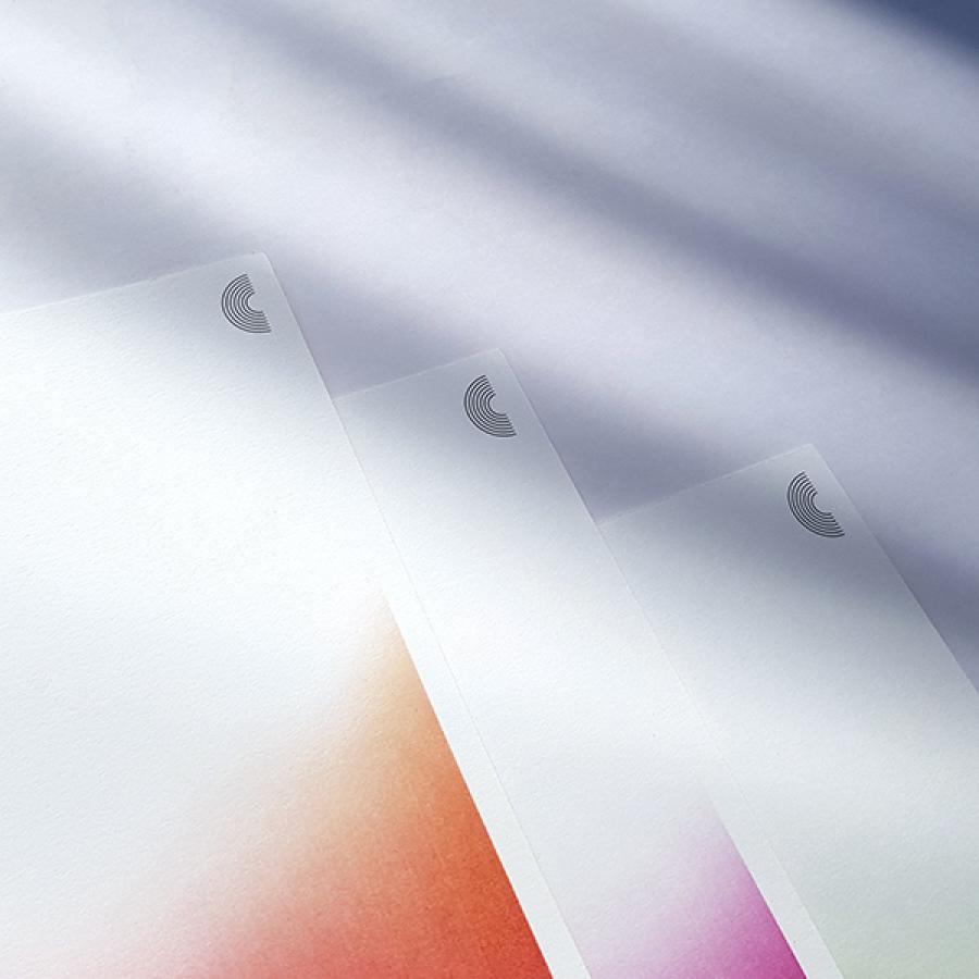
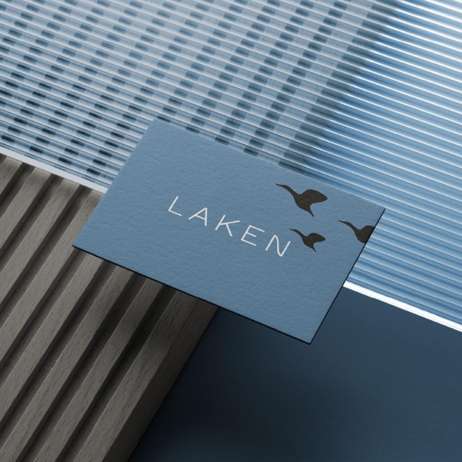
Branding and visual identity artifacts
Credits
- Design: Mateus Araújo
- Scope: Redesign de Identidade Visual
Design by Studio Mateus Araújo for more information make sure to check out www.studiomateusaraujo.com.br and instagram
