by abduzeedo
Dive into the art of branding and visual identity with Nick Barclay's Bread Branding project, showcasing two distinct concepts with modern, sleek designs.
In the dynamic world of branding and visual identity, the project "Bread Branding 2 ways" by Nick Barclay stands out as a beacon of creativity and ingenuity. Barclay, a visionary designer based in Sydney, embarked on this project to craft the identity of a new social content agency, aptly named Bread. Although personal circumstances prevented the completion of the project, Barclay's presentation of two out of four concepts offers a fascinating glimpse into the potential paths Bread's branding could have taken.
The essence of Bread's branding lies in its foundation: the use of simple yet profound elements that echo the primary ingredients of bread itself. Barclay's approach intertwines the simplicity of bread's three basic ingredients with the foundational aspects of building a successful business. This analogy serves not only as a tribute to the brand's name but also as a guiding principle in its visual identity.
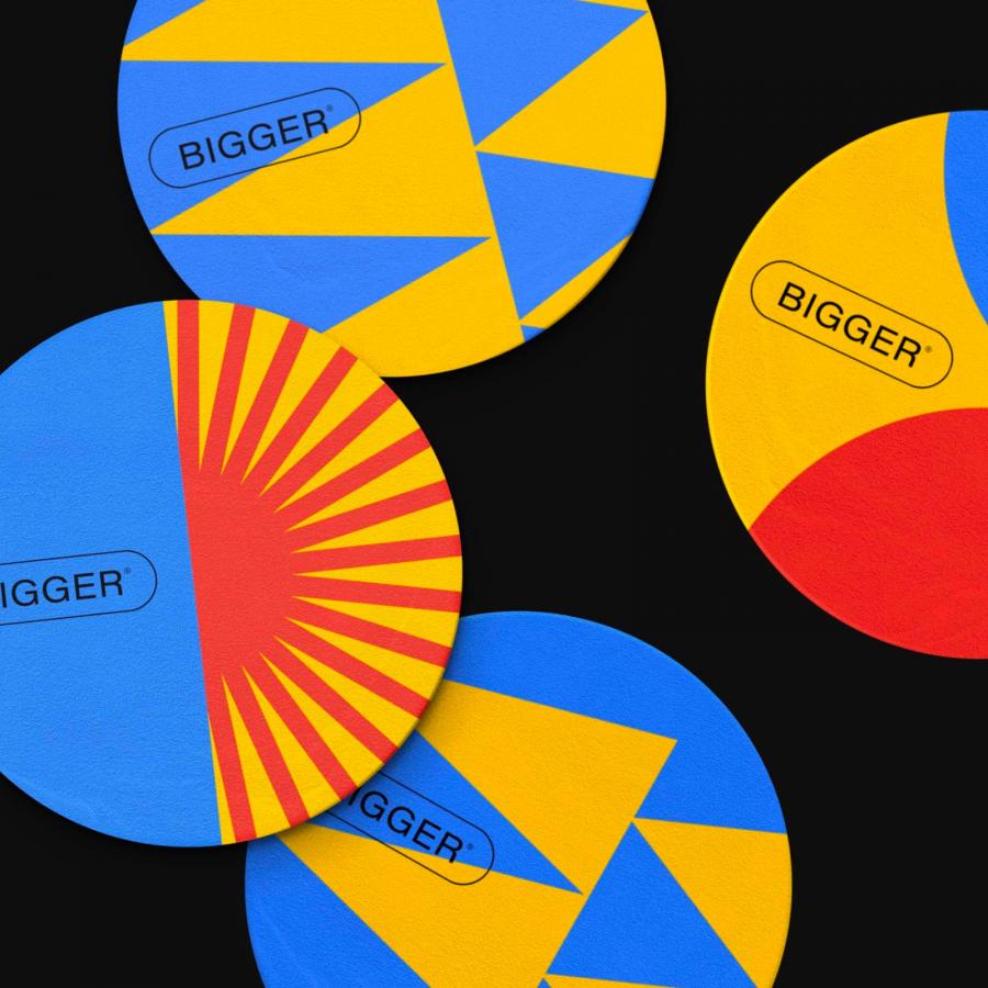
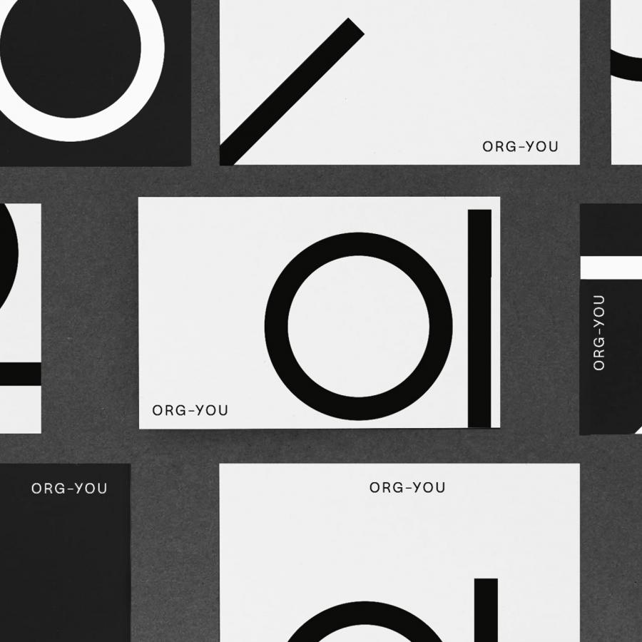
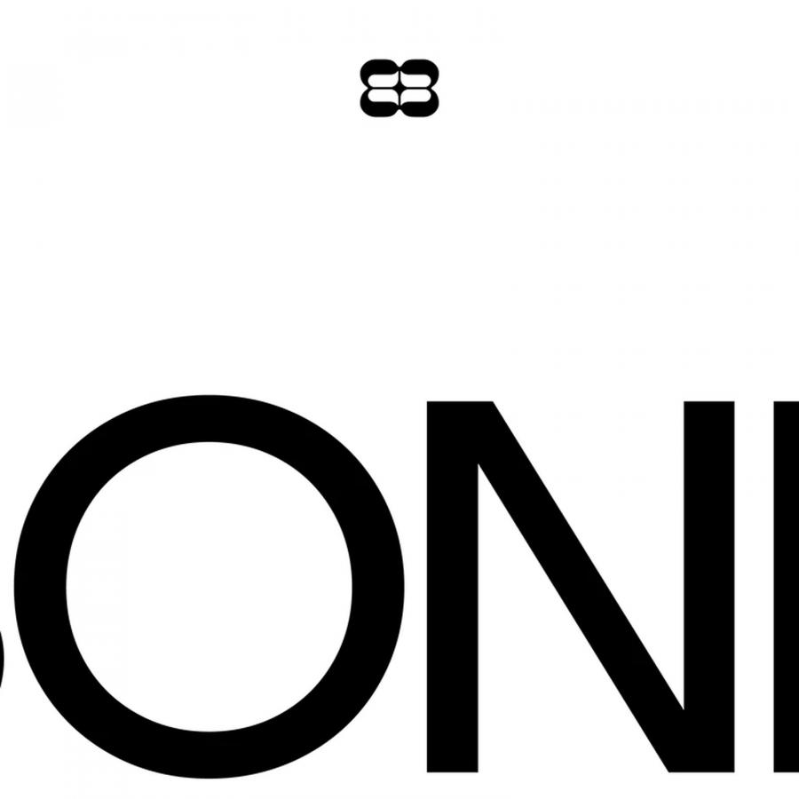
The first concept Barclay introduces is a testament to modern elegance. It employs clean typography and pairs it with three basic forms, each symbolizing one of bread's essential ingredients. This design choice is more than aesthetic; it's a narrative device that conveys the agency's commitment to building strong, simple, and effective strategies for its clients. The clean, modern look speaks volumes about the agency's approach to content creation: straightforward, impactful, and devoid of unnecessary complexity.
This project, even in its incomplete state, serves as a rich source of inspiration for branding professionals and enthusiasts alike. Barclay's ability to derive profound meaning from minimalistic designs reinforces the idea that in branding, sometimes less is indeed more. His work prompts us to consider how the core elements of a brand can be visualized in ways that are both aesthetically pleasing and deeply symbolic.
For those fascinated by the intersection of design and brand storytelling, "Bread Branding 2 ways" offers valuable insights into how visual identity can encapsulate a brand's essence. Nick Barclay's work is a compelling reminder of the power of design to communicate, resonate, and ultimately, to build a bridge between a brand and its audience.
Branding and visual identity artifacts
For more information make sure to check out Nick Barclay website and Behance profile.
