by abduzeedo
NuMar is a contemporary art space that has recently undergone a visual identity makeover by Ognjen Gligorijevic. The new visual identity is minimalist, elegant, and very typographic. This article explores the design elements that make up NuMar's visual identity and how they reflect the essence of the art space.
The NuMar logo is the centerpiece of its visual identity. The logo is a bold, sans-serif wordmark but with a lot of personality. The font used in the logo is modern and minimalist, reflecting the contemporary nature of the art space. The use of uppercase letters conveys strength and confidence, while the absence of any other design elements keeps the focus solely on the name.
NuMar's color palette is primarily black and white, but the usage of imagery contrasts well with the simple palette. The use of a monochromatic color scheme creates a sense of sophistication and elegance, which is perfect for an art space. The occasional images add pop of color that draws the viewer's attention, highlighting important information like event dates or exhibition titles.
NuMar's visual identity is heavily typographic. The font used in the logo is carried throughout all marketing materials, creating a consistent and cohesive look. The font used is easy to read and has a modern feel that complements the contemporary art on display at NuMar.
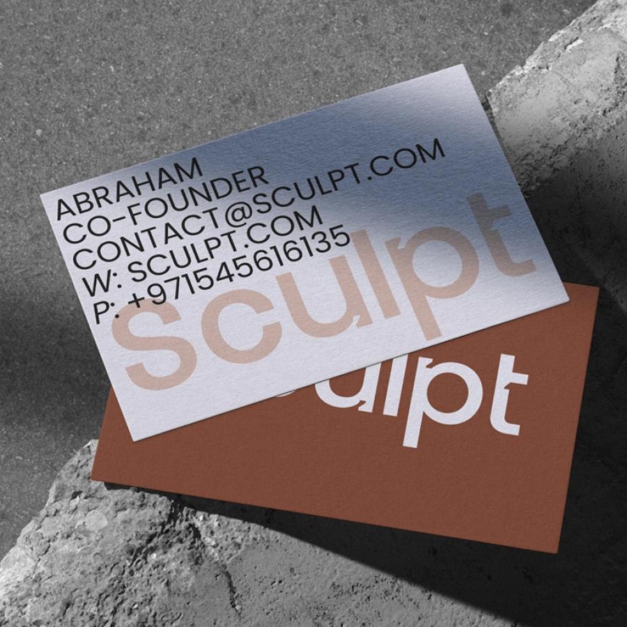
NuMar's visual identity is carried through to all of its marketing materials, including business cards, posters, and exhibition catalogs. The minimalist design approach ensures that the focus is on the art, with the branding acting as a subtle accent. The absence of any unnecessary design elements ensures that the information is easily readable and accessible.
NuMar's new visual identity perfectly reflects the essence of the art space. The minimalist design approach creates a sophisticated and modern look that complements the contemporary art on display. The use of a consistent color palette and typography ensures that the branding is recognizable and cohesive across all marketing materials. Overall, NuMar's new visual identity is a perfect example of how a minimalist approach can be effective and impactful.
Visual identity
For more information make sure to check out Ognjen Gligorijevic website at ogvstudio.com or follow him on Behance and Instagram.
