by abduzeedo
Explore Numinous Agency’s ultra-minimalist brand identity, focusing on clarity, human-centered UI, and Neue Montreal.
Design often feels like a race to see who can shout the loudest. We are constantly bombarded by aggressive headlines and striking imagery that demand our immediate attention. But every so often, a project comes along that does the exact opposite. The website for Numinous is a masterclass in what happens when you decide to stop competing for attention and start prioritizing the user experience. From its inception, the goal was clear: create an interface that never interferes with the content it hosts.
The agency leaned heavily into ultra-minimalism. This wasn't just a trendy aesthetic choice; it was a functional decision to ensure the site felt calm, accessible, and intuitive. By reducing the visual language to a strict toolkit—one typeface, two colors (black and white), and basic geometric shapes like squares and rectangles—they created a space that avoids visual tension. The result is a digital environment that gently guides the user, letting the meaning of the work take center stage.
The technical implementation on Webflow is equally impressive because it hides a lot of complexity under that simple surface. A custom scaling system ensures the proportional harmony remains intact whether you are on a phone or a desktop. They also built a dynamic grid for projects where every third project expands to full width, keeping the layout expressive without breaking the established rhythm. It is a living portfolio that feels effortless to navigate.
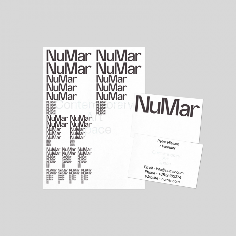
Typography acts as the primary "design tool" here rather than just decoration. By using Neue Montreal as the primary sans serif, the brand communicates with a bold, confident, yet clean voice. The site's copy follows suit; it is precise and intentional, never pushing or overselling the agency's services. It is a rare example of a brand that understands silence and visual pauses are just as much a part of the dialogue as the words themselves.
The structure of the site—built around six core pages—is designed to be a smooth immersion into the agency’s values. Even the marketing logic is respectful; for instance, accessing a capability presentation is a single, effortless step for the user. Ultimately, Numinous has created a space where design supports understanding rather than demanding a spotlight. It is a refreshing return to conscious interaction and clarity.
Images for this project are included below.
Credits: Project by Numinous Agency
