by abduzeedo
The world of branding and visual identity design has witnessed yet another great case study with the rebranding of Okta by Athletics. With a footprint in over 150 countries and partnerships with brands like Zoom, JetBlue, and T-Mobile, Okta stands as the epitome of secure identity cloud systems. With such a mantle to hold, the need for a brand identity that captures the essence of its core beliefs was paramount.
Athletics, in partnership with Okta's internal brand team, embarked on this transformative journey. Their mutual commitment was clear: to create a brand image that underscores Okta's dedication to individual empowerment and agency. It was a task that demanded a design not only reflective of the company's ethos but also one that positions Okta at the pinnacle of its niche.
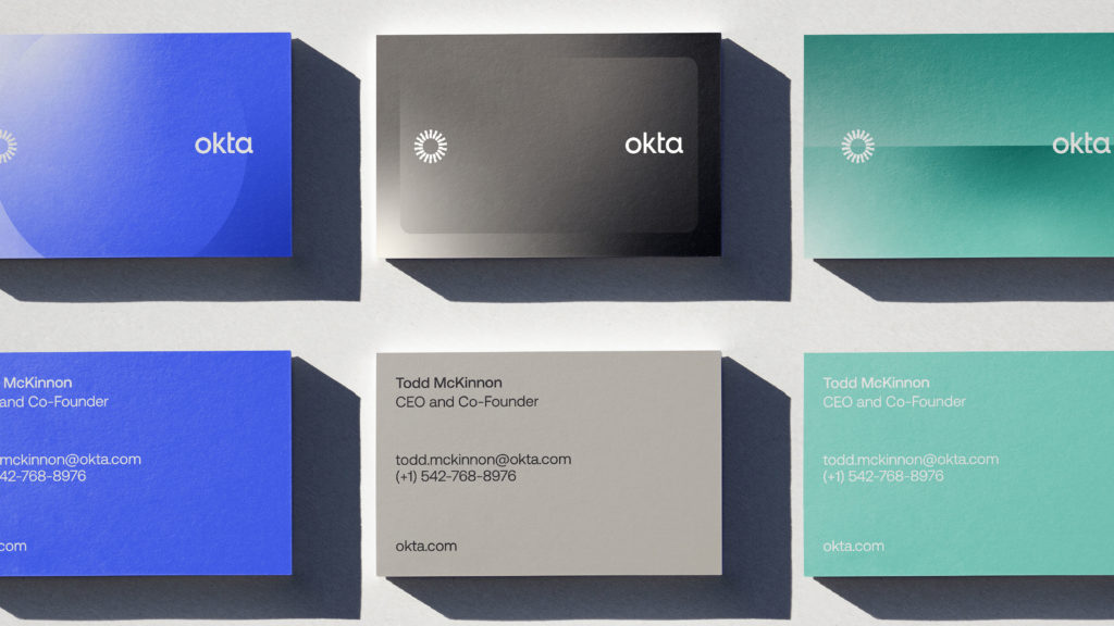
A glance at the refined wordmark makes the meticulous attention to detail evident. The leaner weight coupled with crisper edges, an assertive foundation for the 't', a redesigned 'k', and an overall enhancement in clarity reflect the brand's renewed vigor. Athletics' collaboration with the renowned typeface design studio, Dalton Maag, only added another layer of finesse to these micro-refinements.
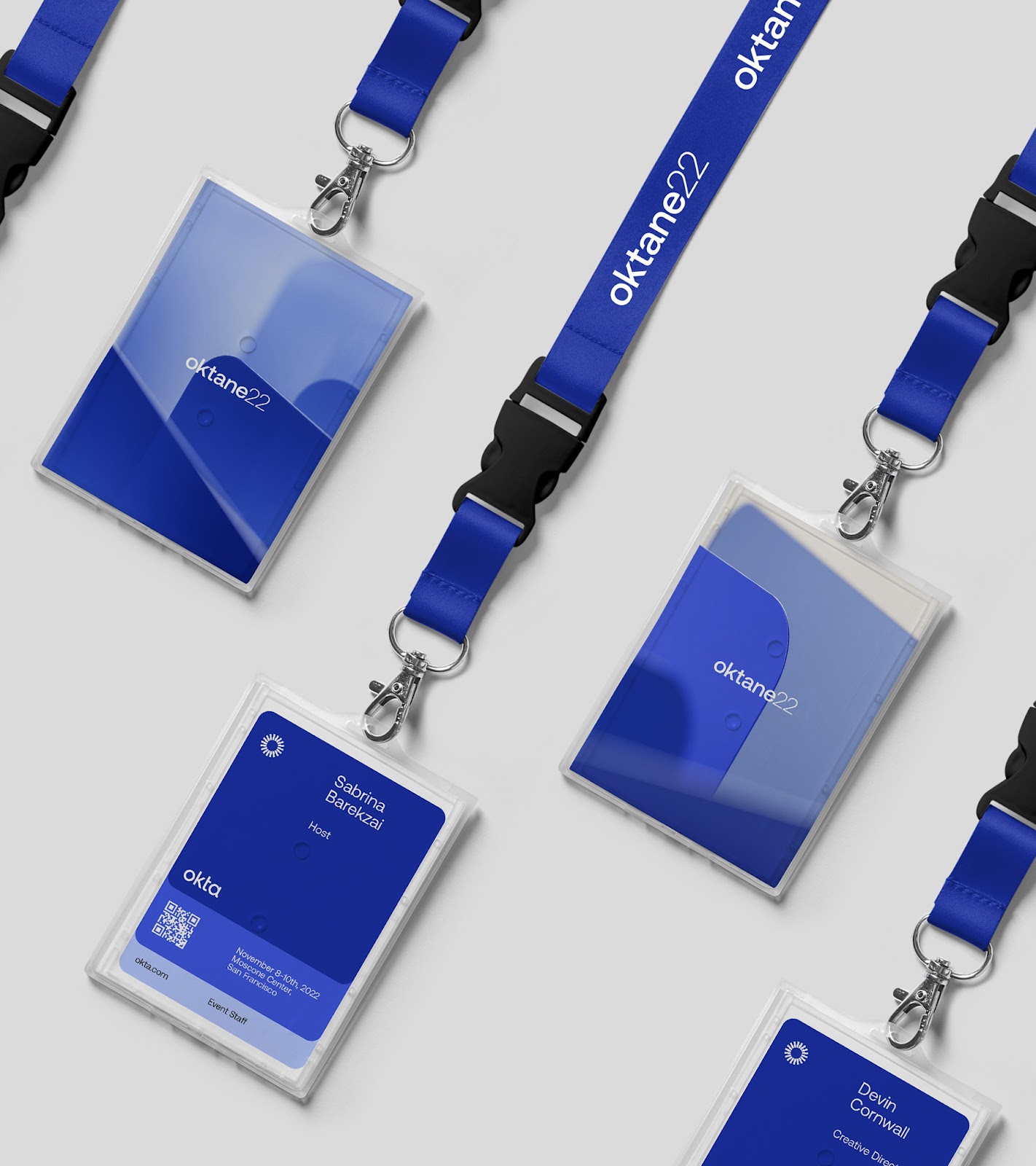
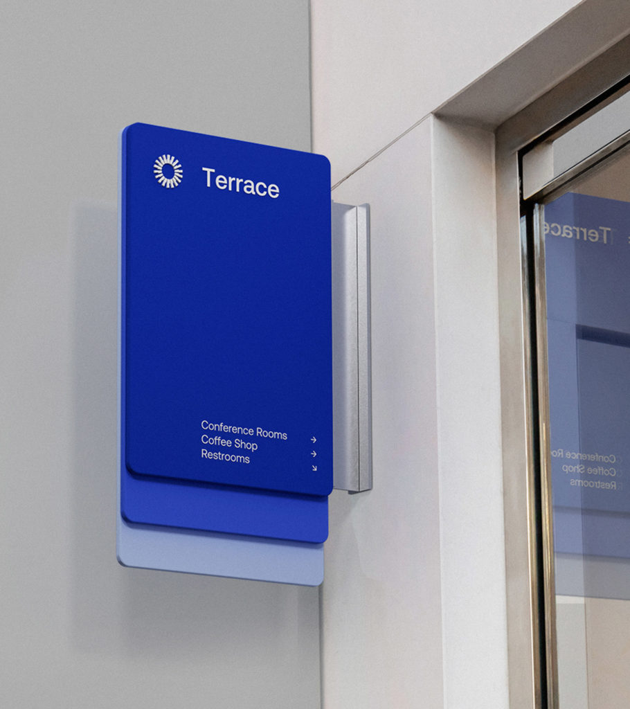
However, the pièce de résistance of the rebrand is undeniably Okta's new brand symbol. The "Aura" at its core is a revolutionary concept around which the entire brand ecosystem orbits. This unique symbol is not just an icon but a storyteller, its spokes capable of portraying images, and when animated, they deliver a dynamic, layered experience.
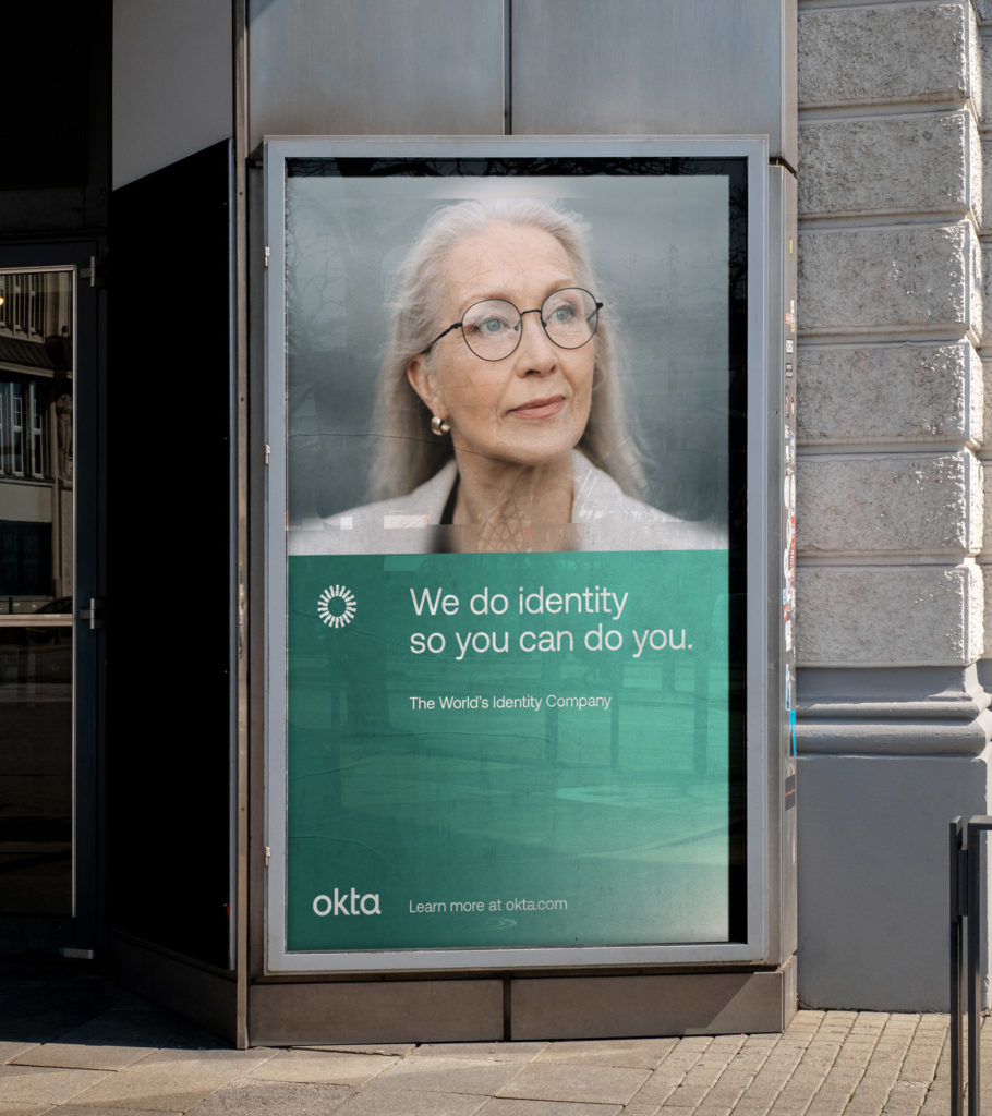
The incorporation of 3D and motion into Okta's identity, particularly through the Aura and the overarching brand system, introduces a fluidity and depth that's a visual treat. But what truly personalizes the brand is the warm and genuine portrait photography, capturing individuals in their most authentic moments. This human touch distinctly sets Okta apart in the expansive tech realm.
Lastly, the rejuvenated voice of Okta resonates with the enthusiasm and ingenuity of its founders. It strikes the perfect balance between visionary foresight and pragmatic planning, much like an inventor charting the path to the future. In summary, Athletics has crafted a brand identity for Okta that is not just distinctive, but emblematic of its core beliefs.
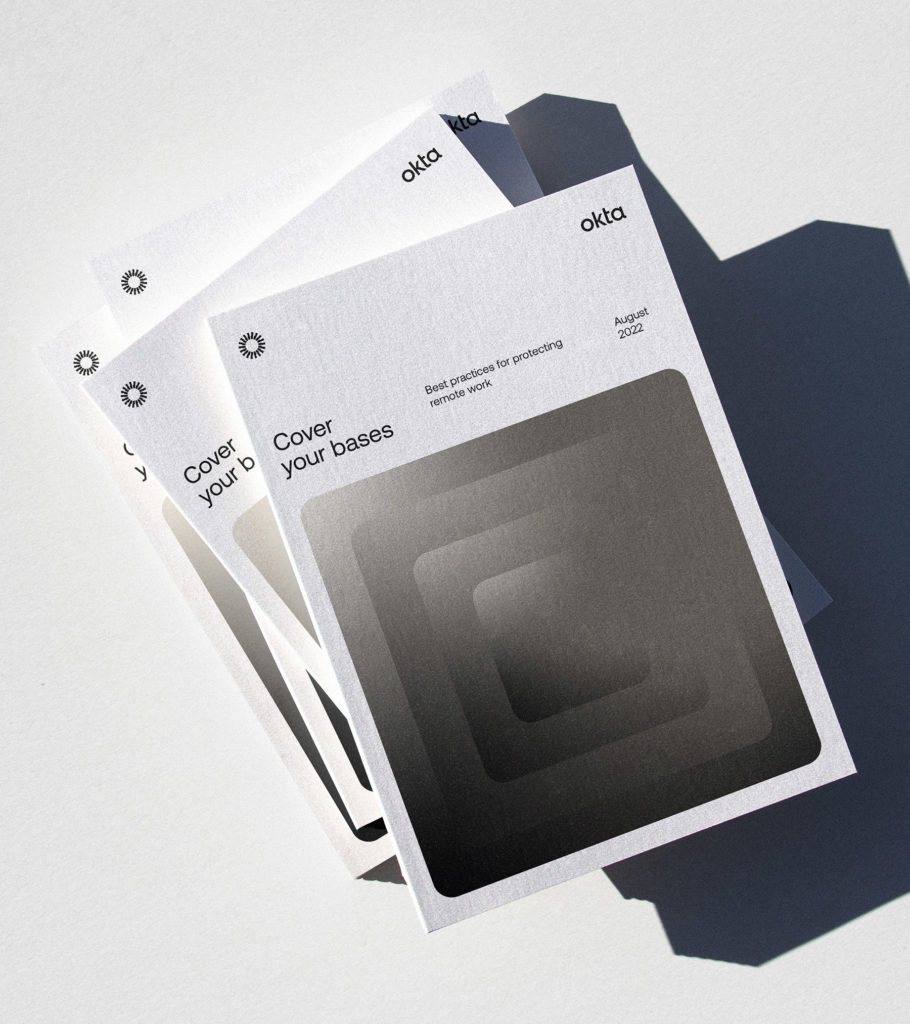
Branding and visual identity artifacts


For more information check out the full case study at Athletics website